The Much Maligned Arms of the Canada Company
Auguste Vachon, Outaouais Herald Emeritus
There is little doubt that freely adopted arms are subject to modifications, a case in point being the arms of the City of Montreal freely adopted in 1833 and freely modified many times. [1] Unfortunately even granted emblems are not immune to alterations by artists in spite of the fact that they appear in heraldic works and a reproduction and heraldic description can be obtained from the granting authority. This is patently demonstrated by the arms of the Canada Company which have been the object of many pronounced revisions. The changes do not merely involve variances in style, which heraldry allows, but also discrepancies in content which contravene the blazon or heraldic description. Investigating why these mutations occur proves important, but equally significant is gaining insight as to why the arms of a company were so frequently displayed as being those of Canada. The distinction between the stylisation of heraldic emblems as opposed to distortion is analyzed in Appendix II.
The Canada Company was established in 1824 and sanctioned by royal charter in 1825. It ceased operations in the 1950s after selling the last parcels of land from the 2.5 million acres it had purchased from the government between Lake Ontario and Lake Huron for purposes of colonization. At the request of Simon McGillivray, one of the directors of the company, the Kings of Arms of England granted the enterprise armorial bearings on15 June 1825 and supporters the next day (fig. 1). [2] These arms include the beaver as a Canadian emblem in the first quarter, and in the others: a saw and axe to clear the land, a plough to till the land and a wheat sheaf representing the benefits to be reaped from this labour. They honour the three nations already there or expected as settlers, the English the Scots and the Irish. The English are represented by the red cross of St. George, three lions and a Tudor rose. The Scottish contribution is highlighted by the thistle and the flag of Scotland, a white saltire on blue, held by the lion on the left, while the Irish participation is acknowledged by a shamrock and the red saltire of St. Patrick on a white flag held by the lion on the right (fig. 1). The armorial achievement is blazoned as follows:
Arms – Argent, on a cross Gules, a lion passant guardant Or between, in the first quarter a beaver statant, in the second quarter a saw surmounted by an axe in saltire, in the third quarter a plough and in the fourth quarter a garb proper, on a chief Erminois a Tudor rose between a thistle and a trefoil proper..
Crest- On a wreath of the colours [Argent and Gules] an oak tree eradicated proper.
Supporters –Two lions guardant Or each supporting a flag staff proper, the dexter flying a banner Azure a saltire Argent, the sinister flying a banner Argent a saltire Gules.
Motto – Non Mutat Genus Solum.
The motto has been translated in various ways because solum as a noun can mean such things as country, land, soil, but it is also an adverb signifying alone, only, merely. Genus likewise has several meanings including family, descent, lineage or ancestry. The translation “The clan alone does not change” seems a little restrictive given that clans are associated with Scotland and Ireland although England is the most represented in the coat of arms. The translation “The country does not alter the race” is correct, but the word “race” has acquired a somewhat negative connotation in this day and age. Since the arms refer several times to the English, Scots and Irish settlers and in various other ways to the newly adopted land to be cleared and cultivated, an acceptable translation could be “The country does not alter the ancestry” or more tersely “Country alters not ancestry.” This translation affirms the simple and powerful truth that coming to a new homeland does not alter one’s roots and, in the context of the company`s colonizing activities, seems a more appropriate interpretation.
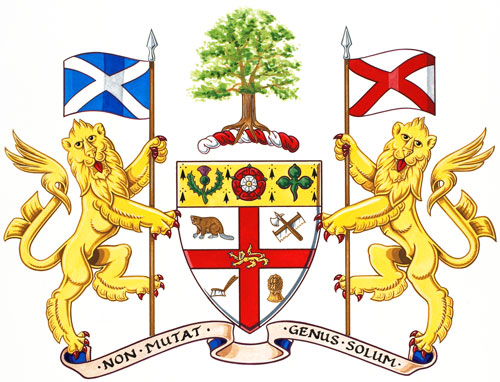
Fig. 1. The armorial bearings of the Canada Company as registered by the Canadian Heraldic Authority on August 15, 2012, vol. VI, p. 167. See the original registration: https://reg.gg.ca/heraldry/pub-reg/project.asp?lang=e&ProjectID=2243&ShowAll=1.
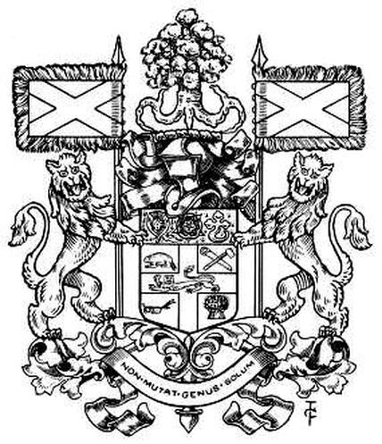
Fig. 2. Another correct depiction of the full achievement of arms of the Canada Company. The saw is a one-man crosscut saw, whereas the saw in figure 1 appears to be a bow saw of the period. Both are correct since the blazon only specifies a saw. From Arthur Charles Fox-Davies, The Book of Public Arms (London: T.C. & E.G. Jack, 1915), p. 147.
In the upper right quadrant of the cross in figure 3, the saw appears to be much the same as in figure 5, but the axe seems unsuited to chop wood. The blade is wide whereas the head where the handle comes through the eye is very narrow and the handle itself is lance-like as on a battle-axe, a combination which is not useful for a nineteenth century colonist in Ontario. Such a flimsy tool could not sustain energetic blows against hardwoods such as maple, oak, ash or hickory. One might remark that heraldic components are frequently stylized. While this is true, the purpose of stylization is to bring out the most salient or characteristic features of a person, animal or object. The process is akin to caricature where the artist captures the essence of a person or situation in a few strokes. Different types of axes can be associated with settlers according to their use for chopping, splitting, squaring or carving wood. All are robust instruments with a sturdy handle and blade. Any stylization should bring out these features, not diminish them. Anything that is technically wrong cannot be viewed as heraldically appropriate because such arrangements defy logic (see appendix II).
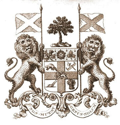
Fig. 3. The arms of the Canada Company as they appeared on documents of the company and on a A Map of the Province of Upper Canada and the Adjacent Territories in North America… by James G. Chewett, assistant draftsman under the direction of Thomas Ridout Esq., surveyor general of the Province; engraved by I. S. Cox, 1826; published by C. Smith & Son, London. The map collection of Library and Archives Canada includes at least one copy of Chewett’s map, NMC 126160. The dots on the lions and in the upper shield indicate the colour yellow or gold.
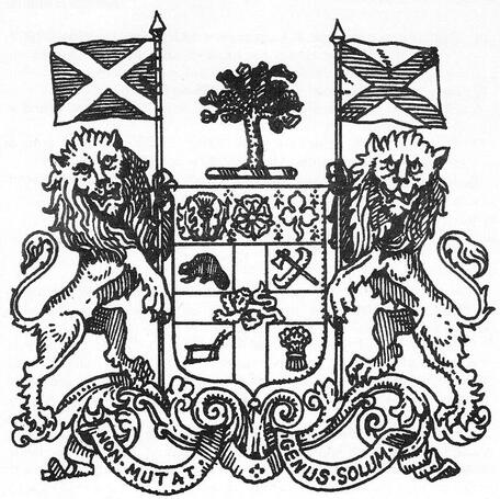
Fig. 4. The second quarter displays a canoe rather than a saw and what looks like a tomahawk rather than an axe, the handle being outside the head. Compare with fig. 5. From Heraldry in Canada/L’Héraldique au Canada, 12, no. 1 (March 1978), p. 20.
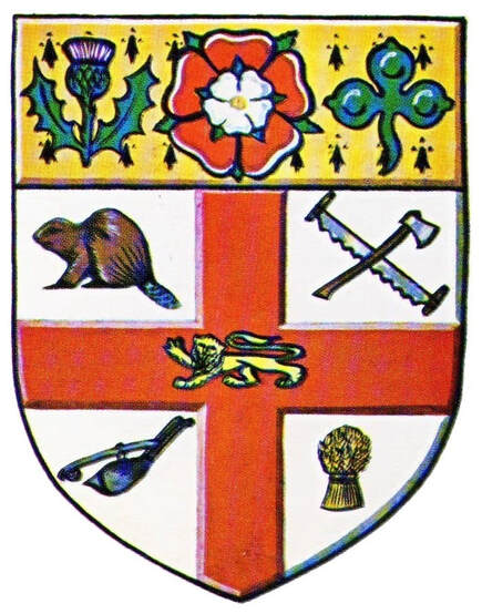
Fig. 5. The arms of the Canada company drawn according to the blazon. The saw is a two-man crosscut saw designed to fell large trees. All the instruments seem realistic for the 1825 period. The beaver looks more dignified than in figs. 1 to 4. Illustration from Beddoe’s Canadian Heraldry, p. 118.
On the trade card of the “Au Camélia” clothes and jewelry store (fig. 6), the shield of the Canada Company rests on its left side, the upper part is gone and everything is reversed as in a mirror (figs. 6, 6a, 6b). Evidently the artist drew the image as is on the lithographic stone without taking into account that it would be reversed during the printing process. The lion on the cross now faces to the right rather than to the left, the buck saw and axe are now in the first quarter rather than the second, and the beaver now appears in the second quarter. The garb (wheat sheaf), now occupies the third quarter rather than the fourth and the plough is seen in the last quarter rather than the third. The lion, axe and plough are all very poorly rendered and the beaver, although mostly covered by the leaf of what appears to be a tobacco plant, is shaped like a second wheat sheaf. It is only when the shield is placed upright and flipped that comparison with other depictions of the company arms becomes possible (compare fig. 6b with fig. 5). The card can be dated by the inscription on the banknote “Montreal, 1st June 1872.” The Mechanics Bank that issued the note existed in Montreal from 1865 to 1879.
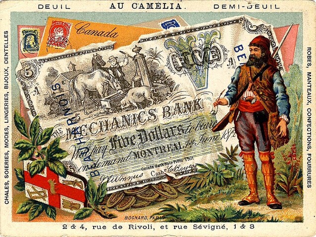
Fig. 6. Trade card of the “Au Camélia” store with a Canadian theme, chromolithographed c. 1872 by Jean Bognard of Paris. The shield of the Canada Company, partially represented on the lower left side, is resting on its side and reversed as in a mirror. Further details on “Au Camélia” and Bognard are found in appendix I.
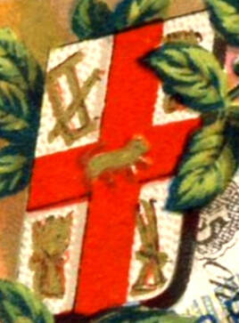
Fig. 6a. The shield taken from fig. 6, set upright. The upper part of the shield (chief) has been excluded by the artist. See fig. 5.
|
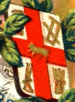
Fig. 6b. The shield as in fig. 6a with right and left reversed placing the components in their correct position. In the first quarter, the blob under the leaf should be a beaver. The lion looks like a dog. Compare with fig. 5 which shows the upper part of the shield.
|
The arms on the miniature jug (fig. 7) contain many deviations from the heraldic description given above. The chief (upper part) should be erminois, that is gold with black ermine spots, not just gold. What looks like a maple leaf replaces the trefoil (like a shamrock) at the right of the chief, and the rose in the centre becomes a wreath of laurel. In the first quarter, the beaver’s legs are much too long and its tail is uncharacteristically raised as if a new heraldic monster was intended. In the second quarter, we see a bow saw with a wooden handle and what looks like a squaring axe both of which are correct since the description only specifies saw and axe. The plough in the third quarter is not recognizable and the lion on the cross should be gold. The shield is topped by the royal crown, an unauthorized practice which was current at that time.
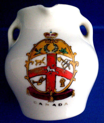
Fig. 7. The highly distorted arms of the Canada Company are presented as the arms of Canada on this miniature three-handled jug by Swan China, England, c. 1910.
In figures 8-10 as in figure 7, the field of the chief (upper part) should be erminois, that is gold with black ermine spots, not just gold and the shamrock on the right should in fact be a trefoil, a figure which resembles a clover leaf in a stylized form (see fig. 5). The trefoil should as well be upright, not with its leaves downwards. The rose being a Tudor rose should have a white rose centered on the red one (figs. 1 & 5). The rest of the rendering is correct though poorly drawn.
Millar and Lang (M & L) published a number of attractive postcards with Canadian themes and inscribed with the number 456 (figs. 8-9). Besides the three cards illustrated here, M & L produced at least another card inscribed “Hands Across the Sea” and displaying, on the left side, the arms of the Canada Company, the Union Jack, the Canadian Red Ensign and maple leaves and, on the right side, a man and woman holding hands while skating. The same series of cards was printed in Great Britain for The Pugh Manufacturing Company of Toronto, figure 10 being one example. M & L also published a number of postcards with the advertisements of other companies. The company name does not always appear on M & L cards, but they are identified on the address side by a stylized lion on a shield inscribed “NATIONAL” SERIES.” The absence of the usual identifying mark on the Pugh series may possibly be explained by the fact that they were printed specifically for Pugh Manufacturing Company of Toronto (see fig. 10). [3]
Millar and Lang (M & L) published a number of attractive postcards with Canadian themes and inscribed with the number 456 (figs. 8-9). Besides the three cards illustrated here, M & L produced at least another card inscribed “Hands Across the Sea” and displaying, on the left side, the arms of the Canada Company, the Union Jack, the Canadian Red Ensign and maple leaves and, on the right side, a man and woman holding hands while skating. The same series of cards was printed in Great Britain for The Pugh Manufacturing Company of Toronto, figure 10 being one example. M & L also published a number of postcards with the advertisements of other companies. The company name does not always appear on M & L cards, but they are identified on the address side by a stylized lion on a shield inscribed “NATIONAL” SERIES.” The absence of the usual identifying mark on the Pugh series may possibly be explained by the fact that they were printed specifically for Pugh Manufacturing Company of Toronto (see fig. 10). [3]
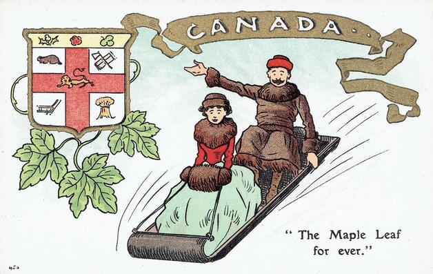
Fig. 8. As in figure 7, the arms of the Canada Company are presented as those of the country. Postcard by Millar & Lang Art Publishing Co. (M & L, Ltd.), Glasgow, Scotland and London, England (National Series). The company came into existence in 1903. Numbered 456 in lower left.
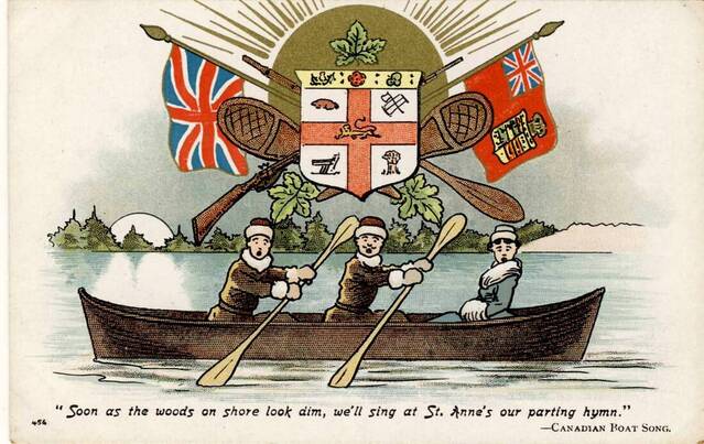
Fig. 9. Another postcard by Millar & Lang featuring the arms of the Canada Company. Their central position between the Union Jack and Canadian Red Ensign, which were both flown in Canada at the time, as well as the accompanying maple leaves imply that the shield displays the emblem of the country. The “Canadian Boat Song” was composed by the Irish poet Thomas Moore during a visit to Canada in 1804. This song must have been quite popular since it was adapted to French by F. R. Angers, poet, lawyer, Q.C., and published in Journal de l'Instruction Publique, vol. 4, no. 5, May 1860, p. 74. The seven-province shield on the Red Ensign (right) is a good indication that the postcard cannot be much later than 1905. Numbered 456 in lower left.
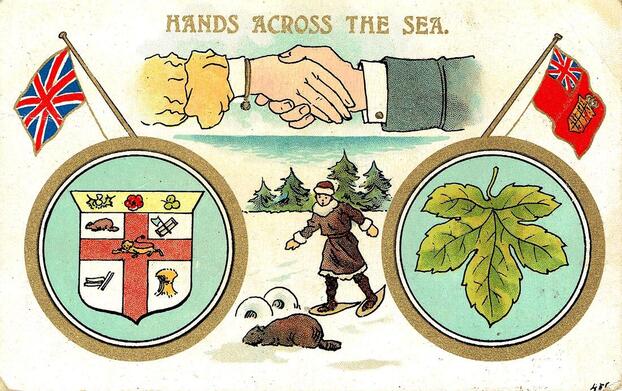
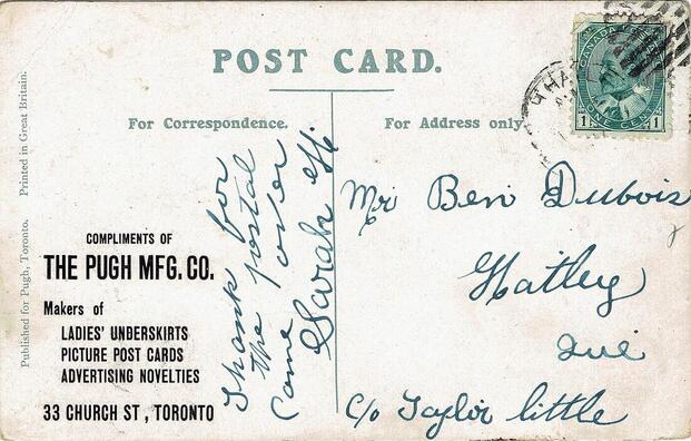
Fig. 10. The image is identical to that of a postcard published by Millar & Lang Art Publishing Co. A series of M & L cards, in the same style and with similar Canadian subject matter, all bear the number 456 on bottom left as do figures 8 and 9. Here the number 456 was added by hand on the right by someone who realized that the image on this card was the same as another card in the M & L series. The beaver and maple leaf were both popular Canadian symbols at the time, although the leaf was gaining grounds over the rodent. The stamp with the effigy of King Edward VII was issued in 1903 which dates the postcard series to that year, the same year M & L was founded, or a little later.
Remarks
The shield of the Canada Company contains many figures. An artist working from a sketch or small illustration without the heraldic description could misinterpret some of the components. It is evident that some souvenir creators made no effort to obtain exact information which resulted in very sloppy renditions (figs. 4, 6-10).
The arms of the company raise the question as to why they were presented as the arms of the country? In the case of the “Au Camélia” trade card printed in Paris c. 1872 (fig. 6), it is conceivable that the armorial bearings of the company were used to designate the country because the shield granted to the Dominion of Canada in 1868 was not yet that well known. However at the beginning of the twentieth century, it is curious that the shield of that company was made to represent the nation (figs. 7- 10) because a multi-province shield had served that purpose for several decades beginning in the 1870’s. [4]
On the other hand, the agglomeration of provincial arms on one shield had no official status and was often criticized as being unsuitable to identify Canada by government officials and heraldic scholars. In the first years of the twentieth century, Canadians were highly confused as to what emblems represented their country. Besides the multi-province devise, the royal arms of Great-Britain appeared within and outside buildings. The Union Jack and the Canadian Red Ensign flew in many places sometimes one alongside the other. Both the maple leaf and beaver were viewed as national emblems. Considering this muddled situation, the enlistment of the arms of the Canada Company to represent the country can be seen as one of the expedients in the quest for national symbols.
N.B. The postcards and trade card illustrated here belong to the Auguste and Paula Vachon collection of patriotic postcards. The ceramic item is now part of the Vachon Collection in the Canadian Museum of History. All the websites included were consulted on 8 April 2019.
Notes
[1] See http://www.heraldicscienceheraldique.com/les-anciennes-armoiries-de-montreacuteal.html.
[2] D.E. Kennedy, “Arms of the Canada Company” in Heraldry in Canada/L’Héraldique au Canada, 12, no. 1 (March 1978): 19.
[3] The Millar and Lang series and the Pugh series are partly illustrated and described in Michael J. Smith, The Canadian Postcard Checklist 1898-1928 (Mississauga: Michael J. Smith, 2001): 156 and 185.
[4] See Auguste Vachon, Variations in the Arms of Sovereignty Connected with Canada: Dominion Shields: http://heraldicscienceheraldique.com/dominion-shields.html.
[5] Beauharnois is now part of greater Montreal.
[6] Charles John Brydges was general manager of the Grand Trunk Railway from 1861 to 1874 and afterwards land commissioner of the Hudson’s Bay Company at Winnipeg.
[7] See: https://www.bankofcanadamuseum.ca/collection/artefact/view/1968.0020.00001.000/canada-mechanics-bank-montreal-5-dollars-june-1-1872.
[8] To get an idea of the many shapes, see the plate “Shield Shapes Through the Ages” in Ottfried Neubecker, Heraldry: Sources, Symbols and Meaning (New York, Montreal, Toronto: McGraw-Hill Book Co., 1976): 76-77.
[9] Compare http://reg.gg.ca/heraldry/pub-reg/project-pic.asp?lang=e&ProjectID=2887&ProjectElementID=10159 with https://open.library.ubc.ca/collections/bookplate/items/1.0215585#p0z0r0f.
[10] See: http://bibliodyssey.blogspot.com/2014_08_10_archive.html.
[11] See maple and oak in the arms of Francis Hugh Brennan:
http://reg.gg.ca/heraldry/pub-reg/project-pic.asp?lang=e&ProjectID=720&ProjectElementID=2549.
[12] Auguste Vachon, “Grimaces of the Canadian Flag” in Gonfanon, 22, no. 4 (Winter 2011): 6-9.
Back