Chapter V
DESIGNING ARMS
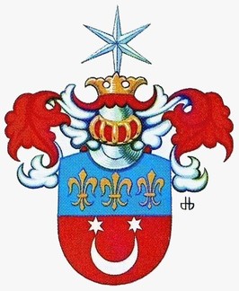
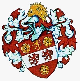
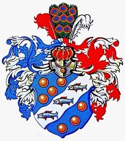
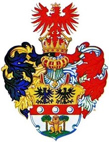
This is the first chapter in the trilogy art, science, symbol mentioned in the introduction. Heraldry is an art, but an applied art that is sometimes viewed as a craft requiring knowledge and apprenticeship. In principle, one could design a coat of arms with very general notions, working virtually out of the blue, but it would not likely follow the structure and composition of heraldry. The same applies to the world of painting. Highly acclaimed painters lacking any formal training are rare. This chapter delves into the philosophic motives for wanting a heraldic emblem and describes a route to arrive at good heraldic results. Since there exists a Canadian Heraldic Authority created by royal proclamation in 1988, it outlines the advantages of cooperating with the Canadian heralds to obtain a grant from the Canadian Crown represented by the Governor General of Canada.
One name that truly stands out in the domain of unschooled art is that of the French painter Henri Rousseau, styled Le Douanier because of his occupation as customs inspector. His highly detailed, strikingly coloured and imaginative art was admired by such prominent artists as Odilon Redon, Edgar Degas, Henri de Toulouse-Lautrec, and even Renoir and Picasso. Arnason said of him that he “belongs next to Picasso, Braque, Matisse and other painters who constituted the first generation of twentieth-century art.”[1] But Rousseau is unique in the annals of art. At another level of craftsmanship, a number of painters such as the American artist Grandma Moses were successful in a field often termed: folk or people’s art or naïve art. Her works are charming and cause one to regress into a world that is simple and devoid of the problems and cares of adult life. The highly decorative scenes of daily rural or urban life in Quebec by the barber-painter Arthur Villeneuve have a similar regressive effect. The question then arises as to whether individuals could create good heraldic designs without a serious study of the art and science of heraldry.
1. Less Is More
“Less is more” has been an enduring dictate of heraldic design. One means of achieving this is to look at heraldry through children’s eyes, in a sense, “becoming as little children.” Heraldic experts discovered that, with a minimum of coaching, children were able to create basically sound heraldry, in fact generally better than amateur adults who attempt the same exercise. It suffices to explain to children that knights painted heraldic symbols on their shields for quick recognition as ally or foe; that they worked with two metals, gold representing yellow, silver white; and four main colours, red, blue, green, and black; that they created contrast by placing a colour on a metal and a metal on a colour; that it is better to represent animals, vegetation, and geographic phenomena in heraldic tinctures rather than natural colours since the objective is contrast and instant recognition at some distance. Children easily grasp the idea that symbolically a forest is best represented by one tree, or even a leaf, a train by a locomotive wheel, a ship by its steering wheel, and so on. These principles can be further illustrated by showing a few good examples and emphasizing again simplicity and the need to place a colour on a metal and a metal on a colour. Then if the children are provided with an empty shield on a sheet of paper and instructed not to repeat the examples shown but to come up with something that they like, a number of results will inevitably be good heraldry.
In 2001 Dr. Kevin Greaves, President of The Heraldry Society of Canada, was called upon to give a two-hour lecture to fourth graders in a primary school where children had already completed a heraldry project as part of the curriculum. Here is what he wrote about their creative efforts: “I expected to be making enthusiastic noises about rather pathetic efforts, (after all these were only nine-years-olds) but was absolutely blown away by what they had produced. A good 80% of the arms were heraldically correct and many of them displayed a degree of talent and imagination that would have put many adult heraldists to shame. These kids were good.” [2]
In April 2009 Dr. Claire Boudreau, Chief Herald of Canada, conducted a similar workshop with grade seven and eight students at the Michaëlle Jean French Elementary School in Ottawa. Again the results were on the whole very good heraldry. The students presented their drawings to Her Excellency the Right Honourable Michaëlle Jean, at Rideau Hall on May 4th during the twentieth anniversary celebrations of the Canadian Heraldic Authority.
Students of the Michaëlle Jean French Elementary School presenting their creations to the Governor General on 4 May 2009. Photography: Jean-François Néron, Rideau Hall, Reference : GG2009-0184-036
A child has many advantages over an adult in the realm of heraldry. A child can feel happy with a red heart, an apple, a sword, a star or a sun. Others may choose an animal such as a dog, a horse, a rooster, a shark or a butterfly, or perhaps something from the plant kingdom such as a tulip, a daisy or a fir tree. Children are not much worried about natural colours. A blue horse on a yellow background does not bother them, and they will likely view these unusual colours as amusing. Also, children are not worried about drawing everything as they exist in nature, nor in a completely precise way. The child will want a horse to look like a horse but will not be concerned about exact proportions. In a sense, children create their own form of stylization, another essential aspect of heraldry that artists achieve by emphasizing the salient points in animals, plants, and various objects. Of course children’s heraldic art can be further improved by an experienced artist who will adjust the proportions and the hue of the colours. This does not take away from the fact that children’s designs can be simple and imaginative, and respect the basic rules of heraldry.
For the adult, a nice red apple on a white background is viewed as juvenile. It does not seem acceptable. Most adults have a family to think about. All are conscious of having ancestors and may be concerned about the future of their own children. Adults have a career, property, and achievements. An adult’s first reaction is usually to express this by dividing the surface of the shield into various compartments to fit this all in a neatly arranged package. Moreover, the adult usually wants things to be drawn as they look in nature and with natural colours. A blue cow on a yellow field is disquieting for the adult mind. Children, on the other hand, have rampant imaginations and have not lost their sense of wonder, of adventure, and of marvel at what is unusual in their universe.
Adults tend to shy away from ideas that are too imaginative or appear a little bizarre. The traditional mermaid with exposed breasts and looking into a mirror might provoke a few snickers among neighbours and friends and, as a result, could be rejected as being somewhat embarrassing on one’s shield. A lion or cat rampant, that is one standing on hind feet with front feet waving in the air, with claws extended, looking lean and mean, taking a defensive stance, and seemingly ready to attack the onlooker if needs be, may not seem quite politically correct in this modern age, and yet this is in the purest heraldic tradition.
One of the major challenges of heraldic art is reconciling the openness and simplicity of the child with all the complexities and conditioned reflexes of the adult, or adults in the case of a corporate body. A Henri Rousseau or Grandma Moses of heraldry, that is one who would draw simple effective heraldry in a spontaneous way, is more likely to be found among children than adults. There may be cases where untrained designers approach heraldry without bringing into play a plethora of objects, a naturalist approach, and compartmentalizing the shield to fit everything in, but they are indeed rare. And it is adults, not children, who request coats of arms. On the battlefield, the one primary role of heraldry was to create a shield distinct enough that a knight was not confused with another knight, and this could be achieved with a few elements and colours. Although some early rolls of arms from the Middle Ages exude an aura of primitive, delightful naivety, a closer examination reveals that the artists possessed a keen sense of effective heraldic style.
Anyone who has mastered the rudiments of heraldry and is willing to respect them should be able to design good heraldry in the abstract, but this can become more difficult when designing arms for a person or a group of persons wanting to see many notions appear on the shield. Nevertheless, if clients are made to grasp the need for simplicity, they can have a significant role in arriving at simple, imaginative, and attractive heraldry. Persons who take time to study heraldry can often produce designs that are acceptable to a granting authority with little or no changes. Before the establishment of the Canadian Heraldic Authority, Alan B. Beddoe created many Canadian arms that were granted without change by the Kings of Arms of England. This also happens when members of the Royal Heraldry Society of Canada or other persons more or less knowledgeable in heraldry submit a design to the Canadian Heraldic Authority.
2. The Exigencies of the Art
It would seem natural for a municipality or another form of corporate body to approach the Canadian Heraldic Authority to obtain officially granted arms. But going to this official body may appear to some as a complicated process where heralds find all sorts of reasons not to give clients what they want. The idea that things can be done with local talent can also be compelling. If a local artist treats a request to design a corporate coat of arms like a shopping list of things requested by the client, the results are bound to be a cluttered and needlessly-divided shield with allusions to local resources, industry, and services. This type of composition is too diffuse to be striking and does not create the sense of awe and mystery required for any symbol to work properly. If on the other hand, the artist views a heraldic project as a challenge and is willing to learn, take time to study, and to convince the client of the virtues of simple heraldry, the results are likely to be much better, and the presentation to the council or the board of directors should prove convincing. Unfortunately in such a case, the artist may have difficulty getting full retribution for all the time spent, and the arms, even if adopted by the municipality or board of directors, will not have an official status.
On a personal basis, there may be good reasons for an individual to design his own coat of arms. One obvious motive may be that the person is unwilling to expend money for an official grant. Another individual may want to learn about heraldry and view designing one’s own arms as an interesting challenge. If someone is truly interested in the field, putting in the required hours of study to achieve good results should prove most stimulating and rewarding. With study and application, one could achieve an imaginative and bold design, provided there is willingness to try many combinations before deciding on a final one. In such a case, I would advise anyone creating arms to strive for a design that could eventually be granted by the Canadian Heraldic Authority.
If you intend to obtain a proper grant but simply want to create the design, there is no guarantee that the Chief Herald of Canada will accept the arms exactly in the way they were designed. The best approach in such a case would seem to first petition for a grant. Petitions to the Canadian Heraldic Authority are processed in the order received. Following the initial acknowledgement, a herald will be assigned to your file. The petitioner, if not already knowledgeable in heraldry, could begin by studying good heraldic examples and conceiving a design that can serve as a starting point for discussion with the designated herald. A petitioner should not approach the Canadian Heraldic Authority with the attitude that his/her creation is final. Even heralds with many years of experience still seek the advice of colleagues. There are parallels in other fields of endeavour. Think of the many years of rigorous training even the most talented of opera singers or musicians undergo before appearing on stage! A writer submitting a first manuscript for publication is likely to get it back with a surprising amount of corrections. Heraldry is a communication tool, not something to be filed in a drawer. Knowing the notions that one wants to convey and being able to communicate these in a clear, effective manner are two different matters.
A herald designing arms often finds that the wishes of the petitioner are at odds with the rules of good heraldry and, therefore, works hard to convince the eventual recipient to accept modifications that may at least constitute a viable compromise. One advantage of designing arms by oneself is that one can be self-critical without the intervention of a third party. But the moment the designer senses that a first approach is not satisfactory, he/she should be willing to try something else and to attempt an entirely new approach if that is what is required. Though a beginner should strive for originality, he can rarely with impunity stray away from basic rules of heraldry that have evolved over hundreds of years.
Before going forward, one should ask: Why do I want a coat of arms? For corporations including municipalities, this question can lead to considerable discussion and soul-searching. For one individual, the motive may be a genuine love of the art and a desire to create and display beautiful and meaningful heraldry. For another it may be a strong desire to give the family a sense of tradition, an anchor in life’s pilgrimage that rushes everyone from cradle to grave. For every human, there is a desire not to sink irreparably into oblivion after death, whether one believes in an afterlife or not. If you should view this as human vanity, read Victor Hugo’s Oceano nox, which describes poignantly how the memory of those that have died tragically at sea fades away like a fugitive dream in the minds of those living closest to them in life.
Thomas Gray’s Elegy Written in Country Church-yard views death as a waste of unfulfilled talent, and also as the great leveller that carries with it everything, even “the boast of heraldry.” This last statement is not quite true, since heraldry lives on within the family and can help others remember ancestors and what they stood for. The desire of the rich to escape oblivion often motivates donations to various institutions, which is only human. The Latin poet Horace was not ashamed to boast “I have built a monument more lasting than bronze and not all of me shall die.” Knowing the reason why one wants a coat of arms is largely an introspective process, a “Know thyself!” exercise.
A second question that should be asked from the start is “How will this coat of arms be used?” This is most important for a corporate body. If heraldic identity extends to all the corporate activities and property such as stationery, vehicles and the display of the emblems as large sculptures, achieving this will require both colour and line art of the entire arms or some of its components. On an individual basis, the answer may be less complex. Depending on individual temperament, one may wish to display arms in the form of a banner on a flagpole or in a sculptural format on the gates or above the door of one’s house. For the less ostentatious, there are more discreet ways of displaying heraldry. This may simply take the form of bookplates, perhaps a ring or a few pieces of heraldic ceramics that serve as an armorial memento. Knowing what use will be made of heraldic emblems will help determine the type and variety of heraldic art required.
We have already stressed the importance of learning the rudiments of the trade before attempting a design, but it would also seem a good idea for those who want to discuss their arms with a herald in the case of a grant. One of the best works for the beginner is Simple Heraldry Cheerfully Illustrated by Iain Moncreiffe and Don Pottinger. [3] Its colourful illustrations and humorous presentation can be gone through in about an hour, but it could also be kept as a reference work as it virtually contains all the basics of heraldry. A Canadian version of Simple Heraldry is Kevin Greave’s A Canadian Heraldic Primer which contains the fundamentals of the field combined with humour and Canadian illustrations. [4] I also recommend A Complete Book of Heraldry by Stephen Slater. [5] This beautifully illustrated work will transport you into a broader historical and international context and provide information on the role of heralds and heraldic jurisdictions.
Then one could go to works dealing with heraldic design. There is a great deal of material on the matter, but the beginner might start with Heather Child’s Heraldic design. [6] It contains no colour but has a straightforward practical approach suitable for the beginner. Then one could move on to The Art of Heraldry by Peter Gwynn-Jones. [7] One should not fail to read Heraldry: Customs, Rules and Styles and The Art of Heraldry by Carl-Alexander von Volborth. [8] These works are international in scope and show how heraldry has developed in parallel with other forms of art, with inevitable variances within different countries. The latter work contains an impressive and inspiring selection of designs representing various periods, countries, and artists. Studying examples found in medieval armorials is also important because the art had a practical application at the time, and its stylistic approaches could inspire the modern artist (Many are available on Gallica: http://lalanguedublason.blogspot.ca/2012/12/nouveaux-armoriaux-en-ligne-sur-gallica.html). The heraldry included in the online Public Registers of Arms, Flags and Badges of Canada is a great source for the student, because it gives access to colour illustrations in many different styles and offers an opportunity for critical analyses. Even among granted arms, it is inevitable that some are better composed than others. The student should seek out the best specimens of the art (see Annex I). Although many modern means of creating imagery exist, the authorities that grant arms still employ the human hand which is a tradition and still the only means of creating the hue of colours and right proportions of good heraldry.
A beginner should also read The Heraldic Imagination by Rodney Dennys since it presents heraldry as creative and imaginative. [9] A lot of reading you might say! Not necessarily so! All of these books contain a large number of illustrations and do not require much time to read. Moreover, some parts relating to the origins of heraldry, the components of arms, and various charges tend to be repetitive. As one progresses these can be skimmed through to look for new information or a new angle.
At this point, you may be inclined to drop this book and move to the interesting and beautifully illustrated works just mentioned, but I recommend that you read on because these works will not necessarily tell you how to choose symbols that are appropriate and meaningful for your own design. In chapter III, we have seen many of the characteristics of an unschooled and spontaneous approach, what has already been termed naive, popular heraldry or folk heraldry. Let us now look at some of the long-standing qualities attributed to heraldry. There is no absolute recipe for a good design, but there are fundamentals that should not be ignored. A writer cannot create a literary masterpiece without an extensive vocabulary, knowledge of grammar and sentence structure, creative talent, imagination and a great deal of practice. It is much the same with heraldry.
Simplicity - Simple, uncluttered, not too busy, and easily recognizable in smaller format such as letterhead or on a ring are constantly recurring admonitions from experienced heraldists. Ten messages do not come across as well as a few well presented and forcefully argued ones. This is particularly true of visual messages that should be recognized at a glance as had to be individual shields on a swirling battlefield. Cluttered arms do not look neat; they do not look dignified. Simplicity is achieved by limiting content and the number of colours, for example a dominant colour (blue, red, black, green, purple) and a metal (gold and silver), and a few other tinctures for details. To achieve simplicity it is quite acceptable to draw a list of desired items, put them in order of priority and remove those at the bottom.
Contrast - The main device for achieving contrast in heraldry is to put a colour on a metal and a metal on a colour. The same principle is used in commercial art. Another means of achieving contrast is to draw the shield in a flat style and to give the crest a tridimensional appearance, as was the case when worn by knights. The same tridimensional treatment can apply to supporters and the compartment on which they stand.
Stylization - This is meant to bring out the essential features or salient points of an animal or plant etc., by exaggeration. The prime example of stylization is the heraldic lion that does not look like the real one and yet is quickly recognized as a lion, though depicted with different proportions from one artist to another. Stylisation requires talent. It would seem easy, for instance, to stylize a beaver with a big flat tail and protruding teeth, a moose with big horns and long skinny legs, and a bison with its beard, triangular head and hump, but bringing out the essential features of these animals and still giving them a dignified and imposing look takes considerable patience and skill. Cartoonists are good at doing this for purposes of humour, and no doubt some of the techniques of their art would be useful in heraldry, but heraldic animals, although they may look rather ferocious and ready to attack, should remain dignified, not humorous. Trees are often drawn with a limited number of exaggerated leaves and enlarged fruits or seeds, such as a maple with its typical leaves and winged keys or the oak with its no less typical leaves and acorns, all enlarged for instant recognition. See: http://reg.gg.ca/heraldry/pub-reg/project-pic.asp?lang=e&ProjectID=40&ProjectElementID=115 and http://reg.gg.ca/heraldry/pub-reg/project-pic.asp?lang=e&ProjectID=2326&ProjectElementID=8233. There are many different and fascinating approaches to heraldic style, and the best way to gain awareness of this is to study well-illustrated works, then to experiment in search of one’s own creative formulas.
Symmetry - Heraldry often repeats charges for purposes of symmetry. This can be viewed as a waste of space by the uninitiated. If there are two maple leaves at the top of the shield, the recipient of the arms might want to put something like a beaver or a moose in lieu of the second leaf, but this is obviously grossly asymmetric. It is much better to insert a moose between two maple leaves, not that I particularly recommend this combination. This example may seem obvious, yet symmetry is sometimes forgotten. A kangaroo coupled with an emu as the supporters of the arms of Australia offer a striking example of asymmetry. On the other hand, similar shapes can often be made to work together. A bison’s head placed beside a bull’s head will work if properly proportioned and given the same colour. In fact, if well treated, the use of similar rather than identical things can create an interesting harmony and rhythm that cannot be achieved by simple repetition, but this requires experience and skill. See: http://reg.gg.ca/heraldry/pub-reg/project-pic.asp?lang=e&ProjectID=699&ProjectElementID=2485; http://reg.gg.ca/heraldry/pub-reg/project-pic.asp?lang=e&ProjectID=2472&ProjectElementID=8765 and http://reg.gg.ca/heraldry/pub-reg/project-pic.asp?lang=e&ProjectID=1530&ProjectElementID=5127.
Proportions - These have to be carefully studied and adjusted to arrive at a pleasing result. Moreover some geometric figures, a cross for instance, should neither be too narrow nor too wide, though between the two extremes there is considerable latitude. If a quartered shield contained three fleurs-de-lis in both the 1st quarter (upper left) and the 4th quarter (lower right), the size of the three fleurs-de-lis would have to be adjusted to fit the reduced space in the 4th quarter, but this can be done harmoniously by a good artist. Sometimes a highly experienced artist will draw some parts of a coat of arms, the crest for instance, in a much larger size than normal for special effect.
Arrangement - The positioning of figures on a shield alters the general appearance. Some arrangements look better than others. Although the desire to give the most important symbol the prominent position may come into play, arrangement should still be looked at closely. When all the elements are in place, one has to make sure that everything goes well together.
Unity - The overall effect must be one of unity of style and harmony. One can create a coat of arms using a cut and paste method, but there will be no unity of style.
Beauty - Beauty is an abstract notion, and it is often said that it lies in the eye of the beholder. Yet it is one of the most important aspects of heraldry, all the more so that heraldic emblems are meant to be displayed for all to see. One could in fact follow all the traditional rules of heraldry and create something that is offensive to the eye. The only way to get a feel for good heraldry is to study the fine examples provided by so many well-illustrated sources. The right combination of colours and symbols can require considerable experimentation. There is no quick and easy approach though for the inquisitive and creative person this presents interesting challenges.
When describing beauty, the author Ralph Waldo Emerson came up with a definition that could be a model for all heraldic designers. “We ascribe beauty to that which is simple; which has no superfluous parts; which exactly answers its end; which stands related to all things; which is the means of many extremes.” Similarly, good heraldry is highly focussed, reaches beyond its physical appearance to a universal plane by its symbolism, and seeks a harmonious balance between extremes. Emerson’s entire essay Beauty is worth reading with respect to heraldry as it expresses so many of its essential principles, for instance: “The line of beauty is the result of perfect economy.” and “In rhetoric, this art of omission is a chief secret of power, and, in general, it is proof of high culture, to say the greatest matters in the simplest way.” This is good advice for both the heraldist and the politician. Emerson also makes very interesting observations about symmetry and imagination that are applicable to heraldry. [10]
Blazonment - While even good heraldry is sometimes difficult to blazon (describe in heraldic terms), a heraldic emblem that cannot be blazoned usually contains a flaw in design pointing to the necessity of going back to the drawing board. Heraldic language encompasses a long and wise tradition arrived at by years of trial and error. Its basic principles are not easily ignored, particularly for the beginner. To test the “blazonability” of a particular design, the student needs to learn how to blazon (see Appendix I). If the design is deemed to be good on closer examination, it is usually possible to come up with a viable blazon though it may require considerable thought and several attempts. The language of heraldry is a powerful tool to describe imagery.
3. A Three-Faced Approach
In 1972, on the sixtieth anniversary of the National Archives of Canada, the internationally renowned Canadian medallist, Dora de Pédery-Hunt, produced a medal bearing a three-faced Janus. As we know, Janus is normally a two-faced ancient Roman god looking both towards the past and the future. The three-faced one looks to the past, present, and future. This formula, which characterized archival institutions, seems also to apply well to heraldry, whether it is for a person or a corporate body. Such an approach may prove particularly useful for anyone who is not sure where to begin.
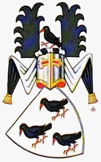
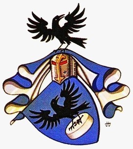
The past - Everyone has a past and can uncover something heraldically suitable from times gone by. It may be an element taken from the arms of the city, geographical area or country where the ancestor originated. It may be a momentous event such as a migration to the West as part of a caravan that could be represented by a wagon wheel or crossing the ocean by a ship’s wheel. Perhaps the family has exercised a trade or profession for several generations and a tool of the trade or a symbol of the profession would prove suitable. A family of wine makers, for instance, could choose blue roundels called hurts to represent grapes and have a shield strewn with such roundels termed in heraldry “semy of hurts.” The motto may derive from a saying that has persisted for generations within the family or even an inscription found on a tombstone. Many cases refer to family by punning on the name (canting arms). John Ruch, a late member of the Royal Heraldry Society of Canada, chose a rook (crow family) to represent his name: http://reg.gg.ca/heraldry/pub-reg/project-pic.asp?lang=e&ProjectID=1425&ProjectElementID=4764.
The present - A well-known person in Canadian heraldry once expressed to me his strong feeling that heraldry should be about ancestry, not about oneself. I hold a more comprehensive view. Everyone is a link between the past and the future. We are in fact made up of the genes of our ancestors and our descendants will carry our own genes. As this important link, we have a privileged opportunity to say who we are and what we believe in. Possibly none of your ancestors had a chance to do this or even thought of doing it. Yet it is important! Any genealogist would love to know what his/her forefathers stood for, what their strengths and beliefs were.
Heraldry offers the chance to express one’s most important achievements and beliefs, and what is judged most important in one’s life. Descendants will be grateful to have this insight and presumably be inspired by it. For an introspective person, this could mean reaching deep into one’s inner-self. It may go so far as to ask: “If I lost all my worldly possessions, what would continue to matter in my life; what qualities or spiritual values would give me the strength to go on?” Paul Cézanne remarked: “… one doesn’t paint souls. One paints bodies …” [11] And yet depicting one’s soul is a major objective of heraldry. The person blessed with dozens of outstanding qualities still needs to choose a few among these to respect the need for simplicity and focussed messages that are essential to good heraldry.
The future - All persons have a future, and this is often centred on one’s children. Therefore, one could choose as a motto a message of hope or courage to leave to posterity, or possibly something to strive for. A corporate body usually has specific hopes for the future and should have no trouble in expressing this.
4. Choosing One’s Path
I have often stated that heraldry is not the domain of recipes. What I have said above could serve as useful guidelines but may not correspond to everyone’s inclinations. A religious person may wish arms focussing exclusively on faith. A person whose life revolves around art and beauty may wish to create a coat of arms that is sheer beauty and will stun everyone by its originality and striking appeal. There is nothing wrong with the beauty approach that is given expression by the poet John Keats:
“Beauty is truth, truth beauty” - that is all
Ye know on earth and all ye need to know.”
Humour can often be made to serve heraldry. Coats of arms are marks of identity, and humour helps recall the components and symbolism on a shield. Stephen Slater’s The Complete Book of Heraldry contains a number of examples of humorous arms. One shield posthumously granted to a judge is made up of three black vertical bands on a white field representing the bars of a jail. From both sides of the shield, over the bars, emerge three raised female legs in black laced stockings wearing a red garter and red shoes. This alludes to the fact that the judge often presided over cases involving prostitutes. What should be retained here is that the judge did choose these arms for himself. Another of Slater’s illustrations shows a white field with four blue jawbones referring to the Queixada family whose name in Portuguese means mandible or lower jaw. [12] The name of the famous Italian composer Ruggiero Leoncavallo would give a designer a great deal to work with as it suggests the notion of roaring (ruggire), lion (leone), and horse (cavallo).
Most persons prefer a milder and more subtle form of humour. The cow (vache) is traditionally associated with the name Vachon, but I did not like this sort of direct allusion in my arms. I was looking for something more elusive and, therefore, opted for a bull in the crest above the arms. Here the humour that takes the shape of an indirect pun is not immediately apparent. In fact, it pokes fun at the spectator who wonders why I chose a bull rather than the traditional cow. One of my grandmothers was Irish, and there may be a bit of leprechaun in my veins, but the joke is on myself as well because some will inevitably think that I missed a golden opportunity to have a direct pun on my name by unequivocally inserting a cow or that I was too dull of apprehension to see this obvious connection. Of course if someone is uncomfortable with poking fun at oneself, there is no obligation to do so.
Indirect allusions are found in other arms. Sir Henry Pellatt, better known for his lavish home of Casa Loma, was active in the development of the Toronto Electric Light Company. His arms are two horizontal black bars representing wires, the upper one charged with a gold roundel called a bezant representing energy travelling along the line. A black roundel would have been called a pellet and would have provided a direct pun on his name. In fact, by reworking the colour arrangement of the shield a pellet could have been included, but in the actual design there is no pellet. Yet the idea that this pun must be there became so engrained in the minds of heraldry amateurs, that when I published a small article on the matter, I received a letter telling me that my interpretation was incomplete as to the meaning of the roundel. [13] Perhaps the designer of the arms, or Pellatt himself, had some mischief in mind in omitting this obvious pun. A similar indirect allusion is found in the motto of Earl Grey, 9th Governor General of Canada, better known for the Grey Cup. It reads “De bon vouloir servir le roy” and yet, when one tries to remember the motto, “De bon gré servir le roy” almost automatically comes to mind because this would be the usual expression. Again there is a hidden pun which possibly was intentional.
Besides mischief there is a profound reason to want to include meaning beyond the obvious. Symbols work best when they retain an aura of mystery; when they are not fully grasped; when they hide as much as they reveal. I have heard this notion expressed by persons in many walks of life: a clergymen, an Amerindian chief, a writer, and of course, several specialists in symbolism.
Another strong ally of heraldry is imagination. A French poem by Robert Desnos, set to music by Joseph Kosma and sung by Juliette Greco, describes an eighteen-metre ant wearing a hat, then another ant pulling a cart full of penguins and ducks, and finally an ant that speaks French, Latin, and Javanese. The statement “It does not exist” follows each description, but the last sentence asks “Well! Why not?” Why not indeed since all these scenes can exist in one’s imagination and can be depicted. Heraldry is generally not so extreme but often contains elements that do not correspond to reality like animals that are usually of a colour other than their natural colours. Green, blue or white elephants are all technically acceptable. Purple ones are also okay, though purple is rare in heraldry. Heraldry also exhibits the strangest combinations such as a fish with antlers, centaurs where the horse portion becomes that of a lion, birds or serpents with a human face. [14] Again I return to Emerson’s essay Beauty (quoted above in the section “Beauty”): “The feat of the imagination is in showing the convertibility of every thing into every other thing.” To illustrate this in a simple way, a black roundel (pellet) can symbolize heraldically the career of a hokey player or the entire sport. Likewise a white roundel (plate) can represent baseball.
Simple imaginative combinations can also give rise to striking effective imagery. The shield granted to Sir Paul McCartney appears to replicate in heraldic format the surface of the sound box of a guitar. The arms of the municipality of Simo in Lapland (Findland) create a striking image using four salmon tails arranged as the arms of a cross: https://commons.wikimedia.org/wiki/Category:Coats_of_arms_of_municipalities_of_Lapland,_Finland. The arms of the commune of Ski in Norway consist of three horse heads conjoined at the neck in a wheel-like pattern http://www.civicheraldry.com/region/norway. These imaginative combinations are simple, striking, effective, and usually beautiful. Achieving good results does not mean coming up with the most outlandish design the imagination can produce. Imagination needs to be balanced by more orderly critical faculties and by aesthetics. Though highly complex and imaginative, the unicorn remains elegant and engaging. On the other hand, combining the body of a camel with the head of a walrus with large tusks, the legs of an elephant and the long bushy tail of a lemur would create a grotesque apocalyptic monster, perhaps humorous, but not dignified. One should always keep in mind the qualities of simplicity, harmony and beauty that are required for good heraldry.
Nota Bene
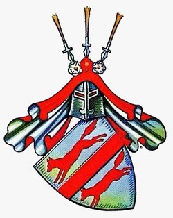
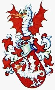
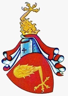
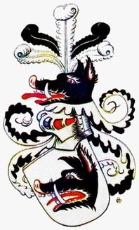
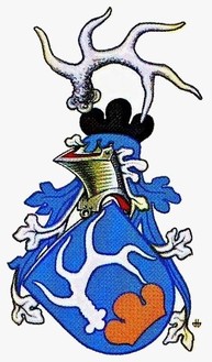
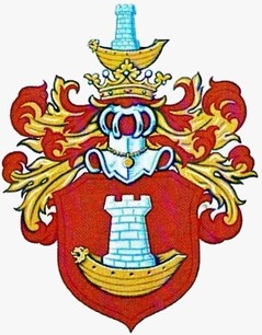
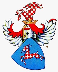
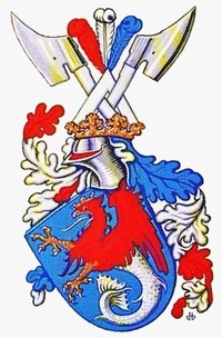
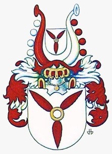
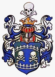
I have chosen the drawings of Hans D. Birk for the illustrations that follow because they are well done, varied, and held by a public institution. The Public Register of Arms, Flags and Badges of Canada contains many examples of good heraldry. Some arms are more complex because the recipient wanted to include more notions in them. Others have supporters to which some Canadians are entitled based on achievement. A sampling of grants is listed in Annex I with links to the register.
Some divisions or variations of the field. Library and Archives Canada, Hans D. Birk, nos. 199, 432, 264, 308, 526, 221.
Geometric figures. Library and Archives Canada, Hans D. Birk, nos. 4, 22, 276, 332, 14, 256.
One single item (charge). Library and Archives Canada, Hans D. Birk, nos. 78, 192, 324, 167, 287, 394.
More complex compositions. Library and Archives Canada, Hans D. Birk, nos. 408, 62, 502, 418, 95, 119.
Animals, animal parts, monsters. Library and Archives Canada, Hans D. Birk, nos. 59, 399, 449, 164, 391, 353.
Imaginative combinations. Library and Archives Canada, Hans D. Birk, nos. 97, 381, 234, 490, 509, 517.
5. Depicting Your Arms
If you are an artist or have artistic talent, you can paint your arms yourself, but you have to go about this in the proper way. A recognized artist in one field does not automatically become a good heraldic artist. It is a discipline of its own. No doubt arms can be computer generated or assembled by cut and paste, but the same requirements of sound heraldry as previously described still apply. With automated approaches, the brilliance of colours, the unity of style, and the harmony of proportions could present a serious problem. Proficiency in the field is achieved by studying good examples in illustrated works and by reading books on heraldic art as are found in the bibliography accompanying this guide. Even a well conceived coat of arms can be made to look shabby when badly drawn. Only when the artist has developed a feel for the art and mastered the suitable colour mix can he hope to create effective renderings. Even then there will be a period of experimentation, of trial and error. One cannot expect on first attempt to create a masterpiece that will live forever in the annals of heraldry.
In the 1921 version of Canada’s arms drawn by Alexander Scott Carter, the shield is traditional heraldry while the lion and unicorn supporters are rendered with an art nouveau flavour mostly in the manes, tails, and tufts of hair. In the 1960s, Alfred Joseph Casson designed a new version of these arms combining traditional style with both art nouveau and art deco treatment in the supporters. Both Carter and Casson successfully adapted to heraldry elements of style inspired by art movements of slightly earlier periods (see illustrations 24 and 28 chapter VI). In fact Art Nouveau and Art Deco are two styles that meld well with heraldic art and can add a refreshing touch to more traditional renderings. Carl-Alexander von Volborth has looked at how certain styles in architecture and art have influenced heraldry up to the end of the nineteenth century. [15] It is certain that Art Nouveau, Art Deco, graphic design, and commercial art have influenced heraldic style. This would seem a good area of investigation for an art history student.
A large part of the costs of obtaining an official grant is the artwork. If you are not artistically inclined, it would seem wise to consider a proper grant before disbursing money for an artist to draw and paint arms that will remain without official status. Even if you have a depiction of arms already done, should you decide to petition for a grant, the Chief Herald of Canada will require new art to accompany the letters patent and may have to make small changes to your design or major ones if the design has flaws.
6. It Can Be Done with Discipline
Designing your own arms can be done. I have seen some members of the Heraldry Society achieve good results, though they pursued heraldry mostly as a hobby. In all these cases, however, they submitted their design to the Canadian Heraldic Authority to iron out any remaining wrinkles before proceeding with a grant. Should you choose to work independently, you will need to exercise great discipline, take the time required to study and to work out a proper design. Above all, one should be honest with oneself and be humble enough to respect some of the basic principles that have applied to heraldry for hundreds of years. If someone chooses to ignore some of the fundamental rules, the results are bound to be less than satisfactory. A little knowledge can be dangerous, and it is ironic that frequently those who make the least effort think they have produced the nec plus ultra of heraldry.
A way of minimizing the risk of going astray might be to join the Heraldry Society of Canada and get input from knowledgeable members, which today is best done by email. But you have to be able to consider the observations or criticism that may result. If it is a matter of time before you petition for a grant and wish to work on a design in the meantime, you should really approach a herald of the Canadian Heraldic Authority to explain your situation and show what you are doing. Although heralds are very busy, one of them will surely take time to offer general guidelines. If one has made every effort to create good heraldry, there is a greater chance that the Chief Herald of Canada will be able to grant the arms as designed, but this is not automatic. There is also the possibility that the Canadian Heraldic Authority will not grant your arms exactly as designed. Perhaps it replicates too closely arms already granted; perhaps the Chief Herald of Canada or one of the artist-heralds will detect flaws that you have missed. A grant only becomes official when it bears the signature of the Chief Herald of Canada and the seal of the Canadian Heraldic Authority. If you have already applied for an official grant, a herald will work with you to finalize your design. If you do not intend to make your arms official, you will surely do your best to achieve good heraldry otherwise you would not be reading this book.
7. Documenting Your Arms
Of course no one can force you to have your arms officially granted. Perhaps you are completely satisfied with your creation and even cringe at the idea that some intrusive expert might tamper with your design because of a few little details. But in such a case, you should really take time to document your arms by indicating that you are the author and have consciously chosen not to have them registered, and you should perhaps explain the reasons for your action. Inevitably some descendants will want to investigate the status of the arms, and the documentation could save them a lot of trouble and perhaps some embarrassment. For instance, if descendants are told by a heraldry buff that the arms are not authentic, they can readily retort: “I know, but they are original arms designed by my grandfather and have become a prized family heirloom.” Without this documentation, descendants might try to register the arms as already granted ones, only to be told they have no official status. Information relating to the arms of municipalities that are not granted should also be recorded. There are many cases where a municipality has used arms for many years, only to realize down the road that there is no record of their origin or symbolism.
With the documentation, should a descendant approach the Canadian Heraldic Authority to have the arms officially granted, there would be no ambiguity as to their origin and status, and they might be granted without changes or with modifications but keeping all that can be kept of the original design. Even then other complications could arise. If there are a number of descendants that could legally lay claim to the original arms, the Chief Herald may have no choice but to grant the claimant a differenced version of the original arms. The same situation can arise with arms designed by companies or amateur artists, and the situation, in such cases, can be made more complex by matters of intellectual property.
****
This chapter contains a great deal of advice and describes many situations that involve personal choices. As a herald, it is obvious that I favour officially granted arms, but since we live in a free country, I have explored the avenue of assumed or freely adopted arms as well. It is hoped that my assessment of both possibilities will help the reader choose wisely. Some of the advice I give in this chapter relates to the Canadian Heraldic Authority. I believe most of it is common sense, but because I am a herald emeritus and no longer a practicing herald, I recommend that you contact the Canadian Heraldic Authority if you are in doubt about anything I have said or wish further information.
The next chapter looks at heraldry as an auxiliary science to several disciplines.
N.B. All the web sites in this chapter were accessed on 29 November 2015.
The next chapter looks at heraldry as an auxiliary science to several disciplines.
N.B. All the web sites in this chapter were accessed on 29 November 2015.
Notes
[1] H.H. Arnason, A History of Modern Art (London: Thames and Hudson, 1969): 282.
[2] Kevin Greaves, “Primary School Heraldry – A golden opportunity,” Heraldry in Canada / L’Héraldique au Canada 35, no. 3 (Autumn 2001): 30-31.
[3] Iain Moncreiffe and Don Pottinger, Simple Heraldry (Edinburgh: Thomas Nelson, 1953).
[4] Kevin Greaves, A Canadian Heraldic Primer (Ottawa: Heraldry Society of Canada, 2000).
[5] Stephen Slater, The Complete Book of Heraldry (London: Lorenz Books, 2002).
[6] Heather Child, Heraldic Design: a Handbook for Students, (London: G. Bell & Sons, 1979).
[7] Peter Gwynn-Jones, The Art of Heraldry, Origins, Symbols and Designs (London: Parkgate Books, 1998).
[8] Carl-Alexander von Volborth, The Art of Heraldry (London: Tiger Books International, 1991), and by the same author Heraldry: Customs, Rules, and Styles (London: New Orchard Editions, 1991).
[9] Rodney Dennys, The Heraldic Imagination (New York: Clarkson N. Potter, 1976).
[10] Charles W. Elliot, ed., Essays and English Traits by R.W. Emerson, The Harvard Classics (New York: P.F. Collier & Son, 1909): 307-21. Online: http://www.emersoncentral.com/beauty2.htm.
[11] Amy Ione, “An inquiry into Paul Cézanne,” footnote 20, p. 68: http://webcache.googleusercontent.com/search?q=cache:Znovh53ZhM8J:journalpsyche.org/articles/0xc011.pdf+&cd=1&hl=en&ct=clnk&gl=ca.
[12] Slater, op. cit.: 89, 238.
[13] Heraldry in Canada / L’Héraldique au Canada 23, no. 2 (June 1989): 2-3.
[14] Many imaginative combinations can be found in Dennys, op. cit. and Slater op. cit. An article in several parts by Darren S.A. George titled “The Mad Menagerie” [Heraldry in Canada / L’Héraldique au Canada 35, no. 3 (Autumn 2001): 48] discusses the composition of some of these strange creatures. The Prairie Tressure [1, no.1 (Spring 2003): 21-24] announces a contest with prizes for creating the best imaginary monsters to be included in a “Prairie Bestiarum”, and examples appear in subsequent issues.
[15] Carl-Alexander von Volborth, The Art of Heraldry: 76-138.

