Canadian Civic Arms on Ceramics
By Auguste Vachon, Outaouais Herald Emeritus
Terminology
Both heraldry and ceramics have their own specialized terminology. The reader who is not familiar with these fields may wish to read the appendix which defines some of the most basic terms.
Both heraldry and ceramics have their own specialized terminology. The reader who is not familiar with these fields may wish to read the appendix which defines some of the most basic terms.
References
Howard M. Chapin, “Canadian Municipal Arms” in The Canadian Historical Review, vol. 18, no. 3 (Sept. 1937) is frequently quoted. He is referred to by surname only, without adding endnotes with page numbers given that his compilation arranges the municipalities in alphabetical order, making them easy to find. Many sections contain links to the Public Register of Arms, Flags and Badges of Canada of the Canadian Heraldic Authority. Readers are encouraged to consult this original source which usually presents an illustration, a blazon (heraldic description) and, where possible, the symbolism. All the websites referred to were consulted on 6 July 2022.
Howard M. Chapin, “Canadian Municipal Arms” in The Canadian Historical Review, vol. 18, no. 3 (Sept. 1937) is frequently quoted. He is referred to by surname only, without adding endnotes with page numbers given that his compilation arranges the municipalities in alphabetical order, making them easy to find. Many sections contain links to the Public Register of Arms, Flags and Badges of Canada of the Canadian Heraldic Authority. Readers are encouraged to consult this original source which usually presents an illustration, a blazon (heraldic description) and, where possible, the symbolism. All the websites referred to were consulted on 6 July 2022.
Picture sources
The ceramic pieces were collected by my wife Paula and I and donated to the Canadian Museum of History in 2011. Figures 60 and 112 are more recent acquisitions. Unless otherwise stated, the heraldic postcards are part of another of our collections. Figures 16-17, 26, 33 are colourized black and white prints.
The ceramic pieces were collected by my wife Paula and I and donated to the Canadian Museum of History in 2011. Figures 60 and 112 are more recent acquisitions. Unless otherwise stated, the heraldic postcards are part of another of our collections. Figures 16-17, 26, 33 are colourized black and white prints.
Part I British Ceramics
Newfoundland and Labrador
Saint John’s
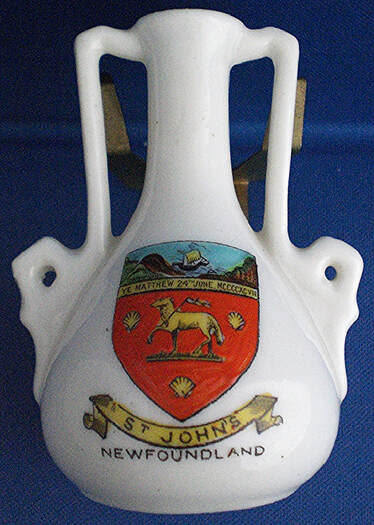
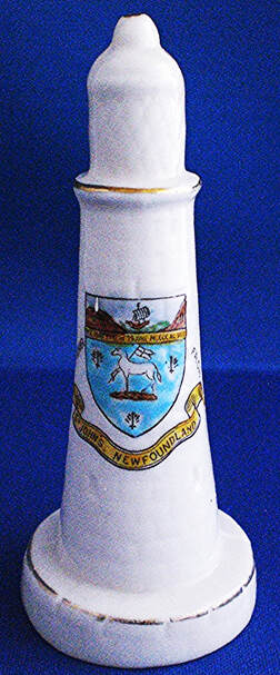
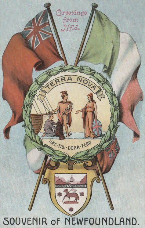
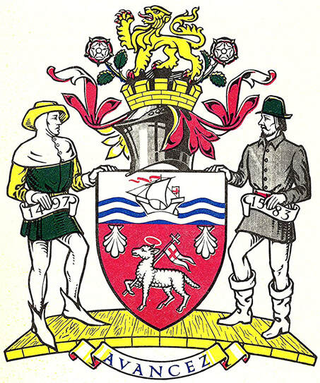
Chapin’s armorial does not include St. John’s because Newfoundland had not yet joined Canada in 1937. In figures 1 to 3, the inscription YE MATTHEW 24TH JUNE MCCCCXCVII on a band across the shield, just below the chief (top part), refers to the arrival of John Cabot (Giovanni Caboto) in Newfoundland aboard his ship the Matthew on St. John the Baptist’s Day, 24 June 1497. [1] The landfall of the ship is depicted at the top while the main part, with the Paschal Lamb and scallop shells, refers to the baptism of Christ by St. John the Baptist (fig. 6). A comparison among figures 1, 2 and 3 reveals discrepancies in the colours of the field, namely red, blue and white respectively. In figure 1, the lamb is Or (gold or yellow); in figure 2, it is Argent (white or silver). The most plausible colour is red which is seen in other ceramic souvenirs and has been retained for the granted achievement of arms in which the lamb and shells become white (figs. 4-5).
Chapin’s armorial does not include St. John’s because Newfoundland had not yet joined Canada in 1937. In figures 1 to 3, the inscription YE MATTHEW 24TH JUNE MCCCCXCVII on a band across the shield, just below the chief (top part), refers to the arrival of John Cabot (Giovanni Caboto) in Newfoundland aboard his ship the Matthew on St. John the Baptist’s Day, 24 June 1497. [1] The landfall of the ship is depicted at the top while the main part, with the Paschal Lamb and scallop shells, refers to the baptism of Christ by St. John the Baptist (fig. 6). A comparison among figures 1, 2 and 3 reveals discrepancies in the colours of the field, namely red, blue and white respectively. In figure 1, the lamb is Or (gold or yellow); in figure 2, it is Argent (white or silver). The most plausible colour is red which is seen in other ceramic souvenirs and has been retained for the granted achievement of arms in which the lamb and shells become white (figs. 4-5).
The postcard (fig. 3) features the arms of St. John’s at the bottom and, in the centre, the badge of Newfoundland which derives from the first known impression of its Great Seal dating from 1827. [2] Above on the left, appears the Red Ensign of the British Merchant Marine which was adopted in 1904 by merchant ships of the island with the badge in the fly. The flag on the right is called the “Pink, White and Green”, which was popularly endorsed by Newfoundlanders in the nineteenth century and became the object of an “unofficial ‘national anthem’ ”. [3] The postcard shows the flag colours in reverse, namely as green white and pink.
Fig. 3. Postcard by Ayre & Sons of St. John’s, Newfoundland. A printed inscription on the back reads: “With Kindest Thoughts and Hearty Good Wishes for a Truly Happy Christmas.” The postage stamp was issued in Sept. 1908. Photo courtesy of Michael Smith from his collection of Canadian postcards.
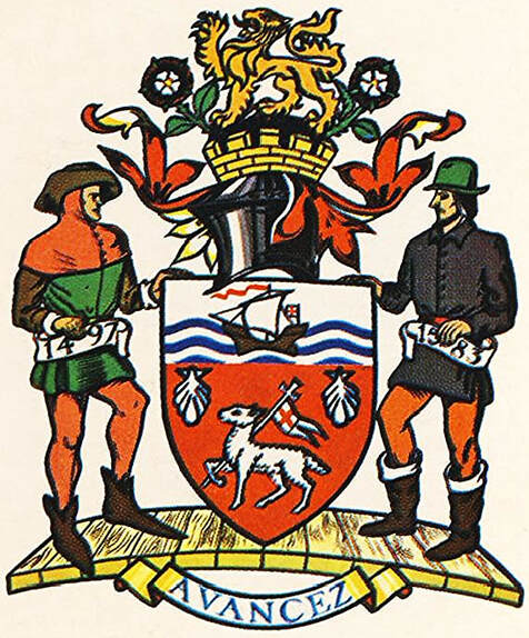
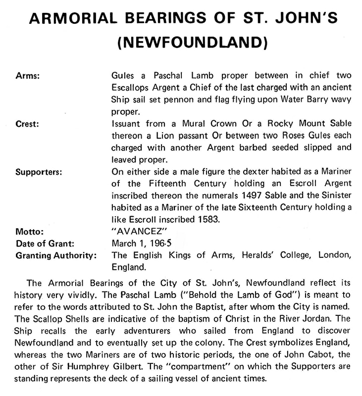
On 1 March 1965, the City of St. John was granted armorial bearings by the English Kings of arms, in which many elements of the original shield were retained. In Beddoe’s Canadian Heraldry, (fig. 5), the garments of the supporters are coloured differently from figure 4, which is acceptable since the blazon specifies attires of a period without indicating colours. In the version recorded in the Public Register of Arms, Flags and Badges of Canada (15 March 2005), there is no helmet above the shield and the supporters are not standing on a sailing vessel deck, two features that are not mentioned in the blazon, see figure 6 and: https://www.gg.ca/en/heraldry/public-register/project/454.
Fig. 4. Armorial bearings of the City of St. John’s granted by the English Kings of arms on 1 March 1965. From Heraldry in Canada (September 1974), p. 2.
Fig. 5. The same supporters as figure 4 with different colouration, from Beddoe’s Canadian Heraldry, p. 94.
Fig. 6. From Heraldry in Canada (September 1974), p. 3.
Nova Scotia
Halifax
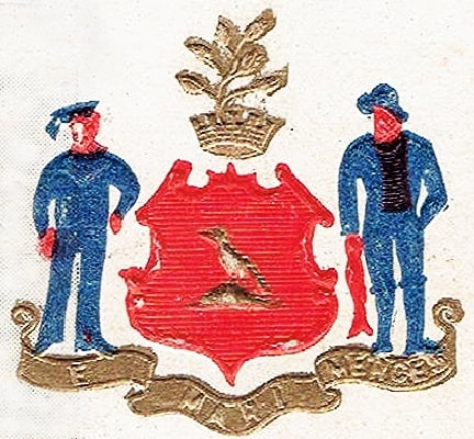
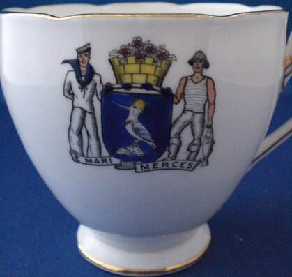
Chapin blazons the arms of Halifax as follows: “Azure perched on a rock sable a kingfisher argent. Crest: Out of a mural crown, mayflowers in bloom. Motto: ‘E mari merces’. Supporters: Dexter a British naval sailor, sinister a deep-sea fisherman with a cod-fish hanging from his right hand.” He further comments: “Sometimes the kingfisher and the rock are or [gold] and sometimes the rock is shown issuant from the sea proper. / John Woodward in Notes and queries, Aug. 7, 1880, gives the arms of Halifax as ‘Or, on a mount in base a blue jay ppr.’ ”. [4]
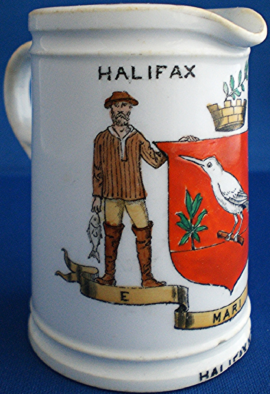
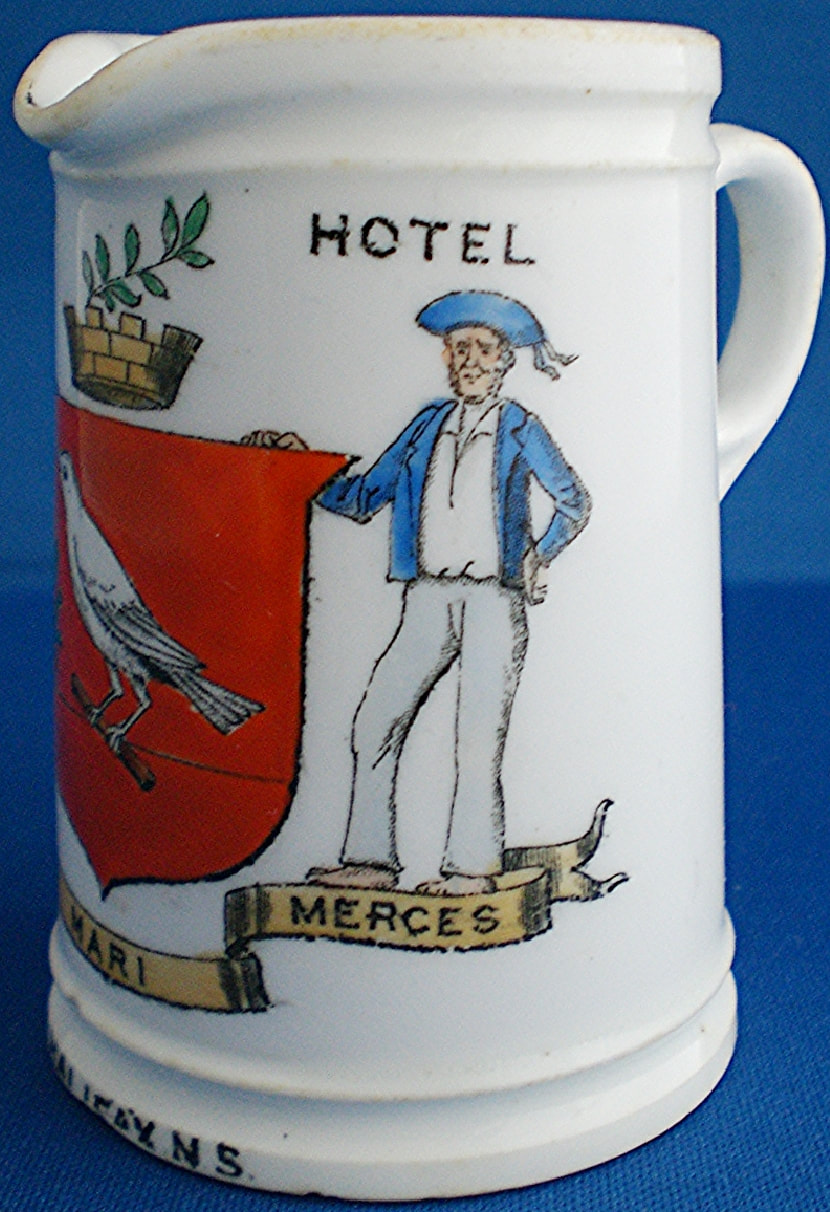
The old arms of Halifax were a favorite of English ceramic manufacturers including a blue and white jasper version by Wedgwood. Two brothers are mentioned as their creators in 1860, James Cogswell and his brother Charles, a medical doctor. Figure 7a-c with a red field, white bird on a wooden perch and a green plant added is another variant, but the red shield is not unique (fig. 8). Figure 7 presents another interesting feature in that the dexter supporter is the fisherman and the sailor the sinister one, which usually was the reverse at the time. The motto E Mari Merces (Wealth from the sea) remains constant. [5]
Fig. 7a-c. Pottery creamer for Halifax Hotel, by The Foley China (Wileman & Co.), c. 1901.
The embossed version in figure 8 shows horizontal lines across the shield which normally denote blue and yet the shield is coloured red. The blue colour of both the sailor and fisherman and the red fish seem somewhat fanciful as does the gold colour of the mayflower rising from the mural crown in the crest. These colours were applied by hand and obviously were sometimes subject to the whims of colourists. In other depictions on MacFarlane postcards with the same arms, the shield is coloured sometimes red, sometimes blue: https://vintagepostcards.ca/Publishers/Canadian/MacFarlane/MacFarlaneViewCards/index.html.
Fig. 8. On a postcard of City Hall, Halifax, by W.G. MacFarlane, Publisher, Toronto. The red of the field is contradicted by the horizontal lines across the shield which indicate blue in heraldry (Azure).
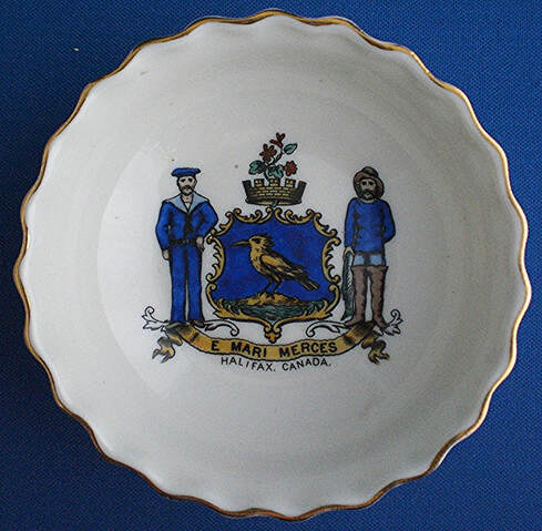
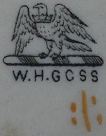
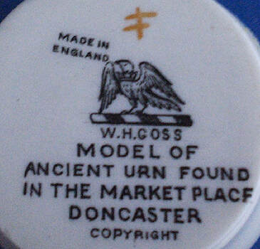
In figures 9 and 10, the shield is blue and the content is essentially the same in both, although the supporters are rendered somewhat differently. Figure 9 is by W.H. Goss, the famous manufacturer of miniature armorial souvenirs. The Goss mark, shown with figure 9b, is a goshawk on a wreath which was also featured “charged on the breast with a bomb fired” in the crest of the family coat of arms designed by William Henry Goss’ eldest son, Adolphus (1853 - 1934). [6] In the Goss mark, the bomb is removed and the bird wears a coronet which has been described as “a falcon rising, ducally gorged” and linked to the Falcon Works where the firm moved around 1870. [7]
Fig. 9a-b. Ivory porcelain bowl by W.H. Goss c. 1905. The shield on this piece is blue. The orange figure under the goshawk is a decorator’s mark.
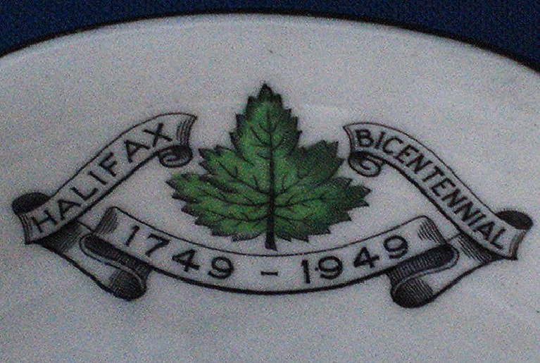
Fig. 10 a-b. Cup and saucer produced by Royal Grafton (A.B. Jones & Sons Ltd.) for the bicentennial of Halifax 1749-1949.
The numerous discrepancies in the depictions of Halifax’s emblem appearing on the memorabilia created to celebrate de city’s bicentenary in 1949 annoyed the municipal solicitor Carl P. Bethune who decided to impose uniformity in future depictions. The city council authorized him to prepare an ordinance to control the design and use of the arms. The ordinance, approved by the minister of Municipal Affairs on 22 October 1964, blazons the arms as follows: “Azure a crested Kingfisher Or, Crest: out of a mural coronet Or a sprig of mayflowers in bloom proper. Supporters: dexter, a deep-sea fisherman with a codfish dependant from his dexter hand; sinister, a naval seaman, all proper. Motto: E Mari Merces.” [8] In the grant by the Chief Herald of Canada, on 1 July 1992, the supporters stand on a grassy mound: https://www.gg.ca/en/heraldry/public-register/project/1591.
Prince Edward Island
I have not found any municipal arms on ceramics for this province.
New Brunswick
St. John
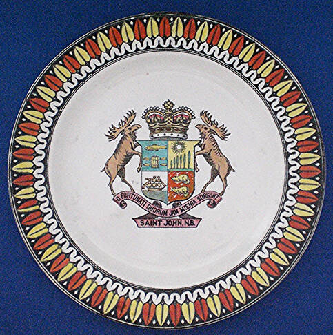
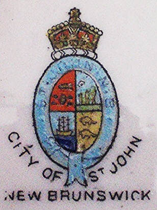
Chapin describes the armorial bearings of Saint John thus: “Quarterly (1) gules a barrel between four fish, in chief a fish, all or; (2) azure on a champagne a row of trees graduated in height and in chief a sun in splendour or; (3) azure a ship or at sea barry undy or and azure; (4) gules two beavers in pale or. The number of trees varies from four to seven and sometimes the highest is at dexter and sometimes at sinister. Crest: A crown. Motto; ‘O fortunati quorum jam moenia surgent’. Supporters: Two moose.”
The number of trees and whether the tallest one is on the right or left is something that is usually left out of a blazon because it is a detail best left to the judgement of artists. The crown is not just any crown, but the Royal Crown which was inserted into many freely adopted municipal arms in the nineteenth and early twentieth century. The background colour of the 1st and 4th quarters is Gules (red) and that of the 2nd and 3rd quarters is Azure (blue), which is the colour retained today. For more recent renderings and the meaning of the motto, see: https://en.wikipedia.org/wiki/Saint_John,_New_Brunswick.
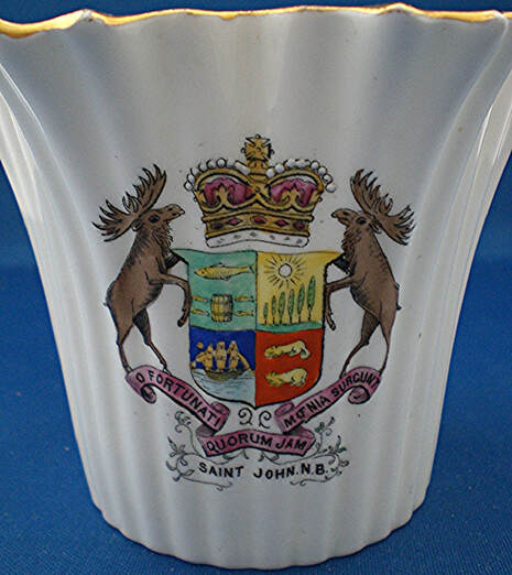
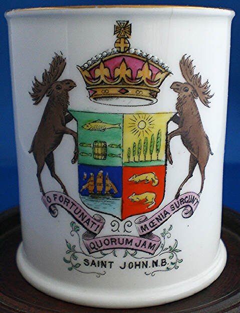
In the collection of heraldic china my wife and I collected, two pieces with the arms of St. John are by The Foley China (Wileman & Co.), one by Shelley China (Late Foley), one by Florentine China (Taylor & Kent), and three by Adams. Two of the Adams are blue jasper with the completely white arms in relief. The Foley ones (figs. 11 and 12) and the Shelley one all display the same design. In all of them, the field colour of the 1st quarter is a light green, the 2nd quarter is gold, the 3rd quarter is blue and the 4th quarter is red. Between figure 11 and figure 12, the differently shaped crowns, one with lowered and the other with raised arches, are options that the artists have chosen. For instance, during the reign of Victoria, both types of crowns ensigned the royal arms at one time or another. [9]
Fig. 11. Dainty white bone china vase by the Foley China (Wileman & Co.) c. 1900. Inscribed in black on bottom, below mark: “MADE IN ENGLAND FOR W.H. HAYWARD.”
Fig. 12. Bone china tumbler by the Foley China (Wileman & Co.). Inscribed in black on opposite side: “WITH THE COMPLIMENTS OF W.H. HAYWARD CO. LTD. ST. JOHN N.B. FANCY CHINA ETC; ON THEIR 50TH ANNIVERSARY 1855-1905.”
Fig. 13. Pottery plate by Adams, c. 1905. The 3rd quarter with the ship is Argent (white) rather than blue as in figures 11 and 12.
In figure 14 the 1st quarter becomes red and the 4th quarter turns to gold along with the beavers, which are visually difficult to discern. The two other quarters are blue. The whole is within a garter inscribed “St. John N.B.” and ensigned by the Royal Crown. It is a poor rendering which, once again, demonstrates that heraldic devices that are not properly recorded are subject to the whims of artists, quite often with deterioration in clarity.
Fig. 14. Arms of St. John on a miniature ivory bone china pin dish by Florentine China (Taylor & Kent), c. 1910.
Quebec
Montreal
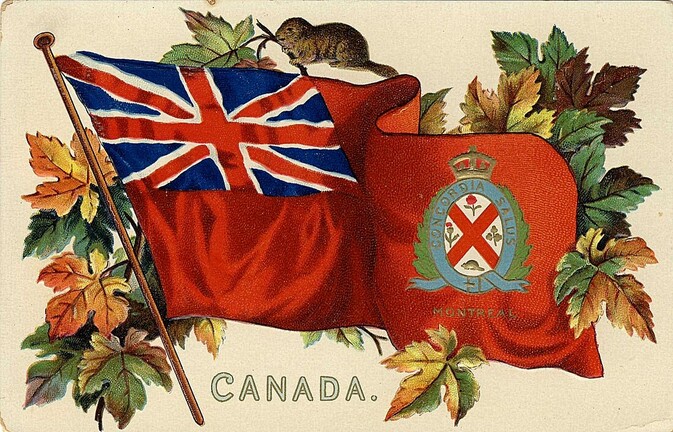
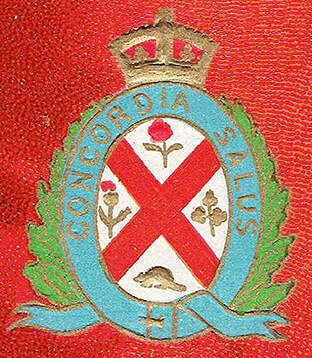
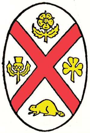
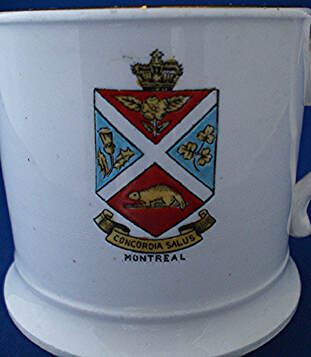
In 1833 Jacques Viger, first mayor of Montreal, created an armorial design for use on the corporate seal of the city. He had several drawings made in oval and round shapes as was required for the seal. Two artists were involved, one of them being James Duncan who is well known for his views of Montreal. The composition of the seal is described in the minutes of a council meeting of 19 July 1833. The description translates as follows: “an oval shape with a field Argent (silver or white) divided quarterly by a saltire Gules (red), in the 1st quarter a rose, 2nd a thistle, 3rd a shamrock, 4th a beaver passant all Or (gold or yellow). Motto: Concordia Salus on a garter Azure (blue). Under the shield, the inscription “Corporation” — “Montreal.” [10]
The emblem attempts to promote harmonious relations among the inhabitants of the city: the rose at the top represents citizens of English descent; the thistle on the left honours Scottish origins; the shamrock on the right symbolizes Irish ancestry and the beaver in base stands for the Canadians of French descent. The motto which translates “Salvation through harmony” conveys the same idea of getting along well together. The red saltire seems a compromise serving the same purpose. The saltire of Scotland being white and the English cross of St. George being red, the red saltire likely constitutes a synthesis of the two crosses.
A seal is not coloured. The fact that colours were specified for its components implies that armorial bearings were also intended for the city. The only depiction I have found that comes close to the original description of the seal is in the fly of the Red Ensign (fig. 15). The differences are that the rose and thistle should be solid gold without any red and that the Royal Crown has been placed on top of the garter. A drawing dated 1833 by the artist William Bent Berczy clearly demonstrates that the symbols accompanying the cross were rendered in natural colours by artists from the very beginning and not in gold as specified for the seal. [11] Berczy’s title translates “Arms of the City of Montreal” which signals a mental transition from a seal to an armorial device. In 1880 John Woodward blazons the arms as “Or, a saltire gu., fimbriated arg., between in chief a rose, in flanks a thistle and a shamrock, and in base a beaver, all ppr.” [12] According to this description, the field would be gold (Or), the red saltire would be edged white or silver (Argent) and everything else would be proper, that is in natural colours. It constitutes another early variation on the city’s emblem.
Fig. 15a-b. Postcard c. 1910 by “Raphael Tuck & Sons ‘Canadian Coats of Arms’ Post Card Series No. 2911. Art publishers to Their Majesties the King and Queen. Printed in Saxony.”
Howard Chapin blazons the shield of Montreal: “Argent a saltire gules between a rose, a thistle, a trefoil, and a beaver passant or. [13] Motto: ‘Concordia salus’.” He remarks: “The trefoil is shown as three trefoils on one stalk but is blazoned officially as ‘a trefoil’. The shield is usually oval and encircled by a blue garter charged with the motto and the two tails of the garter are charged with the words ‘Corporation Montreal’. All the lettering is sable. The trefoil doubtless is considered to be a shamrock.” [14] The trefoil is shaped as in figure 16, but in his own drawing Chapin depicts a shamrock (fig. 17) which no doubt reflects his comment that a shamrock was likely intended. The word “trèfle” in the original description of the seal designates a three-leaf clover in French heraldry.
Fig. 16. A trefoil has three nippled lobes, usually on a curved and pointed stem.
Fig. 17. Colourized version of the arms of Montreal from a line print in Howard M. Chapin, “Canadian Municipal Arms”, 1937, p. 248.
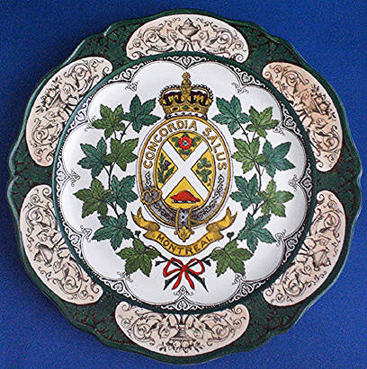
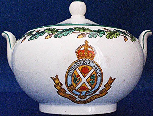
The emblem of Montreal probably appeared for the first time on ceramics in the 1860s, namely on pieces of tableware of the Ocean Steamship Company where it is printed in black and white. [15] It also decorates a number of Wedgwood plates in the royal pattern with red, blue or green borders (fig. 18) and is also seen on tableware decorated with a wreath of oak leaves (fig. 19), both before, during and slightly after the First World War. In figures 18 to 20, the field is now gold, the saltire is white instead of red and all the elements around it are in natural colours. The beaver is placed on a torse as if it were a crest. The Royal Crown above the garter has lowered arches in some cases and in others raised ones.
Fig. 18. Pottery Wedgwood plate, royal pattern with green border, 1917.
Fig. 19. Pottery sugar bowl with lid and oak wreath ornament by Wedgwood, c. 1902.
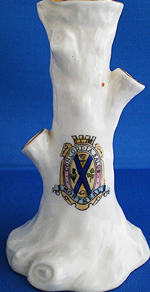
Carlton China produced a number of miniature souvenirs with the old device of Montreal. On them the field is gold, the saltire becomes blue and the accompaniments are all in natural colours. A mural crown, which is the symbol of a city, is placed above the garter (fig. 20).
Fig. 20. Miniature bone china tree trunk vase by Carlton China (Wiltshaw and Robinson Ltd.). The maker’s mark dates from 1902 to 1930, but the piece is likely prior to the First World War when such souvenirs were most popular.
In figure 21 the saltire cross has returned to white as in figures 18 and 19, but the field is now red and celestial blue. The accompanying charges are all gold as in the original description of the seal and the beaver is on a log. The shield is no longer oval, the garter has gone, the motto is on a scroll below the shield, but there is still the Royal Crown on top of the shield. Over time, the achievement of arms of Montreal underwent huge variations with many types of supporters added and different inscriptions. [16]
Fig. 21. Bone china coffee can by E. Hughes & Co., mark 1905-12.
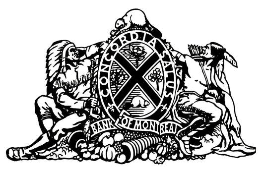
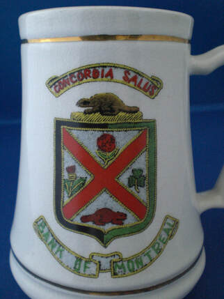
The Bank of Montreal used the arms of Montreal on a half penny bank token of 1837 and on a five dollars bill issued in 1852 to which were added two First Nation supporters and a beaver crest.[17] Figure 22 is another example often seen carved in stone on the pediment of Bank of Montreal buildings. The achievement of arms was granted by the English Kings of arms on 21 April 1934 and registered by the Canadian Heraldic Authority on 16 November 1992: https://www.gg.ca/en/heraldry/public-register/project/1554. Figure 23 shows an example of these arms without supporters.
Fig. 22. From Heraldry in Canada (June 1982), p. 27.
Fig. 23. The depiction is faithful to the 1934 grant of arms to the Bank of Montreal, but without supporters. Pottery stein made in England, 1950s to 1980s?
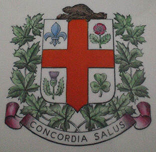
In 1938 the municipal council adopted a new armorial design for Montreal (fig. 24). The shield is of the type most prevalent in France during the eighteen and nineteenth centuries. The cross is no longer a saltire but a red cross on a white field. Although it is the same as the cross of St. George, patron saint of England, it also has a long historical association with France. [18] In the arms of Montreal, the cross has no ethnic connotation. It honours the Christian tradition that presided over the foundation and development of Ville-Marie which became Montreal. A memorable Christian gesture took place in 1643 when Chomedey de Maisonneuve, founder of Fort Ville-Marie, carried a cross to the top of Mount Royal and had it planted there to thank God for having protected the settlement from the rising waters of the St. Lawrence River. This explains the large illuminated cross that dominates Mount Royal today.
The blue fleur-de-lis, which has become the symbol of French Canadians and of the Province of Quebec occupies the 1st quarter of the shield. The rose of England, the thistle of Scotland and the shamrock of Ireland, all in natural colours, are derived from the older design and represent the origins of the city’s founders. The beaver which was previously in base of the shield is now placed on a log as the crest on top of the shield. The original motto Concordia Salus appears on a scroll below as is most frequent in heraldry. The branches of maple outside the shield are a common feature in Quebec civic heraldry.
The blue fleur-de-lis, which has become the symbol of French Canadians and of the Province of Quebec occupies the 1st quarter of the shield. The rose of England, the thistle of Scotland and the shamrock of Ireland, all in natural colours, are derived from the older design and represent the origins of the city’s founders. The beaver which was previously in base of the shield is now placed on a log as the crest on top of the shield. The original motto Concordia Salus appears on a scroll below as is most frequent in heraldry. The branches of maple outside the shield are a common feature in Quebec civic heraldry.
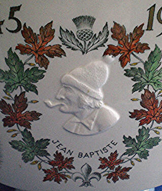
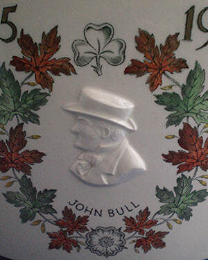
Fig. 24a-c. The 1938 arms of Montreal inside a footed pottery punch bowl by Wedgwood. The bowl features many pictures and inscriptions on the outside regarding historic aspects and the population of the city, including the effigies of Jean-Baptiste and John Bull inside a wreath of maple leaves and floral emblems as also found with the city’s arms. The bowl was given to employees of Morgan’s in 1945 to celebrate the 100th anniversary of the founding of the store by Henry Morgan.
The 1938 arms remained in use until 25 September 2017 when a white pine tree was added in the centre of the cross to honour the original indigenous presence on the territory. A torse was also placed under the beaver on a log in the crest. See the complete blazon and symbolism as recorded by the Canadian Heraldic Authority: https://www.gg.ca/en/heraldry/public-register/project/2960.
Quebec City
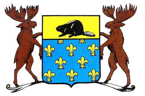
In 1673 Louis Buade de Frontenac, Governor of New France, proposed arms for the City of Quebec to the minister of colonies. They displayed a beaver in the upper part of the shield which is supported by two moose. The governor also recommended blue and white as the city’s livery colours. [19] The shield is blazoned: Azure semy of fleurs-de-lis, on a chief Or a beaver Sable (fig. 25). For some reason, the minister did not endorse this proposition which would have made Quebec the first Canadian city to obtain officially granted arms.
In 1673 Louis Buade de Frontenac, Governor of New France, proposed arms for the City of Quebec to the minister of colonies. They displayed a beaver in the upper part of the shield which is supported by two moose. The governor also recommended blue and white as the city’s livery colours. [19] The shield is blazoned: Azure semy of fleurs-de-lis, on a chief Or a beaver Sable (fig. 25). For some reason, the minister did not endorse this proposition which would have made Quebec the first Canadian city to obtain officially granted arms.
Fig. 25. Achievement of arms proposed for Quebec City by Governor Frontenac in 1673. From Heraldry in Canada (Sept. 1982), p. 35.
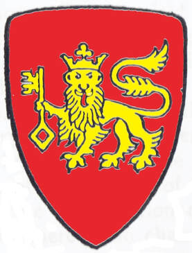
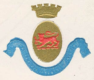
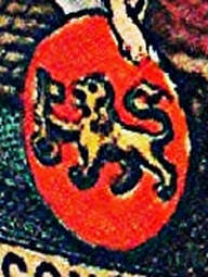
The first arms adopted by Quebec City existed in 1833 since they are held by the goddess Ceres in the first seal of the city designed that year (figs. 28-32). Howard Chapin describes them in 1937: “Gules a lion passant guardant crowned holding in his dexter paw a key palewise wards upwards or. Motto: ‘Natura fortis industria crescit’. ” In some depictions a gold bordure has been added as if it were rivetted on. This is no doubt a latter decorative addition since this bordure is absent from the original city seal (fig. 28) and from most early depictions. The arms of the city with a crowned lion holding a key are carved by Cléophas Soucy outside the Peace Tower in Ottawa: https://theroadhome.ca/2018/09/19/12-things-you-didnt-know-about-the-peace-tower-in-ottawa/#jp-carousel-2261.
Fig. 26. The first arms of Quebec City were in use for over a hundred years. Colourized line print from Chapin’s “Canadian Municipal Arms”, p. 248.
Fig. 27. On this postcard by W.G. MacFarlane of Toronto, the colours on the shield are reversed. Another series of postcards by an unknown publisher show the colours as in figure 26 but with a mural crown above as seen here: https://www.vintagepostcards.ca/collections/Patriotics/PatrioticGreetings/.
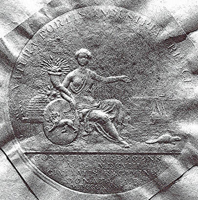
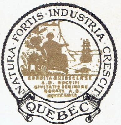
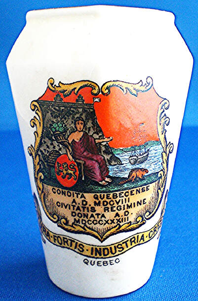
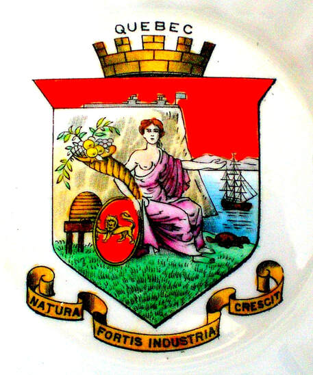
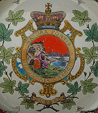
The first seal of Quebec was designed in 1833 by the well-known Canadian artist Joseph Légaré, a counsellor of the city from 1833 to 1836 (fig. 28). Some depictions added to the décor the inscription QUEBEC on a scroll at the base and an inner circle enclosing the pictorial elements (fig. 29). The motto NATURA FORTIS INDUSTRIA CRESCIT (Strong Nature Prospers by Work) appears on the perimeter. The inscription at the base (exergue) CONDITA QUEBECENSE A.D. MDCVIII CIVITATIS REGIMINE DONATA MDCCCXIII means “Quebec was founded in 1608 and incorporated as a city in 1833”. On ceramic souvenirs. the first seal of Quebec was often converted into an armorial device with colours displayed on a shield (figs. 30-31). These images offer a clearer depiction of the pictorial components. The seated figure is Ceres, goddess of agriculture, holding her traditional horn of plenty or cornucopia and accompanied to the right by a beehive. With her right hand, she holds the first armorial shield of the city. With her left hand, she points to the adjacent St. Lawrence River with a ship on it. A beaver walks away from her towards the water. In the background appears a view of the Cap-aux-Diamants crowned by the Citadel fortress.
Fig. 28. The first seal of Quebec City as designed by Joseph Légaré in 1833, impressed directly on the face of an 1855 document into a wafer of wax covered by a square of paper. Library and Archives Canada, MG 24, F 42, negative no. C – 130753.
Fig. 29. The first seal of Quebec City with some additions, on a postcard by Richmond News Co., Richmond, Virginia, c. 1905. Several depictions of the seal can be viewed on this site: https://manegemilitaire.ca/en/coat-of-arms-and-emblems-of-quebec-city/.
Fig. 30a-b. Miniature vase with diamond shaped mouth by W.H. Goss, ivory porcelain, c. 1910. Based on the first seal of Quebec City (fig. 28). The first arms of Quebec are held by the goddess Ceres.
Fig. 31. Old arms of Quebec City derived from its first municipal seal. On a bowl by The Foley China (Wileman & Co.), dated 1900-10.
Fig. 32. The city seal, without the inscription in base, is placed on a cartouche and ensigned by the Royal Crown, the whole within maple branches. Royal pattern Wedgwood plate with red border, 1910.
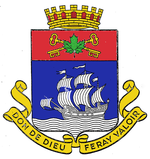
The arms of the City of Quebec (fig. 33), were chosen by a committee for which the well-known art historian, Gérard Morisset, and the sculptor and stained glass artist, Marius Plamondon, acted as consultants. The committee’s report is dated 17 May 1949 and the arms were adopted by the City Council that same day. The version granted to the city on 20 September 1988 was the first municipal grant by the Chief Herald of Canada. The only addition to the composition is a small gold border at the lower edge of the chief to give it greater relief by separating two colours with a metal. The symbolism of the granted arms remains basically the same as the 1949 version, see: https://www.gg.ca/en/heraldry/public-register/project/1826. The motto “Don de Dieu feray valoir” (I will make good of God's gift) refers to the Don de Dieu, one of the important ships of Samuel de Champlain who established the first permanent French settlement at Quebec. [20] This new motto expresses in another way the old motto on the seal (figs. 28-32) which translates “Strong Nature Prospers by Work”.
Fig. 33. Colourized version of the arms of Québec City 1949-88, from a line print.
Sherbrooke
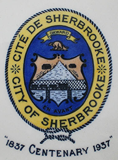
Chapin describes the arms of Sherbrooke as follows; “Argent a river palewise between two houses and at base crossed by a railroad bridge with lattice work sides on two piers with a railroad train engine and three cars on the bridge (all azure). Crest: A beaver. Motto: ‘Onward’.” Figure 34 does not correspond to Chapin’s blazon as to the positioning of the river. It is one of the few instances of Canadian municipal arms on British ceramic after the First World War. The Institut généalogique Drouin designed new arms for the city which are a great improvement on the previous design: https://fr.wikipedia.org/wiki/Armoiries_de_Sherbrooke.
Chapin describes the arms of Sherbrooke as follows; “Argent a river palewise between two houses and at base crossed by a railroad bridge with lattice work sides on two piers with a railroad train engine and three cars on the bridge (all azure). Crest: A beaver. Motto: ‘Onward’.” Figure 34 does not correspond to Chapin’s blazon as to the positioning of the river. It is one of the few instances of Canadian municipal arms on British ceramic after the First World War. The Institut généalogique Drouin designed new arms for the city which are a great improvement on the previous design: https://fr.wikipedia.org/wiki/Armoiries_de_Sherbrooke.
Fig. 34. Old arms of Sherbrooke on a pottery plate made by Spode & Copeland for the centenary of the city.
Ontario
Hamilton
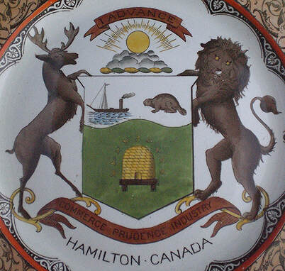
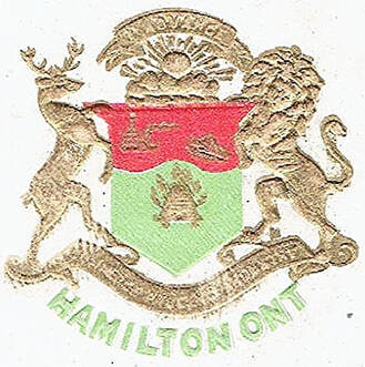
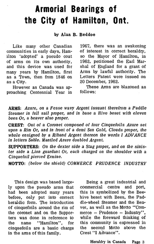
Chapin’s description of the arms of Hamilton reads: “Vert a beehive beset with a demi-orle of eleven bees volant (or), on a chief undy argent at dexter a single-masted lake steamer with funnel at stern and at sinister a beaver. Crest: A demi-sun in splendour issuant from clouds with above the sun the motto ‘I advance’. Motto: ‘Commerce, prudence, industry’. Supporters: Dexter a stag, sinister a lion.” His blazoning does not specify any tinctures for the steamer, the beaver, the entire crest and the supporters. In figure 35, all these elements are more or less proper, that is in natural colours. In figure 36, the same elements become gold. In figure 35, the chief is Argent (silver or white), while in figure 36, it is Gules (red).
Chapin’s description of the arms of Hamilton reads: “Vert a beehive beset with a demi-orle of eleven bees volant (or), on a chief undy argent at dexter a single-masted lake steamer with funnel at stern and at sinister a beaver. Crest: A demi-sun in splendour issuant from clouds with above the sun the motto ‘I advance’. Motto: ‘Commerce, prudence, industry’. Supporters: Dexter a stag, sinister a lion.” His blazoning does not specify any tinctures for the steamer, the beaver, the entire crest and the supporters. In figure 35, all these elements are more or less proper, that is in natural colours. In figure 36, the same elements become gold. In figure 35, the chief is Argent (silver or white), while in figure 36, it is Gules (red).
Fig. 35. Royal pattern Wedgwood plate with red border, 1914.
Fig. 36. Postcard titled “Post Office, Hamilton, Ont.”, c. 1905 by W.G. MacFarlane, Publisher, Toronto.
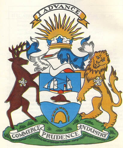
Figure 37 shows and figure 38 describes the armorial bearings granted to the city of Hamilton by the Kings of Arms of England on 20 December 1962. The new design repositions the components of the older one. The city was granted new arms by The Chief Herald of Canada on 15 July 2003 following its amalgamation with several other municipalities: https://www.gg.ca/en/heraldry/public-register/project/99. Of the former arms, only the stag supporter was kept; a tiger replaces the lion supporter and the motto is entirely new.
Fig. 37. Armorial bearings granted to the City of Hamilton by the Kings of Arms of England in 1962, drawn by Alan B. Beddoe, from Heraldry in Canada, March 1973, p. 2.
Fig. 38. Blazon and symbolism of the armorial bearings of the City of Hamilton from Heraldry in Canada, March 1973.
Kenora
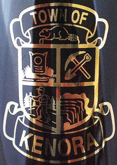
According to Chapin, Kenora’s device is composed “Quarterly (1) a flour sack; (2) a pickaxe and shovel in saltire handles downwards; (3) a British soldier in uniform of about 1870, climbing a mountain side with a staff in his hand; (4) a waterfall. Crest: A beaver.”
The origins of the design are not known. There does not seem to be any explanation of the symbolism although much of it can be deduced plausibly. The flour sac refers to the flour milling industry, namely the Maple Leaf Flour Mills. The pickaxe and shovel represent the mining industry, the city being located in the heart of the mineral rich Canadian Shield. The British soldier must allude in some way to the British troops commanded by Colonel Garnet Wolseley who came through Rat Portage (former name of Kenora) in 1870 on their way to the Red River. The waterfall relates to several examples of this phenomenon in the area. The beaver symbolizes the fur trade and the Hudson’s Bay Company that established a post there in 1837 (fig. 39).
Fig. 39. Arms of Kenora on pottery coffee mug by John Tams 1990s?
Kingston
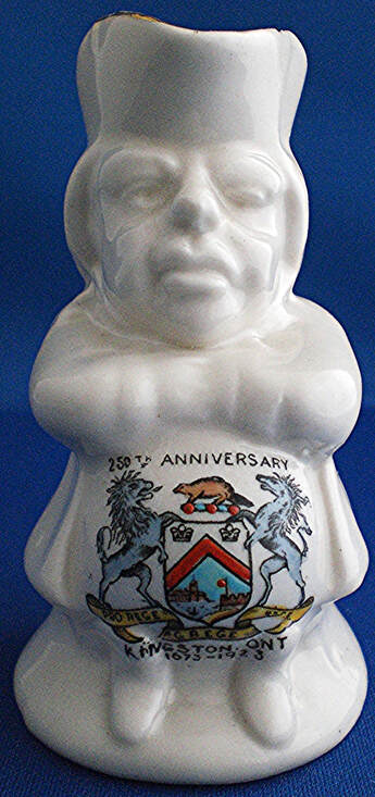
An early version of an armorial device for Kingston appears on the front page of the Canadian Illustrated News of 14 June 1879 showing the vice-regal reception of the Marquis of Lorne and Princess Louise in front of Kingston City Hall. The couple arrived there on May 29 and left on June 3. The shield is placed at the bottom of the page on a scroll inscribed “Welcome to Kingston”. It is divided horizontally into two halves. At the very top is the motto PRO REGE GREGE LEGE, which means “For the king, the people and the law” and which the city kept for at least 120 years. Underneath appears the bust of a crowned king holding a sceptre in his right hand and an orb in the left. The lower half contains a view of Kingston Harbour, not unlike the one in figures 40ab. A border encloses the whole and is red as indicated by vertical lines. The message is very clear: “the king’s town.” The shield can be viewed online: https://www.canadiana.ca/view/oocihm.8_06230_500/2.
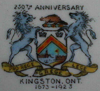
In 1937 Chapin blazons the arms of Kingston thus: “Argent a chevron gules between in chief two crowns the dexter one English and the sinister one French, and in base (a view of the entrance to the harbour) at dexter a government building with a dome and two wings with lesser domes, at sinister a fort issuing from the edge of the shield with a flag and flag pole at the dexter end of the fort, in base a man in a canoe. Crest: A beaver. Motto: ‘Pro rege lege grege’. Supporters: A lion and a unicorn both rampant.” Though some colours are lacking, this description generally corresponds to figures 40a-b. The motto given by Chapin translates “For the king, the law and the people” instead of “For the king, the people and the law”, which is the order of words for Kingston’s motto. This is likely a mistake in reading. On a scroll, a motto is often divided into three parts, and it is often difficult to see the sequence of words at first glance (see fig. 40b).
Fort Frontenac (also called Cataracoui or Cataraqui) was built in 1673 as an advanced trading post at Kingston by the French Governor Louis de Buade, Comte de Frontenac. It was captured in1758 by English troops commanded by Lieutenant Colonel John Bradstreet. The beaver in the crest highlights the importance of the early fur trade for which the fort was built. The two crowns refer to both the French and English period. The government building is the impressive Kingston City Hall dating from 1844 which faces Lake Ontario and was declared a national historic site in 1961. The fort is very likely Fort Henry which was built during the war of 1812. The water and canoe represent Kingston Harbour. The lion and unicorn supporters come from the royal arms of the United Kingdom. Their bluish tint in figure 40a-b no doubt reflects the fancy of an artist.
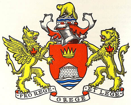
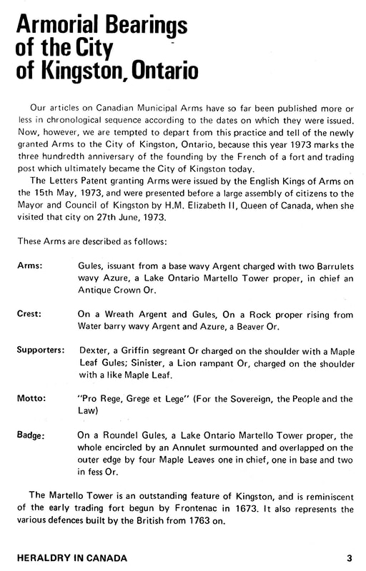
The City of Kingston was granted armorial bearings by the English Kings of Arms on 15 May 1973 (figs. 41-42). A modified version of these arms was granted by the Chief Herald of Canada on 11 January 1999, following a 1998 amalgamation: https://www.gg.ca/en/heraldry/public-register/project/871. For the symbolism of the components, see: https://www.cityofkingston.ca/cok/bylaws/2007/doc/doc926613.PDF.
Kingston presents a good example of a logical progression in the symbols that its citizen chose to represent their city. The first choices were assumed arms that contained flaws, namely a lower portion taking the form of a tableau of outstanding municipal features and far too busy to be easily recognized in smaller size as exemplified by figure 40a-b; supporters that were lifted from the royal arms and surely without royal permission. The city then obtained granted arms with a much improved design and did not hesitate to secure a second grant when a new situation arose.
Fig. 40a-b. Ivory bone china toby souvenir jug commemorating the 250th anniversary of Kingston, 1673-1923, by Robertsons Art China. Pin dish by same company.
Fig. 41. Armorial bearings of Kingston granted by the English Kings of Arms on 15 May 1973. Here “ET” has been added to the motto which clarifies the sequence of words on the scroll, but the meaning remains the same. From Heraldry in Canada (December 1973), p. 2.
Fig. 42. From Heraldry in Canada (December 1973), p. 3.
Nepean
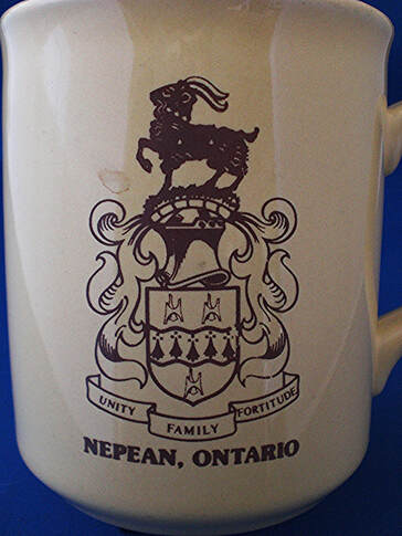
Nepean was named in honour of Sir Evan Nepean, head of the colonial branch of the British Home Office and secretary to the Board of Admiralty. The municipal arms were approved by the City of Nepean on 10 November 1981. They are partly based on the personal arms of city’s namesake. The field of the shield is changed from red to green. The white stars are replaced by “three representations of the old township hall bell as hanging from its support in the Nepean Civic Square” also white. The goat in the crest acquired a collar of gold maple leaves. The city chose its own appropriate motto as seen in figure 43. The arms were granted by the Chief Herald of Canada on 10 October 1990: https://www.gg.ca/en/heraldry/public-register/project/1433. The version on the mug duplicates the one drawn in a somewhat different style on the grant of a flag to the city: https://www.gg.ca/en/heraldry/public-register/project/1488. For comparison with the city, those of Sir Evan Nepean can be viewed here: https://en.wikipedia.org/wiki/Evan_Nepean.
Nepean was named in honour of Sir Evan Nepean, head of the colonial branch of the British Home Office and secretary to the Board of Admiralty. The municipal arms were approved by the City of Nepean on 10 November 1981. They are partly based on the personal arms of city’s namesake. The field of the shield is changed from red to green. The white stars are replaced by “three representations of the old township hall bell as hanging from its support in the Nepean Civic Square” also white. The goat in the crest acquired a collar of gold maple leaves. The city chose its own appropriate motto as seen in figure 43. The arms were granted by the Chief Herald of Canada on 10 October 1990: https://www.gg.ca/en/heraldry/public-register/project/1433. The version on the mug duplicates the one drawn in a somewhat different style on the grant of a flag to the city: https://www.gg.ca/en/heraldry/public-register/project/1488. For comparison with the city, those of Sir Evan Nepean can be viewed here: https://en.wikipedia.org/wiki/Evan_Nepean.
Fig. 43. Pottery coffee mug inscribed on bottom “Made in England”.
Orillia
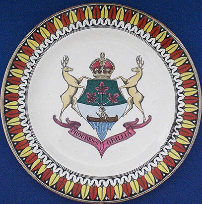
The arms used by the city of Orillia were designed by William Sword Frost, a prominent jeweller and mayor of the city. [21] Chapin describes them: “Per fess, the chief or a sprig of three maple leaves vert, the base argent an Indian paddling a canoe at sea proper. Crest: a crown. Motto: Progress Orillia. Supporters: two deer.” The depiction on the plate (fig. 44) does not correspond to Chapin in that the tinctures in the upper portion are reversed, the field being Vert (green) and the leaves Or (gold). Why should the canoe be paddled at sea, since Orillia is on the shores of two lakes and nowhere near the sea? The arms granted to the city by the Chief Herald of Canada on 27 September 1999 are largely based on the original design: https://www.gg.ca/en/heraldry/public-register/project/868.
The arms used by the city of Orillia were designed by William Sword Frost, a prominent jeweller and mayor of the city. [21] Chapin describes them: “Per fess, the chief or a sprig of three maple leaves vert, the base argent an Indian paddling a canoe at sea proper. Crest: a crown. Motto: Progress Orillia. Supporters: two deer.” The depiction on the plate (fig. 44) does not correspond to Chapin in that the tinctures in the upper portion are reversed, the field being Vert (green) and the leaves Or (gold). Why should the canoe be paddled at sea, since Orillia is on the shores of two lakes and nowhere near the sea? The arms granted to the city by the Chief Herald of Canada on 27 September 1999 are largely based on the original design: https://www.gg.ca/en/heraldry/public-register/project/868.
Fig. 44. Pottery plate by Adams, c. 1905.
Ottawa
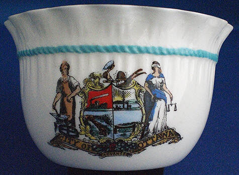
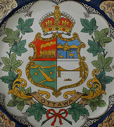
George Hay, a Scottish immigrant, businessman, politician, and philanthropist who moved to Bytown claims “to have designed the city’s coat of arms and to have suggested the name Ottawa to replace Bytown”. [22] Chapin describes the old arms of Ottawa as follows: “Quarterly (1) a locomotive and tender; (2) a lake, with in the foreground a tree between two stags the dexter one lodged [lying down], and in the background a range of hills and the sun issuant; (3) the locks of the Rideau canal; (4) Chaudière Falls and the suspension bridge with a boat in the foreground. Crest: ‘A hand holding a cleaving knife’. Motto: ‘Advance’. Supporters: Dexter a workman with hammer in right hand standing behind an anvil and sinister Justice.”
Chapin’s blazon does not contain a single tincture. In the crest, the hand does not hold a “cleaving knife”, but a hewing axe to square timber. [23] Also the “workman” is evidently a blacksmith. A sheaf of grain, a hand holding a hewing axe, a beehive with bees, and a plough adorns the top of Ottawa’s shield as crests. A large cogwheel at the foot of the blacksmith is a symbol of industry. The scroll below the shield is accompanied by roses, thistles and shamrocks (fig. 45). Figure 46 seems an effort to present a simpler design. The unofficial municipal heraldry of the nineteenth century and first half of the twentieth contained many references to agriculture, means of transportation, landscapes and industries which could include an entire factory with smoke stacks. Three of the quarters of Ottawa’s shield are landscapes or cityscapes. The composition reminds us of Jim Reeves song “Railroad, steamboat, river and canal”.
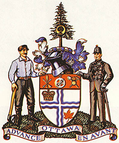
The new arms of Ottawa (fig. 47) were granted by the English Kings of Arms on 15 September 1954 and registered by the Canadian Heraldic Authority, with blazon and symbolism, on 15 June 2001: https://www.gg.ca/en/heraldry/public-register/project/213.
Fig. 45. Old arms of Ottawa on a bone china bagware bowl by Willow Art China, Stoke-on-Trent. The maker’s mark dates 1925-30. Willow is one of the few British companies to feature Canadian municipal arms on ceramic souvenirs after the First World War.
Fig. 46. Shield of the old armorial bearings of Ottawa on Wedgwood royal pattern pottery plate, blue border, 1912.
Fig. 47. The Arms of Ottawa were granted by the English Kings of Arms on 15 September 1954. From Heraldry in Canada (June, 1969), p. 8.
Parry Sound
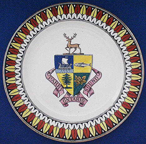
Chapin’s blazon of the arms of Parry Sound reads: “Quarterly (1) a lymphad; (2) a fish fesswise; (3) a fir tree; (4) a maple leaf. Crest: a stag passant.” In this description, not a single tincture is mentioned. Obviously, Chapin did not see the plate illustrated below (fig. 48). The design seems to have remained the same over the years. They are the same in Campbell’s 1990 work. [24]
Chapin’s blazon of the arms of Parry Sound reads: “Quarterly (1) a lymphad; (2) a fish fesswise; (3) a fir tree; (4) a maple leaf. Crest: a stag passant.” In this description, not a single tincture is mentioned. Obviously, Chapin did not see the plate illustrated below (fig. 48). The design seems to have remained the same over the years. They are the same in Campbell’s 1990 work. [24]
Fig. 48. Arms of Parry Sound, Ontario, on pottery plate by Adams, c. 1905.
Perth
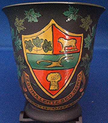
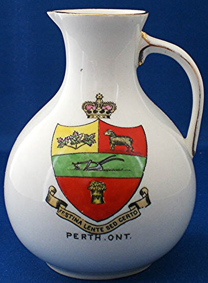
In Chapin’s civic armorial of 1937, the blazon of Perth’s arms reads: “On a fess vert a plow (or), between a chief per pale dexter or a sprig of three maple leaves vert and sinister gules a lamb (sable) and in base gules a garb (or). Motto: ‘Festina lente sed certo’.” The Latin motto signifies “Make haste slowly but surely”. A lamb Sable as in Chapin’s blazon is not likely correct. One of the basic rules of heraldry prohibits a colour being place on a colour or a metal on a metal. Moreover, a black sheep has a pejorative connotation and is not likely to appear in municipal arms unless it has some important historical significance. In figure 49 the gold lamb is on red, a metal on a colour as it should be. In figure 50, the lamb has a golden tint but is so heavily highlighted with black lines that it could be taken to be black. The maple leaves are multicoloured and the plough is silver or white. In an undated embroidery, both the lamb and plough are white: https://www.heraldry-wiki.com/heraldrywiki/wiki/Perth_(Ontario).
Perth was afterwards granted arms by Lord Lyon King of arms which are blazoned: “Gules, a Holy lamb passant reguardant, staff and cross Argent, with the banner of St. Andrew proper, all within an orle of the Second. Below the Shield which is ensigned with a mural coronet Azure, masoned Argent is set this Motto: ‘Pro Rege, Lege, et Grege’.” [25] These arms are largely patterned after those of Perth Scotland, including the motto which, incidentally, is close to that in the former arms of Kingston, except that here “Lege” precedes “Grege” see figures 40-42.
Fig. 49. Old shield of Perth on a Black ironstone (basalt) demitasse by Wedgwood, c. 1900.
Fig. 50. Old shield of Perth on bone china miniature jug by the Foley China (Wileman & Co.), 1900-10.
Toronto
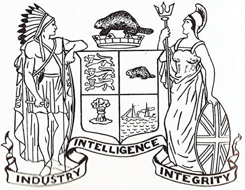
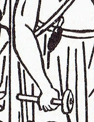
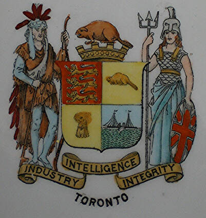
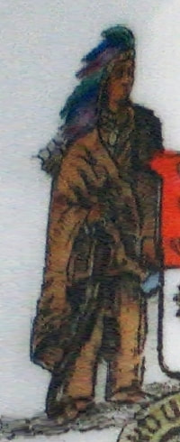
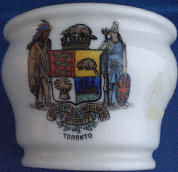
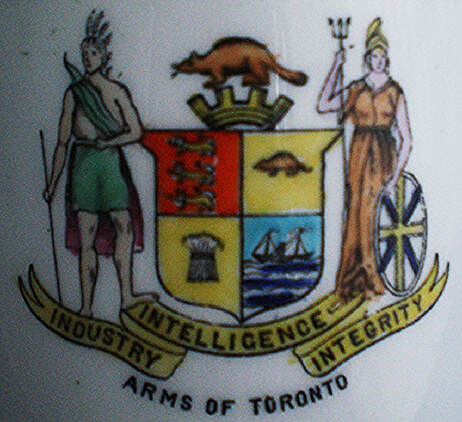
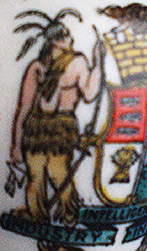
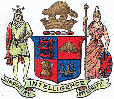
Chapin’s blazon for Toronto reads: “Quarterly (1) gules three lions passant guardant or; (2) or a beaver proper; (3) argent a garb or; (4) azure a steamboat or. Crest: Above a mural crown or, a beaver proper. Motto: ‘Industry, intelligence, integrity’. Supporters: Dexter an Indian habited proper, with in his belt a scalping knife and in his right hand a tomahawk with his left arm leaning on a bow, Sinister Britannia helmed and cuirassed, holding a trident in her right hand and with her left hand resting on a shield charged with the union of the three crosses proper.” Figure 51 corresponds to this description including the scalping knife in the belt seen above the tomahawk in the enlarged detail. The design dates from 1834. [26] In 1880 Woodward describes some of the quarters differently: the second quarter becomes “Sa., a beaver or” which corresponds to a gold beaver on a black field and the third quarter “Sa., a garb or” which means a gold wheat sheaf on a black field. [27] The shield of the first arms of Toronto is among those carved in stone by Cléophas Soucy outside the Peace Tower of the Parliament Building in Ottawa. Soucy also carved these arms in Confederation Hall with the beaver on a mural crown as the crest and the motto on a scroll below the shield.
At least six different manufacturers have featured the arms of Toronto on their ceramic pieces including two examples by W.H. Goss, the famous maker of miniature armorial souvenirs. I have not yet been able to find the arms of Toronto on any Wedgwood item, not on their famous tea sets, nor on their large plates dedicated to many cities across Canada.
Depictions of the first armorial bearings of Toronto have been generally consistent except for the accoutrements of the indigenous supporter. In figure 52, he holds a bow in his left hand, but holds a peace pipe with a long stem in his right hand, not a tomahawk. There exists such a combination as a peace pipe combined with a tomahawk, but their handle is not so long.
Fig. 51a-b. In the enlarged detail, the scalping knife is seen on the belt. Encyclopedia Canadiana, vol. 10 (Ottawa: Grolier Society of Canada, 1958), p. 102.
Fig. 52. Dainty white berry bowl by the Foley China (Wileman & Co.), c. 1900. The company also created a lager fruit bowl of the same type and with the same achievement of arms as also found on other pieces of its tableware.
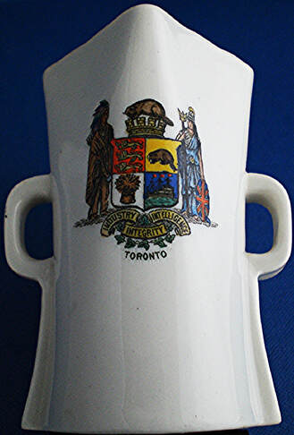
In the collection my wife and I assembled, there are two identical armorial bearings of Toronto by W.H. Goss (figs. 53-54). The indigenous supporter is fully dressed in buckskin with feather headdress, holds the bow in his left hand, and has a quiver of arrows strung across his back (fig. 53b).
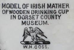
Fig. 53a-c. Ivory porcelain model of a drinking cup by W.H. Goss, c. 1905-14. The inscription with the mark should read “Irish mether or wooden drinking cup”. A mether is a ceremonial drinking vessel.
Fig. 54a-b. Ivory porcelain model of an urn by W.H. Goss, c. 1905-14. The orange figure is a decorator’s mark.
The manufacturer’s mark in figure 54 is accompanied by the inscription “MADE IN ENGLAND” (above, to the left). This does not mean that the Irish mether (fig. 53) and the urn (fig. 54) were manufactured at significantly different times [28].
In figure 55, the supporter on the left has a bow strung across his back, a long stick in his right hand, a short skirt or shorts with a piece of cloth covering his backside. The Union Flag pattern on Britannia’s shield is often blundered, but we see here an extreme case: see the correct disposition of the crosses and colouring on figure 58.
In figure 55, the supporter on the left has a bow strung across his back, a long stick in his right hand, a short skirt or shorts with a piece of cloth covering his backside. The Union Flag pattern on Britannia’s shield is often blundered, but we see here an extreme case: see the correct disposition of the crosses and colouring on figure 58.
Fig. 55. Toronto arms displayed on both a bone china cup and saucer by R.H. & S.L. Plant (Tuscan China), c. 1910. Inscribed under both: MADE EXPRESSLY FOR W.A. MURRAY & CO. LTD TORONTO CANADA.
In figure 56, the indigenous supporter leans on his bow and holds a tomahawk in his right hand as noted by Chapin. He wears a short skirt of feathers or strips of fur. This type of skirt was almost the norm on depictions of Amerindians, in and outside heraldry, from the sixteenth to the eighteen centuries. [29] It is still seen in the achievement of arms of Nova Scotia, which dates from 1625 or a little earlier, and it is described in the registration of the Canadian Heraldic Authority as: a “17th-century representation of an Aboriginal holding in the sinister hand an arrow proper”. The heraldic descriptions of humans are usually very short, often simply mentioning a person of a certain type and of a certain period without offering any details as to their wear. Placing this type of skirt on an 1834 supporter can be viewed as an anachronism, but not a severe one since there were two Amerindians dressed this way on the frontispiece of The Quebec Almanack of 1796, only 38 years earlier. [30] Figure 57 depicts the indigenous supporter in still another way.
Fig. 56. Ivory bone china miniature urn by Willow Art China, Longton. The mark dates from 1907-25, but it is likely prior to the First World War as are almost all Canadian miniature examples of this type.
Fig. 57. Heraldic Series B.A.C.T. postcard by Stoddart & Co., Halifax, West Yorkshire, England. A card in this series is postmarked 1906.
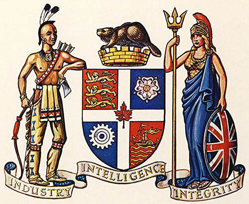
In the arms granted Toronto by the English King of Arms on 29 December 1961, a white cross, which divides clearly the shield into four quarters, is added to the design (fig. 58). The red maple leaf in its centre represents Canada. The white rose of York replaces the beaver in the 2nd quarter referring to York, the former name of the city. A cogwheel supplants the wheat sheaf in the 3rd quarter to illustrate that the economy of the city has shifted from an agricultural to an industrial base. Everything else was retained from the older depiction. The use of the three lions in the 1st quarter, namely the arms of the Kingdom of England, was sanctioned by Queen Elizabeth II. The lions along with Britannia, the supporter on the right, symbolize the bonds with the mother country and the British heritage of the city. The steamboat in the 4th quarter is meant to represent the paddle steamer Great Britain which plied the waters of Lake Ontario in the 1830s and was frequently seen in York harbour. The beaver, which was once a dominant symbol of Canada, represents industry, a word contained in the motto. The mural crown, built like a wall with battlements, frequently appears in the crest of civic arms.
The left supporter, pays homage to the Mississauga First Nation. It is simply described as: “a Mississauga Indian habited and accoutered and supporting in the dexter hand a bow …. all proper”. This description, like so many others of human supporters, does not tell us in any way what the attire looks like nor, apart from the bow, what the accoutrements might be. [31]
The left supporter, pays homage to the Mississauga First Nation. It is simply described as: “a Mississauga Indian habited and accoutered and supporting in the dexter hand a bow …. all proper”. This description, like so many others of human supporters, does not tell us in any way what the attire looks like nor, apart from the bow, what the accoutrements might be. [31]
Fig. 58. Armorial bearings granted to the City of Toronto by the English King of Arms on 29 December 1961. From Beddoe’s Canadian Heraldry (1981), p. 87, no 122.
The Municipality of Metropolitan Toronto, created in 1953, was granted arms on 17 July 1991 based on the original concept of the famous heraldists Alexander Scott Carter: https://www.gg.ca/en/heraldry/public-register/project/1527. After the amalgamation in 1997, the City of Toronto was granted new armorial bearings on 11 January 1999: https://www.gg.ca/en/heraldry/public-register/project/811. These arms are completely different from the former arms.
Wellington County
The arms of Wellington County were designed for a corporate seal in 1860 by the well-known Canadian heraldist Edward Marion Chadwick who blazoned them as: Gules, a cross between five plates in saltire in each quarter argent, all within a bordure of the last charged with eight garbs proper and for a crest a Field Marshall [sic] of England temp. George the Fourth, mounted, proper. [32] An 1860 impression of the seal shows the plates (silver roundels) to be in saltire in all four quarters as described by Chadwick. [33]
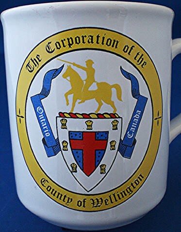
It seems that Chadwick’s seal design was reworked at a later date, sometime prior to the grant by Lord Lyon in 1984. Another description of the content of the seal corresponds to the image on the mug (fig. 59): Azure, a cross Gules between in dexter and sinister chief five pellets in saltire and in dexter and sinister base three pellets in bend and bend sinister, all within a bordure argent charged with seven garbs Or. [34]
The depiction on the cup (fig. 59) differs from Chadwick’s design in several ways. The field is now blue instead of red and the cross is red instead of white. Black roundels (pellets) rather than white ones occupy the four quarters and these, in the two lower quarters, are arranged in bend and bend sinister rather than being in saltire. The equestrian figure in the crest is now almost all gold rather than being in natural colours.
Fig. 59. Pottery coffee mug, illustrated with a version of the seal of Wellington County, prior to the grant of arms by Lord Lyon in 1984. Inscribed on bottom in relief MADE IN ENGLAND and stamped: "Country Town Tile Carleton Place, Canada".
The arms of Wellington County were recorded at the Court of the Lord Lyon in Edinburgh, Scotland on 19 September 1984 and blazoned: Azure a cross gules fimbriated argent between in each quarter five plates in saltire all within a bordure argent charged of seven garbs tenné and for a crest above a coronet composed of a circlet of eight points vert alternating with garbs or the circlet charged with eight maple leaves bendways or (four visible) on a wreath argent and azure a figure of the first Duke of Wellington holding a sword in his dexter hand and mounted on a horse passant proper. [35]
There are substantial differences between Chadwick’s blazon and that of the Scottish grant. The field and the cross are differently coloured and the equestrian crest figure is named specifically as the first Duke of Wellington. The Canadian Heraldic Authority registered the grant on 29 July 1996: https://www.gg.ca/en/heraldry/public-register/project/627. The coronet represents a county and the wheat sheaves symbolize an agricultural area. The motto is “Vision Valour”. Part of the contents of the shield, with colour modifications, come from the armorial bearings of the Duke of Wellington: https://commons.wikimedia.org/wiki/File:Coat_of_Arms_of_the_Duke_of_Wellington.svg.
There are substantial differences between Chadwick’s blazon and that of the Scottish grant. The field and the cross are differently coloured and the equestrian crest figure is named specifically as the first Duke of Wellington. The Canadian Heraldic Authority registered the grant on 29 July 1996: https://www.gg.ca/en/heraldry/public-register/project/627. The coronet represents a county and the wheat sheaves symbolize an agricultural area. The motto is “Vision Valour”. Part of the contents of the shield, with colour modifications, come from the armorial bearings of the Duke of Wellington: https://commons.wikimedia.org/wiki/File:Coat_of_Arms_of_the_Duke_of_Wellington.svg.
Windsor
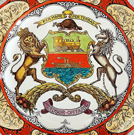
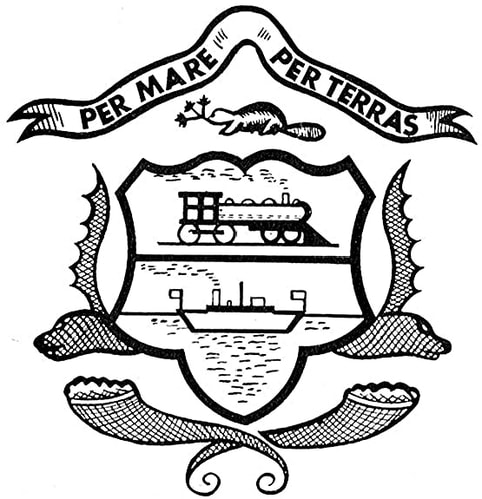
Chapin's description of the old arms of Windsor reads: “Per fess in chief a locomotive and in base a ferryboat. Crest: A beaver holding in his mouth a branch of tree twigs. Motto: ‘Per mare per terras’.”
The locomotive and ferryboat represent the importance of these two means of transportation in the city’s economy. They also echo to some extent the motto which translates “By Sea by Lands”. This motto is also that of several MacDonald and MacDonnell clans and may have some connection with an important member of the former clan such as the prominent businessman Colin MacDonald.[36] The placement of the motto on a scroll above the crest in the Scottish tradition supports this theory as well as the fact that Windsor is far away from the sea. Per Lacus Per Terram (By Lakes by Land) would have corresponded better to its geographical location.
In the crest the beaver with a sprig of maple in the mouth was an important symbol of Canada in the nineteenth century and in the early years of the twentieth century. It may also refer to the early fur trade in the area and to such fur traders as Alexander Duff who constructed the Duff-Baby House, an important historical monument in Windsor. [37] The beaver also frequently alludes to technical ability (building dams) and diligence. The supporters on the plate (fig. 60), a lion and a unicorn, are lifted directly from the royal arms and are no doubt chosen in connection with Windsor Castle which has been associated with British monarchs since William the Conqueror. There is no direct link with the House of Windsor which came into being on 17 July 1917, whereas the plate is dated 1907 from its Wedgwood mark. The two cornucopias on which they stand are symbols of abundance often related to agriculture.
The Wedgwood plate must be one of the few examples of the old arms of Windsor depicted in colour since Chapin’s description in 1937 contains no colours. The design belongs by many aspects to the category I have sometimes dubbed the “Railroad, steamboat, river and canal” type inspired by Jim Reeves’ song and already quoted for the armorial device of Ottawa. Such arms often accumulate many elements and become very busy. This is not the case of the arms of Windsor where the shield displays only two items which convey a quaint and dynamic simplicity with its own appeal. The locomotive and steamboat are facing right (contourné) which is not the usual heraldic positioning but is something that happens in heraldry.
On 8 May 1992, the City of Windsor was granted new armorial bearings by the Chief Herald of Canada. They are quite different from the old ones: https://www.gg.ca/en/heraldry/public-register/project/1577. A salute to the old arms is retained in a locomotive wheel and a steamboat helmswheel on the pendants of the two lion supporters which each hold a cornucopia with tomatoes and corn in them. The motto “The River and the Land Sustain Us” contains the images of water and land as did the older motto. The old shield of arms is still present on the city police badge. For the symbolism of the components, see: https://www.citywindsor.ca/residents/historyofwindsor/pages/coat-of-arms.aspx.
Fig. 60. Old armorial bearings of the City of Windsor on a royal pattern Wedgwood pottery plate, red border, impressed on bottom 3AJ which equals 1907.
Fig. 61. An unusual, almost cartoon-like, rendition of the old arms of Windsor. The cornucopias at the base are clear, but not what is featured on both sides of the shield. These added features are meant to represent the heads of deer with one antler showing as are clearly depicted on the city police badge in use today. From Encyclopedia Canadiana, vol. 10 (Ottawa: Grolier Society of Canada, 1958) p. 337.
Manitoba
Winnipeg
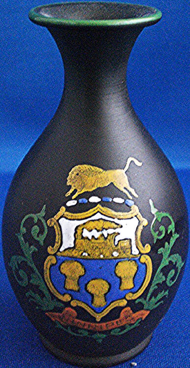
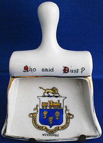
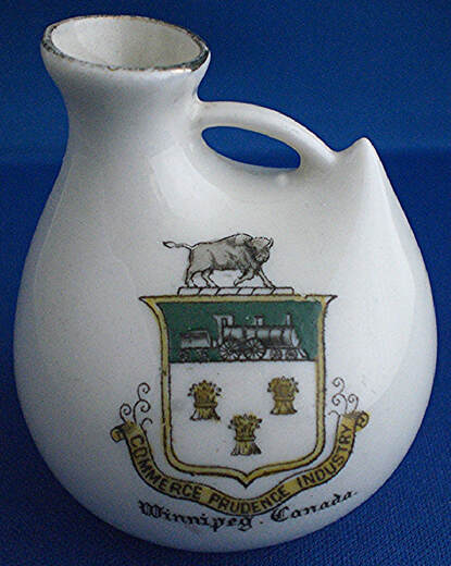
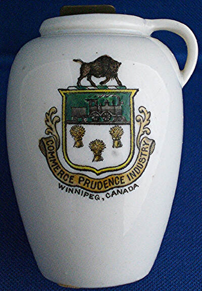
The first arms of Winnipeg go back to at least the 1870s. [38] In 1937 Chapin describes them as follows: “Vert three garbs or, on a chief azure a locomotive and tender or. Crest: a bison statant proper. Motto: Commerce, prudence, industria [sic].” He further comments: “City clerk is authority for colours. The official stationery shows the field by tincture lines azure not vert, and in the manual the tincture lines show gules. The city clerk says the engine is yellow outlined in black with black wheels.” The blazon and comments reveal a great deal of confusion regarding the composition of the design, but this uncertainty existed long before 1937 as figures 62 to 66 demonstrate.
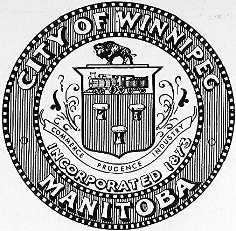
None of the illustrations below correspond to Chapin’s blazon. Furthermore, the last word in the motto is “industry” not “industria” as given by Chapin. In figures 62-63, the field is blue and the chief is white; in figures 63-64, these colours are reversed. This is a striking example of the extent to which the whims of commercial artists take over when armorial devices are not registered with an official body and properly described. In figures 63-65, the bison as well as the locomotive and tender are facing to the sinister. This reversal may be the result of an error in a process called transfer printing which involves several steps. [39] Figure 66, which is a drawing from the municipal seal, shows that the bison and locomotive should be facing to the dexter as in figure 62.
Fig. 62. Black ironstone (basalt) miniature vase by Wedgwood, c. 1905.
Fig. 63. Bone china miniature dust pan by Carlton China (Wiltshaw and Robinson Ltd.), 1902-14.
Fig. 64. Ivory bone china miniature duck-shaped vase by Florentine China (Taylor & Kent), c. 1910.
Fig. 65. Ivory porcelain pitcher by W.H. Goss, c. 1905-14, inscribed on opposite side: MODEL OF PITCHER IN IPSWICH MUSEUM FOUND AT LISTON ABBEY.
Fig. 66. Depiction of the seal of Winnipeg with the arms of the city in the centre: Encyclopedia Canadiana, vol. 10 (Ottawa: Grolier Society of Canada, 1958) p. 342. The vertical lines indicate red (Gules) for the field which is contrary to all the other depictions seen here. It seems that this colour was intended from the start since the drawing replicates the seal.
New and completely different arms were granted to Winnipeg by the Kings of Arms of England on 12 January 1979 and registered by the Canadian Heraldic Authority on 20 May 2005: https://www.gg.ca/en/heraldry/public-register/project/504.
Alberta
Calgary
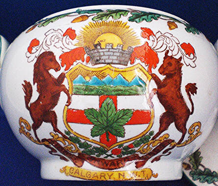
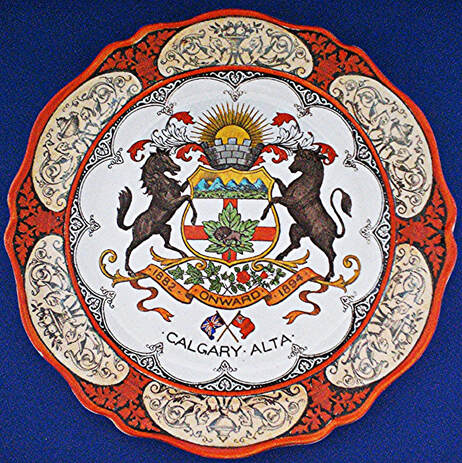
Chapin describes and comments on the armorial bearings of Calgary in these terms: “Argent a cross gules surmounted by a maple leaf vert charged with a bull bison proper; a chief per fess indented azure and the base of the chief per fess undy argent and vert. Crest: Out of a mural crown, a demi-sun in splendour issuant. Motto: ‘Onward’. Supporters: Dexter a horse, and sinister a steer.
“The device of the chief which ‘shows the Rockies―our pride and glory’ is drawn in various ways. Sometimes the demi-sun issuant also appears in the chief. The device of the chief is doubtless derived from the device on the arms of Alberta which in the royal warrant of 1907 is described as ‘Azure in front of a range of snow mountains proper, a range of hills vert’.”
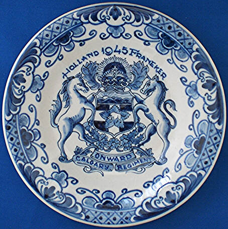
Figure 67 contradicts Chapin’s belief that the scenery in chief of the shield of Calgary is derived from the arms of Alberta since it belongs to a period when Calgary was still part of the Northwest Territories, that is prior to 1 September 1905 when the Province of Alberta was created. Already between figures 67 and 68, which are about a decade apart, differences in content appear. In figure 67, no bison is seen on the central maple leaf, but maple leaves, a rose (England), a thistle (Scotland) and shamrock (Ireland) decorate the space between the shield and motto scroll. In figure 68, the bison is on the leaf and all the other components are there. In figure 69, which is a regimental badge incorporating the city arms, the sinister supporter (spectator’s right), is drawn closer to a unicorn than a steer and the Royal Crown tops the shield instead of a mural crown.
Fig. 67. Pottery sugar bowl decorated by the armorial emblem of Calgary and a frieze of oak leaves and acorns. The inscription on the first scroll beneath the shield is the motto “Onward.” The second scroll is inscribed “Calgary N.W.T.”, which is a clear indication that the bowl was manufactured before 1 September 1905 when Alberta was carved out of the Northwest Territories to become a province. Wedgwood made a lot of tableware with the oak wreath pattern.
Fig. 68. Royal pattern plate by Wedgwood, 1913. The armorial bearings are essentially the same as in figure 67, except for the bison appearing on the maple leaf. The Union Jack and Red Ensign below are patriotic additions, but often depicted with the arms.
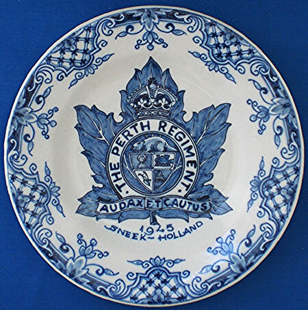
Fig. 69. Badge of The Calgary Regiment composed of the assumed city arms topped by the Royal Crown. The Town of Franeker was liberated on 16 April 1945. The supporter on the right looks more like a unicorn than a steer. Delftware pottery plate by Tichelaar Makkum of the Netherlands. Inscribed on bottom “Tm” in blue below the factory mark.
Edmonton
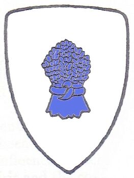
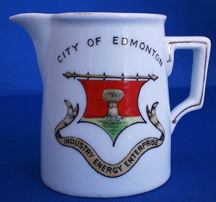
In 1937 Chapin blazons the arms of Edmonton as “Argent a garb azure [fig 70]. Motto: ‘Industry, energy, enterprise.’ ” Around the same time, the arms were carved in stone, without a motto, by Cléophas Soucy as part of the ornamentation on the outside of the Peace Tower of the Parliament Building in Ottawa. No one seems to know the circumstances surrounding the adoption of this device. The design dates at least from the beginning of the twentieth century as witnessed by figure 71. It is interesting that on this earlier version, the tinctures are not the same as described by Chapin (compare figs. 70 and 71). Figure 71 can be blazoned Gules on a grassy base Vert, a garb Or. A Wedgwood plate in the royal pattern with a green border displays the shield of Edmonton with a blue field, a gold wheat sheaf (garb) on a green grassy islet. A wreath of green maple branches encloses the shield which is suspended from a curtain rod as in figure 71. The motto is inscribed on a scroll beneath the shield. [40] Edmonton again exemplifies the fact that freely adopted arms are subject to fanciful variations.
In 1937 Chapin blazons the arms of Edmonton as “Argent a garb azure [fig 70]. Motto: ‘Industry, energy, enterprise.’ ” Around the same time, the arms were carved in stone, without a motto, by Cléophas Soucy as part of the ornamentation on the outside of the Peace Tower of the Parliament Building in Ottawa. No one seems to know the circumstances surrounding the adoption of this device. The design dates at least from the beginning of the twentieth century as witnessed by figure 71. It is interesting that on this earlier version, the tinctures are not the same as described by Chapin (compare figs. 70 and 71). Figure 71 can be blazoned Gules on a grassy base Vert, a garb Or. A Wedgwood plate in the royal pattern with a green border displays the shield of Edmonton with a blue field, a gold wheat sheaf (garb) on a green grassy islet. A wreath of green maple branches encloses the shield which is suspended from a curtain rod as in figure 71. The motto is inscribed on a scroll beneath the shield. [40] Edmonton again exemplifies the fact that freely adopted arms are subject to fanciful variations.
Fig. 70. Colourized version of the arms of Edmonton as described by Howard M. Chapin. From a line print in his “Canadian Municipal Arms”, 1937, p. 248.
Fig. 71. Bone china cream jug by Shelley (Late Foley), c. 1910. The curtain rod on the shield is purely fanciful.
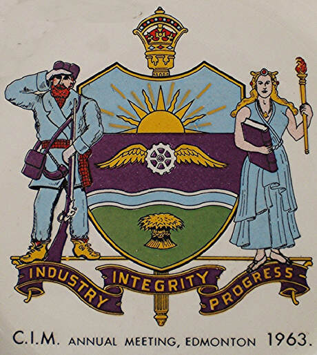
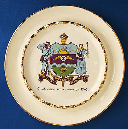
Sometime between 1956 and 1963, Edmonton adopted a much more complete achievement of arms which included many more components on the shield, supporters and the mace of the Legislative Assembly behind the shield. [41] Only the wheat sheaf and motto were kept (fig. 72).
Fig. 72. From a pottery ashtray manufactured by Hycroft China Ltd., Medicine Hat, Alberta, for the annual meeting of the Canadian Institute of Mining (C.I.M.), 1963.
A slightly modified version of the Edmonton arms was granted by the Chief Herald of Canada to the city on 8 October 1995. The blazon, components and symbolism are found on the site of the Canadian Heraldic Authority: https://www.gg.ca/en/heraldry/public-register/project/626.
British Columbia
Burnaby, District of
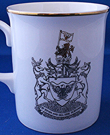
The armorial bearings of the Corporation of the District of Burnaby (fig. 73) were granted by the Chief Herald of Canada on 24 April 1991: https://www.gg.ca/en/heraldry/public-register/project/1502. The components’ symbolism is found on this site: https://www.burnaby.ca/our-city/about-burnaby/coat-arms-and-city-symbols
The armorial bearings of the Corporation of the District of Burnaby (fig. 73) were granted by the Chief Herald of Canada on 24 April 1991: https://www.gg.ca/en/heraldry/public-register/project/1502. The components’ symbolism is found on this site: https://www.burnaby.ca/our-city/about-burnaby/coat-arms-and-city-symbols
Fig. 73. Bone China coffee mug inscribed “Duchesss” which is a trade mark for A.T. Finney & Sons, Ltd.
New Westminster
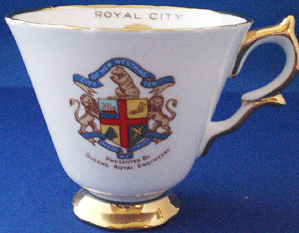
Chapin’s description of the arms of New Westminster is: “Argent a cross azure cantoned by a ship at sea, a plow, a Douglas fir tree, and two salmon in saltire. Crest: A bear sitting on its haunches. Motto: ‘In God we trust’. Supporters: Two lions guardant.” The same components were retained in the achievement of arms granted to the city by the Canadian Heraldic Authority on 29 September 1992. Added to the composition were a mural crown in the crest, a medallion hanging from the neck of the two supporters and a compartment for them to stand on: https://www.gg.ca/en/heraldry/public-register/project/1606. The symbolism of components is outlined here: https://www.heraldry-wiki.com/heraldrywiki/wiki/New_Westminster. In figure 74, the cross on the shield is red rather than blue as it is in the granted arms and as described by Chapin.
Chapin’s description of the arms of New Westminster is: “Argent a cross azure cantoned by a ship at sea, a plow, a Douglas fir tree, and two salmon in saltire. Crest: A bear sitting on its haunches. Motto: ‘In God we trust’. Supporters: Two lions guardant.” The same components were retained in the achievement of arms granted to the city by the Canadian Heraldic Authority on 29 September 1992. Added to the composition were a mural crown in the crest, a medallion hanging from the neck of the two supporters and a compartment for them to stand on: https://www.gg.ca/en/heraldry/public-register/project/1606. The symbolism of components is outlined here: https://www.heraldry-wiki.com/heraldrywiki/wiki/New_Westminster. In figure 74, the cross on the shield is red rather than blue as it is in the granted arms and as described by Chapin.
Fig. 74. Bone china cup and saucer by Taylor & Kent, celebrating the hundredth anniversary of New Westminster in 1960.
Vancouver
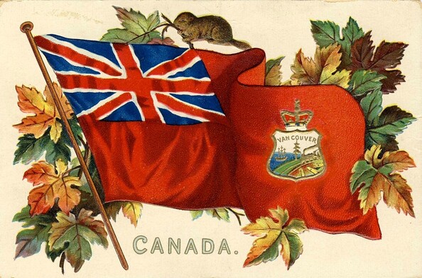
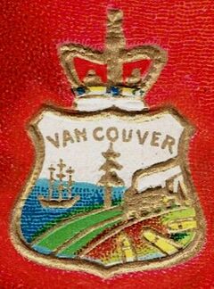
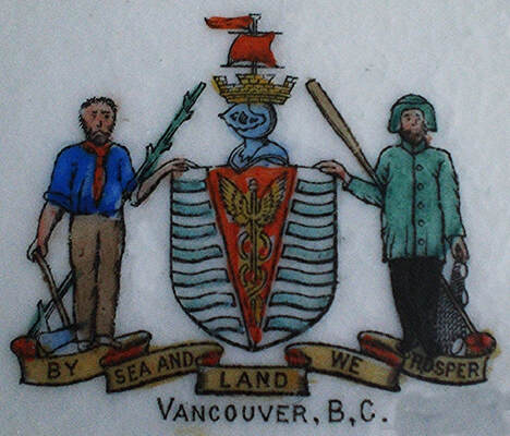
From its incorporation in 1886 up to 1903, Vancouver adopted a badge-like emblem prepared by L.A. Hamilton, a draughtsman and one of the city councillors. His design was in essence a view of aspects of the city with emphasis on its economic base “namely the lumber trade, the development of a sea-port and the link provided by the Canadian Pacific Railway.” [42] . The image which appeared also on the municipal seal has been described as depicting “a sailing ship, a tree, wooden docks and a train.” [43]
This piece of scenery placed on a shield with the Royal Crown on top was reproduced in the fly of the Red Ensign (fig. 75a-b) as part of a series that placed the arms of the Dominion of Canada, all the provinces and major cities on this same flag. What appears on the lower left of the shield are logs as are clearly depicted on the original design with the date of incorporation and various inscriptions that can be viewed here: https://www.heraldry-wiki.com/heraldrywiki/wiki/Vancouver.
Fig. 75a-b. Postcard c. 1910 by “Raphael Tuck & Sons ‘Canadian Coats of Arms’ Post Card Series No. 2911 Art publishers to Their Majesties the King and Queen. Printed in Saxony”.
Following the visit of the Duke of Cornwall to Vancouver in 1901, the mayor of the city, Major T.O. Townley asked James Blomfield, a local artist, to prepare sketches for a new design which was adopted in 1903. The shield and its symbolism have been outlined in a letter by Blomfield and have been summarized by Robert Watt: “The shield (barry wavy, Argent and Azure, on a pile Gules a caduceus or) was meant to represent Vancouver’s situation on the sea and its world wide commerce, alluded to through the use of the caduceus of Mercury, god of commerce. The use of the ship’s sail and the mural crown in the crest were to indicate Vancouver’s status as a sea-port.” He also points out: “Unfortunately, uninformed redesignings resulted in its immediate debasement. Blomfield himself had considerable knowledge of heraldry. Variations of his idea were used as the civic coat-of-arms from 1903-1969.” [44]
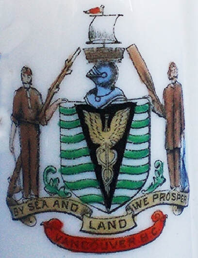
Chapin describes the arms of Vancouver as follows: “Barry undy argent and azure on a pile gules a caduceus argent. Crest: Above a helmet side view and a mural crown the topmast of a square-rigged ship with top sail set and a pennant flying. Motto: ‘By sea and land we prosper’. Supporters: Dexter a woodman his right hand resting on an axe handle and holding under his left arm a pole raguly bend-sinister-wise; sinister a fisherman in ‘southwester’ costume holding under his right arm an oar bendwise. The tincture lines on the official stationery show the barry as argent and vert.” Chapin describes the caduceus as being “argent” (silver) whereas in figures 76-78, it is Or (gold). The barry-wavy argent and vert for the field, noted by Chapin on official stationery, is illustrated by figure 76 and figure 77. In the latter, the pile becomes Sable (black) and the garments of the supporters and almost everything they hold become a brownish colour.
Chapin describes the arms of Vancouver as follows: “Barry undy argent and azure on a pile gules a caduceus argent. Crest: Above a helmet side view and a mural crown the topmast of a square-rigged ship with top sail set and a pennant flying. Motto: ‘By sea and land we prosper’. Supporters: Dexter a woodman his right hand resting on an axe handle and holding under his left arm a pole raguly bend-sinister-wise; sinister a fisherman in ‘southwester’ costume holding under his right arm an oar bendwise. The tincture lines on the official stationery show the barry as argent and vert.” Chapin describes the caduceus as being “argent” (silver) whereas in figures 76-78, it is Or (gold). The barry-wavy argent and vert for the field, noted by Chapin on official stationery, is illustrated by figure 76 and figure 77. In the latter, the pile becomes Sable (black) and the garments of the supporters and almost everything they hold become a brownish colour.
Fig. 76. Armorial bearings on ivory bone china miniature heart-shaped pin dish by Willow Art China Longton, maker’s mark dated 1907-25.
Fig. 77. Bone china miniature leather bottle by The Foley Art China, 1900-10. Inscribed on bottom: “MODEL OF LEATHER BOTTLE FOUND ON THE BATTLE-FIELD OF NEWBURY. 1644. NOW IN MUSEUM.”
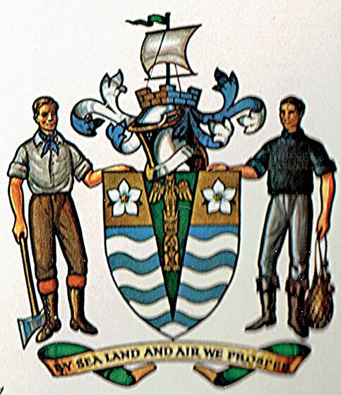
In 1969 Vancouver finally obtained officially granted armorial bearings with several modifications which are described by R. Thompson, the city clerk: “… the Caduceus of Mercury has been replaced by a Totem Pole of Kwakiutl Design: the chief has been charged with two Dogwoods; the Helm has been properly drawn; the Mantle has been added, the word ‘Air’ has been added to the Motto.” [45] The blazon and symbolism of this new creation (fig. 78) are given on this site: https://www.heraldry-wiki.com/heraldrywiki/wiki/Vancouver.
Fig. 78. Achievement of arms of Vancouver granted by the Kings of Arms of England on 31 March 1969. From Beddoe’s Canadian Heraldry, p. 127.
Part II Canadian Ceramics
After the Second World War, Canadian civic arms on British ceramics mostly took the form of coffee or beer mugs. From the 1960’s to the 1990’s, Canadian Art China of Collingwood (Ontario) and a few other domestic companies decorated ceramic pieces with Canadian municipal arms on blanks, some of which are marked as being made in the USA. This trend was to prove ephemeral. A few examples made in other countries are added to show special use of some municipal arms such as on military badges.
New Brunswick
Fredericton
The armorial bearings of the City of Fredericton are featured on at least one piece of ceramic (fig. 79) and on at least one postcard (fig. 80) where they are poorly depicted particularly where the Union Device is concerned. Figure 81 provides details regarding the grant, the blazon and the symbolism of the city’s armorial bearings and figure 82 shows a correct depiction.
The armorial bearings of the City of Fredericton are featured on at least one piece of ceramic (fig. 79) and on at least one postcard (fig. 80) where they are poorly depicted particularly where the Union Device is concerned. Figure 81 provides details regarding the grant, the blazon and the symbolism of the city’s armorial bearings and figure 82 shows a correct depiction.
Fig. 79. The armorial bearings of the City of Fredericton within the municipal police badge on a pottery coffee mug by an unknown manufacturer.
Fig. 80. The same armorial bearings as figure 79 with the incorporation date added. As so often happens, the Union Device on the upper left shield is faulty. From the corner of a postcard entitled “Queen Street, Fredericton, N.B, Canada” by an anonymous manufacturer.
Fig. 81. From Heraldry in Canada (Dec. 1975), p. 3.
Fig. 82. Armorial bearings of the City of Fredericton as registered by the Canadian Heraldic Authority on 16 June 1992. See the original here: https://www.gg.ca/en/heraldry/public-register/project/1592.
In his Notes and queries of 7 August 1880, John Woodward describes the arms of Fredericton as follows: “Arg., on a mount in base a pine tree ppr. The chief per pale: 1. The united crosses of SS. George, Andrew, and Patrick, known as the ‘Union Jack’; 2 The royal arms of Great Britain and Ireland. (The chief, in fact, consists of the national flag and the royal standard impaled).” [46] Here Woodward attempts to place the content of the three shields as shown in figure 82 on a single shield which represents the normal arrangement for armorial bearings. The pine tree appears in the base of the shield; the upper part is occupied by the Union Jack on the left touching the royal arms on the right, which could be described as the royal standard when given a rectangular shape. The cross with rays as clearly seen in most depictions is not mentioned.
Chapin only considers the pine tree shield to be the arms of the city and the cross with rays to be the crest: “Argent a pine tree vert. Crest: A Latin cross with an aura radiant. Motto: ‘Fredericopolis silvae filia nobilis’.” He further comments: “These arms are usually used between two other shields, viz. at dexter a shield bearing the union of the three crosses and at sinister the royal shield of England. Both of these shields are crowned with the Royal Crown.” Chapin also includes Woodward’s blazon as described above.
Ian Campbell quotes some interesting observations regarding these arms:
“… 1848, the city was incorporated…. At that time the arms of the new city were designed by Dr. James Robb, a professor at King’s College (now University of New Brunswick), who was also a member of Fredericton’s first City Council. The arms were drawn without regard to the laws of heraldry and were not recorded or approved by the College of Arms in Britain at that time.
“In 1955 when the late Brigadier Michael Wardell of Fredericton entered into discussions with the College of Arms on behalf of the City with a view to obtaining official authority for the arms, it was stated that in no circumstances could such use of the royal emblems be sanctioned. The difficulties seemed insurmountable, but the discussions continued over the years, the three successive mayors of Fredericton urged the city’s case for official recognition of its arms based on unbroken usage for more than a century.
“In 1970, as a result of procedures suggested by Sir Anthony Wagner, the Garter King of Arms, a petition was made to the Queen by the Governor General of Canada on a proposal of the Lieutenant-Governor of New Brunswick. The Queen, in view of the special circumstances, approved in principle the use of the old arms, thus empowering the College of Arms to grant to the City of Fredericton the lawful authority and unique distinction of being entitled to bear and use the Royal Arms forever as set forth in the Letters Patent presented to the City on June 10th, 1971.” [47]
Moncton
Chapin describes the arms of Moncton as follows: “Quarterly (1) argent a beehive beset with bees volant; (2) vert three garbs; (3) a locomotive; (4) the sea-shore showing the tidal bore. Crest: An arm embowed holding a hammer. Motto: ‘Resurgo’. Supporters: A blacksmith with anvil and tongs, and a farmer with scythe.” In figure 83, the field of the 1st quarter is Azure not Argent and the field of 2nd quarter is Gules not Vert. Also, the blacksmith supporter holds a hammer instead of tongs. The design now appears on the city flag which will no doubt give the composition a degree of stability. The flag and symbolism of the arms as well as the meaning of the motto are found here: https://www.crwflags.com/fotw/flags/ca-nb-mt.html#:~:text=Moncton's%20official%20coat%20of%20arms,is%20depicted%20at%20lower%20right.
Chapin describes the arms of Moncton as follows: “Quarterly (1) argent a beehive beset with bees volant; (2) vert three garbs; (3) a locomotive; (4) the sea-shore showing the tidal bore. Crest: An arm embowed holding a hammer. Motto: ‘Resurgo’. Supporters: A blacksmith with anvil and tongs, and a farmer with scythe.” In figure 83, the field of the 1st quarter is Azure not Argent and the field of 2nd quarter is Gules not Vert. Also, the blacksmith supporter holds a hammer instead of tongs. The design now appears on the city flag which will no doubt give the composition a degree of stability. The flag and symbolism of the arms as well as the meaning of the motto are found here: https://www.crwflags.com/fotw/flags/ca-nb-mt.html#:~:text=Moncton's%20official%20coat%20of%20arms,is%20depicted%20at%20lower%20right.
Fig. 83. Armorial bearings of Moncton. Pottery plate decorated in Canada by Canadian Art China, Collingwood, Ontario, 1960s to 1990s.
Quebec
Granby
Chapin’s blazon of Granby’s arms reads: “Azure a factory building with four chimneys and at sinister a blast furnace. Crest: An ant volant. Motto: ‘Forward’. Supporters: A mechanic with a wrench and a factory worker with a rod and cog wheel.” By 1959, the year of its centennial, the city had adopted new arms as in figure 84. In more recent depictions, the maple leaf and the lion are gold rather than white and the caduceus is black rather than blue. The maple leaf represents Canadian citizens that are of both English and French origins as denoted by the lion of England and fleurs-de-lis representing France just opposite. The book displays the Greek letters Alpha and Omega which signify “the beginning and end of all things, beliefs, education, etc.” The caduceus is said to represent commerce and industry. The motto “Pour y parvenir” means “To get there” or “To achieve it.” The arms are still in existence: https://grandquebec.com/armoiries-blasons/armoiries-granby/.
Chapin’s blazon of Granby’s arms reads: “Azure a factory building with four chimneys and at sinister a blast furnace. Crest: An ant volant. Motto: ‘Forward’. Supporters: A mechanic with a wrench and a factory worker with a rod and cog wheel.” By 1959, the year of its centennial, the city had adopted new arms as in figure 84. In more recent depictions, the maple leaf and the lion are gold rather than white and the caduceus is black rather than blue. The maple leaf represents Canadian citizens that are of both English and French origins as denoted by the lion of England and fleurs-de-lis representing France just opposite. The book displays the Greek letters Alpha and Omega which signify “the beginning and end of all things, beliefs, education, etc.” The caduceus is said to represent commerce and industry. The motto “Pour y parvenir” means “To get there” or “To achieve it.” The arms are still in existence: https://grandquebec.com/armoiries-blasons/armoiries-granby/.
Fig. 84a-b. Pottery stein inscribed in gold on bottom U.S. ORIGIN and impressed: MILWAUKEE. The words “U.S. origin” often appear on ceramic pieces decorated in Canada.
Quebec City
For a colour illustration, description and history of the arms of Quebec City as in figure 85, see figure 33 and the accompanying comments.
For a colour illustration, description and history of the arms of Quebec City as in figure 85, see figure 33 and the accompanying comments.
Fig. 85. The 1949 arms of the City of Quebec on a Beauceware pottery stein, Saint-Joseph-de-Beauce, Quebec, c. 1960. The frieze at the base alternates beavers and maple leaves. These arms are carved in this format by Cléophas Soucy in Confederation Hall of the Parliament Building where they include a mural crown on top of the shield, the motto below and a lily flower added on each side to underline the French character of the city.
Stanbridge, Township of, and Stanbridge East
In 1997 the Township of Stanbridge changed its form of government and became Stanbridge East. The arms, flag and badge of the Corporation of the Township of Stanbridge and the Municipality of Stanbridge East were granted armorial bearings by the Chief Herald of Canada on 18 May 1990 and 20 June 2008 respectively. View the illustrations, blazons and symbolism of both: https://www.gg.ca/en/heraldry/public-register/project/1429 and https://www.gg.ca/en/heraldry/public-register/project/1308. Both are the same as figure 86.
In 1997 the Township of Stanbridge changed its form of government and became Stanbridge East. The arms, flag and badge of the Corporation of the Township of Stanbridge and the Municipality of Stanbridge East were granted armorial bearings by the Chief Herald of Canada on 18 May 1990 and 20 June 2008 respectively. View the illustrations, blazons and symbolism of both: https://www.gg.ca/en/heraldry/public-register/project/1429 and https://www.gg.ca/en/heraldry/public-register/project/1308. Both are the same as figure 86.
Fig. 86. Unmarked pottery plate, decorated over glaze.
Ontario
Barrie
The arms of Barrie were granted by the Kings of Arms of England on 23 April 1975 (fig. 87). They were registered by the Canadian Heraldic Authority on 20 January 2005: https://www.gg.ca/en/heraldry/public-register/project/436.
The wavy blue bars on white allude “to Barrie’s position on the waters of Kempenfelt Bay.” A shield divided into bars is named barry in heraldry and here the bars constitute a pun on the name Barrie. They are inspired by those on the shield of Sir Robert Barrie, a naval officer after whom the city was named. The red chief replicates the colour of the bars in the arms of Sir Robert and the naval crown in centre also derives from his arms. The winged wheel on the left alludes to the city as a centre of transportation, while the cogwheel represents its manufacturing industries. The mural crown on the helmet is characteristic of municipal arms.
The cross in the crest is called a mercat cross, the Scottish name for a market cross. The city is situated in a thriving agricultural area and is the centre of important market activities reflected in its Farmers’ Market and such historical names as Market Square and Market House. The supporter on the right, Ceres goddess of agriculture and fertility, alludes to the crops of the region. She is wreathed about the temples with a garland of corn ears, holds a basket of fruit and has a wheat sheaf at her feet. The word cereal itself derives from the Latin word Cerealis meaning of Ceres or relating to Ceres. The left supporter, a First World War Canadian soldier holding a rifle, recognizes the importance of the nearby Borden Military Camp in the social and economic life of the city. [48]
Fig. 87. Porcelain plate by unknown manufacturer 1975 to1980s. Inscribed on bottom in blue: “DECORATED IN CANADA FOR JOHNSON ADVERTISING BARRIE. ONTARIO.”
Bruce County
Bruce County obtained a grant of arms from Lyon King of Arms on 12 January 1965 as well as its own tartan as displayed in figure 88. Figure 89 shows the arms more clearly and figure 90 explains their genesis. The arms are based on those of Robert the Bruce, hero and King of Scotland, and the tartan resembles that of Clan Bruce.
Bruce County obtained a grant of arms from Lyon King of Arms on 12 January 1965 as well as its own tartan as displayed in figure 88. Figure 89 shows the arms more clearly and figure 90 explains their genesis. The arms are based on those of Robert the Bruce, hero and King of Scotland, and the tartan resembles that of Clan Bruce.
Fig. 88. Pottery bell decorated by Canadian Art China of Collingwood Ontario, 1967.
Fig. 89. Drawing by Alan B. Beddoe from Heraldry in Canada (March 1974), p. 2.
Fig. 90. From Heraldry in Canada (March 1974), p. 3.
Charlotteville Township
Figure 91 displays what may be derived from the township seal or may be a commemorative creation. The Township of Charlotteville was eliminated in 1974 following a series of amalgamations. The date 1850 is the year that the township was incorporated as a municipality within the County of Norfolk. The dates 1850-1974 commemorate an anniversary which also includes the disappearance of the township. The crown is the Royal Crown drawn in the preferred style of Her Majesty Queen Elizabeth II for all government purposes since 1957. It replicates the St. Edward’s Crown used at her coronation. The other figure is a horse-drawn walking plough.
Figure 91 displays what may be derived from the township seal or may be a commemorative creation. The Township of Charlotteville was eliminated in 1974 following a series of amalgamations. The date 1850 is the year that the township was incorporated as a municipality within the County of Norfolk. The dates 1850-1974 commemorate an anniversary which also includes the disappearance of the township. The crown is the Royal Crown drawn in the preferred style of Her Majesty Queen Elizabeth II for all government purposes since 1957. It replicates the St. Edward’s Crown used at her coronation. The other figure is a horse-drawn walking plough.
Fig. 91. Decorated in Canada by Canadian Art China, Collingwood, Ontario, 1974.
Cornwall
Chapin blazons the armorial device of Cornwall as: “Argent a garb azure. Crest: A crown. Motto: ‘Pro patria’.” This design is quite simple, one of the great qualities of heraldry. As described, they are the same as the old arms of Edmonton (fig. 70). The Latin motto translates “For my country.” On the plate (fig. 92), the image appears as a municipal seal and the sheaf of wheat is not blue. On 21 June 1995, the Chief Herald of Canada granted the city new arms based to a large extent on the Duchy of Cornwall in England, but retaining the same motto: https://www.gg.ca/en/heraldry/public-register/project/540.
Chapin blazons the armorial device of Cornwall as: “Argent a garb azure. Crest: A crown. Motto: ‘Pro patria’.” This design is quite simple, one of the great qualities of heraldry. As described, they are the same as the old arms of Edmonton (fig. 70). The Latin motto translates “For my country.” On the plate (fig. 92), the image appears as a municipal seal and the sheaf of wheat is not blue. On 21 June 1995, the Chief Herald of Canada granted the city new arms based to a large extent on the Duchy of Cornwall in England, but retaining the same motto: https://www.gg.ca/en/heraldry/public-register/project/540.
Fig. 92. Porcelain plate decorated in Canada by Canadian Art China, Collingwood, Ontario, 1960s to1980s.
Durham
The arms of the Regional Municipality of Durham were granted by the Kings of Arms of England on 3 December 1975 (fig. 93) and registered by the Canadian Heraldic Authority on 29 September 1999: https://www.gg.ca/en/heraldry/public-register/project/877.
The arms of the Regional Municipality of Durham were granted by the Kings of Arms of England on 3 December 1975 (fig. 93) and registered by the Canadian Heraldic Authority on 29 September 1999: https://www.gg.ca/en/heraldry/public-register/project/877.
Fig. 93. Unmarked pottery coffee mug.
Guelph
Chapin offers the following description for the armorial bearings of Guelph: “Argent on a fess gules cotissed vert a horse courant of the field. Crest: A crown ensigned by a British lion. Motto: ‘Fides fidelitas progressio’. Supporters: A woodchopper with axe over his shoulder and Britannia with cornucopia and shield with union device.” The blazon corresponds to figure 94, but the cotises on that plate (variously spelt) are a little too wide (compare fig. 94 with fig. 95). The Latin motto means “Faith fidelity progress.”
Chapin offers the following description for the armorial bearings of Guelph: “Argent on a fess gules cotissed vert a horse courant of the field. Crest: A crown ensigned by a British lion. Motto: ‘Fides fidelitas progressio’. Supporters: A woodchopper with axe over his shoulder and Britannia with cornucopia and shield with union device.” The blazon corresponds to figure 94, but the cotises on that plate (variously spelt) are a little too wide (compare fig. 94 with fig. 95). The Latin motto means “Faith fidelity progress.”
Fig. 94. Pottery plate decorated in Canada by Canadian Art China, Collingwood, Ontario, 1960s to 1970s.The design depicted was in use from at least 1879 to 1978. It can be viewed in the Canadian Illustrated News, 17 May 1879, p. 309: https://www.canadiana.ca/view/oocihm.8_06230_496/6.
Fig. 95. Argent a fess Gules cotised Vert.
In 1975 Guelph decided to obtain lawfully granted arms. [49] The new design, which retained several features of the former one, was recorded at the College of Arms in London on 8 May 1978 (fig. 96). The same arms were registered by the Canadian Heraldic Authority on 20 November 1993: https://www.gg.ca/en/heraldry/public-register/project/1547. The symbolism of the revised composition appears here: http://www.heraldry-wiki.com/heraldrywiki/wiki/Guelph.
Fig. 96. Pottery plate by Canadian Art China, Collingwood, Ontario, Canada.
Hamilton, Township of
The armorial bearings of the Corporation of the Township of Hamilton were granted by the Chief Herald of Canada on 13 August 1996. They can be viewed online along with the blazon, symbolism and other information: https://www.gg.ca/en/heraldry/public-register/project/634.
The armorial bearings of the Corporation of the Township of Hamilton were granted by the Chief Herald of Canada on 13 August 1996. They can be viewed online along with the blazon, symbolism and other information: https://www.gg.ca/en/heraldry/public-register/project/634.
Fig. 97. Pottery coffee mug, unmarked, c. 1996.
London
Chapin’s description of the arms of the city of London reads: “Per chevron gules and azure a chevron argent between in chief two garbs or, and in base a beaver on a log of wood in sinister base and in dexter background a tree vert. Crest: A locomotive and tender. Motto: ‘Labore et perseverantia’. Supporters: Dexter a deer and sinister a brown bear.” The Latin motto signifies “Through labour and perseverance.” Chapin’s description corresponds essentially to figure 98. Canadian Art China of Collingwood, Ontario, decorated a number of pieces with these same arms. In figure 99, the whole background is changed to blue by the same company as decorated figure 98. In figure 101, the top of the shield is red as indicated by the vertical lines, but a wheat sheaf appears in base.
The London Police Service obtained a grant of arms, badge and flag from the Chief Herald of Canada which retained the same supporters as well as the beaver in the base of the shield: https://www.gg.ca/en/heraldry/public-register/project/1097.
Fig. 98. Porcelain plate decorated by Canadian Art China, Collingwood, Ontario, 1960s to 1980s.
Fig. 99. Pottery plate decorated by Canadian Art China, 1964, Collingwood Ontario, on USA blank.
Fig. 100. Arms of London from Encyclopedia Canadiana, vol. 6 (Ottawa: Grolier Society of Canada, 1958) p. 198. This illustration shows more clearly the scene at the bottom of the shield.
Fig. 101. Arms of Victoria Hospital of London based on the armorial device of the city. The vertical lines at the top indicate a red background. Bone china side dish by Thomas Poole and Gladstone (Royal Stafford China), England, 1952 onwards.
Perth County
Little is recorded regarding the arms of Perth County. They feature agricultural symbols, the honey industry, the importance of the railway in the town’s economy and symbols of Canada.
Little is recorded regarding the arms of Perth County. They feature agricultural symbols, the honey industry, the importance of the railway in the town’s economy and symbols of Canada.
Fig. 102. Pottery plate with the assumed arms of Perth County from a Canadian Art China plate, 1960s to 1980s. The date 1853 in centre of the scroll marks the year when the county separated from the united counties of Huron, Perth and Bruce.
Fig. 103. Badge of The Perth Regiment displaying the assumed arms of Perth County. Audax et Cautus means “Bold and Wary.” Canadian troops entered Sneek (Netherlands) on 13 April 1945. With a few adjustments this badge was registered with the Canadian Heraldic Authority: https://www.gg.ca/en/heraldry/public-register/project/398. Delftware pottery plate by Tichelaar Makkum of the Netherlands.
Simcoe, County of
The County of Simcoe identifies itself in figure 104 with the arms of John Graves Simcoe quartered with those of his wife Elizabeth Posthuma Gwillim. The crest comes from the Gwillim arms and the motto from those of Simcoe. The arms of Simcoe and his wife are very well documented in J. Ross Robertson, The Diary of Mrs. Simcoe (Toronto, 1911) which is available online: https://archive.org/details/diaryofmrsjohngr00simcuoft/page/4/mode/1up, pp. 4, 14-15, 31-32. The county arms are still in use, but with several changes in the colouring: https://www.simcoe.ca/CorporateCommunications/Documents/Visual%20Identity%20Guide_small.pdf. The original colours can be viewed here: http://www.the-gwillim-simcoe-story.org.uk/biographies.html.
The County of Simcoe identifies itself in figure 104 with the arms of John Graves Simcoe quartered with those of his wife Elizabeth Posthuma Gwillim. The crest comes from the Gwillim arms and the motto from those of Simcoe. The arms of Simcoe and his wife are very well documented in J. Ross Robertson, The Diary of Mrs. Simcoe (Toronto, 1911) which is available online: https://archive.org/details/diaryofmrsjohngr00simcuoft/page/4/mode/1up, pp. 4, 14-15, 31-32. The county arms are still in use, but with several changes in the colouring: https://www.simcoe.ca/CorporateCommunications/Documents/Visual%20Identity%20Guide_small.pdf. The original colours can be viewed here: http://www.the-gwillim-simcoe-story.org.uk/biographies.html.
Fig. 104. Pottery mug with the arms of the County of Simcoe, inscribed on bottom MADE IN ENGLAND (embossed): and DECORATED IN CANADA BY CREEMORE CHINA & GLASS/ CREEMORE, ONT. (in gold).
Thunder Bay
The text in figure 109, describes the arms granted to Thunder Bay as “the new arms were a composite of the two older designs.” To what extent is this true? Chapin blazons the device of Fort William (absorbed into Thunder Bay) as follows: “A grain elevator, a chief per pale dexter a steamship and sinister a locomotive. Crest: A beaver. Motto: ‘A posse ad esse’. Supporters: A hunter with a paddle and an Indian.” The Latin motto means “From the possible to the real.” The lower part of the shield displays a grain elevator accompanied at the top by a steamship on the left facing a locomotive on the right (fig. 105). While these massive features would be recognizable on a billboard, they would become very difficult to recognize on municipal letterhead.
The text in figure 109, describes the arms granted to Thunder Bay as “the new arms were a composite of the two older designs.” To what extent is this true? Chapin blazons the device of Fort William (absorbed into Thunder Bay) as follows: “A grain elevator, a chief per pale dexter a steamship and sinister a locomotive. Crest: A beaver. Motto: ‘A posse ad esse’. Supporters: A hunter with a paddle and an Indian.” The Latin motto means “From the possible to the real.” The lower part of the shield displays a grain elevator accompanied at the top by a steamship on the left facing a locomotive on the right (fig. 105). While these massive features would be recognizable on a billboard, they would become very difficult to recognize on municipal letterhead.
Fig. 105. Seal of Fort William from Encyclopedia Canadiana, vol. 4 (Ottawa: Grolier Society of Canada, 1958) p. 233.
Chapin’s blazon for the emblem of Port Arthur (absorbed into Thunder Bay) is extremely intricate because the composition of the arms is complex: “Per pale dexter on a fess a grain steamship in bend alongside a dock issuant from dexter and the lake in the background between in chief a grain elevator with a railroad train at dexter and in base a bridge over a waterfall, sinister per fess in base a saw-mill, the chief per fess in chief a river and bridge and in base a mine; and over all a chief vert charged with the inscription City of Port Arthur, and a champagne purpure a beaver between maple leaves. / The present device on the city seal and stationery is not armorial.”
It is hard to imagine something less heraldic than Port Arthur’s device as formulated by Chapin. I first tried to describe its content in ordinary language, but when I reread the description a few days later, I found it very complex and confusing. I have opted for a shield with the divisions and labelling indicating the placements of the different components according to Chapin’s description (fig. 106). Besides the large number of divisions of the shield, the quarterings are filled with huge objects: a grain elevator, a train, a steamship, a dock, two bridges, a lake, a river, a dock, a sawmill, and a mine. The only smaller features are the beaver between maple leaves at the tip of the shield, but on purple which here is an unusual colour. The inscription at the top of the shield is generally considered poor form in traditional heraldry. On rare occasions, words appear on shields, but this practice is frowned upon within the discipline. If an agglomeration with so many large features were used as letterhead, most of the details would be undecipherable. Chapin states that Port Arthur used another design that was “not armorial” on its seal and stationery, which is likely what is replicated in figure 107. The design emphasizes the position of the city as a link between Est and West and as a gateway to the West.
It is hard to imagine something less heraldic than Port Arthur’s device as formulated by Chapin. I first tried to describe its content in ordinary language, but when I reread the description a few days later, I found it very complex and confusing. I have opted for a shield with the divisions and labelling indicating the placements of the different components according to Chapin’s description (fig. 106). Besides the large number of divisions of the shield, the quarterings are filled with huge objects: a grain elevator, a train, a steamship, a dock, two bridges, a lake, a river, a dock, a sawmill, and a mine. The only smaller features are the beaver between maple leaves at the tip of the shield, but on purple which here is an unusual colour. The inscription at the top of the shield is generally considered poor form in traditional heraldry. On rare occasions, words appear on shields, but this practice is frowned upon within the discipline. If an agglomeration with so many large features were used as letterhead, most of the details would be undecipherable. Chapin states that Port Arthur used another design that was “not armorial” on its seal and stationery, which is likely what is replicated in figure 107. The design emphasizes the position of the city as a link between Est and West and as a gateway to the West.
Fig. 106. Shield showing the divisions of the shield in red, with inscriptions indicating the colours where they exist and the placement of the components.
Let us now see what was retained from the three designs for the armorial bearings granted to Thunder Bay in 1970 (fig. 108). The waters of the Kaministiquia and Current rivers and of Lake Superior appear as wavy white and blue bars at the base of the shield. The notion of a gateway to the West from Port Arthur’s old device (fig. 107) is retained with the gateway between two towers. The hunter with a paddle from the device of Fort William is similar to the voyageur supporting the new arms. The rest of the design is new. The top part of the shield with the canoe as well as the beaver gnawing at a pine tree crest are derived from the assumed arms of the North West Company which are part of the arms granted to William and Simon McGillivray by the Kings of Arms of England on 6 June 1823. [50] The sheaf (garb) under the left foot of the voyageur is a new addition as is the moose with its collar and a salmon under its right foot. The compartment on which the supporters stand depicts the Sleeping Giant, another novelty.
Fig. 107. Device of Port Arthur from Encyclopedia Canadiana, vol. 8 (Ottawa: Grolier Society of Canada, 1958), p. 256.
The heraldic description of the crest in the 1970 rendering is “a Beaver gnawing at the root of a Pine Tree proper.” The crest in the arms of the North West Company as well as that in the arms of William and Simon McGillivray also feature a pine tree. In the actual depictions of the crest of Thunder Bay, the tree is consistently depicted like a fir or spruce tree. Moreover, beavers gnaw at the lower trunk of a tree, not at a root as stated in the heraldic description (see figure 108).
Fig. 108. Coat of arms of the City of Thunder Bay, Ontario, granted by the Kings of Arms of England on 1 January 1970. On a pottery plate by Canadian Art China, Collingwood, Ontario.
Fig. 109. From Heraldry in Canada (Sept. 1977), p. 3.
Welland
Chapin’s blazon for the arms of the City of Welland reads: “Argent a lion saliant azure. Crest: A locomotive and tender. Motto: ‘Where rails and water meet’. Supporters: Two steamships bow on.” In figure 110, the lion is rampant, not salient, a term which means in a position to jump with the two hind paws on the ground. Also, the train is contourné, that is facing to the sinister, the spectator’s right. The two steamships are not supporting the shield but placed on both sides at a slight distance and with wavy lines representing water under them. A quote in Ian Campbell’s work on the arms of Canadian municipalities states: “The lion is a symbol of strength and leadership.” The train and steamships echo what is expressed in the motto which could be paraphrased “Where locomotives and ships meet.” [51]
Chapin’s blazon for the arms of the City of Welland reads: “Argent a lion saliant azure. Crest: A locomotive and tender. Motto: ‘Where rails and water meet’. Supporters: Two steamships bow on.” In figure 110, the lion is rampant, not salient, a term which means in a position to jump with the two hind paws on the ground. Also, the train is contourné, that is facing to the sinister, the spectator’s right. The two steamships are not supporting the shield but placed on both sides at a slight distance and with wavy lines representing water under them. A quote in Ian Campbell’s work on the arms of Canadian municipalities states: “The lion is a symbol of strength and leadership.” The train and steamships echo what is expressed in the motto which could be paraphrased “Where locomotives and ships meet.” [51]
Fig. 110. Arms of Welland, pottery plate decorated by Canadian Art China, Collingwood, Ontario, 1983.
Alberta
Edmonton
Figure 111 is one of the few examples of heraldic ceramic that was made entirely in Canada. The early arms of Edmonton were also depicted on British ceramics. For a complete account of the evolution of the city’s armorial bearings, see figures 70-72 and the accompanying text.
Figure 111 is one of the few examples of heraldic ceramic that was made entirely in Canada. The early arms of Edmonton were also depicted on British ceramics. For a complete account of the evolution of the city’s armorial bearings, see figures 70-72 and the accompanying text.
Fig. 111. Arms of Edmonton, pottery ashtray by Hycroft China Ltd., Medicine Hat, Alberta, for the annual meeting of the Canadian Institute of Mining (C.I.M.), 1963.
Red Deer
Chapin’s description of the arms of Red Deer reads: “Per fess indented (argent) at dexter a demi-sun in splendour issuant (gules) and vert two cows statant facing each other sable, the sinister one argent, on a chief azure six milk cans argent; and a champagne per pale dexter argent a Van Syke breaking plow sable, sinister azure an open book argent. Crest: A red deer’s head affronttee (gules). Motto: “Education, industry, progress”. Supporters: A unicorn and a lion.
The description of the shield is very awkward. Scenery is not considered the best heraldry although landscapes inevitably happen. In such cases, there is often a tendency to use too many heraldic terms and over-describe details that are best left to the artist. Within a countryside view, it is futile to give the cows rigid positions like statant (standing) or affronty (facing one another). It is much better to let the artist decide what is most effective. The same applies to the dexter positioning of the rising sun.
In figure 112a, the chief with the milk cans is not Azure (blue) but Argent (white), the horizontal division line is not indented (notched like the teeth of a saw) and is not at the level of the fess (middle). In the bottom right segment, the book should be described as proper. While the pages are argent, the writing and binding are black. The horizontal lines behind the book indicate blue as noted by Chapin, although the field remains white in the plate depiction. Such lines should not be included in a colour drawing. The unicorn and lion come from the royal arms, but with their positions reversed. In the arms depicted on the city site, the skies at the top and in the bottom left segment are blue. The top part seems to be separated from the rest as would be a chief and has horizontal lines to indicate blue as recorded by Chapin “on a chief azure six milk cans argent”: https://www.reddeer.ca/about-red-deer/history/history-of-red-deer/emblems-and-symbols/#:~:text=The%20symbols%20on%20the%20coat,the%20shipping%20of%20dairy%20products.
Fig. 112a-b Arms of Red Deer on porcelain plate created for Aalco (Anglo American Leather Co.), North Vancouver, British Columbia. The symbolism of the arms appears on the bottom of plate.
British Columbia
Port Moody
The arms of the City of Port Moody were registered by the Canadian Heraldic Authority on 15 November 2000: https://www.gg.ca/en/heraldry/public-register/project/169.They were originally granted by the Lyon King of Arms of Scotland. For a clearer image, see: https://www.heraldry-wiki.com/heraldrywiki/wiki/Port_Moody.
The arms of the City of Port Moody were registered by the Canadian Heraldic Authority on 15 November 2000: https://www.gg.ca/en/heraldry/public-register/project/169.They were originally granted by the Lyon King of Arms of Scotland. For a clearer image, see: https://www.heraldry-wiki.com/heraldrywiki/wiki/Port_Moody.
Fig. 113. Arms of Port Moody, bone china coffee mug, created for Aalco (Anglo American Leather Co.), North Vancouver, British Columbia.
Fig. 114. From an article by Robert Douglas Watt, “History and Symbolism of Recently Granted Arms in British Columbia” in Heraldry in Canada (June 1988), pp. 11-12.
Richmond
The arms were granted by the Kings of Arms of England on 16 August 1979 and registered by the Canadian Heraldic Authority on 15 April 1996. [52] See a colour illustration along with the symbolism: https://www.heraldry-wiki.com/heraldrywiki/wiki/Richmond_(British_Columbia).
The arms were granted by the Kings of Arms of England on 16 August 1979 and registered by the Canadian Heraldic Authority on 15 April 1996. [52] See a colour illustration along with the symbolism: https://www.heraldry-wiki.com/heraldrywiki/wiki/Richmond_(British_Columbia).
Fig. 115 Armorial bearings of Richmond on an unmarked pottery coffee mug.
Part III
Remarks
Remarks
Civic arms encapsulate the history, values and aspirations of communities at a given time in their evolution. This is reflected in their symbolism and motto. Beyond this, they have a history of their own which includes their designer, the date of creation and possible modifications to their content, tinctures and style over the years. Whether they follow the basic rules of heraldry and whether they are registered by a state heraldic authority or adopted by the municipal council are other facets of that history as exemplified by the examples featured in this article. An accurate record of all changes which may occur to civic arms over the years is essential to anyone recreating their history.
Howard Chapin’s 1937 “Canadian Municipal Arms” was the first effort to compile a civic armorial for Canada. It was a herculean task. Finding reliable sources and colour depictions proved serious obstacles. There were two main sources of colours for such arms prior to 1937: postcards and particularly ceramic patriotic souvenirs and tableware. Whether Chapin used any of these two sources is not known, but just how useful this documentation would have been is questionable. Even for the same municipality, these two mediums present a large number of discrepancies in colours and sometimes in content. Using them would inevitably have caused further uncertainty. Since few municipal arms were described in heraldic language at the time, Chapin had to compose most of his own blazons. His use of heraldic terminology is generally good except for a few small irregularities, such as using the expressions at dexter and at sinister instead of simply dexter and sinister. [53]
The sampling presented here illustrates a number of phenomena, one of them being how poorly these early arms were documented. In many instances, only the figures could be described with more or less accuracy while many of the colours remained unknown. It is little wonder that artists inserted what colours or even figures seemed most appropriate to them. Even in cases where armorial devices were adopted by a city council and clearly described, such as in the case of Montreal, these measures did not carry enough authority to prevent their immediate alteration by artists. This highlights the importance of recording civic arms with accurate descriptions and good quality depictions as is done at the Canadian Heraldic Authority.
Emblems such as coats of arms, flags or badges have always served to ensure instant recognition from their earliest use by fast moving knights seen at a distance clad in armour on the battle field or in tournaments. The same necessity exists when the arms are seen on a passing city vehicle or, alternatively, on a building or elsewhere by someone viewing them from a moving vehicle. The same applies when they catch one’s eye on a flag flapping in the wind. A not frequently mentioned facet resides in the fact that armorial designs have to stick in one’s memory to be recognized when seen again after a lapse time. The heralds of old had to memorize the arms of many knights as they exhibited their prowess in tournaments or on the battle field, both of which took place at intervals. If armorial designs are constantly modified or too complex, this purpose is defeated.
Instant recognition does not mean instantly grasping significance. The symbolism of heraldic emblems should not be too obvious. Anything that is too obvious quickly becomes boring. A locomotive and tender clearly imply that the economy of a municipality depends on the railroad. Placing two black parallel bars (bars gemelles) across the shield to represent a railroad track would be more imaginative and pictorially less encumbering. On the shield of the Yukon, gold roundels (bezants) adorn two pointed shapes representing mountains to convey the notion expressed colloquially as “there’s gold in them thar hills”.
It has been repeated many times that the paramount virtue of heraldry is simplicity. Focussing on what is most important applies to most aspects of communication. If you have three important points to get across and ten minor ones, it is much more effective to concentrate on the three major issues and discard the rest which will drown the more crucial in the more trivial. Moreover, the major points have to be conveyed in a clear encapsulated form to be understood by the general public. Likewise, a shield that is filled with too many symbols fails to deliver a focussed message. Dividing a shield into quarters and placing in them means of transportation, landscapes and cityscapes such as industrial buildings including chimney stacks spewing smoke, is not only unimaginative, but difficult to recognize at a glance or in small format such as letterheads.
Heraldic art is not meant to be enclosed in a straightjacket or frozen in time. Changes in style, proportions and tint can occur provided the content and basic tinctures are respected. This is well exemplified by the arms of Canada. The style of the arms granted to Canada in 1921 was reworked in 1923 without changing the content or colours. In 1957 a new style was adopted by the government and the leaves on the sprig of maple were changed from green to red. This required no change in the blazon contained in the royal proclamation where the leaves are described as proper, that is natural colours, which for maple leaves can be green, red, gold or multicoloured. In 1994 the style was again revised and the motto of the Order of Canada added around the shield. The changes were approved by Queen Elizabeth II. Crown corporations sometimes modify the design of the arms of Canada for their own purposes. For instance, the arms on the fifty cents coin from 1937 to 1952 has no helmet or crest, only the royal crown resting on the shield and the tip of the shield is rounded like a semi-circle. Government buildings like the Bank of Canada, post offices and the front entrance of the Confederation Building in Ottawa all display a distinctly styled design.
Most Canadian civic arms have undergone various modifications, often being initially designed to serve as a seal and many of them eventually became the object of an official grant. The evolution of some of them, such as the cities of Montreal, Quebec and Guelph as well as the County of Wellington have been the object of scholarly articles. Of course, any municipality has the right to modify its emblems if it feels a need to do so. Granted arms can be completely different from their predecessors as in the case of Winnipeg, but usually they retain something of the older design. A municipality with officially granted arms can choose to obtain further grants if a need arises to modify its first arms due to amalgamation or any other type of new situation such as a change in its economic base. Artists will sometimes modify even officially granted arms, but should this happen there is solid documentation to set the record straight. Some armorial devices in this article have not undergone any basic changes from the day they were designed.
Souvenirs with Canadian emblems on ceramics seems something of the past. During the country’s 150th anniversary in 2017, myself and some friends tried to find a decent piece of pottery or porcelain with the emblem commemorating that event, but there was nothing to be found.
Appendix
Basic Terminology
1. Heraldry
In a strict sense, arms refer to the shield and what is on it. Armorial bearings or achievement of arms refer more precisely to the complete composition which includes several components such as arms, crest, mantling, supporters and motto. In practice, the word arms is frequently used as a generic term to include both the shield alone and full achievements. For instance, the classification of heraldic emblems includes arms of alliance, arms of community, arms of dominion, arms of office, etc., even though these devices inevitably include both the arms alone and the arms with other components. The royal arms are usually depicted with many parts, but the expression has become standard usage. The word arms frequently appears in titles where achievement of arms or armorial bearings could seem somewhat elaborate, for instance in A.C. Fox-Davies’ The Book of Public Arms. Coat of arms logically should be the equivalent of arms, because the coat that the knight wore over his armour displayed exactly what was on his shield. Nevertheless, coat of arms like simply arms is used, even by experts, to designate the entire achievement of arms. The prestigious journal of The Heraldry Society (London, England is titled The Coat of Arms even though it deals with a huge variety of emblems which are often full achievements of arms.
The crest is what the knight bore on top of his helmet over a piece of cloth called mantling held by a circle of twisted ropes. A parallel situation exists in depicted arms where the crest designates what is placed above the shield and on top of the helmet if there is one. It connects at the base with a wreath, sometimes called a crest wreath, alternating two or more colours and shaped like a piece of twisted rope and often looking like a curved sausage. In the general public, crest is often used to mean the entire achievement of arms. This usage is condemned by heraldists and should clearly be avoided in any scientific work. Fairbairn’s Crests of the Families of Great Britain and Ireland contains only crests as the title tells us, not full achievements: https://archive.org/details/fairbairnsbookof02fair/page/n3/mode/2up.
A shield can be divided into three parts horizontally, the chief (upper part), the fess (central part) and the base (lower part). The word dexter means the right with respect to the knight holding the shield; it is the left with respect to the spectator. The same applies to sinister which is the left for the knight and the right for the spectator. There are two heraldic metals Argent (silver or white) Or (gold or yellow) and five colours Azure (blue), Gules (red), Sable (black), Vert (green), Purpure (purple, not frequent). The designation tinctures applies to both. Proper means natural colours and is most useful in describing animals such as birds. Imagine trying to describe the many tints of the American kestrel (falco sparverious) using traditional heraldic tinctures.
As mentioned in the introduction, a blazon is a heraldic description and to blazon means to describe armorial devices in heraldic terms. In official blazons, there is no punctuation and the first letter of charges and tinctures is often capitalized except proper where the first letter is usually lowercased. The Canadian Heraldic Authority capitalizes the first letter of each tincture except proper and uses no punctuation but does not capitalize the first letter of charges. In many publications that quote blazons, capitalization rules are rarely followed although the whole blazon is usually italicized.
2. Ceramics
The term ceramics refers to all kinds of materials made of baked clay. China is frequently used to designate porcelain in general, while bone china, which is a type of porcelain with bone ashes added to the mixture, is a well-established expression in English usage. The equivalent designation in many Romance languages contains the word porcelain” and “bone” but not the word “china.” For instance, the French, Spanish and Romanian names are respectively porcelaine d’os, porcelana de hueso and porţelan de os, literally “bone porcelain”. True porcelain also known as hard-paste porcelain contains kaolin, is partly vitrified and translucent. Bone china is a very fine porcelain which has a softer look than hard-paste porcelain. The well-known ivory porcelain of William Henry Goss combines feldspar, ground clear glass, flint and kaolin.
The Oxford Encyclopedic English Dictionary (2d edition, 1995) describes stoneware as a pottery: “a kind of dense, impermeable, usually opaque pottery, made from clay containing a high proportion of silica and partly vitrified during firing.” Another source specifies that “It differs from traditional pottery by the addition of flint [silica] or sand to the clay …” [54] Both flint and sand are used in making glass and when heated to the point of fusion cause vitrification. Ironstone is a kind of stoneware made of a finer clay which produces a thinner ware with a more refined appearance and is often used for tableware. Basalt is a black ironstone developed by Wedgwood.
Pottery is used here to describe all earthenware pieces other than porcelain and stoneware which have specific names. Encyclopedia Britannica defines earthenware as “pottery that has not been fired to the point of vitrification and is thus slightly porous and coarser than stoneware and porcelain.” Earthenware, which is basically synonymous with pottery, is often glazed to render it impervious to water.
Porcelain and stoneware are no longer included in the category of pottery according to several authors. One source defines pottery as: “All types of earthenware; formerly referred also to stoneware and porcelain.” [55] Another specifies: “At present time the term pottery is regrettably applied only to earthenware and is not applied to translucent porcelain or to vitrified stoneware.” [56] Although stoneware is now considered a separate category by some authors and, although the volume of its production is enormous, it is generally absent from the titles of publications on ceramics that only mention pottery and porcelain. [57 In fact, some of the same authors who state that stoneware today is no longer included in the pottery category still label stoneware as a pottery in their definition of that term. [58] This would explain its absence from the titles of works dealing with ceramics. It seems that some confusion in terminology arises even in scientific spheres as we have also seen in the first part on heraldic terminology.
Notes
[1] The landing place of John Cabot is disputed, though Newfoundland is increasingly accepted as the land he reached. Along with Labrador, it is the part of North America closest to England, from which Cabot sailed.
[2] Conrad Swan, Canada Symbols of Sovereignty (Toronto and Buffalo: University of Toronto Press, 1977), p. 87.
[3] Michael Steer, “Hurrah for the Pink, White and Green: A New Provincial Flag for Newfoundland and Labrador?” in Heraldry in Canada / L’Héraldique au Canada, vol. 14, no. 2 (June 1980), pp. 11-12.
[4] John Woodward, “Colonial Arms” in Notes and Queries … (London: John Francis, July-Dec. 1880) p. 104: https://archive.org/details/s6notesqueries02londuoft/page/104/mode/1up.
[5] The motto of Halifax echoes that appearing on eighteenth and nineteenth century seals of the Province of Nova Scotia, namely Terrae Marisque Opes (The resources of land and sea): Swan, Canada Symbols of Sovereignty, pp. 126-130.
[6] Lynda and Nicholas Pine, William Henry Goss: The Story of the Staffordshire Family of Potters Who Invented Heraldic Porcelain (Markham, Ontario: Fitzhenry & Whiteside, 1987), p. 138.
[7] http://www.thepotteries.org/allpotters/456.htm.
[8] Kevin Harrington, “The Haligonian Halcyonic Flag: The Flag of the City of Halifax, Nova Scotia’s Capital” in Flagscan, vol. 6, issue 22 (June-July-August, 1991), pp. 11-14; Ian L. Campbell and Marion I. Campbell, The Identifying Symbols of Canadian Institutions, part III, vol. 1, The Identifying Symbols of Canadian Municipalities (Canadian Heraldry Associates, 1990), pp. 64-68.
[9] On the 1839 seals of both Lower Canada and Upper Canada, the Royal Crown has lowered arches. On the 1870 seals of both Quebec and Ontario, the arches are raised: Swan, Canada Symbols of Sovereignty, pp. 111, 113, 167, 171. In 1901 King Edward VII adopted a new type of crown with much more rounded arches than in figure 12: Arthur C. Fox-Davies, The Art of Heraldry (London: Bloomsbury Books, 1986), p. 268. Newly adopted crowns are not always modified in existing municipal coats of arms.
[10] Émile Miller, Les Armoiries de Montréal (Montreal: Adjutor Ménard), 1920, p. 2.
[11] Berczy adds to his depiction, a wolf on the right of the shield and a beaver on the left. The beaver on the shield holds a sprig in the mouth, no doubt a stem with three maple leaves. One interesting aspect is the inscription below which clearly credits the mayor Jacques Viger as the designer of the emblem: “J. Viger, 1er Maire de Montréal (invenit)” meaning “J. Viger 1st mayor of Montreal (devised it)”. See: http://www2.ville.montreal.qc.ca/archives/500ans/portail_archives_fr/rep_chapitre6/chap6_theme4_doc11_page1.html.
[12] John Woodward, “Colonial Arms”: https://archive.org/details/s6notesqueries02londuoft/page/104/mode/1up. The white edging added to the cross breaches the rules of heraldry by placing a metal on a metal, that is silver on gold.
[13] Chapin describes the beaver as passant (walking by). Passant as well as statant (stopped) or couchant (lying down) are sometimes used to describe the attitudes of the beaver. When walking, beavers maintain their belly slightly above ground and they can walk on their hind legs only when carrying something in their forelegs such as a lump of mud. The beaver can adopt special positions such as rampant (standing up on the left hind leg) or sejant (sitting with forepaws on the ground). Whether it is necessary to specify the exact attitude of a beaver as the one on the shield of Montreal is debatable. Many grants to Canadians from the Kings of Arms of England or the Lord Lyon King of Arms of Scotland simply indicate a beaver without specifying any attitude: Alan Beddoe, Beddoe's Canadian Heraldry, revised by Col. Strome Galloway (Belleville, Ontario: Mika Publishing Company, 1981), pp. 21 (fig. 15), 22 (fig. 18), 24 (figs. 23-4), 118 and 120-21 (figs. 184-187).
[14] Chapin’s blazon is not especially clear. When a saltire divides a shield, it is necessary to specify where everything is. The order followed frequently goes from the chief to the base, then to the dexter flank (spectators left) and sinister flank (spectators right). But this order is not always followed even in official grants. Some descriptions mention the charge in base last as was done for the original seal. Therefore, it becomes essential to describe the exact placement of everything as in this blazon: Argent a saltire Gules between a rose and a beaver in pale and a thistle and shamrock in fess Or.
[15] Elizabeth Collard, Nineteenth-Century Pottery and Porcelain in Canada, 2d ed. (Kingston and Montréal: McGill-Queen’s University Press, 1984), plates 41, 42.
[16] Auguste Vachon, “Les anciennes armoiries de Montréal”: https://heraldicscienceheraldique.com/les-anciennes-armoiries-de-montreacuteal.html.
[17] https://www.bankofcanadamuseum.ca/collection/artefact/view/1963.0019.00021.000/canada-bank-of-montreal-5-dollars-april-3-1852.
[18] The red cross on white was first assigned to France as a crusading country in 1188. England began using the red cross of St. George from the thirteenth century, but even then, France continued to use the same red cross on white for centuries. A white standard with a red cross was widely used at the time of Francis I (1515-1547), King of France when Canada was discovered by Jacques Cartier in 1534. See Hervé Pinoteau, La symbolique royale française Ve-XVIIIe siècles (Loudun: PSR Éditions, 2000), pp. 641-42.
[19] [Auguste Vachon], “Un projet sans lendemain” in Heraldry in Canada / L’Héraldique au Canada, 16, no. 3 (Sept. 1982), pp. 34-35; Frontenac to Colbert, 13 Nov. 1673, Library and Archives Canada, MG 5, B1, vol. 5, part 2, p. 99; also published in Rapport de l’Archiviste de la Province de Québec 1926-27 (Québec: L. Amable Proulx, 1927), p. 29, on the site: https://numerique.banq.qc.ca/patrimoine/details/52327/2276296.
[20] The Don de Dieu was the ship on which Samuel de Champlain arrived at Tadoussac in 1608 and on which he explored the Saguenay River. He went on to Quebec in a bark (Dictionary of Canadian Biography: http://www.biographi.ca/en/bio/champlain_samuel_de_1E.html). Still the Don de Dieu is traditionally associated with Champlain and the founding of Quebec. For further reading on the history of Quebec’s emblems, see: Marc Beaudouin, “Le 30e des armoiries de la ville de Québec” in Heraldry in Canada / L’Héraldique au Canada, vol. 53, nos. 1-2 (year 2019), pp. 9-18.
[21] Campbell, Identifying Symbols Canadian Municipalities, part III, vol. 2, p. 438.
[22] Dictionary of Canadian Biography, vol. 13: http://www.biographi.ca/en/bio/hay_george_13E.html
[23] Hewing axes can be seen in Charles W. Jefferys, The Picture Gallery of Canadian History, vol. 2 (Toronto: Ryerson Press, 1945), p. 93: https://issuu.com/aoallen/docs/picture_gallery_of_canadian_history_v2.
[24] Campbell, Identifying Symbols Canadian Municipalities, part III, vol. 2, pp. 446-47.
[25] Ibid., p. 450.
[26] Alan B. Beddoe, “Armorial Bearings City of Toronto Ont.” in Heraldry in Canada / L’Héraldique au Canada, vol. 5, no. 3 (Sept. 1980), p. 3.
[27] John Woodward, “Colonial Arms”: https://archive.org/details/s6notesqueries02londuoft/page/104/mode/1up.
[28] Nicholas Pine’s The Concise Encyclopaedia and Price Guide to Goss China (1999, p. 33), contains two W.H. Goss marks with the inscription MADE IN ENGLAND under the goshawk crest. He dates both of these as post 1930. On page 31, he seems to make an exception for exported items: “Some Second and Third Period pieces made for the French and Belgian markets also carry the words EXPORTÉ D’ANGLETERRE or IMPORTÉ D’ANGLETERRE. For worldwide use MADE IN ENGLAND was used, particularly on pieces destined for the Australian market.” The second period was from 1881 to 1934 and the third one from1929 to1939. This offers quite a large range of dates. In his Encyclopaedia of British Porcelain Manufacturers (1988, p. 14), A. Godden states: “The full statement ‘Made in England’ indicates a present-century dating, normally post-1920. But again, the reader is reminded, as with the single word ‘England’, that these country-of-origin marks were required only on goods imported into foreign countries …” Among the Goss pieces with Canadian arms we have collected, one miniature bottle inscribed MADE IN ENGLAND displays the armorial bearings of Canada as they existed from 1921 to 1923.
[29] Auguste Vachon, “L’Amérindien stéréotypé en héraldique canadienne : son évolution en regard de l’image imprimée”: https://www.heraldicscienceheraldique.com/lrsquoameacuterindien-steacutereacuteotypeacute-en-heacuteraldique-canadienne--son-eacutevolution-en-regard-de-lrsquoimage-imprimeacutee.html.
[30] Ibid., fig. 11.
[31] Further reading: Alan B. Beddoe, “Armorial Bearings City Toronto” in Heraldry in Canada / L’Héraldique au Canada, vol. 5, no. 3 (Sept. 1971) pp. 2-3, 34-35.
[32] Jonathan S. Lofft “Solving the Mystery of the Origin and History of the Armorial Achievement of the County of Wellington, Ontario” in The Coat of Arms, 4th ser. 4 (2021), no. 238, pp. 75–89.
[33] Ibid., p. 76. For further reading on the same subject by the same author, see: https://www.erudit.org/fr/revues/onhistory/2019-v111-n2-onhistory04913/1065082ar.pdf.
[34] Darrel E. Kennedy, “1984 A Bonus Year for Wellington County” in Heraldry in Canada / L’Héraldique au Canada, vol. 19, no. 1 (March 1985), p. 23.
[35] Lofft “Mystery Armorial Achievement County of Wellington”, p. 81.
[36] http://www.windsorscottish.ca/pl-lp-macdonalds.php; Margaret O. MacDougall ed., Robert Bain, The Clans and Tartans of Scotland, enlarged and re-edited by Margaret O. MacDougall (London and Glasgow: Collins, 1964), pp. 154, 156, 158, 164, 166.
[37] https://www.historicplaces.ca/en/rep-reg/place-lieu.aspx?id=8844.
[38] They are illustrated as being the arms of Manitoba in the Canadian Illustrated New of 6 December 1879, p. 361.
[39] An image engraved on a metal plate is done in reverse in relation to the original drawing because in the process of printing the image is turned around to correspond with the original drawing. In transfer printing the plate is engraved to be the same as the original drawing because the image is first reversed by printing on a sheet of paper or a bat (a flexible sheet of glue or gelatin) which is applied to the earthenware surface reversing the image again so that it corresponds to the original drawing. Since engravers are used to engraving in reverse for one step printing, they can easily do the same thing if not aware that the plate is for transfer printing.
[40] The plate was on sale on the Internet.
[41] The mace included in the design was presented to the Alberta Legislative Assembly in February 1956 by the Provincial Civil Service Association on the occasion of the Province’s Golden Jubilee.
[42] Robert D. Watt, “Armorial Bearings of the City of Vancouver” in Heraldry in Canada / L’Héraldique au Canada, vol. 10, no. 2 (June 1976), p. 25.
[43] Campbell, Identifying Symbols Canadian Municipalities, part III, vol. 2, p. 663.
[44] Watt, “Armorial Bearings Vancouver”, p. 25.
[45] Ibid., p. 26.
[46] John Woodward, “Colonial Arms”: https://archive.org/details/s6notesqueries02londuoft/page/104/mode/1up.
[47] Campbell, Identifying Symbol Canadian Municipalities, part III, vol. 1, pp. 90-91.
[48] Further reading: Osmond J. Rowe, “Simple Heraldry: Understanding the Arms of the City of Barrie” in Heraldry in Canada / L’Héraldique au Canada, vol. 12, no. 4 (Dec. 1978), pp. 24-27.
[49] Further reading: Darrel E. Kennedy, “Arms of the ‘Royal City’ of Guelph” in Heraldry in Canada / L’Héraldique au Canada, vol. 13, no. 1 (March 1979), pp. 25-28 and by the same author: http://ash.heraldry.ca/issues/2009/ASH_2h_Kennedy-Guelph.pdf.
[50] Auguste Vachon, “The Mystery Arms of the North West Company / Les mystérieuses armoiries de la Compagnie du Nord-Ouest”: https://heraldicscienceheraldique.com/the-mystery-ldquoarmsrdquo-of-the-north-west-company--les-mysteacuterieuses-laquo-armes-raquo-de-la-compagnie-du-nord-ouest.html.
[51] Campbell, Identifying Symbols Canadian Municipalities, part III, vol. 2, p. 504.
[52] Robert Watt, “Arms for Richmond, B.C. in “Heraldry in Canada / L’Héraldique au Canada, vol. 14, no. 2 (June 1980), pp. 14-18.
[53] In many instances, these words are not needed. When two different figures are placed horizontally on a chief, fess or base, the first one mentioned is automatically on the dexter side and the second one on the sinister.
[54] Translation of the definition of grès (stoneware) from Dictionnaire illustré des antiquités & de la brocante (Paris: Librairie Larousse,1988), p. 255.
[55] Collins Encyclopedia of Antiques (London & Glasgow, 1982), p. 274.
[56] Louise Ade Boger, The Dictionary of World Pottery and Porcelain: From Prehistoric Times to the Present (New York: Charles Scribner’s Sons, 1971), p. 269.
[57] This is well illustrated by Elizabeth Collard’s Nineteenth-Century Pottery and Porcelain in Canada which deals extensively with various types of stoneware and ironstone. Many other works follow the same pattern: Roger Hawkins, Pottery and Porcelain Restoration: A Practical Guide (2020); Louise Ade Boger, The Dictionary of World Pottery and Porcelain (1971); and earlier works such as W. Burton and R.L. Hobson, Handbook of Marks on Pottery & Porcelain (1909).
[58] Collins Encyclopedia of Antiques defines stoneware as: “Pottery using refractory clays which, fired at 1200-1400oC, vitrify without collapsing.” Louise Ade Boger’s Dictionary of World Pottery and Porcelain also classifies stoneware as a pottery: “In ceramics; a name given to all types of clay pottery except porcelain having a body fired to a state of vitrification which is non-porous.” Elizabeth Collard”s Nineteenth-Century Pottery and Porcelain in Canada (p. 125) fits ironstone into the group of earthenware which is virtually synonymous with pottery.
