DID ALEXANDER SCOTT CARTER GIVE CANADA ITS NATIONAL COLOURS?
Auguste Vachon, Outaouais Herald Emeritus
Originally published in Heraldry in Canada, 1-4 (2010), p. 9-18.
The notion of colours for Canada is a relatively recent one. None of the early booklets entitled The Arms of Canada published by the Department of the Secretary of State from 1921 mention national colours. The arms of the country had been in existence for 43 years when the 1964 edition informed us that the maple leaves in base of the shield had been made red on a white background “in order to accord with Canada’s national colours as exemplified by the mantling and its wreath”. This notion was not an obvious one since it had remained in the dark for many years. The recognition of red and white as Canada’s national colours has an interesting history of its own, which brings us to look at the evolution of Canada’s coat of arms.
In the spring of 1919, a committee was appointed to “to secure a satisfactory symbol for Canada, which will embody personal and national loyalty and pride”.[1] The members were: Thomas Mulvey, Under-Secretary of State, Sir Joseph Pope, Under-Secretary of State for External Affairs, Arthur G. Doughty, Dominion Archivist, and Major-General Willoughby G. Gwatkin of the Department of Militia and Defence.[2]
By January 1920, the committee had agreed on many of the components they wanted to include in Canada’s emblem, and to put this in visual form, Doughty ordered a line drawing from Alexander Scott Carter, a Toronto architect and talented heraldic artist. Carter is well known for the shields of the universities of the world he created to decorate the main dining hall of Hart House, University of Toronto. As could be expected, Carter’s rendering was strikingly good although he made a small mistake in the Latin of the motto a mare instead of a mari. [3]
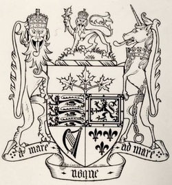
Drawing of proposed arms for Canada by A. S. Carter 1920, LAC neg. C-133326.
Carter’s excellent work seems to have been lost on the members of the committee who were not versed in heraldic design. At the end of May, they had a drawing of the proposed arms prepared by a Mr. Champagne,[4] and had it printed at the end of June as a means of making the proposed emblem publicly known.[5] The supporters were now holding flags, and a spray of floral emblems was repeated on both sides of the motto scroll. The design was getting closer to the present arms, except that the maple leaves were coloured green, at the specific request of Pope, and were placed in chief rather than in base as they are today.[6] There were neither helmet nor mantling, the lion wore a crown, and the crown ensigning the present arms was missing. The signatures of the members of the committee appeared below the arms, with the date “Ottawa July 7, 1920.” The rendition was greatly criticized for its poor artistic appearance.[7]
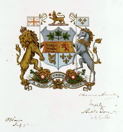
Print of the proposed arms for Canada from a drawing by Mr. Champagne, signed by members of Arms Committee, Ottawa, 7 July 1920, LAC neg. C-133325.
When King George V was made aware of the design, it was reported that he “would gladly give his consent to the proposed incorporation of portions of the Royal Arms into these Armorial Bearings”, but took exception “to placing the Arms of the Sovereign under a Chief with Maple Leaves, and considers that the position should be reversed so that the arms come above the leaves”.[8]
The revision requested by the King was entrusted to Carter.[9] As could be expected from a heraldic artist with a sense of colour and harmony, the maple leaves, now in base, were drawn red on a white background. The crest wreath was white and red, and the mantling was red doubled white. Pope saw the new rendering and reiterated his concern about red leaves. He felt that the red formed “a blot on the whole blazon,” and “that the symbol of a young country like Canada should speak of life and growth and vigour, rather than of decline, decay and approaching death.”[10] The leaves were duly made green on the final draft that was signed by the committee and sent to England.[11] They were described in the order in council which initiated the process as “on a base argent three maple leaves slipped vert”.[12]
The revision requested by the King was entrusted to Carter.[9] As could be expected from a heraldic artist with a sense of colour and harmony, the maple leaves, now in base, were drawn red on a white background. The crest wreath was white and red, and the mantling was red doubled white. Pope saw the new rendering and reiterated his concern about red leaves. He felt that the red formed “a blot on the whole blazon,” and “that the symbol of a young country like Canada should speak of life and growth and vigour, rather than of decline, decay and approaching death.”[10] The leaves were duly made green on the final draft that was signed by the committee and sent to England.[11] They were described in the order in council which initiated the process as “on a base argent three maple leaves slipped vert”.[12]
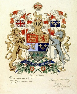
Drawing of arms of Canada replicated on the 1921 Royal Proclamation, by A. S. Carter, signed by members of the Arms Committee, LAC neg. C-3488.
Normally, the crest wreath and mantling display the dominant colours in the arms. The prominent colours in Canada’s arms are blue and red, and the most pervasive metal is gold. In fact, white is found only in base of the shield. When Carter made the leaves red on white and retained the same colours for the crest wreath and lambrequins, it is clear that he wanted to emphasize Canadian colours. By insisting on a green sprig, Pope destroyed the harmony of the whole and greatly weakened the notion of colours for Canada. It is obvious that Pope, like other committee members who accepted the change to green, did not grasp Carter’s attempt at creating Canadian colours.
After Carter, the first known person to perceive national colours in Canada’s arms was Colonel Archer Fortescue Duguid. As Director of the Historical Section of the General Staff at National Defense Headquarters, he appeared, in 1945, before a Joint Committee of the Senate and House Commons on the question of a national flag. Duguid insisted that Canada was assigned red and white as national colours by virtue of the 1921 proclamation granting the country its arms.[13] This was truly a bold assertion. The proclamation itself clearly spells out that the colours of the mantling and crest wreath are Argent and Gules, but it does not specify that these colours have a national status. Neither does it necessarily follow that the colours in the lambrequins of national arms become national colours. For instance, the mantling in the royal arms in respect of the United Kingdom is gold doubled ermine, and yet the colours of the United Kingdom are considered to be red, white and blue derived from the Union Flag. Duguid’s stance was made more tenuous by the presence, at the time, of green rather than red maple leafs in the specifically Canadian portion of the arms.
On the other hand, Duguid’s interpretation was reinforced by the fact that the arms were the only existing national emblem, and if national colours existed, they had to be part of that unique Canadian emblem. Moreover, the presence of white exclusively in the Canadian portion of the shield clearly marked this colour as being Canadian. Since the proclamation described the sprig of maple as proper rather than Vert, it is conceivable that Duguid looked beyond the existing situation to a day when the leaves would be made red, one of its autumnal colours.
In spite of Pope’s uninspired intervention, Carter’s desire to record Canadian colours survived. When Duguid appeared before the Flag Committee in 1964, his dogged efforts to promote national colours had received a powerful boost.[14] In 1957, Alan B. Beddoe had revised the arms of Canada making the leaves red, which was in conformity with the proclamation, and the booklet of the Secretary of State had designated red and white as the national colours. Undoubtedly, the acceptance that Canadian national colours were recorded in the Arms of Canada was the main factor in choosing red and white as the colours of the national flag.[15] In fact, without Carter’s initiative, the colours of Canada could be quite different from what they are today.
ALEXANDER SCOTT CARTER A-T-IL DONNÉ AU CANADA SES COULEURS NATIONALES ?
Sommaire
La notion de couleurs nationales pour le Canada a pris beaucoup de temps à s’imposer. Les premières publications du Secrétariat d’État concernant les armoiries du Canada, à partir de 1921, ne disaient rien à ce sujet. Les armoiries du pays existaient depuis 43 ans lorsque l’édition de 1964 nous apprenait, qu’à la suite d’une révision autorisée en 1957, les trois feuilles d’érable en pointe de l’écu seraient désormais rouge au lieu de verte « … afin de concorder avec les couleurs nationales du Canada … » reproduites dans les lambrequins et le bourrelet. Pour découvrir la genèse des couleurs nationales, nous devons examiner l’évolution des armoiries nationales.
Le comité établi en 1919 pour doter le pays d’armories, après s’être entendu sur les composantes du nouvel emblème, avait demandé à Alexander Scott Carter, héraldiste et architecte torontois bien connu, de les représenter dans un format convenable pour les faire parvenir à Londres. Carter, qui possédait un sens artistique raffiné, revêtit de rouge sur fond blanc les trois feuilles d’érable symbolisant le Canada, couleurs qu’il donna aussi aux lambrequins et au bourrelet. L’un des membres du comté, Sir Joseph Pope, sous-secrétaire d’État aux Affaires extérieures, croyait dur comme fer que les couleurs automnales de la feuille d’érable, dont le rouge, symbolisaient la vieillesse et la dégénérescence, et que la couleur verte s’imposait pour un jeune pays. Il eut tôt fait de convaincre les autres membres du comité, car comme lui, ils ignoraient les exigences de la science et de l’esthétique héraldiques.
Il semble évident, qu’en retenant le rouge et le blanc pour les feuilles d’érable, le bourrelet et les lambrequins, Carter avait voulu introduire la notion de couleurs nationales. L’intervention inopportune de Pope ébranlait son initiative, mais les couleurs demeuraient dans le bourrelet et les lambrequins. En 1945, lorsqu’il parut devant un comité ayant pour mission de doter le Canada d’un drapeau, et même si les feuilles d’érable demeuraient toujours vertes, le colonel Archer Fortescue Duguid, historien en chef à la Défense nationale, promut énergiquement l’idée de couleurs nationales présentes dans les armoiries du pays. Comme la proclamation royale assignant les armoiries décrit les feuilles d’érable comme étant « au naturel », le colonel avait peut-être anticipé le jour où elles vireraient au rouge. Lorsqu’il témoigna devant le deuxième comité du drapeau en 1964, Duguid réitéra la même conviction, mais cette fois il bénéficiait de puissants appuis. Les feuilles d’érable dans le nouveau dessin réalisé par l’héraldiste Alan Beddoe étaient rouges et la brochure du Secrétariat d’État désignait le rouge et le blanc comme couleurs nationales, notion qui s’est perpétuée dans le drapeau du pays. On constate que l’initiative de Carter a été déterminante dans l’adoption des couleurs nationales canadiennes. A.V.
NOTES
[1] Library and Archives Canada (LAC) RG 6, A1, vol. 210, file 1156, part 1, p. 102-110. Report of the Committee, Oct. 14, 1919.
[2] Ibid., p. 291-92. Minutes of the Committee . . . , April 3, 1919.
[3] Ibid., p. 61-62. Doughty to Mulvey, Jan. 27, 1920.
[4] Ibid., p. 18. Mulvey to Pope, May 25, 1920.
[5] Ibid., p. 5. Mulvey to Gwatkin, June 26, 1920.
[6] Ibid., p. 23. Pope’s remarks were: “I trust that on consideration, we may come round to the green maple leaves. The more I consider the matter, the more I am inclined to the opinion that it is preferable that the leaves should speak of growth and life rather than decay and approaching dissolution, which the sere and yellow, or even the red leaf, to my mind symbolize.” Pope to Mulvey, April 17, 1920.
[7] Ibid., part 2, p. 168. Mulvey to Carter, Feb. 2, 1921.
[8] Ibid., p. 196-97. Milner to Devonshire, Nov. 19, 1920.
[9] Ibid., p. 118, 124, Carter to Mulvey, 18 April1921; Mulvey to Carter, 20 April 1921. For more examples of Carter’s works see R.G.M. Macpherson, “A. Scott Carter, R.C.A.” on the web site: http://www.heraldry.ca/art/painter/carter/carter.htm.
[10] Ibid., p. 114. Pope to Mulvey, Apr. 26, 1921.
[11] This drawing is signed by committee members and inscribed “Arms of Canada Final draft on which the Royal warrant was based.” LAC, negative C-3488.
[12] LAC, RG 6, A1, vol. 210, file 1156, part 2, p. 107-108. Certified copy of a Report of the Committee of the Privy Council approved by His Excellency the Governor General on the 30th April, 1921.
[13] John Ross Matheson, Canada’s Flag: a Search for a Country (Belleville [Ontario]: Mika Publishing Company, 1986), p. 52.
[14] Ibid., p. 104-105.
[15] Ibid., p. 239. On a photo in the LAC by Duncan Cameron, John Ross Matheson is seen with a framed picture of the 1957 arms of Canada explaining how they embody the national colours. LAC, negative PA-136233. Although the colours of the Royal Military College flag, which George Stanley proposed as a model for Canada’s flag, were indeed red and white (Ibid., p. 122), it seems obvious that the colours of a military college in Ontario would not have become the national colours in a diversified country like Canada unless more compelling historical reasons came into play. The 1921 proclamation read: “mantled Argent doubled Gules.” Wanting to be completely faithful to the 1921 proclamation, Beddoe introduced this change into his 1957 rendering of Canada’s arms. I have always felt that this wording in the proclamation was a lapsus calami, and that the original drawing was the correct interpretation of the mantling. This feeling is reinforced by the fact that the crest part reads “On a wreath of the colours Argent and Gules,” which would normally translate into mantling “Gules doubled Argent.”