Chapter 6
Bureaucrats and Artists
There was no depiction of the Canadian arms with the copy of the king's proclamation sent on 25 November 1921 by Churchill. Soon lithographers and government departments began clamouring for a representation of Canada's newly granted emblem. When a depiction was received, the members of the arms committee were surprised to discover that the rendering did not differ significantly from the draft they had signed and sent to England. A booklet was published by the Department of the Secretary of State to make the arms known to the public, but there remained nagging doubts as to the artistic quality of the representation. This notion prompted Thomas Mulvey, under-secretary of state, to obtain a revised version, which he considered to be an improvement.
Frederick Cook, Chairman of the Editorial Committee on Governmental Publications, informed Mulvey that his committee had turned down a number of requests for stationery with “the old Dominion Arms realizing that His Majesty's authority to use the new Arms must shortly be forthcoming.” While in Europe, Mulvey had discussed the matter of the new arms with Sir George Foster, chairman of the Canadian delegation to the first assembly of the League of Nations. Foster had stated “What is the advantage of having New Armorial Bearings if we are not going to use them.”[1] Cook also mentioned a despatch from the Rt. Hon. Walter Long, secretary of state for the colonies, dated 4 January 1917 to support his view that it should not be left to government departments to choose as identification either the royal arms or the Dominion arms. He had as well consulted the College of Arms on the same matter and had received the following answer:
“All Departments of the Dominion generally, including the King's Printer, might doubtless use the Royal Arms in the same way as these are used by the High Court and by Departments of State in the United Kingdom. But the case of the United Kingdom differs from that of Canada in that the Royal Arms are the only Arms available for use by public departments in the United Kingdom, whereas special Armorial Bearings have been assigned to the Dominion of Canada.”[2]
Cook obviously favoured the adoption of the newly granted arms on all stationery and was looking for a definite ruling on the matter in order to print only the new emblem in the future. He reminded Mulvey that they had cooperated in 1916 to “get rid of a lot of hybrid devices then in use upon department stationery”.[3] It seemed apparent that the new arms were intended to replace the former heraldry on government stationery, but the question remained a complex one. It involved positioning and size and the fact that a coat of arms is not always used in its entirety. It may consist of the shield alone, the shield with motto or the shield with motto and crest. Sometimes only the crest is displayed, as on the governor general’s flag; sometimes the crest and motto are joined together. Should some departments be allowed to display the emblem differently from others was another question that could legitimately be raised?
Mulvey, who had expected the proclamation to include a painting of the arms, had been sending cablegrams to the high commissioner in London urging the College of Arms to prepare a coloured rendering. The provinces had received a royal warrant illustrated with their arms, and Mulvey had expected the same for the arms of Canada. A December 9 cablegram urged:
“Canadian public anxious for lithographic issue of exact form of Arms. Decided not to issue until warrant received. Kindly urge expedition on Privy Council and College of Arms. In delineation of Arms if the Heralds see no objection we should like each of the banners to be shown with gold fringe around it and with maple leaves as decorative addition to wreath.”[4]
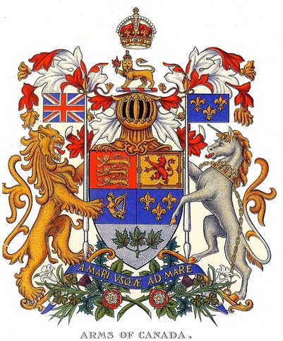
The requested exemplification of the arms of Canada was undertaken around December 21.[5] At the end of December, Mulvey received a cablegram informing him that it was too late to make the additions he had requested to the arms. The first booklet regarding the new Arms was prepared by Charles Frederick Hamilton in May; however, the booklet only appeared in 1922.[6] It included a coloured illustration (fig. 1).
Fig. 1 Illustration appearing in the first publication The Arms of Canada, dated 1921.
One reader wrote to the journal Rod and Gun in Canada:
“I happened to see the new coat of arms of the Dominion the other day and was much surprised and sorry to find that the Canadian beaver was left out, and in its place was a lion holding a maple leaf. The lion, as everybody in the Dominion knows, is not our emblem; it is the emblem of Great Britain. The beaver is our emblem, or at least I have always been taught that it was, and from my point of view, should never be left out of our coat of arms.”[7]
Mulvey's reply is interesting because it tells us precisely why the beaver was excluded:
“The Committee having charge of the recommendation of Arms considered fully the suggestion that the Beaver should be included, and it was decided that as a member of the Rat Family, a Beaver was not appropriate and would not look well on the device. One example of the objections raised is quite well known. The Canadian Merchant Marine displayed a Beaver on their House-Flag, and they have ever since been colloquially known as ‘The Rat Line.’ As your correspondent says, the Lion is not the representative of Canada except in so far as Canada is a part of the British Empire, and in this connection it was considered appropriate to have the Lion hold the Maple Leaf.”[8]
As soon as the new arms were made public, flag manufacturers began expressing some concerns. Were the new arms to replace the dominion multi-province shield in the fly of the Red and Blue Ensigns? This first question was answered on 26 April 1922 by an order in council authorizing the use of the newly granted shield on both ensigns.[9] However, some manufacturers were still wondering if the entire arms with crest, supporters and motto, were to be used or just the shield. With the creation of the Irish Free State on 31 March, a rumour had spread that the arms of Canada, which contain the harp of Ireland, would have to be altered. It seems that the rumour had come from printers and manufacturers in England claiming to have received an official word of caution not reproduce the arms as changes were imminent.[10] Mulvey, who was in England trying to obtain the depiction he wanted for Canada’s arms, reacted with some annoyance to this rumour:
“It is quite apparent to me that the question put is very foolish, but in order that there may be no doubt about it I saw Sir Henry Burke, and discussed the subject with him. He quite agrees with me that the Arms were granted on a proclamation of His Majesty the King. It is an accomplished fact and does not depend upon any action which may be taken as a result of the Irish Treaty. Moreover, no change could possibly be made except on the application of the Canadian Government, and I can say without hesitation that no change will be applied for.”[11]
Mulvey was up to his own foolishness. When he had received a certified copy of the proclamation with the arms depicted, he was disappointed that the draft drawing sent to England with the signatures of the members of the committee had been granted without alterations.[12] He was expecting a more artistic rendering. The drawing, evidently prepared by Alexander Scott Carter within very short notice and depicted according to the committee’s general instructions, was quite good with a strong influence of art nouveau in the treatment of the supporters. The major blot on the rendering came from Pope's request that the maple leaves in base of the shield be made green instead of red as originally depicted. The one criticism that could be levelled against the composition was that the supporters were a little too decorative, thus lacking some of the simplicity of the best heraldry.
Working together, Mulvey and Ambrose Lee came up with a new design. Mulvey explains the matter as follows in an official report to the Department of the Secretary of state for transmittal to the Colonial Office:
“The Arms committee of which I was Chairman, recommended the device covered by this despatch, and it was approved by Order-in-Council. A tentative drawing was forwarded for the consideration of the Colonial Office. This drawing was intended to be merely suggestive, and it was expected that it would be put in an artistic form by the Heralds College. However the device was approved of by His Majesty the King, being adopted without any change. Subsequently the writer had a number of discussions on the subject with the Garter King-at-Arms and the Norroy King-at-Arms [sic], at that time York Herald, and it was decided that a more artistic representation should be prepared by the College of Arms. This was done, and the device in that form adopted as the standard in Canada. I may say that each device complies accurately with the description given, and that the only changes are in the presentation and ornamentation. For this reason, it seems preferable that the more artistic representation should be adopted throughout the Empire.”[13]
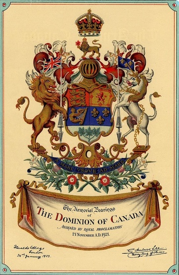
The drawing which Lee had prepared was sent directly to Mulvey who had large lithographs prepared and smaller ones which appeared in a second edition of The Arms of Canada which was published in 1923 by the Secretary of State (fig. 2).[14]
Fig. 2 The arms of Canada granted in 1921, revised by Ambrose Lee, Norroy King of Arms, at the request of Thomas Mulvey, under-secretary of state for Canada, signed and dated 24 January 1923. From: Department of the Secretary of State of Canada, The Arms of Canada (Ottawa: F.A. Acland Printer to the King’s Most Excellent Majesty, 1923).
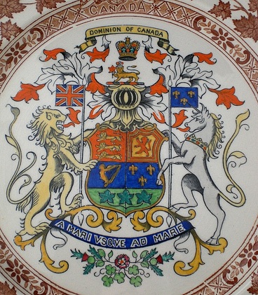
With respect to the 1921 depiction of Canada's arms, Mulvey spoke of a misunderstanding with the College of Arms. Sir Edward John Harding of the Colonial Office pointed out to him that the College of Arms was at no time informed that Canadians expected a different rendering than that submitted. He also informed Mulvey that he had made inquiries at the College of Arms and had been told that, because there had not been any change in substance to the arms, the College would simply record them at a cost of ten guineas. The ten guinea draft was acknowledged by the College of Arms on 8 September 1925, which means that the 1923 version of the arms were recorded at about that time. When the College of Arms was sent a lithographed copy of the revised design, it observed that, in printed form, the portion at the base, which should have been white, had acquired a greenish tint (fig. 2).[15] This unfortunate greenish hue was to appear, sometimes quite pronounced, on some souvenirs (fig. 3).
Fig. 3 A version of the 1923 design of Canada’s arms where the lower part of shield is almost as green as the leaves. Green on green is not acceptable in heraldry where visibility is paramount. On a plate by Mason’s, England, ca. 1930, A & P. Vachon Collection, Canadian Museum of History.
The 1923 arms were very close in style to some version of the royal arms around 1850.[16] Mulvey was obviously not aware of the latest trends in heraldic style and grossly underestimated the artistic qualities of the 1921 version. It is almost certain that he was accustomed to seeing Victorian depictions of the royal arms with an elaborate shield and well-fed supporters. He must have reasoned that the original depiction did not look royal enough and expressed this to Burke and Lee. The Heralds must have found his views a bit silly, but obviously saw no great harm in providing Canada with slightly outdated arms, if that was what it wanted.
Chadwick had died on the 15 of December 1921. Had he been alive, he would have deplored what had happened to the original design. He had already complained against elaborate shields which he called Hanoverian (chapter 4, figure 8). In 1922, an order in council had authorized the shield of the newly granted arms to be placed in fly of both the Canadian Red Ensign and the Canadian Blue Ensign. When the 1923 more ornate shield arrived on the scene, it was never authorized to replace the 1921 shield on these flags because the new shield would have looked bizarre. This demonstrates that Mulvey’s aesthetic preferences had limitations.
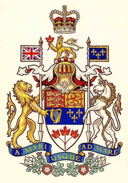
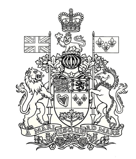
In 1957, the arms of Canada were simplified by Alan B. Beddoe who made the shield more modern, of the type shaped like a clothes iron (heather shape) as in the 1921 design. He also changed the colour of the sprig of maple from green to red, reversing Pope’s preference for green. This change was possible because the leaves are described as proper (natural colour) in the proclamation. Because the mantling was described as Argent doubled Gules (white outside, red inside) and, although this was assuredly a mistake in wording, Beddoe painted the mantling white with a red lining. Normally it is the other way around. Besides this anomaly, which looks a little strange to someone familiar with heraldry, the shield itself is rather narrow and long (fig. 4).
Fig. 4 Arms of Canada as revised by Alan B. Beddoe in 1957.
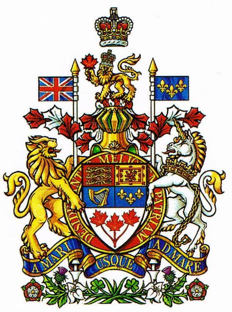
In 1994, the motto of the Order of Canada, Desiderantes meliorem patriam (They desire a better country), was added around the shield. The revised version was drawn by Cathy Bursey-Sabourin, Fraser Herald at the Canadian Heraldic Authority. The shield was made shorter and the three maple leaves more prominent. The tips of the mantling were given the shape of maple leaves and arranged in such a way as to show more red than white, rendering less apparent the positioning of these colours in the mantling (fig. 5). Introducing the motto of the Order of Canada on a ring around the shield was in imitation of the arms of the United Kingdom which display in this way the motto of The Most Noble Order of the Garter: Honi soit qui mal y pense. The idea of adding the motto of the Order of Canada began in the late 1970s with members of the Heraldry Society of Canada, particularly John Williamson, Terry Manuel and Bruce Hicks who was the most persistent in promoting this goal. In the spring of 1989, the Canadian Heraldic Authority had already introduced the motto of the order around Canada’s shield on the heading of its grants. The motto was also added to the arms of Canada in the regal window created by Christopher Wallis and installed at Rideau Hall in 1992 to commemorate the 125th anniversary of Confederation and the 40th anniversary of Her Majesty’s accession to the throne.[17] Ending the tips of the mantling with maple leaves was done for the first time in a drawing of Canada’s Arms done around 1970 by the heraldic artist Hans D. Birk (fig. 6).
Fig. 5 Arms of Canada revised in 1994 to include the motto of the Order of Canada. The three maple leaves occupy a large portion of the shield and the tips of the mantling around the helmet take the shape of maple leaves.
Fig. 6 Arms of Canada as rendered by Hans D. Birk c. 1970 with the tips of the mantling shaped as maple leaves. Drawing in Library and Archives Canada.
Notes
LAC = Library and Archives Canada
RG 6 = Secretary of State papers
[1] LAC, RG 6, A1, vol. 210, file 1156, part 3, p. 253, Cook to Mulvey, 23 December 1921.
[2] Ibid.
[3] Ibid.
[4] Ibid., pp. 266, 252, Mulvey to Perley, 9 December 1921 and Griffith to Mulvey, 16 December 1921.
[5] Ibid., p. 249, Griffith to Mulvey, 21 December 1921.
[6] Ibid., part 2, pp. 69, 70-83, Gwatkin to Mulvey and Memorandum, 31 May 1921.
[7] Ibid., part 4, p. 288, The Editor of Rod and Gun in Canada to the Secretary of State, 28 October 1922.
[8] Ibid., p. 287, Mulvey to Editor of Rod and Gun in Canada, 30 October 1922.
[9] Ibid., part 3, p. 55, Order in Council, P.C. 843, 26 April 1922.
[10] Ibid., part 3, p. 231, part 4, pp. 308, 311, Christensen to Mulvey, 6 January 1922 and 4 August 1922; John Leckier Limited to Secretary of State, 16 August 1922.
[11] Ibid., part 4, pp. 295, 305, Mulvey to Dent, 9 September 1922; Dent to Mulvey, 17 August 1922.
[12] Auguste Vachon, "Significant documents" in The Archivist 18, no. 1 (January-June 1991), pp. 2-3.
[13] LAC, RG 6, A1, vol. 210, file 1156, part 4, pp. 47-49, Report by Mulvey, Department of Secretary of State, 5 January 1925.
[14] Ibid., pp. 43-44, Mulvey to Harding, 28 July 1925. The original drawing done by the College of Arms, now much faded, is in the picture collections of the Library and Archives Canada.
[15] Ibid., pp. 45-46, Harding to Mulvey, 8 July 1925.
[16] Charles Hasler, The Royal Arms (London: Jupiter Books, 1980), p. 248.
[17] Christopher McCreedy, The Order of Canada: Its Origins, History and Development (University of Toronto Press, 2005), p. 199.
