Augmentations of Patriotism to Canadian Emblems
Auguste Vachon, Outaouais Herald Emeritus
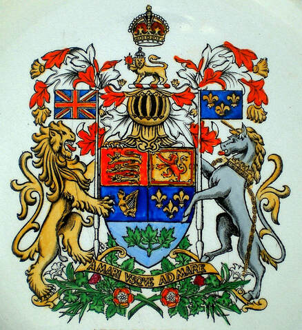
Heraldic amateurs are familiar with the expression “augmentation of honour” which is an honourable addition to armorial bearings. In 1963 a well known Canadian augmentation of honour was conferred by royal warrant of Queen Elizabeth II on the Right Honourable Vincent Massey. The addition to his coat of arms is described as: “A Canton Azure charged with Our Crest of Canada.” The royal crest in question is the gold lion holding a red maple leaf on a wreath above the helmet in the arms of Canada (fig. 19).[1] In Canadian heraldry, additions were made to certain emblems to augment their patriotic nature. Shortly after Confederation, an armorial shield was adopted to represent the Dominion of Canada. This emblem became the object of two equally strong tendencies. Some surrounded it with Canadian symbols such as the beaver and maple leaves to make the whole more Canadian; others added symbols from the royal arms of the United Kingdom to better represent British ancestral roots and traditions. In some cases, both Canadian and British symbols melded to form one armorial composition. These popular practices began in the nineteenth century and continued well into the twentieth century. They were criticized by heraldists and some government officials as being unauthorized, but today they provide valuable insight into important aspects of the Canadian psyche.
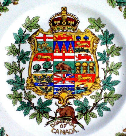
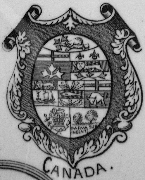
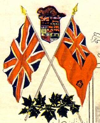
By royal warrant in 1868, Queen Victoria granted a common seal to the newly formed Confederation known as the Dominion of Canada. This seal was to display the arms of the four united provinces joined on one shield, namely Ontario, Quebec, Nova Scotia, and New Brunswick. As new provinces joined confederation, their emblems, taken from their seal or designed by amateurs, were added to the design.[2] Various symbols also appeared with the shield such as the royal crown on top, a wreath of maple around it and a beaver below (fig. 1). Although none of this had been authorized by the original warrant, the purpose of the additions was to make the design more representative of the country and more inclusive of the symbols that Canadians had adopted. Although these symbols were freely chosen by the people, they were not unsuitable in the sense that they expressed both Canadian values and attachment to the British monarchy highlighted by the royal crown. In that sense, they were augmentations of patriotism.
By royal warrant in 1868, Queen Victoria granted a common seal to the newly formed Confederation known as the Dominion of Canada. This seal was to display the arms of the four united provinces joined on one shield, namely Ontario, Quebec, Nova Scotia, and New Brunswick. As new provinces joined confederation, their emblems, taken from their seal or designed by amateurs, were added to the design.[2] Various symbols also appeared with the shield such as the royal crown on top, a wreath of maple around it and a beaver below (fig. 1). Although none of this had been authorized by the original warrant, the purpose of the additions was to make the design more representative of the country and more inclusive of the symbols that Canadians had adopted. Although these symbols were freely chosen by the people, they were not unsuitable in the sense that they expressed both Canadian values and attachment to the British monarchy highlighted by the royal crown. In that sense, they were augmentations of patriotism.
Fig. 1. The quarters are from left to right: 1st row Ontario, Yukon, Quebec; 2nd Prince Edward Island, Manitoba, Saskatchewan; 3rd Nova Scotia, British Columbia, New Brunswick. All the arms on this shield are granted except for the Yukon in the middle upper row. Alberta, which was granted arms on 30 May 1907, is missing. Wedgwood plate 1908. See other examples of Dominion shields: http://heraldicscienceheraldique.com/dominion-shields.html.
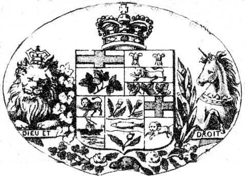
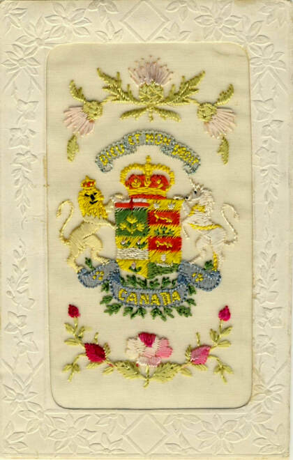
Other combinations aimed to make the Canadian emblem more British by introducing elements from the royal arms. Besides the crown, the motto “Dieu et Mon Droit” was at times added along with the lion and unicorn supporters, all taken from the royal arms of the United Kingdom. The impulse to combine British elements with the shield of Canada was not a passing fancy. It originated in the nineteenth century and continued into the first quarter of the twentieth century. (figs. 2-5). It is noteworthy that the royal crown as well as the lion and unicorn supporters are found in Canada’s coat of arms assigned by royal warrant in 1921 and still in use today (fig. 19).
Fig. 2. Five-province shield with the addition of the crown, supporters and motto of the royal arms. The beaver underneath accompanies roses representing England and shamrocks symbolizing Ireland. The Scottish thistle may be there, but it is not distinguishable. Maple leaves appear on the left of the shield and a branch of laurel on the right. From “Bird's eye view of the City of Ottawa… 1876” drawn by Herm. Brosius. Library and Archives Canada.
Fig. 3. A World War I postcard embroidered on silk for sale to soldiers. The unicorn and lion taken from the royal arms hold the four-province shield of the Dominion. Above the shield, the crown and the motto “Dieu et Mon Droit” are also from the royal arms. There are green maple leaves about the scroll inscribed “CANADA.” Scottish thistles appear at the top of the card and English roses at the bottom. The cardboard part was printed in Paris, France. This example is unique, but it is not the only instance where the Dominion shield was depicted with British additions. Figures 2 and 4 are printed examples meant for wide distribution.
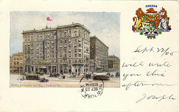
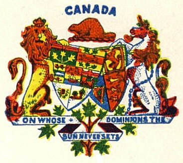
Fig. 4. This view of King Edward Hotel in Toronto features the seven-province shield of the Dominion of Canada overlapping the shield of the United Kingdom. Both shields are held by the lion and unicorn, which are the supporters of the royal arms. Here the royal crown, usually shown above the Dominion shield (figs. 1-3), is replaced by a beaver, a Canadian symbol dating from the time of New France. The motto scroll intermingles with a maple branch, already a major Canadian symbol at the time. The motto itself “ON WHOSE DOMINIONS THE SUN NEVER SETS,” mirrors the British Empire. The same armorial arrangement appeared on the postcards of several companies. The card is dated 22 September 1905 by the sender. Printed by Richmond News Company, Richmond, (Virginia). At that time, many Canadian postcards were printed abroad, particularly in England, the United States and Germany.
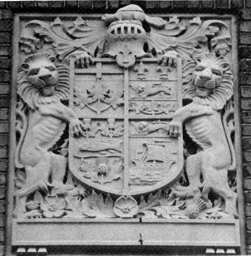
In figure five, the four-province shield on the façade of the Canadian Grenadier Guards Armoury in Montreal, constructed in 1913-14 is held by two lions. Lion supporters are not exclusive to British heraldry, but here they are surely associated with Britain, all the more so that the spray underneath the shield includes the rose of England. As in figures 4, 9, 10, and 12 the beaver rather than the royal crown is placed above the Dominion shield. It is another example where Canadian and British symbols are intermingled. A post office, also constructed in 1913-14 on Ste Catherine St. West in Montreal, features on its parapet a bronze of the Dominion arms surrounded by royal attributes. The royal crown appears above; the supporters are those of the royal arms with their positions reversed, the unicorn being on the left and the lion on the right, both lying down. Issuing on both sides of the design, above the supporters, are the royal sceptres and rods as well as a mace. Strangely enough, all the heraldic devices on the shield are prior to 1905.[3] In Canadian architecture and iconography, there are surely other examples where Canadian and British symbols coexist.
Fig. 5. Four-province shield with a beaver as crest, lion supporters, and below the rose of England, the thistle of Scotland, maple leaves and oak leaves. On the façade of the Canadian Grenadier Guards Armoury in Montreal, designed by the architect Donald Norman MacVicar, built in 1913-14. From Heraldry in Canada / L’Héraldique au Canada (December 1989): 12.
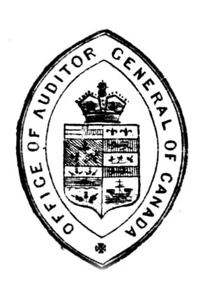
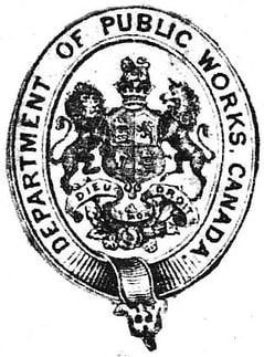
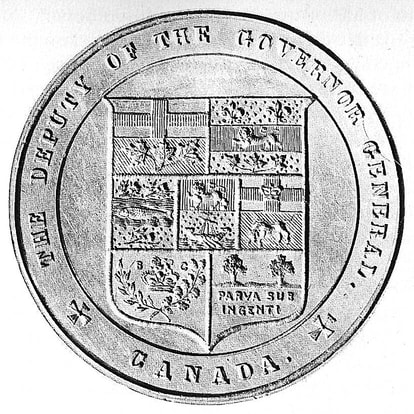
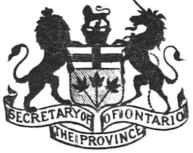
After Confederation, there was little uniformity in the way departments and officials of the Canadian federal government identified themselves. Many used the four-province Dominion shield assigned in 1868. Others could not resist adding the royal crown above the shield (fig. 6). Some adopted a design displaying more than four provinces (fig. 7) while others preferred the royal arms (fig. 8). An 1894 article informs us that, on official documents of the Ontario government, the royal crown as well as the lion and unicorn were frequently added to the provincial arms (fig. 9), and that federal government departments sometimes included the same components as well as royal mottoes with their identifying marks.
“The use of a crown, and the lion and unicorn, which is frequent in official documents of the Province of Ontario, in unison with the coat of arms of the Province, is likewise unauthorized and incorrect. There are no such appendages as crest, supporters or motto to the arms of the Dominion or those of the Provinces. The same error is made by some departments of the Dominion Government at Ottawa in coupling with various departmental designs, the royal supporters, mottoes and crown.”[4]
“The use of a crown, and the lion and unicorn, which is frequent in official documents of the Province of Ontario, in unison with the coat of arms of the Province, is likewise unauthorized and incorrect. There are no such appendages as crest, supporters or motto to the arms of the Dominion or those of the Provinces. The same error is made by some departments of the Dominion Government at Ottawa in coupling with various departmental designs, the royal supporters, mottoes and crown.”[4]
|
Fig. 6. A federal government office using a four-province shield with the royal crown above.
Fig. 8. A number of Canadian federal departments displayed the royal arms on their letterhead.
|
Fig.7. A government official being identified by a seven-province shield, the devices of Manitoba, British Columbia, and Prince Edward Island being added to the original four.
Fig. 9. An Ontario official adding the royal crest and the lion and unicorn to its provincial arms.
|
Figures 6 and 8-9 are from an album of letterheads dated 1877. Figure 7 is from Library and Archives Canada.
In figures 4-5 and 10-11, the beaver replaces the royal crown which is generally seen above the shield of the Dominion (figs. 1-3). This gesture constitutes a powerful assertion of Canadian patriotism.
Fig. 10. These arms of the Dominion of Canada displaying a beaver on a maple branch above the shield have appeared on three commemorative plates attributed to Wallis Gimson & Co. (England): two portraits c. 1884; one of the Right Honourable Sir John A. Macdonald, first Prime Minister of Canada; another of the Honourable Edward Blake, Liberal Leader of the Opposition. The one displayed here is from a third plate dedicated to the 1887 Golden Jubilee of Queen and Empress Victoria (see entire plate at http://heraldicscienceheraldique.com/royalty-mingling-with-beavers-and-maple-leaves.html, fig. 1). The portrait on the plate dedicated to Prime Minister Macdonald is from a photograph by William James Topley of Ottawa (see http://heraldicscienceheraldique.com/dominion-shields.html, fig. 20).
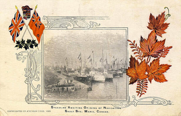
Fig. 11. Beaver on top of a seven-province Dominion shield on a postcard by Atkinson Bros. (Toronto) postmarked 24 January 1906. Other beavers above the Dominion shied appear on these sites: http://heraldicscienceheraldique.com/dominion-shields.html, fig. 21 and 22 and http://heraldicscienceheraldique.com/royalty-mingling-with-beavers-and-maple-leaves.html, figs. 9-9a. A World War I box inscribed “Chocolate for our Soldiers” also features a beaver on top of the Dominion shield: https://fanshawepioneervillage.ca/blog/chocolate-our-soldiers.
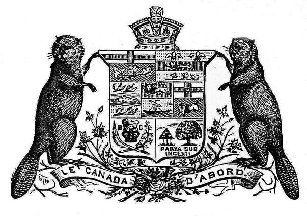
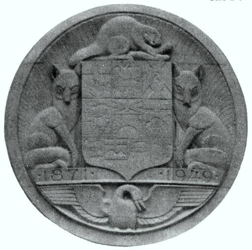
Another way of making the Dominion shield more representative of Canada was to give it Canadian supporters such as those proposed in figures 12-13. Figure 13 illustrates so well the fanciful whims that heraldry can be subjected to in the hands of architects or designers. Although Canada had been granted armorial bearings by royal proclamation in 1921, it was decided to display a ten province shield in the manner of the old Dominion shields which included up to nine provinces. The intention was to feature all the provinces including Newfoundland that had entered the Canadian Confederation in 1949.
Fig. 12. The seven-province shield of the Dominion, in use from 1876 to c. 1905, augmented with the usual crown, beavers as supporter and a motto. The floral badges of England, Scotland and Ireland, mixed with maple leaves, appear around the motto scroll, a similar idea will be retained for the arms granted to Canada in 1921 (fig. 19). Illustration from T. Martin Castorologia (Montreal: Wm. Drysdale & Co., 1892): 204.
Fig. 13. A ten province shield above the entrance to the Dominion Bank (later Toronto Dominion) built in 1949 at the corner of Bank and Sparks Streets in Ottawa. The year 1871 on the band at the base of the shield is the date when the Dominion Bank was launched in Toronto. The arms of Newfoundland are there because the island entered the Canadian Confederation in 1949. Canada had national arms since 1921, but this composition includes every province as did former Dominion shields. A beaver gnaws at a branch in the crest on top; two seated foxes support the shield, and a Canada goose appears underneath. The stone carving has an art deco flavour to it especially in the treatment of the animals. From Heraldry in Canada / L’Héraldique au Canada (December 1989): 11.
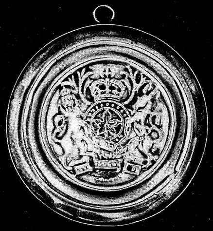
Another tendency involved adding Canadian symbols to British emblems with the intention of making them more representative of Canada. Sometime between 1773 and 1807, Robert Cruickshank produced a medal featuring the royal arms of the United Kingdom where the shield in the centre was replaced by a maple leaf while other components were retained (fig. 14).
Fig. 14. This medal created by Robert Cruickshank, probably for trade with Indigenous peoples, substitutes a maple leaf to the shield of the royal arms of the United Kingdom while retaining the other components. Cruickshank produced this medal between 1773 when he settled in Montreal and 1807 when he left for London and perished at sea on his return. The medal measures 8.5 cm and belongs to the Henry Birks Collection of Canadian Silver of the National Gallery of Canada (C 220).
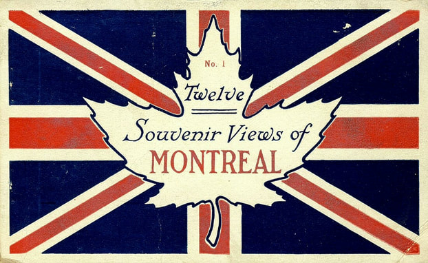
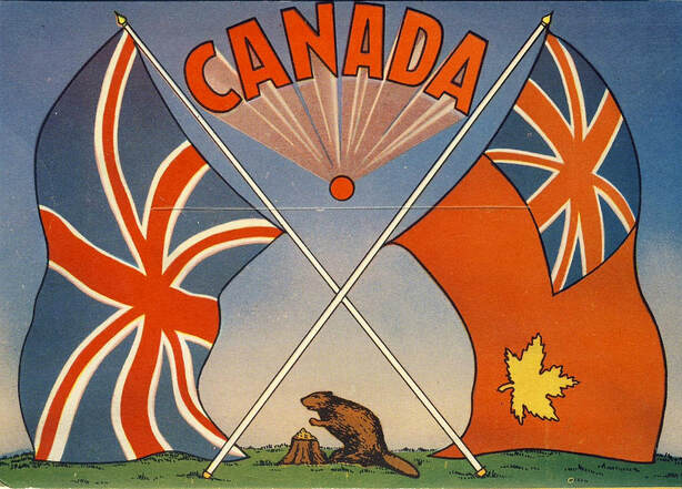
Postcard (fig. 15) is one of many twentieth century examples of the random mixing of Canadian and British symbols, a tradition going back to the nineteenth century (fig. 14). On 31 July 1869, a memorial from the Right Honourable the Lords Commissioners of the Admiralty authorized colonial governors and administrators to be identified with the colonial badge in centre of the Union Jack. On 16 July 1870, a despatch from the Secretary of State for the Colonies authorized the governor general of Canada to fly, from boats and other vessels on which he was embarked, the Union Flag (Jack) with the four-province shield in centre topped by the royal crown and within a wreath of maple leaves, the whole on a white roundel.[5] The same despatch authorized the lieutenant governors to fly, from boats and other vessels on which they were embarked, the Union Flag bearing in centre the provincial arms or badge on a white roundel and within a wreath of maple leaves but without a crown.[6] It is almost certain that the idea of placing the shield of the Dominion within a wreath of maple with a crown on top as in figure 1 came from the flag authorized for the governor general of Canada in 1870.[7]
Fig. 15. Cover of a postcard folder featuring a maple leaf in centre of the Union Jack, c. 1920.
On 16 December 1865, the secretary of state for the colonies advised the governor general that pursuant section 3 of the Colonial Naval Defence Act (Act. 28, Vict., Cap. XIV), vessels owned or in the service of the colony were to fly the Blue Ensign with the badge or seal of the colony in the fly. He further asked to be supplied, for the Lords of the Admiralty, with “a correct drawing of the Seal or Badge which is to form the distinguishing mark of Canadian Vessels.” Shortly after Confederation, Canada began using the Red Ensign, which was the flag of the British Merchant Navy, as the country’s flag with a four-province shield in the fly. After 1907 nine-province shields were often seen (fig. 17).[8] The idea of creating a flag by placing a Canadian mark in the fly of the Red Ensign may have been inspired by what had been authorized for the Blue Ensign, but why prefer one ensign over another?
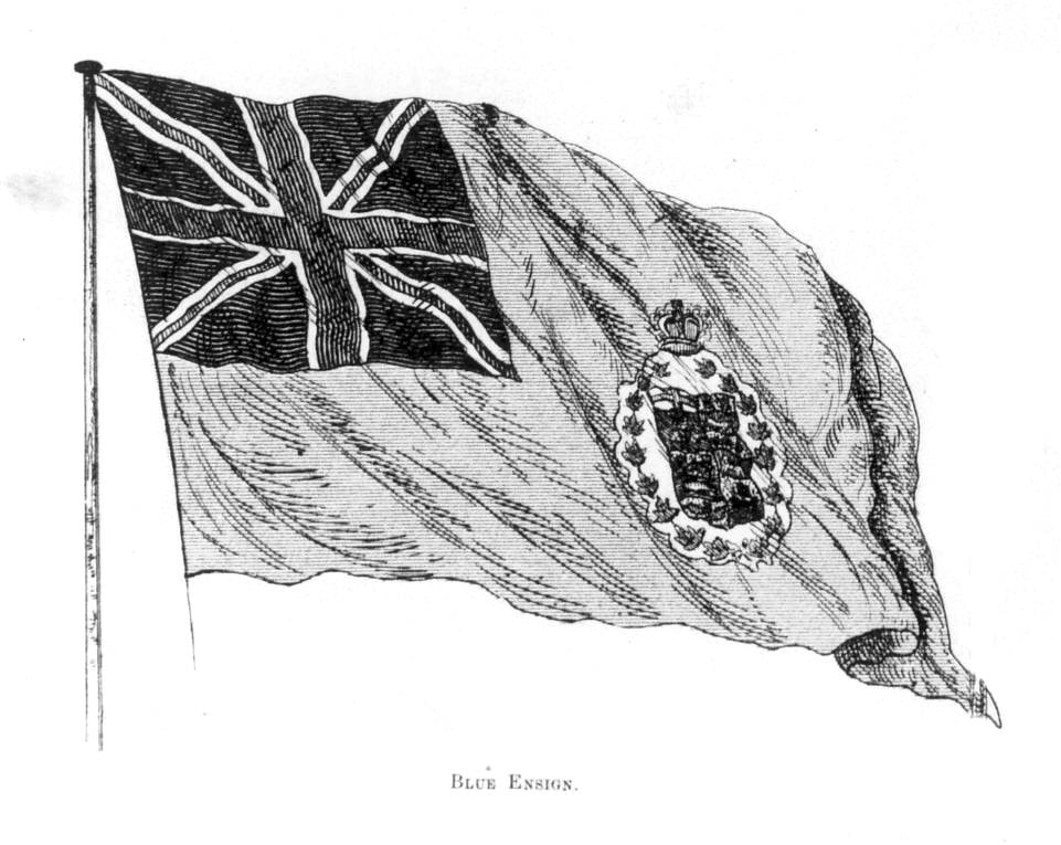
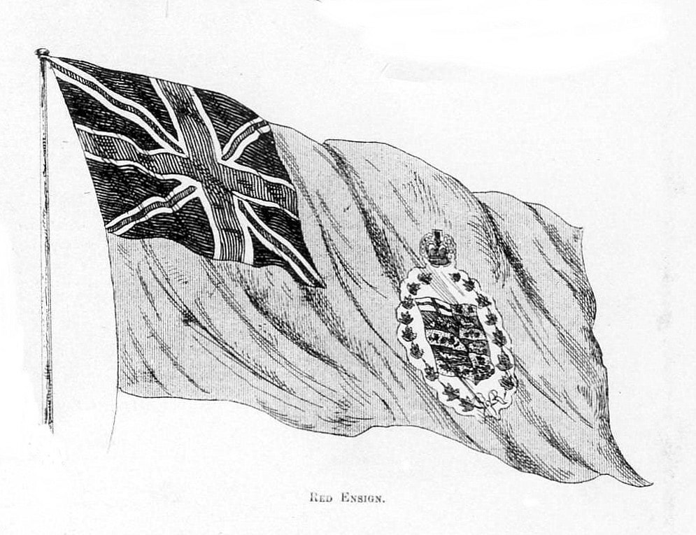
Long before 1865, the Red Ensign had been flown from forts and early establishments often with the monograms of the Hudson’s Bay Company or the Northwest Company in the fly.[9] Canadians had become accustomed to seeing this flag on land and identified with it. A short 1871 article in the Canadian Illustrated News shows an illustration of the Canadian Blue Ensign described as the “flag of the Dominion Navy” with the four-province shield in the fly to which it adds unauthorized features, namely a wreath of maple around the shield and the royal crown above. A similar illustration of the Red Ensign with the same arrangement in the fly is described as the “flag of the Dominion” (fig. 16). The article clearly expresses the notion that the Canadian Blue Ensign is Canada’s flag on the sea and the Canadian Red Ensign is Canada’s flag on land. In 1892 the Red Ensign with a four-province shield in the fly was authorized by Admiralty warrant for merchant vessels registered in Canada.[10] This did not prevent Canadians from using shields with more than four provinces on both land and sea.[11]
Long before 1865, the Red Ensign had been flown from forts and early establishments often with the monograms of the Hudson’s Bay Company or the Northwest Company in the fly.[9] Canadians had become accustomed to seeing this flag on land and identified with it. A short 1871 article in the Canadian Illustrated News shows an illustration of the Canadian Blue Ensign described as the “flag of the Dominion Navy” with the four-province shield in the fly to which it adds unauthorized features, namely a wreath of maple around the shield and the royal crown above. A similar illustration of the Red Ensign with the same arrangement in the fly is described as the “flag of the Dominion” (fig. 16). The article clearly expresses the notion that the Canadian Blue Ensign is Canada’s flag on the sea and the Canadian Red Ensign is Canada’s flag on land. In 1892 the Red Ensign with a four-province shield in the fly was authorized by Admiralty warrant for merchant vessels registered in Canada.[10] This did not prevent Canadians from using shields with more than four provinces on both land and sea.[11]
Fig. 16. Blue and Red Ensigns from the Canadian Illustrated News of 6 May 1871: 274, illustrations: 281.
Fig. 17. The Canadianized Red Ensign with a nine-province shield in the fly c. 1915. Postcard, B.B. (Birn Bros.) London Series, England.
On 14 November 1945, the Canadian Parliament headed by Prime Minister William Lyon Mackenzie King established a Joint Committee of the Senate and House of Commons to give Canada a national flag. On 11 July 1946, the committee opted for a Red Ensign with a gold maple leaf edged white in the fly (fig. 18).[12] The flag never became official, but it was reproduced here and there. As in figures 14-17, this combination placed a Canadian stamp on a British emblem.
Fig. 18. On the right appears a Canadianized version of the Red Ensign proposed in 1946 as a flag for Canada by a Joint Committee of the Senate and House of Commons. The gold maple leaf should be edged in white. Back cover of a postcard folder entitled “Souvenir of the Thousand Islands, Ontario” published by Jack H. Bain, Toronto, Ontario.
Fig. 19. The achievement of arms of Canada granted by proclamation of King George V on 21 November 1921. The illustration is from a souvenir plate by Adams (England) commemorating the 175th Anniversary of Albion Lodge No. 2, A.F. & A.M. (Ancient Free and Accepted Masons), Quebec.
Remarks
From the seventeenth century, the beaver was viewed as representing Canada, but it was not until the nineteenth century that this ingenious rodent along with the maple leaf became dominant symbols. Adding maple leaves and the beaver to the Dominion shield (figs 1, 4, 10-13) expressed a will to give these two symbols a place within the emblem representing the country. After Confederation, when the Dominion shield cohabited with British emblems, parts of the royal arms became attached to the Canadian device (figs. 2-5, 14) and Canadian symbols were added to the arms and flags of Britain (figs. 15-18). In some instances, both Canadian and British symbols were given equal weight in the same design (figs. 4 and 15). The British additions made to the emblems of Canada and the Canadian additions made to the emblems of Great Britain are important because they reflect the perception that Canadians had of their collective identity, an awareness of themselves they expressed in similar ways over many years.
The armorial bearings chosen by a Canadian committee and granted to Canada in 1921 are devoted to the founding nations. They reflect the country’s colonial past and closely resemble those of the United Kingdom. The only Canadian components are the maple leaf held by the lion in the crest, the sprig of maple leaves in base of the shield and the motto (fig. 19). At the time, a few voices arose in favour of more Canadian content to the point of promoting a single maple leaf on a shield.[13] This effort may have helped give Canada’s armorial bearings its few Canadian features, but the overall concept remained essentially British. On 12 July1994, at the suggestion of some citizens and on the advice of the Prime Minister of Canada, Queen Elizabeth II approved that the motto of the Order of Canada be added on a ring around the shield of the national arms. This was a significant initiative and a true augmentation of honour. The addition of the motto imitates the royal arms where the motto of the Order of the Garter on a belt encloses the shield of the United Kingdom. In this sense, the new element combined the same two purposes served by earlier additions to the Dominion shield: increase Canadian significance while honouring British traditions.
By adopting the flag with a single maple leaf granted by royal proclamation dated 28 January 1965, Canada expressed its growing maturity. It involved abandoning symbols of the country’s colonial past in favour of a single Canadian symbol. For some, the maple leaf flag represented a newcomer that threatened to displace older traditions, especially British ones exemplified by the Union Jack and Canadian Red Ensign[14] both of which, although used in various ways to represent Canada, were never the country’s national flag. For others, the colours were criticized as being exclusively British[15] even though George Stanley who proposed all the components of the flag clearly stated that he favoured red and white because they were the traditional colours of both Great Britain and France, which is a historical fact.[16]
In the nineteenth century and first half of the twentieth century, long before the parliamentary debates that led to the adoption of a national flag, the maple leaf had undeniably become the dominant Canadian symbol and the only one truly appropriate to represent Canada.[17] The fact that the leaf is of plant origin takes nothing away from its power or suitability as a symbol, as has been suggested.[18] Clover, oak, holly, linden, laurel, and water lily leaves are favourites in heraldry. The planta genista or broom plant was the badge of the royal house of Plantagenet. The pomegranate appears in a number of heraldic designs and represents Granada in base of the arms of Spain. The rose is frequent in heraldic designs and is well known as a badge of the royal houses of York, Lancaster and Tudor. It has been convincingly demonstrated that the fleur-de-lis is a stylized form of the lily.[19] Plants or parts of plants, often highly stylised, have always constituted a significant branch of heraldic art.
It is important to emphasize that the maple leaf, as a national symbol, was not proposed by experts in heraldry or any other individual. It was not adopted by a committee after months of discussion and soul-searching. It did not arise out of a contest where a panel of judges declared a winner. Rather it sprouted spontaneously and imperceptibly―nobody knows just how or when―from the collective consciousness of Canadians and, for this reason, it is a true and a strong symbol. It has been more than 50 years since the country acquired its national flag. Among younger generations, there is no longer a yearning for the Union Jack or Red Ensign. The maple leaf flag enjoys wide acceptance and respect. It is the ultimate expression of Canadian patriotism that needs no augmentation.
N.B. The postcards (figs. 3-4, 11, 15, 17-18) and the ceramic pieces (figs. 1, 10, 19) are from the collection of patriotic postcards and the collection of heraldic ceramics assembled by Auguste and Paula Vachon. The ceramic collection was donated to the Canadian Museum of History in 2011. All the websites mentioned were consulted on 16 February 2019.
Notes
[1] "Warrant of Queen Elizabeth II augmenting the arms of the Right Honourable, Charles Vincent Massey, 11 December 1963" in Alan Beddoe, Beddoe's Canadian Heraldry, revised by Col. Strome Galloway (Belleville, Ontario: Mika Publishing Company, 1981): 173.
[2] The first known depiction with seven provincial devices appeared on the front page of the Canadian Illustrated News of 5 December 1874. Afterwards more provincial emblems were added to the shield.
[3] Christiane Lefebvre, “L’héraldique au secours de l’histoire de l’art” in Heraldry in Canada / L’Héraldique au Canada (September 1998): 4-11. In 1998, the building was named Post Office Station H and was located at 1420 Ste Catherine West, Montreal. An example of a Dominion shield with same content as in the post office bronze can be seen here: https://www.heraldicscienceheraldique.com/chapter-3-the-dominion-shield.html, fig. 9.
[4] Colin Campbell, “The Flag of Our Country” in The Canadian Almanac (Toronto: Copp Clark, 1894): 204.
[5] See image: https://media.nationalarchives.gov.uk/files/2012/03/co325-54-flag-for-governor-general-of-canada-1870.jpg.
[6] http://heraldicscienceheraldique.com/chapter-3-the-dominion-shield.html, Nova Scotia has preserved the Union Jack with the provincial arms surrounded by maple leaves on a white roundel in centre: https://www.canada.ca/en/canadian-heritage/services/royal-symbols-titles/canadian-flags-royal-family/lieutenant-governor-flags.html.
[7] See other examples of the Dominion shield within a wreath of maple with a crown on top here: http://heraldicscienceheraldique.com/dominion-shields.html, figures 5, 10-11, 29.
[8] http://heraldicscienceheraldique.com/dominion-shields.html, figs. 27-33.
[9] http://www.heraldicscienceheraldique.com/chapter-1-european-heritage.html, section 5.5.
[10] http://heraldicscienceheraldique.com/chapter-3-the-dominion-shield.html.
[11] Many postcards, such as figure 17, attest to the use of the multi-province shield in the fly of the Red Ensign on land. Regarding this complicated arrangement, E.M. Chadwick remarks: “Objection has been made to the use of the Arms as a badge for the Flag on two grounds: ―Firstly, because they are so complicated that a Canadian ‘cannot tell what the flag of his country is.’… Secondly, that being complicated they are not readily visible at a distance, especially at sea …” E. M. Chadwick, “The Canadian Flag” in The Canadian Almanac (Toronto: Copp Clark, 1896): 227.
[12] John Ross Matheson, Canada’s Flag: a Search for a Country (Belleville, Ontario: Mika Publishing Company, 1986): 49-50, 63.
[13] These voices were Major-General Eugène Fiset, deputy minister of the Department of Militia and Defence, Charles Frederick Hamilton, a journalist and author on the staff of the Royal Canadian Mounted Police, and Major-General Sir Willoughby Garnons Gwatkin who was a member of the committee appointed to give Canada a proper coat of arms. See Auguste Vachon, Canada’s Coat of Arms: Defining a Country within an Empire, chapter 3, http://heraldicscienceheraldique.com/dominion-shields.html; chapter 4, http://heraldicscienceheraldique.com/chapter-4-one-resolute-man.html.
[14] See for instance C.P. Champion, The Strange Demise of British Canada: the Liberals and Canadian Nationalism, 1964-1968 (McGill-Queen`s University Press, 2010): 4.
[15] Some express the notion that the tinctures of Canada’s flag in its present form are exclusively British by adding two blue vertical bands on both side of the white square in centre of the flag to represent French presence in Canada: https://www.crwflags.com/fotw/flags/ca_misc.html#blue. Robert Lepage, playwright, actor, film director, and stage director, expressed the same idea in his play “1887.”
[16] Dr. George F.G. Stanley’s Flag Memorandum: letter to John Ross Matheson, 23 March 1964: https://people.stfx.ca/lstanley/stanley/flagmemo2.htm, paragraph 5c. The red cross on white was first assigned to France as a crusading country in 1188. England began using the red cross of St. George from the thirteenth century, but even then, France continued to use a red cross on white for centuries: “On land and sea, whatever its shape, the flag that symbolizes the Kingdom of France at the end of the XVth century is red with a white cross.” – translated from Hélène-Andrée Bizier and Claude Paulette, Fleur de lys d’hier à aujourd’hui (Montreal: Éditions Art Global, 1997): 68. A white standard with a red cross was widely used at time of Francis I (1515-1547), King of France when Canada was discovered by Jacques Cartier in 1534. See Hervé Pinoteau, La symbolique royale française Ve-XVIIIe siècles (Loudun : PSR Éditions, 2000): 641-42.
[17] In 1946 John R. MacNicol, Member of Parliament for the riding of Davenport (Ontario) examined 2, 409 propositions for a Canadian flag and found that 116 included the beaver and 1, 611 the maple leaf. John Ross Matheson, op. cit.: 59. Regarding the popularity of the maple leaf, see: http://heraldicscienceheraldique.com/ldquothe-maple-leaf-foreverrdquo-a-song-and-a-slogan--the-maple-leaf-forever--une-chanson-et-un-slogan.html ― http://heraldicscienceheraldique.com/land-of-the-maple.html ― http://heraldicscienceheraldique.com/chapter-2-the-beaver-and-maple-leaf.html ― http://heraldicscienceheraldique.com/comment-la-feuille-drsquoeacuterable-devient-emblegraveme.html ― http://heraldicscienceheraldique.com/la-socieacuteteacute-saint-jean-baptiste-et-la-feuille-deacuterable.html.
[18] C.P. Champion, op. cit.: 178.
[19] Hervé Pinoteau, La symbolique royale française (see note 14): 440-441.
