Chapter III
ARMS VERSUS LOGO
Choosing between a coat of arms and a logo can be one of the most divisive issues facing a city council or a board of directors. Opinion can become almost equally divided in favour of one or the other. The choice is frequently based on a visceral reaction rather than an understanding of the nature of these two types of symbols, and this can lead to highly emotional discussion. Sometimes the decision is taken to adopt both, but confusion often remains as to what use should be made of each. In chapter I, we have looked at the origins and nature of heraldry; we will now do the same for the logo before comparing one to the other.
Origins of the Logo
Logo comes from the Greek word logos meaning word. Some authors extend its meaning to signify the essence of something in the sense that the logo captures the essence of the entity it wishes to represent. The origins of the logo have been traced to seals, pictograms, and even branding irons used in antiquity. These attempts to find a remote origin generally prove to be lacking in some respect, like trying to force a piece of a puzzle into a spot other than its own. One example that illustrates this is the SPQR, Senatus Populusque Romanus (the Senate and the Roman people), which was a monogram of the Roman State. A coin made at the time of Gaius Julius Vindex (d. AD 68), a governor of Gaul who led a revolt against Nero, is inscribed with SPQR within an oak wreath. This has all the elements of a logo and could be used today as one, particularly if the letters were stylized by a modern graphic artist. However SPQR, though frequently used, was merely a form of abbreviation often inserted within inscriptions on coins, not a highly stylized design. Its combination with the oak wreath was a decorative addition and not an emblem consistently used to identify the Roman State.
Another ancient logotype is the Chi Rho or Sacred Monogram of Christ composed of the first two letters of the Greek XPICTOC meaning Christ. The Chi Rho often decorated early Christian sarcophagi with the interlaced letters XP sometimes accompanied on either side by the Greek letters A and Ω, alpha and omega, all within a laurel wreath. Although the monogram of Christ is found on many religious souvenirs sold today, it was originally a sacred symbol and not a corporate one as most logos are today.
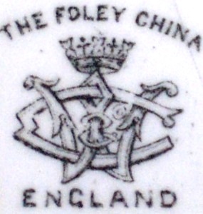
Company marks as they appear under porcelain or pottery wares from the eighteenth century sometimes come extremely close to the modern logo. They frequently contain both pictorial elements and stylized letters or words and identify both a product and its manufacturer. Many of these are true logos if we only look at their composition and the fact that they are revamped periodically as many logos are today. However these marks are not displayed boldly as logos are on labels, letterheads, buildings, and panels. They are stamped rather discretely underneath china to identify makers, and later on, to be viewed by experts, collectors, and knowledgeable buyers (fig. 1).
Fig. 1 Ceramic mark of The Foley China, England, with the interlaced monogram of Wileman & Co., underneath a tumbler displaying the shield of the Dominion of Canada, ca. 1905.
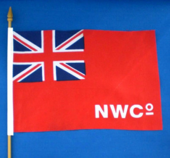
Many arrangements of letters from the past are close to the modern logo. The North West Company displayed the letters NW in gold script on a red background as its canoe flag, and it flew the Red Ensign with the white initials NW Co. in the fly from its forts, possibly also in script (fig. 2). Likewise the Hudson’s Bay Company flew the Red Ensign with the letters HBC or H.B.C. in the fly from its forts. Modern recreations tend to conjoin the HB although pictorial evidence from the period would indicate that this was not a common practice. For both companies, this was a specific use of abbreviations, and not their use as predominant emblem of the companies. The North West Company used the crest of its arms, a beaver gnawing at a tree, as its main identifier, and the Hudson’s Bay Company used its armorial bearings on its seals, on maps, and on its buildings.[1]
Fig. 2 A tourist version of the Red Ensign defaced with the monogram of the North West Company.
The logo is really a modern invention that came into being particularly with colour printing along with graphic and commercial art in the last quarter of the nineteenth century. Like heraldry, it was born on a kind of battlefield, namely the acutely competitive world of modern publicity aiming to sell, not only products or services, but also a company name.
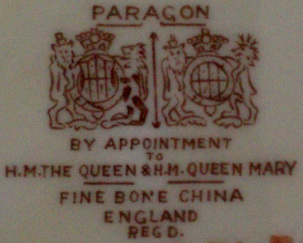
In the past, the reputation of an artisan or a guild was very important and jealously guarded. Royal patronage was a valued mark of good quality (fig. 3). Today the consumer is keenly aware of the notion of good value for money and that buying cheap can be costly and frustrating in the long run. One of the means of judging a product is the reputation of the manufacturer. This is of paramount importance when the stakes are high. Imagine what unblemished credentials and impeccable corporate image a company must have when trying to sell a product like airplanes to an airline or country. One is not just promoting a product, but the reputation and professionalism of the product maker. Anything that may look amateurish or untidy about a company could mean the difference between winning or losing an important contract. The company logo is part of that corporate image. In some cases, a company may decide to have a consumer-oriented logo for its products and a more formal looking logo, or a coat of arms, for corporate identity.
In the past, the reputation of an artisan or a guild was very important and jealously guarded. Royal patronage was a valued mark of good quality (fig. 3). Today the consumer is keenly aware of the notion of good value for money and that buying cheap can be costly and frustrating in the long run. One of the means of judging a product is the reputation of the manufacturer. This is of paramount importance when the stakes are high. Imagine what unblemished credentials and impeccable corporate image a company must have when trying to sell a product like airplanes to an airline or country. One is not just promoting a product, but the reputation and professionalism of the product maker. Anything that may look amateurish or untidy about a company could mean the difference between winning or losing an important contract. The company logo is part of that corporate image. In some cases, a company may decide to have a consumer-oriented logo for its products and a more formal looking logo, or a coat of arms, for corporate identity.
Fig. 3 Example of royal patronage with the outline of the arms of Queen Elizabeth and those of Mary, the Queen Mother, Paragon mark (England) underneath a cup displaying the arms of Ontario ca. 1945.
Many attempts have been made to weigh the relative merit of coats of arms as opposed to logos, which are often seen as competing one against the other. My own reflections on the matter, over many years, have led me to conclude that heraldic emblems are better suited for certain purposes while logos are preferable for other applications. Before discussing the best functions for each, I have tried to take a comparative look at their similarities and differences beyond the fact that one has existed for centuries and the other for little more than a century. Of course there are many ways of looking at this same question. My first objective is to promote further reflection in this area not just from designers but from the prospective clients of such designs.
Similarities Between Arms and Logos
Clients - Whether one is designing a coat of arms or a logo, the first step is to find out what the client has done, does, and wants to do. In the case of a coat of arms, the designer will search for history, tradition and moral values. For a logo, products, market, competition, and plans for future growth are important.
KIS – “Keep it simple, stupid” is often expressed by the acronym KISS. But, because an emblem has to be clever to work well, the best approach is KIS, or “Keep it simple”. Readability and clarity, even when reproduced in small size, are most important. This means: no clutter and immediately identifiable content. The viewer does not have time, for instance, to figure out whether an object is a skullcap or an umbrella. The moment this happens the message is lost. An emblem can only convey with strength a few ideas, not a half dozen or more. Usually the first crop of ideas is far too abundant and a distillation process is necessary to arrive at bare essentials. Information gathering and subsequent refining to arrive at a few key notions helps the designer know the entity to which the design will apply, makes clients an important part of the creative process, and allows them to see how their ideas are given graphic expression.
Appeal – A coat of arms or logo that is not appealing will not do its work even if it should contain the cleverest of ideas or the most interesting symbolism. Good design and artwork are of paramount importance. The final rendering should be catchy, retain the viewer’s attention and convey a nice warm feeling. Well-designed and well-drawn heraldic emblems or logos radiate a certain magic that makes them memorable.
Proportions - Right proportions are also important. A lion on a shield, for instance, needs to be a certain size in relation with the space on the shield. In fact, a lion so stylized as to look somewhat crowded by the confines of the shield will look powerful, like a huge King Kong barely contained within its cage, and will serve the purpose of heraldry better than a small lion lost in the centre of the shield. Likewise, a logo that is too wide with respect to its height, or vice-versa, will not normally look appealing, unless it is intended for a specific effect. Getting the right proportions usually requires many trials.
Colours - Any interior decorator or fashion conscious person knows that certain colours do not work together. Some logos have many colours and appear well suited to the product and the targeted buyers and seem to fit very well into an age when we are bombarded with colours. Still, the use of many different colours has to be managed with care. A few well-chosen dominant colours will normally prove more effective in conveying a message than a wide spectrum of hues. Fewer colours convey a more sober and dignified look. This again may require the comparison of a number of drafts.
Contrast - Heraldry has two metals, namely, gold (yellow) and silver (white), and four basic colours: red, blue, green, and black. It achieves contrast by never placing a metal on a metal nor a colour on a colour. Commercial art follows identical principles. A look at a number of products will readily prove this point. Emphasis or exaggeration will also create contrast. Heraldry stylizes objects to bring out some of the salient features. For instance, an oak tree may feature big leaves and acorns to quickly and clearly identify the type of tree, and also as a means of producing interesting artistic effects. A lion can have a lean body with oversized limbs, mane, claws and tongue to bring out its strength and ferocity, in fact to convey the most essential elements that make it a lion. Similarly, logo designers emphasize certain words, letters or images by stylization, relative proportions and colouring.
Abstraction – Both arms and logos have subliminal qualities, in other words, influence the viewer at an unconscious level. While arms are meant to convey an aura of tradition and history and have a dignified appearance, logos strive to make the buyer feel that a product is the key to a better life, be it a matter of food, drink, comfort, leisure, libido or social status.
Uniqueness – Since the purpose of arms is to identify specific persons, countries, municipalities, corporate bodies, and institutions of all kinds, uniqueness becomes a must. Today cases relating to plagiarism or counterfeit more frequently relate to commercial art. But beyond the danger of plagiarizing another design, being unique is one of the great strengths of both logos and arms. What is unique will generally draw a more attentive and conscious look than what is run-of-the-mill or déjà vu, though what is familiar can also have its own appeal.
Borrowing - A logo will sometimes borrow traditional heraldic forms such as a shield, a lion, a unicorn or a fleur-de-lis, all of which have been used in heraldry for hundreds of years. Here the artist simply gives the symbols a graphic style to make it fit into the overall composition. Similarly incorporating a logo into a coat of arms requires skill, since a logo has a specific graphic form that cannot be changed without dramatically altering its character. One approach would be to adapt the entire composition to the style of the logo and to abandon the traditional heraldic style. A better approach might be to meld the two styles, and it is a fact that some heraldic emblems successfully combine several styles as we shall see (fig. 31).
Consultation and feedback - Too many cooks spoil the broth has often been quoted in connection with heraldry, and this surely applies as well to logos. Organizing a contest and declaring a winner rarely works. Going to a broad-based consultation in democratic fashion is good to gather ideas, but such ideas have to be distilled into a few essential ones since cluttered emblems do not work. Decision-making should also be highly focussed to avoid becoming bogged down in endless discussions. A panel of three seems a good number. It is wise to get critical feedback from specialists in one’s own field before showing results to the client. For public coat of arms such as those of municipalities, reaction usually comes from journalists or private citizens, and tends to be short-lived. The decision to keep, replace or modify a logo will, of course, depend on the response of the public.
Differences Between Arms and Logos
Structure - Heraldry is a structured art with specific parts and a concise description in heraldic language (a blazon), which allows two artists working separately, even in different centuries, to recreate the same emblem in their own style. The logo does not have a prescribed structure, such as shield, motto, crest and supporters, and is not described with the same specific terms found in heraldry.
Commercial use - Arms are sometimes used commercially to identify the manufacturer of a particular product and sometimes a patron, as in the case of royal patronage. Some commercial depictions are pseudo-heraldry, but a certain number of examples of good heraldry can be found particularly on the labels of wines and spirits, cigars and select foods such as fine cheese. Logos, on the other hand, are far more commercial and, in fact, come into competition with coats of arms only when they cease to be exclusively commercial and are used to represent the corporate identity itself rather than its products. This often happens with municipalities that regularly adopt a logo rather than a coat of arms.
Family emblems - Coats of arms are granted to one person and descendants and become family emblems by heredity. Logos do not, as a rule, represent a single person or a family. There may be instances of personal or family logos, but these would undoubtedly be rare and unusual as they are not well suited for that purpose.
Life expectancy - Arms are granted forever and can be redrawn in many different styles over the centuries as long as the different renderings comply with the blazon. A logo with a lifespan of ten years is considered a success, although some logos have lasted over a hundred years.
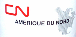
Flexibility – A coat of arms is generally viewed as allowing more flexibility than does a logo in the different styles it can be rendered. An artist can draw a coat of arms from a written description without reference to a previous drawing. Some logos, such as that of the Canadian National Railway, are drawn in such a precise, studied way that even a small alteration would change their character (fig. 4). The letters CN, presented in different graphic forms, are used as the logo of several companies. Since the Middle Ages, it has been against heraldic practice for one entity to use arms belonging to another entity. Even if two heraldic emblems were drawn in very differently styles, the blazon would remain essentially the same and the rules of heraldry would be infringed.
Fig. 4 CN logo, on a coffee mug “Made in England”.
Use of letters and words - While logos make extensive use of letters and entire words presented in stylized form, heraldry usually limits words to the motto on a scroll below or above the shield. Letters on the shield are not frequent, except in the case of some European cities where letters or entire inscriptions appear on the shield. A well-known example is SPQR found on the arms of the present City of Rome and on those of other cities of Roman origin. The arms of Gälve in Sweden display a large gold stylized G on a blue field. A number of Spanish cities such as Badajoz, Cádiz, Málaga and San Sebastián have placed their motto on the shield itself. Other heraldic traditions consider this practice poor heraldry because the shield was the essential identification tool at a time when few could read.
Values - Heraldry reflects tradition, history, and old well-tested values. It is formal or official in appearance and is often linked to authority, while still conveying an appealing image. The arms of the London Stock Exchange are a striking embodiment of these values as exemplified by its motto: dictum meum pactum, "My word is my bond". A logo is generally a friendlier-looking device aimed at creating favourable emotions in the viewer in order to sell a product. While heraldry seeks intellectual content such as symbolism and significance, logos tend to appeal more to emotions. A happy or smiley face can appear in a logo but has no place in heraldry. The heraldic sun can have a human face but not a broadly smiling one. In traditional heraldry, animals are made to look as if they were ready and able to defend their territory. A lion should never be given a pussy-cat look.
Availability of artists - For logos, the problem is to find good artists among the many who are available. Heraldic artists, on the other hand, are harder to find, and too often, clients resort to artists with no training in heraldic art.
General Remarks
Heraldry – Those who favour the logo above heraldry will inevitably remark that coats of arms look outmoded in this day and age, whereas the logos looks modern and fresh. Underlying this notion is the fact that we still see more bad than good heraldic designs, and bad heraldry can look shabby or outmoded in comparison with a well-designed modern logo. Modern heraldry strives to return to the simplicity of the heraldic shield that was used on the medieval battlefield where it had to be quickly and accurately identified, but not all heraldic manifestations reach this degree of excellence.
When heraldry ceased to play a role on the battlefield and in tournaments, it suffered a slow decline from the sixteenth century onwards, which took the name of heraldry of the decadence. It was not until the second half of the twentieth century that a widespread effort was made to return to the simplicity of medieval art. In the intervening period, the art became too ornamental as witnessed by complex and oversized mantlings, baroque shields, and the multiplication of quarterings to which the bearer was not necessarily entitled. Examples of this heraldry have come down to us in publications and in other forms such as bookplates, but should not be taken as models since good heraldry strives for simple design. A heraldic description (blazon) that is unduly complicated sounds amateurish, even phoney.
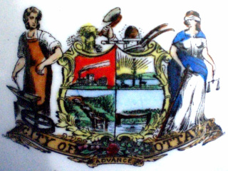
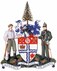
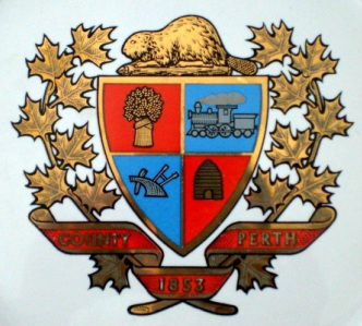
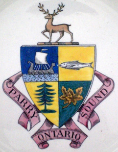
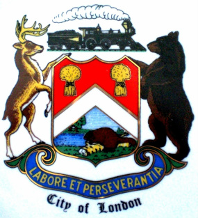
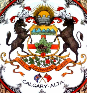
In North America, artists with little knowledge of heraldry have composed many of the municipal arms and even state arms in the USA. Most of these compositions are far too cluttered to convey a clear message and may depict too graphically life as it existed at a particular period (fig. 5).
The occasional heraldic artists who designed these arms belonged to the world of ornamental and decorative arts such as house, coach and sign painters. Others were attached to the world of publication as illustrators, illuminators, calligraphers, engravers and printers. Some were landscape or portrait artists. Others still were architects, draftsmen or designers. Some became involved with heraldry as numismatists. [2]
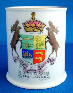
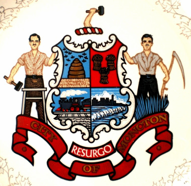
Though they generally knew what the components of a coat of arms were, many of these amateur artists had very sketchy notions as to heraldic composition and art. As a rule, they failed to reduce symbolism to its simplest expression such as a tree, a sprig, a leaf to symbolize a forest, a locomotive wheel or boat wheel instead of a train or a ship, water as alternating wavy blue and white bars instead of a sea or river. They frequently depicted scenes in realistic style and natural colours. The results were too often landscapes, seascapes or cityscapes depicted on a shield. Their heraldry emphasized agricultural products, grain elevators, and industry, which might include mills with smoke stacks, modes of transportation such as locomotives, sailing ships, steamboats, rivers and canals. These elements were sometimes combined with a few heraldic forms such as a chevron having as main function to divide the shield into two parts. However, the most frequently used division was partition into four, which allowed placing each scene neatly in its own well-defined space (figs. 5, 7-10). The amateurs who took time to learn something about heraldry and to create arms of a more educated nature were few. [3]
|
Fig. 7 Arms of St. John New Brunswick, on a tumbler made for the 100th anniversary of W.H. Hayward, St. John, marked The Foley China by Wileman & Co., England, 1905. Vachon Collection, Canadian Museum of History.
|
Fig. 8 Arms of Moncton, New Brunswick, on plate by Canadian Art China, Collingwood, Ontario, ca. 1970. Vachon collection, Canadian Museum of History.
|
The creations of occasional heraldic artists can be charming as a sort of popular art and can contain good ideas, but they are not heraldry in the traditional sense. They also appear a little colonial and become outdated, as the economic bases of cities change over the years. When these emblems are also badly rendered, they can do a great disservice to heraldry as an effective modern means of communication and convey a false notion of heraldic composition to the general public. A logo-oriented person will rightly point out that these devices are ill equipped to compete with the modern logo.
When heraldry is commissioned on a client-artist basis, the artists try to accommodate the client who usually has no knowledge of heraldry. A common practice is to include something for everyone although less is considered more in matters of symbolism. A city, for instance, might request something for education, religion, major annual events, its resources, its industries, its ethnic composition, its geographic location, its flora and fauna, often in natural depiction. Everything put together can create a jungle of shapes and a rainbow of colours. The work of a good heraldic artist is to reduce these elements to a limited number of symbols and colours in order to create a coat of arms that is simple, beautiful and conveys powerfully a few major ideas. This can prove difficult to achieve even by officially appointed heralds who wield the authority of an official body. It rarely proves possible for individual designers.
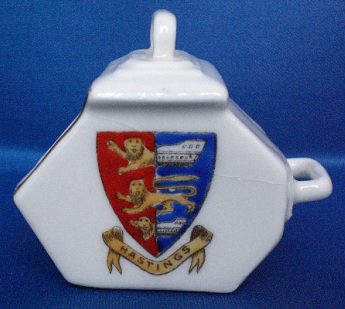
Good heraldry has timeless qualities. Its symbolism is often beyond time and space; its imagery can transport us into imaginary worlds. For instance, the arms of the English Cinque Ports juxtapose two shields split in half that join the fore-halves of lions to the sterns of ships (fig. 13). There is no such thing in the real world, but the imagery is intriguing and in fact contains the same idea as modern amphibious vehicles. The mythical unicorn, which is so popular today in cartoons, fiction and as souvenirs, is often viewed as a white horse with a long horn. But the traditional unicorn is composed of the body, mane, and head of a horse, the horn of a narwhal, the beard of a goat, the tail of a lion, and the legs of a hart or antelope with tufted hocks and cloven hooves. Another composite creature, among many, is the dragon, a serpent-like creature with a horned head, a forked tongue, an armoured chest and belly, a pointed tail, legs ending in talons, and the wings of a bat.
Fig. 13 Hastings arms, on miniature flour scoop with Gemma mark by Schmidt & Co., Czechoslovakia, ca. 1925. Property of A. & P. Vachon
Other relatively well-known fanciful creatures are the phoenix, the mermaid, the griffin, and the Pegasus. Lesser-known ones are the wyvern, the cockatrice, the yale, the onipicus and the enfield, all of which combine parts from various animals. Admittedly these creatures are a motley mixture, but when drawn they appear to form an organic whole and look less monstrous than some existing animals such as the platypus, a semi-aquatic egg-laying Australian mammal with a leathery duck-like bill, brown fur and webbed feet bearing poisonous spurs in the case of the male. The okapi of the Congo looks like a zebra and a giraffe fused together.
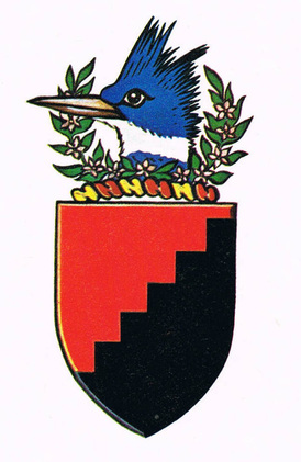
Moreover heraldry can contain clever allusions that are amusing and easily remembered. Arthur Drysdale Stairs of Halifax Nova Scotia was granted a shield divided into red and black by an indented diagonal line that produces a simple shield with the effect of stairs (fig. 14). Sometimes heraldic imagination is carried to the point of humour, as in the arms of Hopwell of Hopwell Derbyshire that consist of three red rabbits, termed conies in heraldry, each playing a bagpipe, “hop well” being represented by rabbits. [4] Sometimes humour is at the expense of the recipient. When the edict of 1696 forced many classes of people in France to obtain arms in order to raise money for the king, an unwilling apothecary of Quimper, Brittany, was granted a blue shield bearing a syringe between three chamber pots, all silver. [5] A lawyer of Normandy named Le Marié (the married man) was granted a pair of horns. [6] Of course such arms were not in the spirit generally conveyed by heraldry, though the messages were direct, clear and simple.
Moreover heraldry can contain clever allusions that are amusing and easily remembered. Arthur Drysdale Stairs of Halifax Nova Scotia was granted a shield divided into red and black by an indented diagonal line that produces a simple shield with the effect of stairs (fig. 14). Sometimes heraldic imagination is carried to the point of humour, as in the arms of Hopwell of Hopwell Derbyshire that consist of three red rabbits, termed conies in heraldry, each playing a bagpipe, “hop well” being represented by rabbits. [4] Sometimes humour is at the expense of the recipient. When the edict of 1696 forced many classes of people in France to obtain arms in order to raise money for the king, an unwilling apothecary of Quimper, Brittany, was granted a blue shield bearing a syringe between three chamber pots, all silver. [5] A lawyer of Normandy named Le Marié (the married man) was granted a pair of horns. [6] Of course such arms were not in the spirit generally conveyed by heraldry, though the messages were direct, clear and simple.
The coats of arms that are continuously being created and granted by the various heraldic authorities of the world often contain modern realities such as the propeller of a plane, a computer chip or electrons in orbit, in other words, small objects that represent modern technology without having to bring large complex and cumbersome machines into the picture. Monsters of modern technology, such as tower cranes, oil derricks and tankers, could lack elegance if depicted whole. Two bulldozers with blades positioned on either side of a shield would make truly powerful supporters, but would not be especially dignified. In fact they would look a bit like cartoons or caricatures since the object of supporters is to uphold and protect the shield, not to crush it. Animals make the most suitable and elegant supporters because, with skill and time, they can be stylized to look serious and determined, even a little angry, without looking caricatural. The stylized lion does not look much like a real lion, though it is readily recognized as one. Humans and inanimate objects do not lend themselves well to this degree of stylization.
One striking modern coat of arms is that of the United Kingdom Atomic Energy Authority. It consists of a black field covered with white roundels representing a block of graphite with uranium rods inserted in it. The atomic pile is represented by the heraldic pile, which looks like the end of a sharp pencil pointing downwards from top to bottom of the shield. Across the pile are red horizontal zigzag lines suggesting nuclear fission and the resulting energy: http://blog.nuclearsecrecy.com/2013/01/22/more-nuclear-symbolism/ (accessed 18 July 2015).
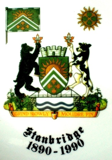
Heraldry is far more versatile than normally believed, not just because it can be drawn in a number of styles, but also because various components of a coat of arms can be used separately. The shield and crest can both be used alone or displayed accompanied by the scroll bearing the motto. On silverware or letterheads, for instance, we often see the crest alone or the crest with the scroll inscribed with the motto underneath. Any person or corporate body having received a grant of arms is entitled to a banner of the arms, which involves transposing the content on the shield unto a square or rectangular surface to create a flag (fig. 16).
Fig. 16 Arms, Banner and Badge of Stanbridge Township, Quebec, granted by the Canadian Heraldic Authority 1990, on unmarked plate. Vachon Collection, Canadian Museum of History.
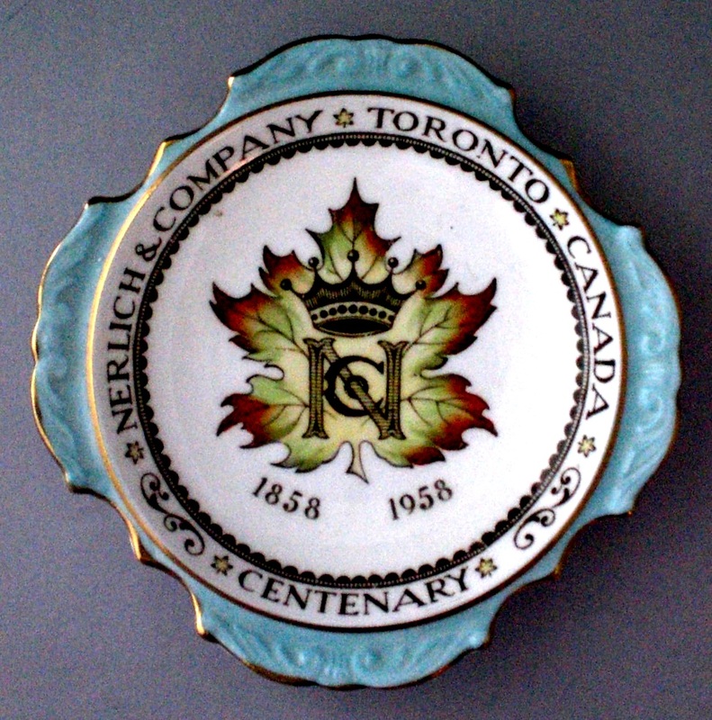
Another heraldic device is the badge. In former times, it was associated with a household in the same manner as livery colours and was worn on the uniforms of servants. Today it usually reproduces in a simpler form some of the components of a coat of arms, and should not be confused with a logo. When a city uses an emblem derived from its arms without lettering or words added, it should be termed a badge. While a badge can include the motto derived from the arms, on a surrounding belt for instance, it does not, as a rule, include within the badge itself letters or words such as the name of a city or corporation. A logo, on the other hand, can be made up simply of a stylized word or monogram, sometimes on a framed background. It may be in colour or black and white. A heraldic badge, however, will always have pictorial content and solid colours, which are specified in the heraldic description. Any heraldic emblem can also be reproduced simply as line art without colouring. This is merely a simplified version for a specific application such as black and white printing. Usually a badge looks a bit more formal than a logo, and in most cases, it is fairly easy to classify an emblem as a badge or logo, but there are instances where the distinction is not obvious on the basis of composition. Nevertheless a badge-like device for commercial purposes without reference to a coat of arms is not a badge in the heraldic sense.
Badges can be useful to identify the machinery, equipment and vehicles used by cities or corporations. Being simpler than full coats of arms, they cost less to reproduce, yet they command a certain respect because of their formal appearance. Here one is not trying to promote or sell equipment or machinery, but simply to indicate ownership. Such marks of identification need not be fancy or friendly; they only need to clearly identify property, as badges are suited to do.
Military badges are sometimes derived from a coat of arms, but more frequently they are original creations, which may or not be heraldic. In some countries, we find naval badges depicted in a humorous way to look somewhat like cartoons. It would seem that any badge connected with the military, where discipline and belief in a cause are important, should be a little more formal and traditional as they are in Canada. Surely there must be better ways of boosting morale than displaying comic badges.
It is highly recommended that arms, flags and badges be petitioned from the heraldic authority of countries where they exist. This ensures that what is received is heraldically sound, well recorded and has official status. Generally in the heraldic authorities of various states, the herald does the conception of the arms from information supplied by the petitioner. This requires a broad culture on which to draw for appropriate symbols. Knowing the rules of heraldry, having a good imagination and a sense of composition are all essential to put ideas into an effective design. The artist usually translates the concept into a first rendition, which tests the visual merits of the composition. At this point, the artist and other heralds should be given the opportunity to offer advice. At the Canadian Heraldic Authority, the preliminary drawing is approved by both the Chief Herald and the client. The process will normally involve discussions and compromises. On rare occasions, a deadlock may result, but generally everything works out rather smoothly provided none of the major steps are skipped.
The Logo - The main criticisms levelled against logos are that they lack tradition, are meaningless, ugly and will disappear within a few years. These remarks are unwarranted the moment we understand that coats of arms serve one purpose and logos another. The two types of emblems belong to different traditions and serve different ends. In all the arts, whether it is music, painting, architecture or fashion, there is a tendency to favour one approach and criticize the other rather than acknowledging that each may have its own merit. The classical music lover may view rock music as unpleasant noise and conversely the rocker may find classical music boring and not in tune with the pace of modern life. Beyond personal taste, it may be said that one type of music is more appreciated by certain age groups and more suitable for certain occasions.
As in heraldry, mythical allusions are sometimes found in logos like that of Reynolds Aluminium showing St. George assailing a dragon. The phoenix and Pegasus appear in a number of logos, sometimes in highly stylized form, cases in point being the logo of Phoenix Geophysics of Toronto and Pegasus Communications in the USA. Historical figures are also present like the silhouette of Napoleon dominating the logo of Courvoisier Cognac and the bust of a Quaker in traditional dress on Quaker Oats products. Other logos seem to be inspired by the past, such as the Michelin tire man armoured in tires imitating the traditional metal armour of the knight. The six-legged fire-breathing dog of AGIP (a European oil and gas company) reminds us of fire-breathing creatures such as the traditional dragon or the heraldic panther, though it is in fact a new creature: https://en.wikipedia.org/wiki/Agip (accessed 18 July 2015).
Though their graphic form may be inspired by the past, logos are designed to serve the present and future. So many are just the name of the company or acronym in stylized form, alone or enclosed in a more or less elaborate frame. The famous Coca Cola logo is simply made up of these two words in stylized form while the also famous MARTINI logo is framed in various ways. Among famous acronym logos are IBM and CNN. Other logos form a pictogram using the letters of their name or acronym such as that of Bolle Dairy of Berlin where the letters are arranged into a human figure with a bell in hand. The eBay logo is made up of an interesting arrangement of letters in various sizes, levels and colours. Other logos such as those of Shell and Apple are centered respectively around the depiction of a shell and a variously coloured apple with a bite out of it. Many logos are both pictorial and scripted.
To say that some logos are ugly is one thing, but to say that all or most logos are ugly is nonsense. If all or most logos were ugly, life would be most distressing, since they are all around us. Logos are made to attract and please and they usually do this to varying degrees in a fairly subtle way. Creating an outstanding logo requires skill and even some luck. It is generally accepted that good logos are simple, readable, well proportioned, catchy, pleasing and appropriate for the product or entity they represent. A highly elegant artistic logo would be expected of an art company and a more robust-looking one for a company manufacturing heavy machinery. However, beyond such general guidelines, there is no simple recipe. In the process of creating something new and effective, the designer will likely attempt a large number of combinations before arriving at a final choice.
What makes a logo successful is fascinating but elusive. The success of a logo ultimately rests on its popularity, and what makes it popular is as intangible as the making of a star in the entertainment world. A logo’s success might be measured to some extent by increased business and sales, but to separate the logo’s success from overall achievement due to strategy and promotion techniques seems most difficult. A company that has used the same basic logo for several decades might well hesitate before adopting a new one. One approach might be to introduce, as many companies do, the new logo in some areas without shedding the old one. A way of judging a logo’s popularity could be to diffuse it on a variety of collectables such as cups, T-shirts, caps, lapel buttons and coasters. The popular demand for such gifts and collectables would seem to be a good way of judging a logo’s appeal and to make the logo known.
There is a constant need for renewal and new appeal in the commercial world. Even especially good television commercials suddenly disappear, never to be seen again. Obviously these good commercials are considered to be effective only for a short period, after which a new angle is sought to maintain public interest. The same types of pressures come to bear on logos because they are linked to the same world of publicity, but for the logo it is difficult to judge at what time too much exposure may become detrimental.
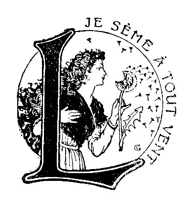
Although ten years is considered a good life span for a logo, some logos have retained the same basic word or image for over 100 years. The most frequently quoted example in this respect is the calligraphic inscription of Coca Cola, which has retained the same basic structure since 1886. But there are many other oldies around. Since 1890, the publication company Larousse, which sold many dictionaries to students in Canada, has represented the diffusion of knowledge with the art nouveau head of a lady blowing on a ripe dandelion to spread its seeds (fig. 19). The motto “Je sème à tout vent” meaning “I sow with the wind” further reinforced the idea of diffusion of knowledge. For many years some schoolbooks bore the logo of the Belgian publisher Marabout, which featured a Marabout (an African and East Indian stork) with a book under its wing. The same image variously coloured and framed is still in use today. To francophone Canadians “marabout” had a funny side because it means a grouch or grouchy, a colourful Canadian meaning now noted in the Nouveau Petit Robert. All such logos have undergone small cosmetic or peripheral changes, but have retained the same basic elements. It is common for logos to undergo a face-lift from time to time.
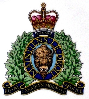
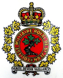
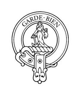
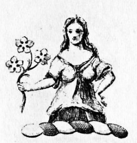
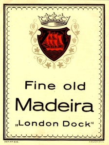
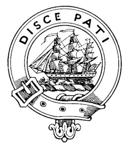
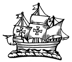
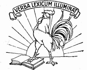
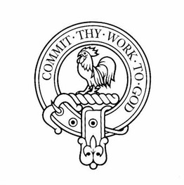
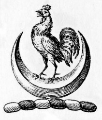
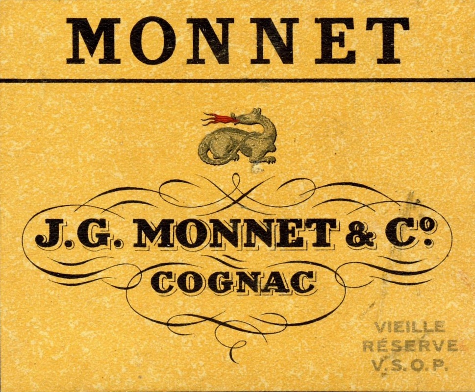
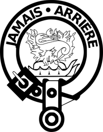
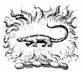
The illustrations below show the close resemblance between some logos and various heraldic emblems such as badges and crests.
*See original rendering at : https://en.wikipedia.org/wiki/List_of_Scottish_clans#/media/File:Clan_member_crest_badge_-_Clan_Douglas.svg.
The ten-year span does not apply to other logos that have been around for decades such as Mobil Oil, Esso, Shell, Goodyear, IBM, General Electric, Philips, Alcan, Kodak, Javex, Tide, Arm & Hammer, Kellogg’s, Catelli, Kraft, Nestlé, etc. If one looks at a 20 to 30-year old magazine or telephone directory, one will find many logos that are still in use today. The notion that all logos are ephemeral obviously needs re-examination. Today the efficiency of the more enduring logos, as opposed to the more trendy types, warrants serious study. With exposure emblems tend to grow on people, and those that are unique, catchy, and respond more to traditional values, rather than passing trends, have a better chance of a long life. Trendy logos have their place on ever changing products such as clothing, but tend to change more frequently because they are linked to the effervescent world of fashion.
Heraldists often speak of logos as being superficial, but again one must keep the purpose intended in mind. If the board of directors of a wine company that had been in existence for many years and was known for the long-standing quality of its products were given the choice between arms or a logo, it is most likely that the board would instinctively favour the arms. On the other hand, if a company were trying to market a new product that depended greatly on quick sales before it was supplanted by a new product, surely there would be no hesitation in choosing a modern logo rather than a coat of arms. Attempting to create a logo that will become the identifying mark or signature of a corporate body for a number of years is a highly challenging task requiring knowledge, imagination and skill, all the more so because there is no trodden path to achieve this. One might say that a company would do better with a coat of arms for purposes of corporate identity, but this may not be suitable for a product-oriented company since coats of arms are generally not sale-oriented. Creating a trendier logo for an ephemeral purpose also requires knowledge of the current tastes and, more importantly, anticipating what will be popular in the near future. Working at such creations is fascinating and exciting and is part of our effervescent, competitive and changing world.
Heraldists delve into mythology, religion, history and folklore to find suitable symbols, which will usually illustrate abstract notions. They also explore nature in its broadest sense, as well as man’s creations including modern ones. Beyond a broad culture, heralds like logo designers need a creative mind, a fertile imagination and the open mindedness to explore modern possibilities. Both good logos and good coats of arms are unique, striking and intriguing. Both areas of endeavour are captivating, and can be highly rewarding in a creative sense.
The Melding of Styles
Canada’s flag presents an interesting case of traditional heraldry being mixed with the graphic arts. Except for the centre, which is twice as wide as normal to accommodate a large squarish maple leaf, the background is traditional heraldry. A graphic artist, on the other hand, conceived the stylized leaf. The leaf is completely symmetric and fits very well into the given space. Although it presents a rigid form, it is a powerful rendition. In fact, if one tries to substitute a maple leaf as found previously in Canada’s heraldry, the flag loses a great deal of its appeal and strength. When travelling abroad, I have seen versions of the Canadian flag with a more natural looking leaf. This made the flag look trivial, like a travesty of the real one. Some flag designs are more flexible. The Union Flag (Jack) is a completely geometric design, but still looks appealing when drawn more or less elongated and with the crosses more or less wide.
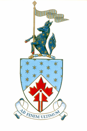
The arms granted to the Canadian Space Agency by the Canadian Heraldic Authority in 1991 feature a logotype red maple leaf on which is superimposed a white arrow having a wide point with its shaft extending into the stem of the leaf. A red roundel is placed near the tip of the arrow. The impression given is that the leaf is equipped with a rocket propulsion system to raise it into the stratosphere represented by gold stars on a bleu-céleste background in the upper part of the shield. The combination is not offensive and has a rather dynamic and forward looking appearance (fig. 31).
Fig. 31 Arms of the Canadian Space Agency, granted by the Canadian Heraldic Authority, 1991. Reproduced by permission of the Canadian Heraldic Authority of Canada © Her Majesty in Right of Canada.
Confusion often arises from the fact that flags and even military badges are not always heraldic. There seems to be nothing wrong with this in principle, but at times such emblems mix heraldic symbols with a naturalistic approach or with logotypes drawn from commercial art which do not always meld well together. A skilled artist may be able to achieve a fairly harmonious mixture, but many of these creations are not heraldic, neither in composition nor in appearance. Although a person highly skilled in blazonry (art of describing heraldic imagery with heraldic words) can succeed in describing a hodgepodge device with remarkable accuracy in heraldic terms, it does not make the design more heraldic. It is more a tribute to the descriptive power of heraldic terminology. The confusion becomes even greater when these heteroclite designs are described with a gibberish blazons. A blazon that does not accurately describe imagery is useless because the purpose of blazoning is to permit the recreations of emblems with all their components should the image be lost or to allow the correction of drawings that contain errors.
|
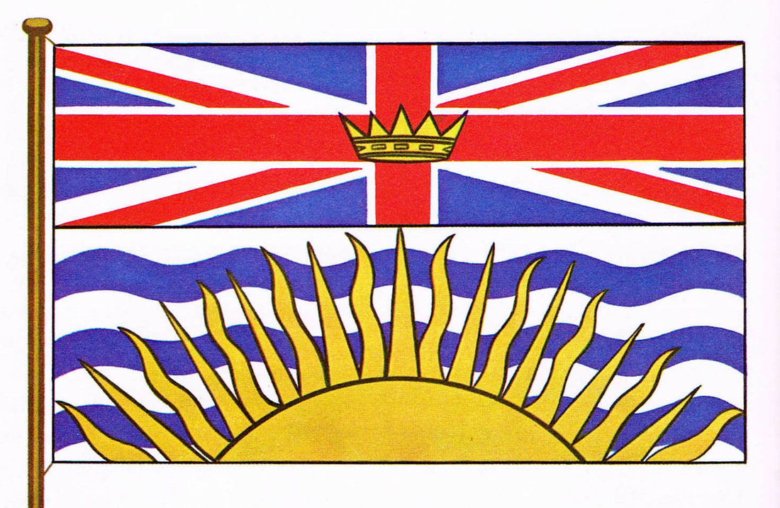
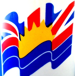
Fig. 32 Banner of the Province of British Columbia, adopted 1960.
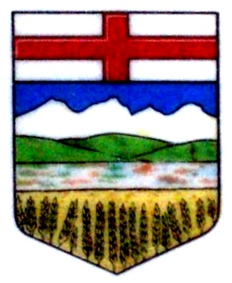
Fig. 34 Though granted in 1907, Alberta’s arms are a landscape approach to heraldry. On butter pad made in Western Germany, 1960s.
|
Fig. 33 A powerful, though inaccurate, commercial depiction of British Columbia’s banner, on a coffee mug made in China, 1980s-1990s.
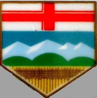
Fig. 35 An interesting attempt at simplification by a commercial artist. On plate decorated in Canada by Canarada, ca. 1980s. |
Making a Choice
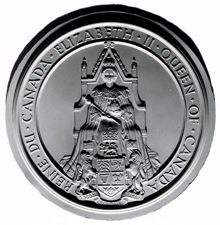
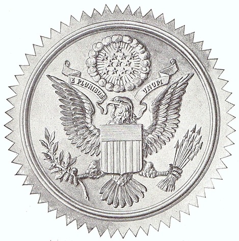
Why do states choose coats of arms rather than logos as their main identifying symbols? On analysis, the reasons seem fairly clear. States want emblems that will express in an enduring and formal way their sovereignty, their independence, their authority to govern and make laws. States also have flags, which are almost always of a heraldic nature, and are sometimes derived from the arms themselves. But the most powerful instrument of a state is its great seal by which the most important decisions recorded in writing are given their final official mark of authenticity and authority. Great seals of state bear more or less prominently the coat of arms of the state, not a logo. A logo would not be effective on a state seal used to authenticate documents and to signify clearly what authority issues them. Logos generally do not present a sufficiently formal image to convey the notion of sovereignty and authority.
Why do states choose coats of arms rather than logos as their main identifying symbols? On analysis, the reasons seem fairly clear. States want emblems that will express in an enduring and formal way their sovereignty, their independence, their authority to govern and make laws. States also have flags, which are almost always of a heraldic nature, and are sometimes derived from the arms themselves. But the most powerful instrument of a state is its great seal by which the most important decisions recorded in writing are given their final official mark of authenticity and authority. Great seals of state bear more or less prominently the coat of arms of the state, not a logo. A logo would not be effective on a state seal used to authenticate documents and to signify clearly what authority issues them. Logos generally do not present a sufficiently formal image to convey the notion of sovereignty and authority.
Fig. 36 Present Great Seal of Canada, arms at base of throne. Silicone mould, LAC, neg. C 33866.
Fig. 37 Great Seal of the United States with arms in centre, photographic print 1896
I strongly feel that a coat of arms is more appropriate than a logo for the main emblem of a municipality. Even a mining town expects to continue once the mine runs out. All towns are heirs to some history and tradition and issue a number of formal or official documents. Presenting a citizen with a prestigious award or certificate bearing a logo does not seem quite right. Municipal councils should also be aware that heraldry can provide simple forms of identification by using various components of the full achievement of arms, as we have seen. Besides a coat of arms, a council may well choose a logo to promote tourism, for recreational activities and popular events. Only the municipal government is able to take such a decision, but it should do so in a lucid, informed way, not just in response to someone’s bias in favour of a coat of arms or logo.
Any municipality looking for identification should first determine when and where a coat of arms or logo might be used. Some municipalities that have first approached a company to come up with a civic identity package were not satisfied with the results, and after spending substantial sums of money, approached the Canadian Heraldic Authority. They finally realized that something more traditional than commercial art was needed to represent the many facets of their identity. Going through the preliminary exercise of determining the basic activities and identity needs of the municipality also ensures that emblems will be used appropriately once acquired.
Any municipality looking for identification should first determine when and where a coat of arms or logo might be used. Some municipalities that have first approached a company to come up with a civic identity package were not satisfied with the results, and after spending substantial sums of money, approached the Canadian Heraldic Authority. They finally realized that something more traditional than commercial art was needed to represent the many facets of their identity. Going through the preliminary exercise of determining the basic activities and identity needs of the municipality also ensures that emblems will be used appropriately once acquired.
Corporate bodies should do the same type of evaluation as just outlined for municipalities. If a public body is dedicated to the promotion of science and education, it may well opt for a coat of arms because it is a good media to express traditional values. Even in such a case, neither a coat of arms nor a logo is excluded depending on corporate orientations and functions. A corporation might well choose to use its logo for all publicity activities and a coat of arms for internal communications such as letters from the president or director general and on anything formal such as certificates, awards and official correspondence.
Before proceeding, it is important to have precise views of what should appear in an emblem and to present only a few main ideas. For a municipality, history, geographical setting, industries and hopes for the future will usually be important, whereas a commercial enterprise will likely be more concerned with marketing strategies, gaining an edge over competition, future growth and expansion. Reducing the list to one or two major points and a few secondary ideas will be of immense help to artists and will give the client a barometer against which to judge results. Cluttered heraldry works no better than a cluttered logo. If the client does not go through the process of triage, the herald or artist will do so without necessarily knowing as much about the city or corporation. On the other hand, it is most important that the client present only general ideas and not attempt to do the actual design.
It is essential to let the heralds, designers or artists do their work. For instance, if a community opts for a coat of arms and wishes to emphasize community spirit, the herald will want to know how this spirit is manifested in the community with a view to finding a suitable symbol for it. People selling pies at a table for the promotion of a cause will not do. Should the community spirit be most evident in the support of its hockey team, a black roundel (called in heraldry a pellet) could do nicely. If nothing stands out in the history or activities of the municipality, the herald might consider a chain with several links, interlocking rings or lozenges, a tree with several branches and a single trunk, a bee hive, a wheel with several spokes and one hub, or some other heraldic figures with interwoven parts to show a united community. Finding something more unusual, more imaginative and unique to the municipality would be much better still.
For every idea the client wishes to depict, there usually are a number of options and choosing the right one is just the beginning. Fitting it all together into a coherent attractive whole is the most difficult task and having experience in the matter is essential. The final result should be a tightly knit design.
Like the heraldist, the logo designer has several options: a pictorial image alone, a monogram, a full name, or combinations of these. There is a great deal of composition work involved, not just for content but also for colours, proportions, spacing and the type of lettering if words or letters are included. The client is of course the ultimate judge, but by the time the results are presented, every aspect of composition has been closely considered to fit together, and adding or subtracting elements usually requires rethinking the entire design.
In matters of heraldry, the importance of going to the official state body, if one exists in the country, cannot be overstated. There are far too many amateurs and even charlatans in this field to leave it to chance. Even a good heraldic artist cannot give heraldic insignia an officially granted status. If there is no official state authority, one is usually able to find some association or society dedicated to the promotion of good heraldry that will provide guidance. Many types of artists can become good heraldic artists, but all require some training. To ask the local artist or local graphic company to produce a coat of arms does not as a rule result in good heraldry. This question will be dealt with in greater detail in chapter V on designing a coat of arms.
In the case of a logo, there are many artists and companies looking for business, and it is most important to find the right ones, since commercial interests are usually involved. This should not be a political choice, but one based on ability. The Web is useful in making preliminary research in this area, but the choice will usually depend on closer contact. All artists and companies have a portfolio of what they have produced so far and should be able to provide this with a convincing presentation. The client can request to be led through the various design steps for a particular logo. In order for a logo to be unique, the human hand and imagination are necessary. If an artist has downloaded every component or worked from a collage, it may be best to look elsewhere.
Most heraldic authorities provide only very general guidelines as to the use that can be made of a coat of arms, badge or flag once granted. This may be because heraldry is viewed as flexible and adaptable to many situations. As a result, once granted, coats of arms may be given to a commercial art company who will redraw the arms to integrate them into a uniform package of corporate identity. In such cases, the arms are sometimes reworked as logotypes, loosing all their strength and meaning as a heraldic composition. A commercial company will, on the other hand, usually provide a huge binder outlining precisely the way in which a logo is to be used in different circumstances, with the realisation that positioning, relative size, and composition may be better suited for one purpose than another. There is a need for heralds to look more closely at the use that is made of a coat of arms once designed and granted. The client requires this sort of precise guidance, which surely the young Canadian Heraldic Authority will provide in a structured way as time goes on.
Another aspect of heraldry that can be confusing is the statement in letters patent that arms are granted according to the law of arms of a particular country. As a rule, the law of arms is not a written text. It is usage established over the years by the heralds of a particular country, and is rarely codified. Heralds can decide such things as the circumstances under which supporters and certain coronets are granted and set this down in writing. However, they should not try to codify heraldic art with all sorts of rules as some countries have done. For instance, stating that heraldic colours should always be flat without tonality or relief instead of leaving this decision to artists would restrain artistic expression.
When heraldry ceased to have a practical use on the battlefields, heralds tended to multiply rules and complicate the language of heraldry. This proved detrimental to the art, and of course, it is not wise to attempt to codify any form of art. A heraldic designer or artist must have talent and imagination and the opportunity to realize their full potential without artificial restraints. Unfortunately the avenues for training are few or nonexistent in many countries.
Sports have generally adopted the logo but have kept the idea of colours, not unlike the livery colours. National or city arms or the main symbol derived from arms have begun appearing on ice hockey and soccer jerseys of European teams at international matches and Olympics. This adds colour and a dignified look to sports. In some countries, teams could also obtain grants of arms to give a greater aura of legitimacy to their emblems. But we are still far away from seeing individual players using personal arms instead of a number for identification. This would restore the original role that heraldry played on the battlefield. Would the public view personal arms in sport as a bit pretentious? Perhaps the idea would gain acceptance with time, perhaps immediately. Although these visions remain the musing of a herald, they are amusing to contemplate as a future possibility.
Fig. 42 The Flyers’ goalie Martin Biron showing his origins by wearing the arms of the Province of Quebec below his face mask, during the 2008 Stanley Cup finals. From Gonfanon, summer 2008, p. 14 .
****
So far heraldry and logos have worked as two solitudes, one often spurning the other. Increasingly, the choice of a coat of arms or a logo comes under consideration when corporate identity is involved, and particularly in the case of municipalities. A number of articles by heraldists deplore the fact that municipalities increasingly adopt logos although arms better express history and tradition. But they are unable to reverse the tide. This is true as well of universities. [7]
This chapter is an attempt to approach both areas with some objectivity. There is a need to look at the two types of emblems to see where they serve best. There is little doubt that one discipline could benefit from knowledge of the other. Ideally, commercial art students should receive an initiation to heraldic art, and heraldry designers should take time to explore the world of logos. Seminars that would allow both logo designers and heraldists to express their point of view followed by discussion and confrontation should prove very worthwhile for both fields, and hopefully would throw some bridges across the chasm of prejudice.
This chapter is an attempt to approach both areas with some objectivity. There is a need to look at the two types of emblems to see where they serve best. There is little doubt that one discipline could benefit from knowledge of the other. Ideally, commercial art students should receive an initiation to heraldic art, and heraldry designers should take time to explore the world of logos. Seminars that would allow both logo designers and heraldists to express their point of view followed by discussion and confrontation should prove very worthwhile for both fields, and hopefully would throw some bridges across the chasm of prejudice.
Notes
[1] The arms of the North West Company are looked at in greater depth as a historical document in chapter 6. For the arms of the Hudson’s Bay Company, see Ramsay Traquair, “The Coat of Arms,” The Beaver 276 (June 1945): 42-46.
[2] This is based on research particularly in J. Russell Harper, Early Painters and Engravers in Canada (Toronto and Buffalo: University of Toronto Press, 1972); Colin S. MacDonald, Dictionary of Canadian Artists, 8 vols. (Ottawa: Canadian Paperbacks, 1967-2006).
[3] Encyclopedia Canadiana (Ottawa: The Canadiana Company Ltd., 1957) offers an excellent panorama of this type of heraldry: vol. 2, 164, 317; vol. 4, 233, 258; vol. 5, 63, 72, 194; vol. 6, 198; vol. 7, 127; vol. 8, 166, 256, 376, 437; vol. 9, 162, 204, 231, 234, 430, 449; vol. 10, 102, 104, 148, 232, 337, 342.
[4] Rodney Dennys, The Heraldic Imagination (New York: Clarkson N. Potter, 1976), 154.
[5] This is only one example of the many arms of dubious taste that were granted. Rémi Mathieu, Le système héraldique français (Paris: J.B. Janin, 1946), 82-83.
[6] Michel Pastoureau, Heraldry, an Introduction to a Noble Tradition (New York: Harry N. Abrams, 1997), 36.
[7] Jonathan Good, “Coats of Arms or Logos? Current Graphic Identity by Canadian Universities” in Heraldry in Canada/L’Héraldique au Canada, 49 no. 1-2 (2015), 31-49.
