Arms of Canada
Procuring national armorial bearings for Canada was a rather tedious process, mostly because the views of the committee appointed to give Canada arms clashed with those of Garter Principal King of Arms at the College of Arms in England. The committee had to obtain the approval of the King George V as a means of coercing Garter into finding a viable solution. The arms of Canada were modified in style several times but the changes always remained within the parameters allowed by the blazon (heraldic description) in the royal proclamation of 1921. The addition of the motto of the Order of Canada (an augmentation in heraldic parlance) was approved by Queen Elizabeth II in 1994.
1. Government Versions
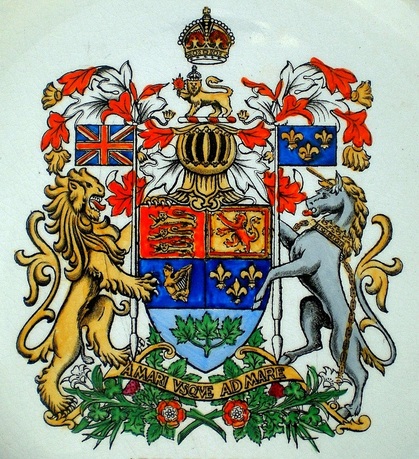
Fig. 1. The achievement of arms of Canada granted by proclamation of King George V on 21 November 1921. The illustration is from a souvenir plate by Adams (England) commemorating the 175th Anniversary Albion Lodge No. 2, A.F. & A.M., Quebec.
The proclamation of 1921granting arms to Canada describes the mantling (on both side of the helmet) as “upon a Royal helmet mantled Argent doubled Gules.” This means that the outside is white and the lining on the inside is red. To easily understand this, it suffices to think of a person wearing a white cape with a red lining. This arrangement is abnormal because the mantling, also called lambrequins, traditionally displays the colour on the outside and the metal as the inner lining. Without this anomaly, the wording would be “upon a Royal helmet mantled Gules doubled Argent.” In my view, a human error has occurred. One strong indication of this appears in the drawing accompanying the proclamation. Its mantling has the exterior coloured red and the internal lining coloured white (silver) which is the normal arrangement but the reverse of the description in the proclamation. Another clue that the wording for the mantling is a mistake appears in the crest wreath (under the lion, above the helmet). In a crest wreath, contrary to the mantling, the metal normally comes first followed the colour. Accordingly the proclamation reads: “On a wreath of the colours Argent and Gules, a lion …” Since the normal sequence for the metal and colour appears in the crest wreath, the normal sequence of colour should logically appear in the mantling. The only explanation seems a slip of the pen.
Another bothersome matter concerns the background of the lower shield featuring the sprig of three maple leaves. In the proclamation, this background is clearly described as Argent (white), but in the printed image supplied by the government, the background has a bluish tint which is rather pronounced in the illustration above. Something else worthy of note is the colour of the maple leaves. In the original drawing submitted to the committee appointed in 1919 to design arms for Canada, the leaves were red. This did not please Sir Joseph Pope, then under-secretary of state for External Affairs and member of the committee, who viewed red leaves as being in a state of decay and most unbecoming for a young country. Consequently he had the leaves changed to green, a colour which clashed with the rest of the design as it is found nowhere else. Fortunately the proclamation left the door open for modifications by describing the leaves as proper, which means natural colouring. In other words, they could be green, red, gold or multicoloured.
Another bothersome matter concerns the background of the lower shield featuring the sprig of three maple leaves. In the proclamation, this background is clearly described as Argent (white), but in the printed image supplied by the government, the background has a bluish tint which is rather pronounced in the illustration above. Something else worthy of note is the colour of the maple leaves. In the original drawing submitted to the committee appointed in 1919 to design arms for Canada, the leaves were red. This did not please Sir Joseph Pope, then under-secretary of state for External Affairs and member of the committee, who viewed red leaves as being in a state of decay and most unbecoming for a young country. Consequently he had the leaves changed to green, a colour which clashed with the rest of the design as it is found nowhere else. Fortunately the proclamation left the door open for modifications by describing the leaves as proper, which means natural colouring. In other words, they could be green, red, gold or multicoloured.
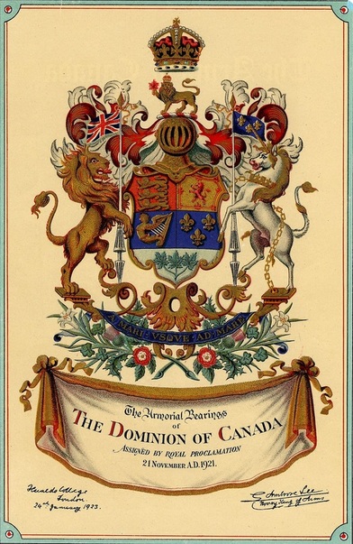
Fig. 2. The 1923 arms of Canada with revisions in style. Note the greenish tint in the background of the lower portion with the maple leaves. Illustration from: Department of the Secretary of State of Canada, The Arms of Canada (Ottawa: F.A. Acland Printer to the King’s Most Excellent Majesty, 1923).
When the Canadian arms committee saw that the drawing accompanying the king’s proclamation was the same as the one they had sent to England, they were quite disappointed. Thomas Mulvey, under-secretary of state and chairman of the committee, went to England to work with Ambrose Lee, Norroy King of Arms, with a view to producing a more artistic depiction. What they came up with was something suitable for the Victorian period (fig. 2) rather than modern times. It is important to note that, although the above print refers to the original proclamation of 21 November 1921 as it should, it is signed and dated 24 January 1923 by the College of Arms. All too often the 1923 version is confused with the 1921 version (fig. 1) because the date of the proclamation appears prominently with the image. Another problem with the printed image is that the base of the shield with the leaves has a greenish hue―the 1921 print had a blue tint in the same area (fig. 1). In some depictions the green becomes quite pronounced (fig. 3). Of course this area should be pure white as described in the proclamation.
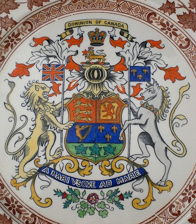
Fig. 3. In this depiction, the base of the shield, which should be pure white, is given a pronounced greenish tint based on the government printed version of 1923. The crown is not the one approved for the arms of Canada at that time (see fig. 2). On a plate by Mason's, England.
The manufacturer of this souvenir plate took the background with the maple leaves to be green because of the slight green tint in the government printed image. In heraldic art, one should not put a colour on a colour, but rather a colour on a metal, and certainly not a colour on the same colour with a different hue.
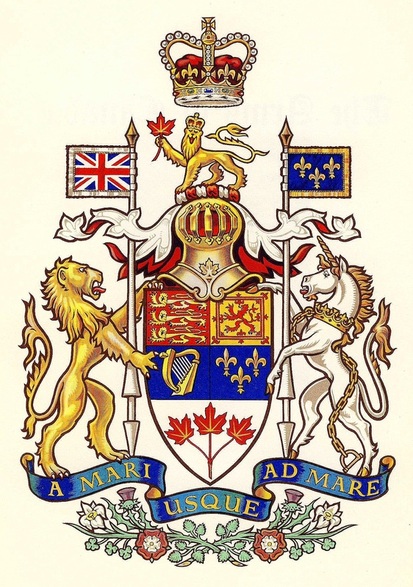
Fig. 4. The 1957 version of Canada’s armorial bearings as designed by Alan Beddoe.
In 1957 a new simplified design created by Alan Beddoe was approved by the Canadian Government. Beddoe introduced the St. Edward’s Crown with lowered arches which Queen Elizabeth II wore at her coronation (compare with figs, 1-2). The three maple leaves were made red for aesthetic reasons and the mantling was coloured white on the exterior and doubled red to correspond with the heraldic description in the proclamation. As pointed out in the comments accompanying fig. 1, the wording of the proclamation was in all probability a mistake, so that the reversal of the colours in the mantling was not particularly a good judgement call. Moreover, this arrangement looks very awkward to anyone versed in heraldry. I have often wondered why Mr. Bedddoe made the shield so long. I concluded that he wanted to give the maple leaves a larger space without diminishing the surface allowed for the arms of the founding nations above.
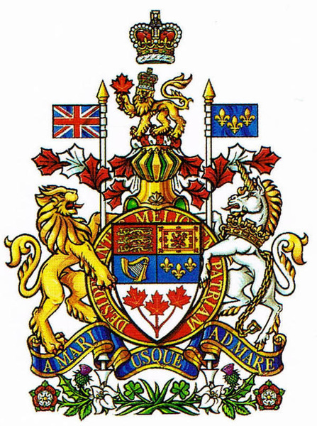
Fig. 5. Design with the motto of the Order of Canada on a ring around the shield, approved by Queen Elizabeth II in 1994.
In 1994 the motto of the Order of Canada, Desiderantes meliorem patriam (They desire a better country), was added around the shield. The revised version was drawn by Cathy Bursey-Sabourin, Fraser Herald at the Canadian Heraldic Authority. The shield was made shorter and the three maple leaves more prominent. The tips of the mantling were given the shape of maple leaves and arranged in such a way as to show more red than white, rendering less apparent the positioning of these colours in the mantling (compare with fig. 4). Introducing the motto of the Order of Canada on a ring around the shield was in imitation of the arms of the United Kingdom which display in this way the motto of The Most Noble Order of the Garter: Honi soit qui mal y pense. The idea of adding the motto began in the late 1970s with members of the Heraldry Society of Canada, particularly John Williamson, Terry Manuel and Bruce Hicks who was the most persistent in promoting this goal. In the spring of 1989, the Canadian Heraldic Authority had already introduced the motto of the order around Canada’s shield in the heading of its grants. The motto was also added to the arms of Canada in the regal window created by Christopher Wallis and installed at Rideau Hall in 1992 to commemorate the 125th anniversary of Confederation and the 40th anniversary of Her Majesty’s accession to the throne. On the advice of the Prime Minister of Canada, Queen Elizabeth II approved the changes on 12 July 1994. They were registered on 15 March 15, 2005 in
vol. IV, p. 457 of the Public Register of Arms, Flags and Badges of Canada. See: http://reg.gg.ca/heraldry/pub-reg/project-pic.asp?lang=e&ProjectID=461&ProjectElementID=1555.
vol. IV, p. 457 of the Public Register of Arms, Flags and Badges of Canada. See: http://reg.gg.ca/heraldry/pub-reg/project-pic.asp?lang=e&ProjectID=461&ProjectElementID=1555.
2. Individual Renditions
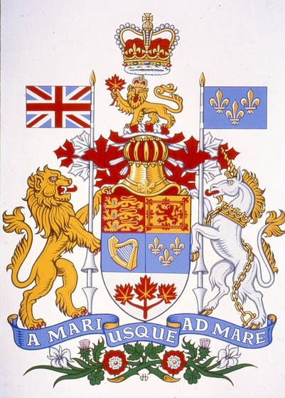
Fig. 6. Arms of Canada as rendered by Hans D. Birk c. 1970, with the tips of the mantling shaped as maple leaves for the first time. Drawing in Library and Archives Canada.
One may wonder why Mr. Birk made the blue so light in this depiction. Modern English heraldic dictionaries call this colour bleu céleste meaning “sky blue” and note that it is new in English heraldry and relatively uncommon (J.P. Brooke-Little, An Heraldic Alphabet and Stephen Friar, A New Dictionary of Heraldry). In French heraldry, pale blue is not uncommon at all, and in fact, older treatises equate the French heraldic word for blue with celestial blue. According to them azur (azure in English) comes from the Arabic word azul which translate into bleu céleste [Jouffroy d’Eschavannes, Science du blason (Paris: Édouard Rouveyre, 1885), p. 40 and Victor Morin, Traité d’art héraldique (Montreal, Librairie Beauchemin, 1919), pp. 43, 199]. A more recent author notes that blue has more frequently been represented as a light colour, often a very light blue rather than a deep one [Michel Pastoureau, Traité d’héraldique 3d ed. (Paris: Picard, 1997), p. 110]. The idea that azur means bleu céleste has been abandoned by modern experts for the simple reason that blue has often been represented with a darker hue for centuries. One author puts it succinctly: “… the tones do not matter. … For instance, on the arms of the King of France … the Azure can be sky blue or ultramarine …” [Michel Pastoureau, Heraldry: An Introduction to a Noble Tradition (London: Thames and Hudson, 1997), p. 46]. Since the arms of France appear twice in the achievement of arms of Canada, once in the shield and once on the banner held by the unicorn, the light blue could hardly be faulted. Outside the official circles of government, artists have a right to depict arms in their own style.
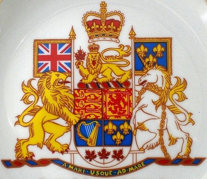
Fig. 7. Version designed by Alfred Joseph Casson c. 1965. On plate by Viletta, Canada.
Many artists have created versions of Canada’s coat of arms in their own style but respecting the original heraldic description contained in the royal proclamation of 1921. In this design by Casson, the helmet is omitted, but this happens in many depictions of the royal arms of Great Britain where the crown only, without the crest or helmet, is placed directly on top of the garter bearing the motto Honi soit qui mal y pense.
3. Aberrant Depictions
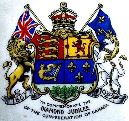
Fig. 8. A distorted version of armorial bearings of Canada. On a pin dish by John Aynsley & Son, England, 1927.
Some artists are very creative in modifying granted arms, particularly to place on souvenirs. In this case the flags, no longer held by the lion and unicorn, are placed in saltire behind the shield. The crest is gone and the crown, which should be above everything, is engulfing a large portion of the helmet. The motto A mari usque ad mare is replaced by dates on the scroll below.
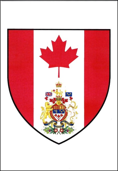
Fig. 9. On this postcard, the Canadian flag is enclosed within a shield, the maple leaf is raised and the 1994 armorial bearings of Canada are placed underneath. This is of course a hybrid design. The back is inscribed: “ecolepourlesgaulois.com CD. 2.0067” and “CANADA.” See: http://ecolepourlesgaulois.fr/. Here, the postcard is reproduced for educational purposes on a non-commercial site.
Further Reading
Vachon, Auguste. “Bureaucrats and Artists.” Chapter 6 of Canada’s Coat of Arms: Defining a Country within an Empire: http://heraldicscienceheraldique.com/chapter-6-bureaucrats-and-artists.html.
Vachon, Auguste. “Bureaucrats and Artists.” Chapter 6 of Canada’s Coat of Arms: Defining a Country within an Empire: http://heraldicscienceheraldique.com/chapter-6-bureaucrats-and-artists.html.
Picture Sources
Library and Archives Canada: fig. 6.
Canadian Museum of History, Vachon Collection: figs. 1, 3, 7, 8.
Auguste and Paula Vachon: fig. 2.
Library and Archives Canada: fig. 6.
Canadian Museum of History, Vachon Collection: figs. 1, 3, 7, 8.
Auguste and Paula Vachon: fig. 2.
Nota Bene
All the sites included here were accessed on 4 April 2016.
All the sites included here were accessed on 4 April 2016.