Arms and Devices of Provinces and Territories
The pictures that follow relate to granted arms that have received subsequent augmentations and to devices freely adopted by provinces or that came into use after being proposed by various heraldic amateurs. Many combinations were used to identify provinces at one time or another. For instance, the obverse of the seal of Ontario appeared on a shield, but there is no evidence that this combination gained any acceptance. A few designs with Yukon dogs were proposed for the Territory of the Yukon, but these proposals never came into use. The only design included here that has received no public recognition, is the shield with cods and a crown on ermine proposed by Edward Marion Chadwick for Newfoundland. The Chadwick proposal seems worthy of mention because its author was very active in designing arms for various Canadian provinces and territories. It also offers insight into Chadwick’s mindset. He either ignored that Newfoundland already had properly granted arms or was convinced that his own design was more suitable. One recurring phenomenon with freely adopted coats of arms is that they easily acquire modifications from one representation to the next. Yet granted arms are not always spared these intrusions. In several depictions, we find a tendency to add a beaver as a crest over shields of arms even after they were granted. The symbolism of the arms of Canadian provinces and territories is found on this site: http://www.thecanadianencyclopedia.ca/en/article/provincial-and-territorial-emblems/.
Alberta
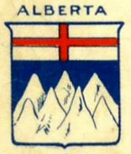
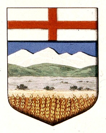
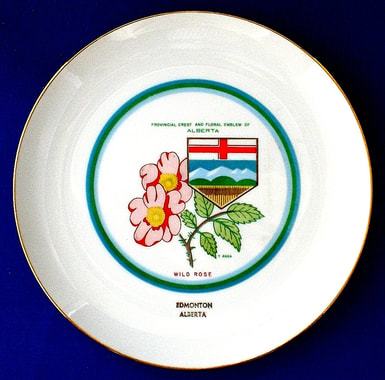
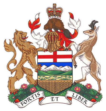
Even after Alberta became a province in 1905 it was sometimes attributed the shield conceived for the Northwest Territories by Edward Marion Chadwick (see comment with figs. 31-32). In February 1907, Chadwick proposed for Alberta Argent on a bend barry of ten Or and Sable between two bulls passant Gules, three garbs proper. In plain language, what is described consists of a diagonal band from top left to lower right divided, in the direction of the band, into ten segments gold and black on which are placed three gold sheaves of wheat upright. The band is between two red bulls walking by, one at the top and one in the lower part of the shield (Library and Archives Canada, MG 30, E86, Vol. 129, file 89. Chadwick to Pope, 1 Feb. 1907). His proposal did not gain acceptance, but it shows again Chadwick’s predilection for local produce.
Fig. 1. This unusual depiction of Alberta’s shield appeared on the title page of a 1914 sheet music for “O Canada” of which the Music Division of the Library of Congress holds a copy: https://www.loc.gov/resource/ihas.100006817.0/?sp=1
Fig. 1a. Arms granted to Alberta by royal warrant dated 30 May 1907. The lower part of the shield is not heraldry in the traditional sense, but rather a depiction of the landscape across the province.
Fig. 2. The depiction on this plate attempts to simplify the arms of Alberta by making the range of hills semicircular and the prairie section underneath less evident. Plate designed and decorated in Canada by CanaRada.
Fig. 3. The crest, supporters and motto were added to the shield of arms of Alberta by royal warrant of Her Majesty Queen Elizabeth II dated 30 July 1980. See original on the site of the Canadian Heraldic Authority: http://reg.gg.ca/heraldry/pub-reg/project-pic.asp?lang=e&ProjectID=1206&ProjectElementID=4187.
British Columbia
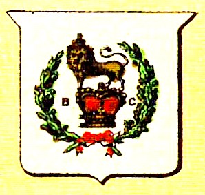
Fig. 4. Badge adopted by British Columbia in 1870 to place on the Blue Ensign for ships and, from 1871, in centre of the Union Jack to serve as the flag of governors of the colony and lieutenant governors of the province.
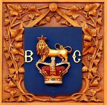
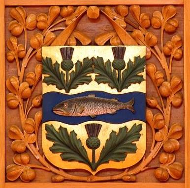
Fig. 4a. Badge of British Columbia placed on a blue shield, without a wreath of oak. Woodcarving in the Library of Parliament, 1876.
Many devices derived from seals or created provincially were adopted unwittingly as legitimate armorial emblems by Canadians because of a confusion that came from England. In 1865 the secretary of state for the colonies advised the governor general that vessels owned or in the service of the colony were to fly the Blue Ensign with the badge or seal of the colony in the fly. In 1870 a dispatch from the colonial secretary authorized lieutenant governors to fly, from boats and other vessels on which they were embarked, the Union Flag bearing in centre the provincial arms or badge on a white roundel within a wreath of maple leaves. This led to a series of dispatches from the Colonial Office requesting that the provinces or colonies provide a drawing of whatever badge they wanted to use on these two flags, so that these could be published in the Admiralty Flag Book and made known. The dispatches left the door open to almost any form of emblem whether they were granted arms, imagery on a seal, or something they might adopt for that purpose. See: http://heraldicscienceheraldique.com/chapter-3-the-dominion-shield.html.
The above badge was adopted by the colony of British Columbia in response to these dispatches from the Colonial Office. The device includes the crest of the royal arms of England, namely a lion standing on the royal crown and similarly crowned. The crown itself is flanked with the letters B.C., and the whole is placed between branches of laurel (sometimes oak and laurel). It was approved by the Admiralty on 9 July 1870: http://fraser.cc/FlagsCan/Provinces/BC.html. The Dictionary of Canadian Biography attributes this design to Richard Clement Moody, a former lieutenant governor of the colony: http://www.biographi.ca/en/bio/moody_richard_clement_11E.html. It was incorporated into the shield of the Dominion in 1874 as seen on the front page of the Canadian Illustrated News of 5 December of that year. The same design with the motto of British Columbia, Splendor Sine Occasu, is seen on a plaque commemorating the beginning of the construction of the Parliament Buildings on 7 June1893 in Victoria: Conrad Swan, Canada: Symbols of Sovereignty (1977), pp. 183-84.
The above badge was adopted by the colony of British Columbia in response to these dispatches from the Colonial Office. The device includes the crest of the royal arms of England, namely a lion standing on the royal crown and similarly crowned. The crown itself is flanked with the letters B.C., and the whole is placed between branches of laurel (sometimes oak and laurel). It was approved by the Admiralty on 9 July 1870: http://fraser.cc/FlagsCan/Provinces/BC.html. The Dictionary of Canadian Biography attributes this design to Richard Clement Moody, a former lieutenant governor of the colony: http://www.biographi.ca/en/bio/moody_richard_clement_11E.html. It was incorporated into the shield of the Dominion in 1874 as seen on the front page of the Canadian Illustrated News of 5 December of that year. The same design with the motto of British Columbia, Splendor Sine Occasu, is seen on a plaque commemorating the beginning of the construction of the Parliament Buildings on 7 June1893 in Victoria: Conrad Swan, Canada: Symbols of Sovereignty (1977), pp. 183-84.
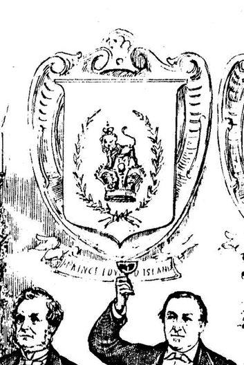
Fig. 5. “The toast to the guest of the evening [Sir John A. Macdonald], the great Conservative banquet at Ottawa” in Canadian Illustrated News, December 6, 1879, p. 361. The shield with the British Columbia badge is mistakenly captioned “Prince Edward Island.”
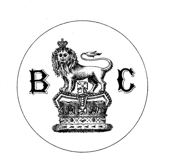
Fig. 6. The badge of British Columbia as it appeared in Drawings of the Flags in Use at the Present Time by Various Nations. Admiralty. August 1889. By Authority. (London: Her Majesty’s Stationery Office, 1889), plate 16.
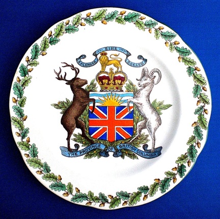
Fig. 7. A version of the heraldic composition designed in 1895 by Reverend Arthur John Beanlands for the seal of British Columbia, in use from (1896-1911). Plate by Wedgwood, England, 1906.
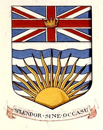
In the original design of the provincial seal, the motto Splendor sine occasu was on a scroll below the shield, not above the crest. The crown and lion, sometimes with the motto, had long been used as the emblem of the province (figs. 4-6). British Columbia approved this design by order in council on 27 May 1904 and began displaying it immediately on government letterhead. The design was sent to Sir Joseph Pope, under-secretary of state for Canada, to be submitted to the College of Arms in London for approval. A reply on 8 March 1905 from A.S. Scott-Gatty, Garter King of arms, objected to the content because: 1) the other provinces did not have a crest and supporters; 2) the Union Jack could not be assigned except “in special circumstances.” Garter suggested an alternate design with a lion at the top of the shield (in chief). After attempts to have the original design accepted, the province was granted a shield as in figure 8. For further information, see: http://www.protocol.gov.bc.ca/protocol/prgs/symbols/coat_of_arms.htm and http://www.hubert-herald.nl/CanBritishColumbia.htm.
Fig. 8. The arms granted to British Columbia by royal warrant of Edward VII dated 31 March 1906. The motto was not mentioned in the patent but accompanied the rendering of the arms, as is often the case.
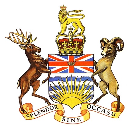
Fig. 9. Crest and supporters added to arms of British Columbia without authorization, used by the province from 1915 to1987.
In 1915 British Columbia tried to have this design approved by the Heralds of the College of Arms. The province was displaying it on its letterhead from 1916, (possibly a little earlier), and a precedent existed to justify this request in the arms of Ontario that had been augmented with a crest and supporters in 1909. After rather tedious correspondence and objections from the College of Arms to the use of the royal crest as the provincial crest, the province abandoned its efforts to have its design approved.
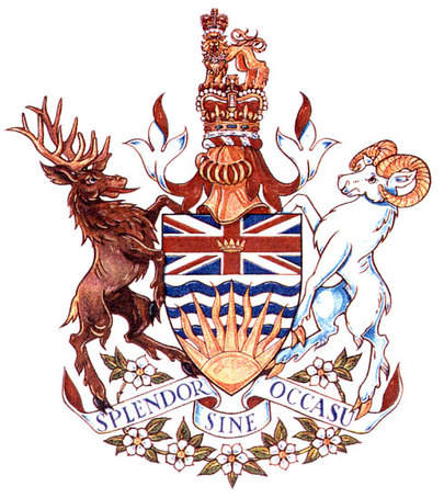
Fig. 10. Augmentations to the arms of British Columbia were granted by royal warrant of Queen Elizabeth II dated 15 October 1987.
On 15 October 1987, the same day that the royal warrant was issued and signed by Her Majesty Queen Elizabeth II as Queen of Canada to augment the armorial bearings of British Columbia, a provincial proclamation was issued in the name of the Queen to bring into use the new design. The augmentations were registered by the Canadian Heraldic Authority on 17 April 1990, vol. II, p. 3, see the original: http://reg.gg.ca/heraldry/pub-reg/project-pic.asp?lang=e&ProjectID=1406&ProjectElementID=4704. Her Majesty’s royal crest is here granted by her to the province differenced by a garland of Pacific Dogwood around the lion’s neck.
Manitoba
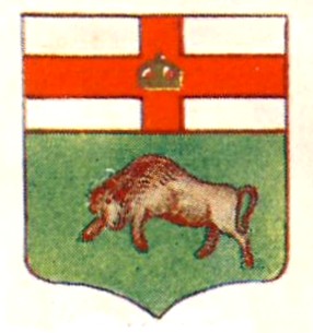
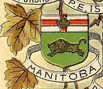
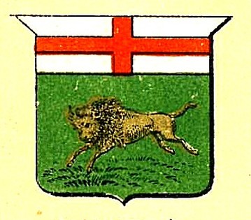
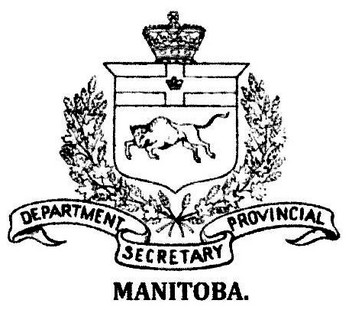
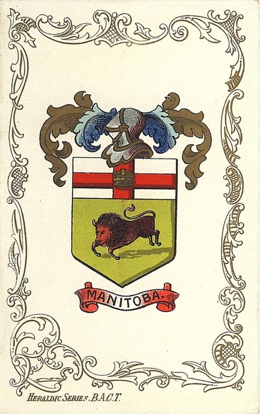
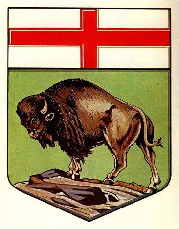
Like many other provinces, Manitoba began using the imagery on its seal as its provincial mark early in 1873 and possibly a bit before. On the first Great Seal of the province (1870-1903), the stance of the buffalo is close to fig. 11, almost as if the animal was ready to charge. In other depictions it is charging wildly, figs. 12-14. The crown is sometimes omitted from the St. George cross, fig. 13.
|
Fig. 13. From a print entitled “Arms of the Dominion and of the provinces of Canada.” Dated 1880s or 1890s.
|
Fig. 14. This charging buffalo appears at the head of a letter from James Hooper, deputy provincial secretary of Manitoba, to Joseph Pope, under-secretary of state for Canada, 19 May 1904. The garland about the shield is composed of wheat and maple, a combination not frequently seen.
|
Fig. 14a. An astonishing depiction of a buffalo on this postcard.
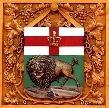
Fig. 14b. A powerful rendering of the buffalo on a woodcarving of 1876 in the Library of Parliament. The stance is close to the version granted in 1905 (fig. 16).
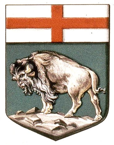
Fig. 15. This shield for Manitoba was designed in the early 1880’s in response to a request for a device to be included in the Admiralty Flag Book (see remarks with fig. 4). It was accordingly published in Drawings of the Flags in Use at the Present Time by Various Nations … 1889 (see fig. 6). Though it appeared in other printed works, there is no indication that it was used widely. It was placed at least once in the Dominion shield: http://www.flagsforum.com/viewtopic.php?t=889. For a colour illustration, see http://www.crwflags.com/fotw/flags/ca_mb-h.html.
In the arms granted to Manitoba by royal warrant of 10 May 1905, the buffalo’s face exhibits human features particularly in the eyebrows, nose, and lips (fig. 16). Subsequent depictions rectified this (fig. 17). The granted arms are essentially those that appeared on the provincial seal in 1903.
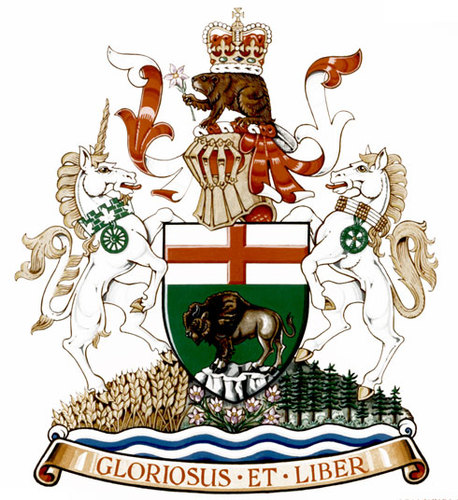
Fig. 18. The complete achievement of arms of Manitoba from 1992.
On 23 October 1992, the arms of Manitoba were augmented with helm, mantling, crest, supporters, compartment and motto by vice-regal warrant of His Excellency the Right Honourable Ramon John Hnatyshyn, Governor General of Canada. At the same time, a provincial proclamation, also dated October 23, was issued in the name of Her Majesty Queen Elizabeth II as Queen of Canada bringing the arms into use. The same day, the Vice-Regal Warrant was presented to the province by His Excellency in the Legislative Assembly at Winnipeg. It was the first provincial augmentation of arms in Canada following the establishment of the Canadian Heraldic Authority on 4 June 1988 and the first vice-regal warrant signed by a governor general to augment arms. The augmentations were registered by the Canadian Heraldic Authority, 15 September 2011, vol. VI, p. 66. See the original and the symbolism: http://reg.gg.ca/heraldry/pub-reg/project.asp?lang=e&ProjectID=2214&ShowAll=1.
New Brunswick
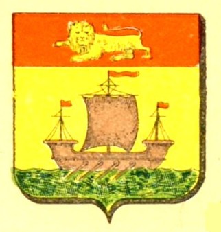
Fig. 19. Arms granted to New Brunswick by royal warrant of Queen Victoria dated 26 May 1868.
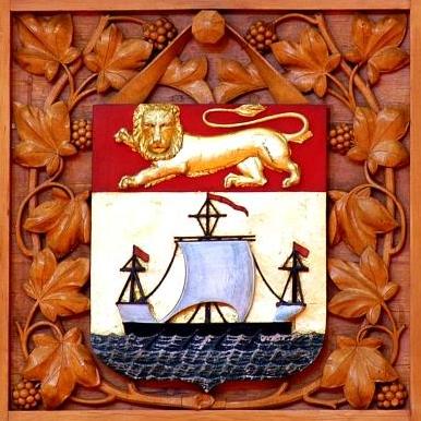
Fig. 19a. In this woodcarving of 1876 in the Library of Parliament, the oars of the ship (lymphad or ancient galley) are missing. Rendering lions without a tongue or claws was typical of some depictions in the nineteenth century and well into the twentieth.
In early drawings such as this one and the next, the ancient galley was moving to the right (sinister side of the shield) which is not normal. This was corrected in subsequent renderings, see fig. 21.
Fig. 20. In this depiction, the flags have become Union Jacks, which is artistic license carried a bit too far. From a postcard by Traveltime Product, Vancouver, British Columbia c. 1960.
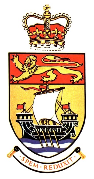
Fig. 21. Version adopted by the New Brunswick government in 1966 and in use until 1984
In 1965 Robert Pichette, an expert in heraldry and administrative assistant to Louis Robichaud, Premier of New Brunswick, proposed the addition of the royal crown and the motto Spem reduxit to the arms of New Brunswick. The motto presented no problem, all the more so that it had been inscribed on the first seal of the province from 1785. Alan Beddoe, a well known Canadian heraldic artist and scholar, was asked to discuss these proposed augmentations with the heralds at the College of Arms on a trip to London. In a letter dated 16 November 1965 Beddoe received at the Cumberland Hotel in London where he stayed, Sir Anthony Wagner, Garter Principal King of Arms, explained that “Only the Arms of one of Her Majesty’s kingdoms can properly be ensigned with the Crown, and since New Brunswick is not a kingdom nor is Queen of New Brunswick among Her Majesty’s style, this would not be appropriate.” Garter went on to say that a crest incorporating the royal crown could be granted to the province. The provincial government, as Quebec had done before, adopted the revised arms in 1966. They did not appear in The Arms, Flags and Emblems of Canada published by the Department of the Secretary of State before 1981 (the source of this illustration). Beddoe introduced another change, which was merely an effort at normalization, by making the galley move towards the dexter side of the shield (left of spectator) rather than the sinister (right of spectator). The author has a photocopy of Wagner’s letter to Beddoe which he was given around 1965. The original should be in Beddoe’s papers at Library and Archives Canada.
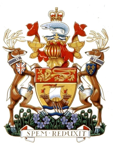
Fig. 22. The augmentations to the arms of New Brunswick were assigned by royal warrant of Queen Elizabeth II dated 25 September 1984. Rendering by Karen Bailey.
The arms with the augmentations, assigned by royal warrant of Queen Elizabeth II dated 25 September 1984, were registered by Governor General Jeanne Sauvé at a special ceremony in the Legislative Chamber of the province on 5 April 1989. The letters of registration were signed by the governor general and by Frank McKenna, premier of the province. The new arms are entered in vol. I, p. 16 of the Public Register of Arms, Flags and Badges of Canada: http://reg.gg.ca/heraldry/pub-reg/project.asp?lang=e&ProjectID=1834&ShowAll=1. As suggested by Sir Anthony Wagner, the crown is incorporated into the crest with other elements, namely a coronet with maple leaves and water from which a leaping salmon supports the royal crown on its back.
Newfoundland
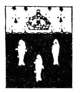
Fig. 23. Chadwick proposed this device for Newfoundland in 1900, although the crown colony had properly granted arms since 1637. Detail of fig. 27, second column from base, second to last shield.
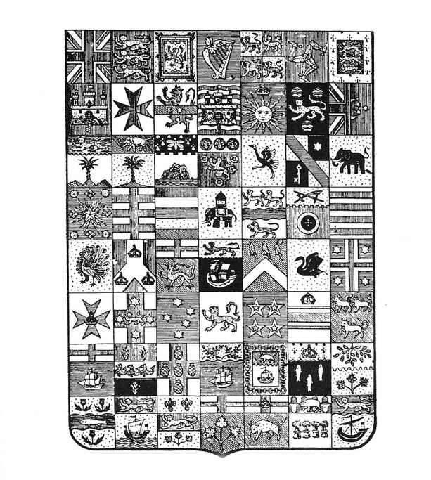
Edward Marion Chadwick included these arms for Newfoundland in the shield he proposed for the colonies and dominions of the British Empire (fig. 27). He described them as Sable three codfishes haurient, on a chief engrailed ermine a crown proper in the “Armorial of Canada” he sent to Sir Joseph Pope ((Library and Archives Canada, Pope Papers, MG 30, E 86, vol. 129, file 89, Chadwick to Pope, 25 April 1904). The cod no doubt refers to the cod fisheries, the engrailed (semicircular pattern) at the base of the chief (upper part) refers to the waves of the sea, the ermine spots to the fur trade and the crown to a crown colony. Chadwick may have ignored that Newfoundland already had properly granted arms since they were not officially used by the province at that time (fig. 24). He may also have felt that his design was simpler and more suitable for the colony. At one time, he showed a marked preference for the arms granted to Nova Scotia in 1868 over the original ones granted in 1625 or slightly earlier. See: http://ash.heraldry.ca/issues/2011_2012/ASH_4_10_Vachon_NS_Arms.pdf, pp. 238-40.
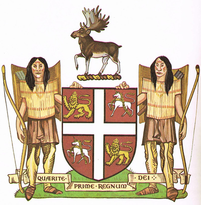
Fig. 24. Armorial bearings granted to the colony of Newfoundland by letters patent of Charles I dated 1 January 1637.
The arms granted to Newfoundland by Charles I in 1637 were not used officially until 1927. They were recognized as the arms of the province in 1928 and again in 1949 when the island joined Canada, but were never modified from the year of their grant. The heraldic description for the crest reads: “an elke passant pper,” that is an elk walking by in natural colours. This presents a small problem because the elk was never native to the province. Since moose were successfully introduced in 1904 only, a caribou may have been intended. The Beothuk supporters are of special historical interest because of their war armour which does not seem to be represented anywhere else. The name of the province was changed to Newfoundland and Labrador in 2001.
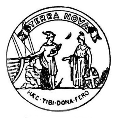
Newfoundland responded in its own way to the dispatches from the Secretaries of State for the Colonies requesting a badge or seal for use on the Blue Ensign by colonial ships and on the Union Jack by colonial governors and administrators (see comments fig. 4). There were ambiguities in the dispatches which frequently placed seals or badges on the same footing as properly granted arms. Although Newfoundland had granted arms and could have used its shield to distinguish the two flags, it likely chose to create a badge because the arms granted in 1637 were not yet officially used. The first badge (fig. 25) is represented in Drawings of the Flags in Use at the Present Time by Various Nations… 1889 (see fig. 6). It was replaced by a second badge showing Mercury, Britannia and a fisherman, approved by King Edward VII in 1904. The Latin phrase Haec tibi dona fero translates “I bring you these gifts,” namely Mercury bringing gifts from the sea to Britannia. The imagery is from the early seals of the colony: Conrad Swan, Canada: Symbols of Sovereignty (1977), pp. 87-93 See colour illustrations: http://www.crwflags.com/fotw/flags/ca-nf.html. The phrase Haec tibi dona fero is also found in the verses of Johann Sommer, author of Hortulus Ingenuii Amoris. See: Lore Poelchau, “Johannes Sommer (1542-1574)” in Humanistica Lovaniensia, Journal of Neo-Latin Studies 46 (1977), p. 211 (stanza 240). I do not know whether there exists any connection between Sommer’s verse and the inscription on the Newfoundland seal.
Northwest Territories
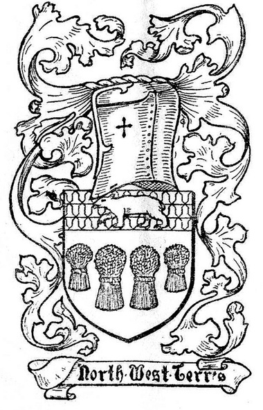
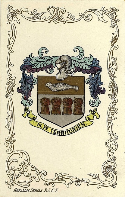
The story of the arms of the Northwest Territories begins with a shield of 56 quarterings which Chadwick proposed to represent the colonies and dominions of the British Empire and published in The Genealogical Magazine, Jan. 1900, p. 378 (fig. 27). His intended arms for the Northwest Territories are seen in the second to last shield.
Fig. 27. Armorial shield conceived by Edward Marion Chadwick in 1900 to represent the colonies and dominions of the British Empire.
For this type of comprehensive shield, Chadwick used the expression écu complet (complete shied) which seems to be his own terminology since this expression is not found in French heraldic vocabulary.
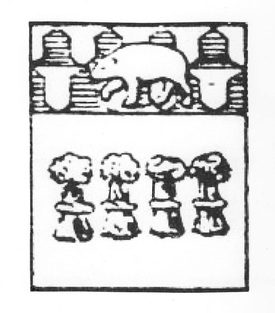
Fig. 28. Emblem devised by Chadwick for the Northwest Territories in 1900, detail of fig. 27, second to last shield.
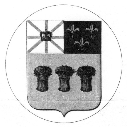
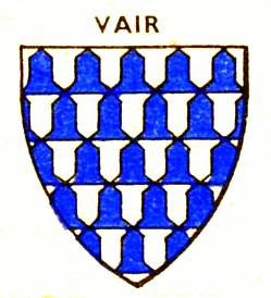
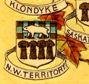
In a 1904 document entitled “Armorial of Canada” (see comment fig. 23) which Chadwick sent to Sir Joseph Pope, under-secretary of state for Canada, he blazons his proposed arms for the Northwest Territories as: Silver, four wheat sheaves proper, on a chief vairy gold and azure a polar bear passant proper. He further offers as symbolism: “This is intended to symbolize a country grain-producing in its southern parts and fur producing (signified by the vairy field) in its northern parts, which the polar bear shews [shows] to stretch away into the farthest north.” The description vairy gold and azure means that the interlocking bell shapes behind the bear are alternately coloured gold and blue. The wheat sheaves were appropriate at that time because the Northwest Territories then included the territory which now forms the provinces of Manitoba, Saskatchewan and Alberta.
The caption in Todd’s work reads: “(In use several years without official authority.) Arms: Argent four garbs proper, on a chief vair a polar bear passant also proper.” Vair means that the bell shapes on which the bear appears are white and blue as on the shield to the right (fig. 30). In Chadwick’s description (with fig. 28), the bell shapes are gold and blue.
|
Fig. 31. Illustration from a postcard view of Niagara Falls published in 1907 by Zybach & Co. of Niagara Falls, Ontario.
|
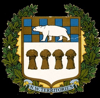
Fig. 32. A depiction of the Northwest Territories emblem within maple leaves.
|
In depictions I have never seen the vair pattern gold and blue that Chadwick proposed for the chief (upper part) of the Northwest Territories, and the vair white and blue (figs. 29-30) is rarely seen. In most depictions of Chadwick’s proposal, the upper part of the shield is a chequered pattern gold and blue (fig. 31) and occasionally blue and gold (fig. 32). The Chadwick shields, which were at times also attributed to Alberta, were never endorsed by the Northwest Territories, though they were fairly widely displayed particularly in the Dominion shields (see the section on the Dominion shields).
Fig. 32a. On this perhaps unique postcard depiction, a seal on gold replaces the polar bear.
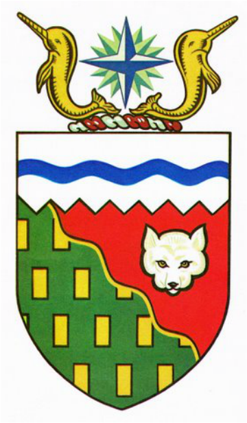
Fig. 33. New arms were designed by Alan B. Beddoe and granted in 1957.
The arms of the Northwest Territories were not granted by the usual royal warrant, but by the submission of a drawing and description of the arms dated 17 February 1956 that was signed and approved by H. M. Queen Elizabeth II on February 24. Beddoe retained the idea of the extreme north and warmer south.
Nova Scotia
Fig. 34. Shield of arms granted to Nova Scotia by royal warrant of Queen Victoria dated 26 May 1868. Woodcarving in the Library of Parliament, 1876.
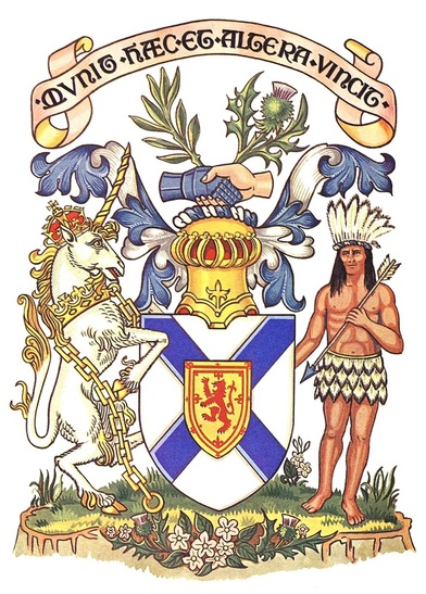
Nova Scotia was granted this shield in 1868, although it had a much older and complete achievement of arms granted in 1625 or slightly earlier. The older arms were never completely forgotten, and after the First World War, a movement was spearheaded by John A. Stewart to have the older emblem restored. As a result, the Nova Scotia government initiated a formal request to have the 1868 shield annulled and replaced by the older achievement. This was done by a royal warrant of George V dated 19 January 1929. See: http://ash.heraldry.ca/issues/2011_2012/ASH_4_10_Vachon_NS_Arms.pdf.
Fig. 35. Achievement of arms granted to Nova Scotia in 1625 or slightly earlier. Reinstated by royal warrant of George V dated 19 January 1929 to replace the 1868 shield.
Nunavut
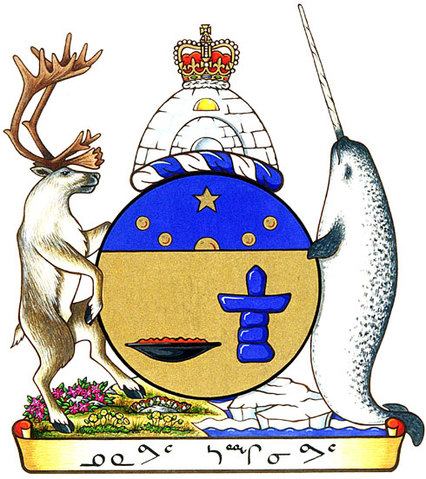
Fig. 36. Achievement of arms granted by Vice-Regal Warrant of Governor General Roméo LeBlanc dated 31March 1999 and entered in vol. III, p. 293 of the Public Register of Arms, Flags and Badges of Canada. See: http://reg.gg.ca/heraldry/pub-reg/project.asp?lang=e&ProjectID=813&ShowAll=1.
Ontario
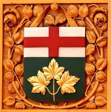
Fig. 37. Shield granted to Ontario by royal warrant of Queen Victoria dated 26 May 1868. Woodcarving in the Library of Parliament, 1876.
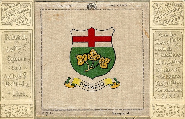
Fig. 38. Coat of arms of Ontario printed on silk and attached to a postcard to be cut out and sewn to various items as listed on the right. It is an interesting manifestation of heraldry as an applied art. Postcard by W. N. Sharpe of Bradford, England, c. 1906.
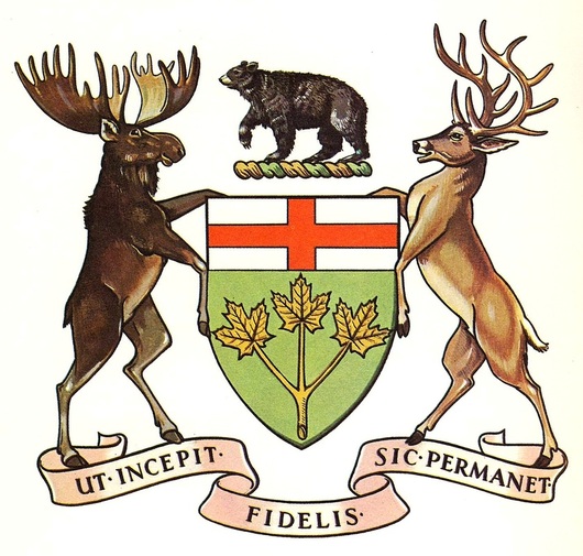
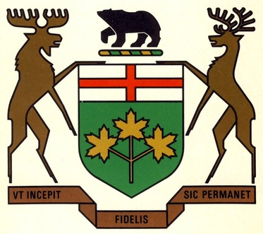
Fig. 39. The achievement of arms of Ontario with crest, supporters and motto granted by royal warrant of Edward VII dated 27 February 1909.
The crest, supporters, and motto of Ontario were proposed by the Toronto barrister Edward Marion Chadwick who greatly deplored the fact that the grant did not include a helmet (helm) along with the other armorial additions. In a letter dated 13 January 1920 to Sir Edmund Walker, president of the Canadian Bank of Commerce, he stated that “… a Coat of Arms with supporters and crest and no helmet is like a man going out of doors with an overcoat on and no hat.” While it is true that the royal warrant contained no mention of a helmet and there was none in the accompanying drawing, no heraldic rule prevented the province from inserting a helmet at any time. This is confirmed in Chadwick’s own letter where he informs us that, when he expressed his concerns about the absence of a helmet to the heralds at the College of Arms, the reply was “surely everyone knows the proper helmet to use.” In his work Canada: Symbols of Sovereignty (plate 19), Conrad Swan inserts a helmet with green and gold mantling. The composition now forms an organic whole and looks rejuvenated (see the depiction on this site: http://sustainontario.com/2013/02/27/14654/news/throne-speech-creates-opportunity-for-addressing-food-issues-in-ontario).
Chadwick’s letter is contained in files on the Arms of Canada in the papers of the Secretary of State at Library and Archives Canada, RG 6, A1, vol. 210, file 1156, part 1.
Chadwick’s letter is contained in files on the Arms of Canada in the papers of the Secretary of State at Library and Archives Canada, RG 6, A1, vol. 210, file 1156, part 1.
Fig. 40. Achievement of arms of Ontario as redrawn in 1972.
“The coat of arms of Ontario was redrawn in a contemporary style in 1972. It is often used in one colour in a solid-tone version, as a logo. The full colour version adheres to the blazon. The leaves are unveined. This logotypical and flattish stylization has not been without criticism from heraldic purists.” This quote is from Kevin Harrington, “The Arms of Ontario” in Flagscan, vol. VI, no. 3, issue 23, Fall 1991, p. 12. A similar style, perhaps not so stiff, is found in many of the municipal arms of Norway. See: https://en.wikipedia.org/wiki/List_of_Norwegian_coats_of_arms.
Prince Edward Island
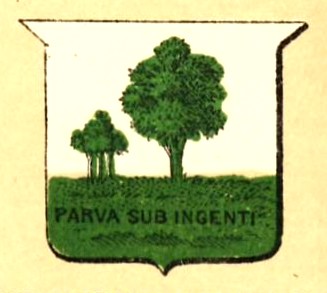
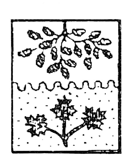
Fig. 41. This shield for Prince Edward Island was derived from the obverse of the seal assigned to the colony in 1769.
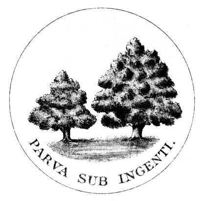
In 1769 Prince Edward Island was still named Island of St. John, a continuance of île Saint-Jean at the time of New France. Its seal included a large oak and three saplings as well as the motto Parva sub ingenti from Virgil’s Georgics 2.19. The large oak represents Great Britain protecting the smaller saplings traditionally intended to refer to the three counties of Kings, Queens, and Prince. In some depictions, the motto is omitted. For further information, see: http://www.crwflags.com/fotw/flags/ca-pe_h.html.
Fig. 42. The badge of Prince Edward Island as it appeared in Drawings of the Flags in Use at the Present Time by Various Nations… 1889 (see fig. 6). On the seal of 1769, the three oak saplings on the left were shown with separate trunks as in figs. 41 and 44-45.
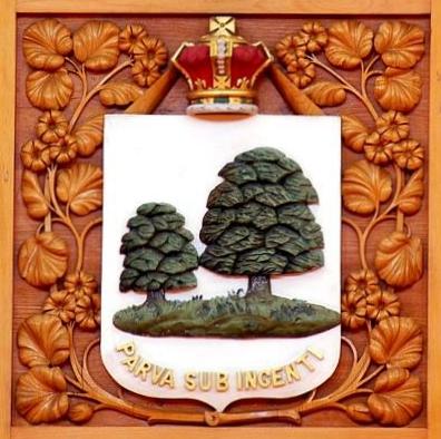
Fig. 42a. This woodcarving of 1876 in the Library of Parliament appears to have been inspired by the depiction in fig. 42, with the royal crown added on top of the shield. The treatment of the leaves is powerful though not distinguishable as oak leaves.
Fig. 43. Arms designed by Chadwick for Prince Edward Island, 1900. Second row from bottom, last shield (fig. 27).
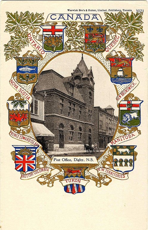
Fig. 43a. On this postcard c. 1904, the arms of Prince Edward Island (mid-left) are depicted as conceived by Chadwick in 1900. Many other depictions show different tinctures. Warwick Bro’s & Rutter, Limited, Publishers, Toronto, Canadian Souvenir Post Card.
Chadwick designed this arrangement for Prince Edward Island within the écu complet he proposed for the colonies and dominions of the British Empire), second row from bottom, last shield (fig. 27). In a 1904 document entitled “Armorial of Canada” which he sent to Sir Joseph Pope, under-secretary of state for Canada (see comment fig. 23), he describes the design as follows: Per fess nebuly silver and gold, in chief a spreading branch of oak issuing from the top vert and in base a spring of three maple leaves gules. We know that the oak branch is inspired by the seal of the province from which arms have been derived and used (fig. 41-42). The nebuly line (undulating) which divides the shield in half no doubt refers to the water surrounding the island, and the sprig of maple seems to imitate those on the arms of Ontario and Quebec granted in 1868. Chadwick was a great admirer of simplicity which is of paramount importance in heraldry, but sometimes, as in this case, he applied the principle of sobriety at the expense of strength and visual impact. In many cases where his design appears in the Dominion shield, the maple leaves are argent (white or silver) rather than gules (red) as described by Chadwick. This places a metal on a metal which should be avoided in heraldry See the section on the Dominion shields.
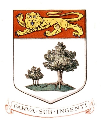
Fig. 44. Arms granted to Prince Edward Island by royal warrant of King Edward VII dated 30 May 1905. The motto was not mentioned in the granting document as is often the case, but appeared with the depiction.
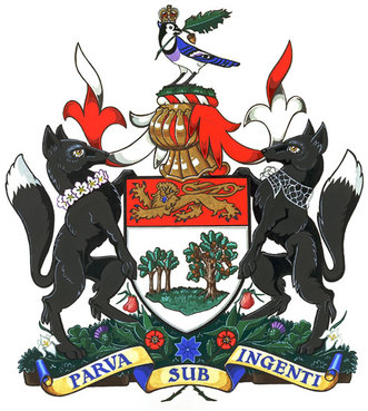
Fig. 45. On 26 April 2002, a crest, supporters, a compartment, and the province's traditional motto were granted by Vice-Regal Warrant of Governor General Adrienne Clarkson.
Prince Edward Island’s augmented achievement of arms is confirmed by an act of the Legislature, the Coat of Arms Act, proclaimed to come into force on 13 December 2002, the day when Governor General Adrienne Clarkson unveiled the new design. They are recorded in vol. IV, p. 195 of the Public Register of Arms, Flags and Badges of Canada. The above illustration is from: http://reg.gg.ca/heraldry/pub-reg/project-pic.asp?lang=e&ProjectID=298&ProjectElementID=1257.
Quebec
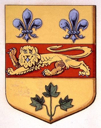
Fig. 46. Shield granted to Quebec by royal warrant of Queen Victoria dated 26 May 1868.
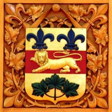
Fig. 46a. Woodcarving in the Library of Parliament, 1876.
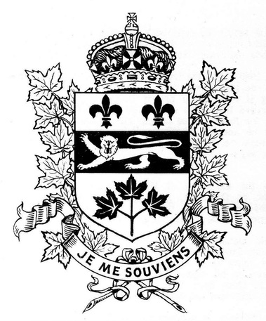
Fig. 47. In 1883 Etienne-Eugène Taché, architect of the Quebec Parliament, added the motto “Je me souviens” under the shield of Quebec, the royal crown above, and branches of maple on either side. Drawing by Alan Beddoe in Heraldry in Canada 1, no. 2 (January-March 1967).
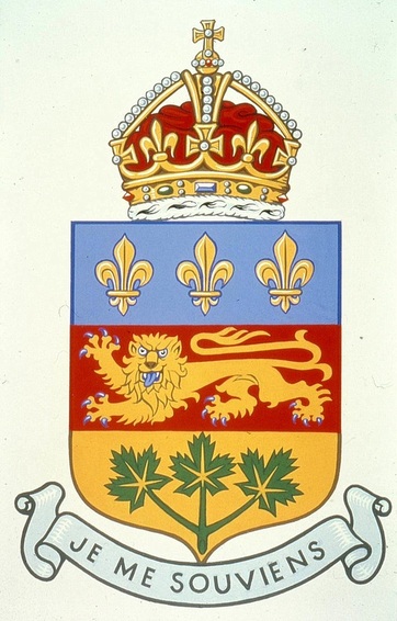
Fig. 48. The fleurs-de-lis in the upper third of the shield were changed from three to two and the colours reversed to correspond to the arrangement on the shield of royal France, by Order of the Lieutenant Governor in Council approved 9 December 1939. A powerful rendering of the arms by Hans D. Birk c. 1970, Library and Archives Canada.
In the May 1940, Quebec attempted to have its revised arms approved by England. The College of Arms did not object to the changes in colour nor to the increased number of fleurs-de-lis in the upper part of the shield. Just as for British Columbia earlier, heralds at the college objected to the inclusion of the royal crown over the top of the shield with nothing else added to differentiate the use of this symbol as a personal mark of the sovereign from other uses. New Brunswick was in the same situation from 1966 to 1984 (fig. 21). After the refusal of the crown without additions, Quebec took no further steps in the matter.
In the above rendering, one may wonder why the blue is so light. Modern English heraldic dictionaries call this colour bleu céleste meaning “sky blue” and note that it is new in English heraldry and relatively uncommon (J.P. Brooke-Little, An Heraldic Alphabet and Stephen Friar, A New Dictionary of Heraldry). In French heraldry, pale blue is not uncommon at all, and in fact, older treatises equate the French heraldic word for blue (azur) with celestial blue. For them azur comes from the Arabic word azul which translate into bleu céleste [Jouffroy d’Eschavannes, Science du blason (Paris: Édouard Rouveyre, 1885), p. 40 and Victor Morin, Traité d’art héraldique (Montreal, Librairie Beauchemin, 1919), pp. 43, 199]. A more recent author notes that blue has more frequently been represented in a light colour, often a very light one, rather than a darker tint [Michel Pastoureau, Traité d’héraldique 3d ed. (Paris: Picard, 1997), p. 110]. The idea that azur means bleu céleste has been abandoned by modern experts for the simple reason that for centuries azur has also been represented in deeper blue. One author puts it succinctly: “… the tones do not matter. … For instance, on the arms of the King of France … the Azure can be sky blue or ultramarine …” [Michel Pastoureau, Heraldry: an Introduction to a Noble Tradition (London: Thames and Hudson, 1997), p.46].
In the above rendering, one may wonder why the blue is so light. Modern English heraldic dictionaries call this colour bleu céleste meaning “sky blue” and note that it is new in English heraldry and relatively uncommon (J.P. Brooke-Little, An Heraldic Alphabet and Stephen Friar, A New Dictionary of Heraldry). In French heraldry, pale blue is not uncommon at all, and in fact, older treatises equate the French heraldic word for blue (azur) with celestial blue. For them azur comes from the Arabic word azul which translate into bleu céleste [Jouffroy d’Eschavannes, Science du blason (Paris: Édouard Rouveyre, 1885), p. 40 and Victor Morin, Traité d’art héraldique (Montreal, Librairie Beauchemin, 1919), pp. 43, 199]. A more recent author notes that blue has more frequently been represented in a light colour, often a very light one, rather than a darker tint [Michel Pastoureau, Traité d’héraldique 3d ed. (Paris: Picard, 1997), p. 110]. The idea that azur means bleu céleste has been abandoned by modern experts for the simple reason that for centuries azur has also been represented in deeper blue. One author puts it succinctly: “… the tones do not matter. … For instance, on the arms of the King of France … the Azure can be sky blue or ultramarine …” [Michel Pastoureau, Heraldry: an Introduction to a Noble Tradition (London: Thames and Hudson, 1997), p.46].
Saskatchewan
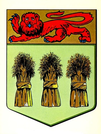
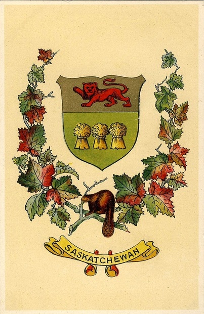
Fig. 49. Shield of arms of Saskatchewan granted by royal warrant of King Edward VII dated 25 August 1906. From a postcard by Traveltime Product, Vancouver, British Columbia c. 1960.
The basic elements of the arms of Saskatchewan were proposed by Edward Marion Chadwick. In 1905 Ambrose Lee, York Herald, sent Joseph Pope, under-secretary of state for Canada, a slightly revised version of Chadwick’s proposal where the lower part of the shield remained as granted, but the bottom line of the upper part (chief) was wavy and its background was red with a gold lion (Library and Archives Canada, NAC, MG 30, E86, Vol. 129, file 89. Lee to Pope, 3 Oct. 1905). The colours of the lion and background were reversed in the granted arms, probably to avoid a colour touching another colour. In other words, a red chief touching a green field would have created less contrast than a colour with a metal. There also seemed to be no reason to make the lower line of the chief wavy.
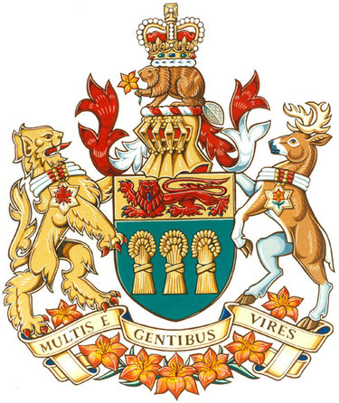
Fig. 50. The crest, supporters, and motto of Saskatchewan were granted by royal warrant of Queen Elizabeth II, signed on behalf of Her Majesty by Governor General Jeanne Sauvé on 16 September 1986 in the Legislative Chamber of the province. On the same occasion, Lieutenant Governor F. W. Johnson signed a royal proclamation bringing the new coat of arms into official use. See: http://reg.gg.ca/heraldry/pub-reg/project-pic.asp?lang=e&ProjectID=548&ProjectElementID=1920.
Yukon
|
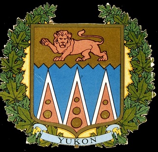
Fig. 51. Emblem designed by Chadwick for the Yukon, 1903 or slightly earlier. In this depiction, there are only two bezants (gold roundels) on two of the piles (triangles).
|
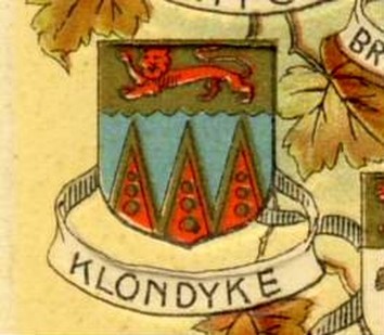
Fig. 52. In this depiction, the Yukon is called by its gold field, the “Klondyke”. The piles are edged gold instead of silver.
|
The shield of the Yukon was designed by Edward Marion Chadwick between 1900 and 1903. It did not appear in the écu complet he published in January 1900 (see fig. 27), although the Yukon Territory, which was carved out of the Northwest Territories, existed since 1898. Chadwick blazons the arms he proposed for the Yukon in a 1904 document entitled “Armorial of Canada” which he sent to Sir Joseph Pope, under-secretary of state for Canada (see fig. 23): Azure; three piles reversed gules fimbriated silver, each charged with three bezants in pale; on a chief indented gold a lion passant guardant gules. He offers the following symbolism: “This is intended to shew [show] a country under British government having for its principal mountains gold bearing and snow clad.” These arms were used to represent the Yukon particularly in the shield of the Dominion, but were never recognized by the government of the territory. In fig. 52, the Yukon is called the Klondyke (Klondike), the region where gold was discovered in 1896 and which led to the creation of the Yukon Territory. Although the postcard from which this illustration is drawn was published in 1907, the name of the goldfield is still retained for the territory. In Canada, French expressions such as un vrai klondike or c’est pas le klondike, equate the region with huge gold treasures or wealth, much like Peru or El Dorado.
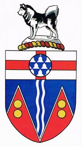
Fig. 53. Official arms for the Yukon were designed by Alan B. Beddoe and granted, not by the usual royal warrant, but by the submission of a drawing and description of the arms dated 17 February 1956 that was signed and approved by H. M. Queen Elizabeth II on February 24.
For the arms of the Yukon, Beddoe retained two of Chadwick’s pointed figures representing mountains and the yellow roundels representing gold. In a 1962 conference, he expressed this notion as “gold in them thar hills.” Regarding the dog in the heraldic description, he comments: “The crest, described as ‘Husky Dog’ is actually a Malamute, which is considered the best type of sled dog in the North.” Beddoe’s Canadian Heraldry (1981), p. 79.
Mixing Provincial Shields with Emblems of Great Britain
During the first half of nineteenth century and first quarter of the twentieth century, British emblems were often mixed with Canadians ones to express attachement to both the mother country and to Canada, the new homeland. This happened with Canadian provincial arms just as with the arms of the Dominion of Canada.
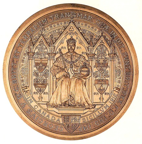
Fig. 54. Counter seal of the Great Seal of George V for Canada.
All the Great Seals of Canada from Victoria to George V displayed the individual arms of the four original provinces in Confederation and the royal arms on the legend band below the sovereign.
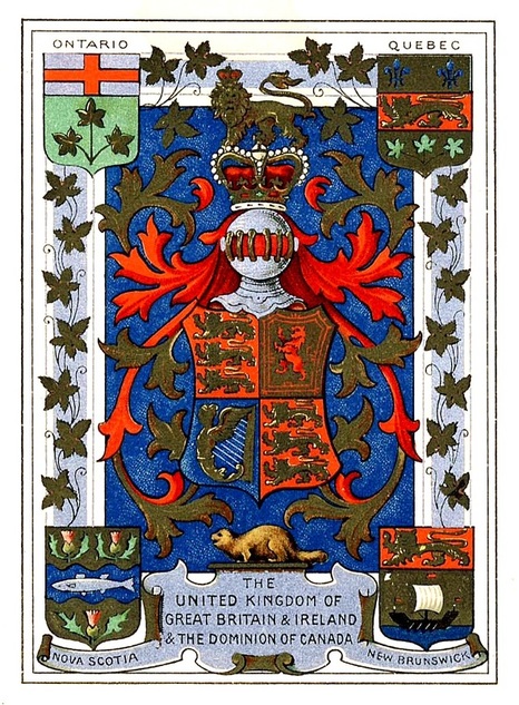
Fig. 55. Postcard by unknown printer. Inscribed by hand on reverse: “Glasgow June - 26. 1902.”
In centre are the royal arms with their lion crest above and a beaver below. The shields of the original provinces to join the Canadian Confederation are in the corners. The leaves in the margin on vines are likely grape leaves which are very similar to maple leaves.
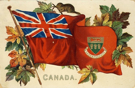
Fig. 56. Arms of Saskatchewan in the fly of the Red Ensign, postcard by Raphael Tuck & Sons.
The Dominions shield and the arms of all the Canadian provinces have appeared in the fly of the Red Ensign in this “Canadian Coats of Arms” postcard series produced by Raphael Tuck & Sons of London (England), from c. 1908. Canadianism is further emphasized by the beaver and the spray of maple leaves.
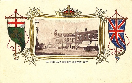
Fig. 57. Ontario and Great Britain are represented on this postcard by Universal Postal Union Canada.
Gonfannons (or Gonfalons) of the coat of arms of Ontario on the left and of the Union Flag (Jack) on the right flank a frame decorated with the royal crown and maple leaves. The postcard is inscribed on the back “Universal Postal Union Canada.” It was probably printed in England since the royal arms appear on the back.
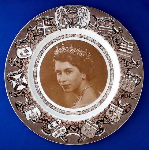
Fig. 58. Coronation plate for Queen Elizabeth II by Clarice Cliff, manufactured by Arthur J. Wilkinson Ltd., Royal Staffordshire Pottery, England.
The arms at the top could have been the royal arms of Canada instead of the British royal arms since Queen Elizabeth II was invested with the title of Queen of Canada by an act of the Canadian Parliament passed on 3 February 1953. The shield for Québec is that assigned in 1868 and not the one adopted by the province in 1939. Reproduced in centre is the original 1951 portrait photograph of the Queen by Yousuf Karsh which is kept in the National Portrait Gallery in London, England, inv. no. NPG P337.
Additions to Provincial Arms
On souvenirs almost many kinds of addition to coats of arms can appear, but the most frequent one has been the beaver added as a crest above the shield of a few provinces in the same manner that beavers were added as crests above the Dominion shields (see that section).
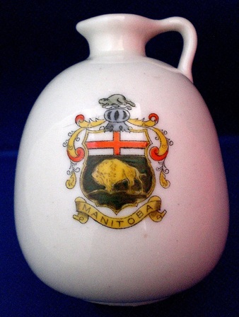
Fig. 59. Arms of Manitoba with a helmet and beaver as crest. Unmarked miniature pitcher made in England c. 1905-1910 for William John Simpson of Winnipeg.
The shield is basically the one appearing on the seal of Manitoba in 1903 and granted to the province in 1905. The helmet and beaver are fanciful additions. See the biography of W. J. Simpson who ordered and sold the souvenir at: http://www.mhs.mb.ca/docs/people/simpson_wj.shtml.
Fig. 60 Canadians seemed to think that their armorial emblems were never Canadian enough. The remedy was to add the perpetual beaver and maple leaves (see also figs. 55-56 and the section on the Dominions shields). Yet their attachment to the Crown was unflinching. As we have seen many times, the addition of the royal crown without royal authorization was also a favourite (see also figs. 8, 14, 21, 47-48 and the section on the Dominions shields).
Remarks
With the establishment of the Canadian Heraldic Authority in 1988, Canada achieved heraldic autonomy. Getting there, from colonial days when the emblems of France and Great Britain were the only marks of sovereign authority on Canadian soil, has sometimes been a confused and convoluted process. Yet, when looking at the four parts of this pictorial panorama, one gets the impression of a continuous evolution towards better heraldic practices. Undoubtedly, the Royal Heraldry Society of Canada, created in 1966, is largely responsible for this evident progression.
The provinces of British Columbia, New Brunswick and Quebec, at one point, all chose to overlook the advice of the heralds of the College of Arms in England although their recommendations were reasonable, namely not to use the royal crest nor the royal crown alone without any other distinguishing additions (see figs. 9, 21 and 48). The heralds pointed out that, with the exception of Canada, no other Dominion, province or colony had been allowed to ensign their arms with the royal crown. They further argued that provinces are not kingdoms, that the crown is personal to the sovereign denoting royal status, and that the crown alone does not constitute a crest.
Being refused the inclusion of the royal crown was a difficult notion to grasp for Canadians who, for many years, had been placing this symbol, without royal authorization, on top of the multi-province shields of the Dominion as well as those of provinces and municipalities. Eventually both New Brunswick and British Columbia chose to regularize their emblems by adding Canadian attributes to the royal symbols in their crests and having them granted (figs. 10 and 22). There seems no compelling reason why Quebec should not follow the same route, but such decisions belong to the people and government of that province. The augmentations to the arms of Manitoba (1992, fig.18) and Prince Edward Island (2002, fig. 45) were authorized by a vice-regal warrant of the governor general who exercises the royal prerogative of granting heraldic emblems in Canada by proclamation of Queen Elizabeth II dated 4 June 1988.
Picture sources
Library of Parliament, © Library of Parliament / Mone Cheng: figs 4a. 14b, 19a, 34, 37, 42a, 46a
Library and Archives Canada: figs. 1, 5, 8, 14, 16, 22, 32, 34, 44, 46, 48, 51, 54.
Canadian Museum of History, Vachon Collection: figs. 2, 7, 58, 59.
Canadian Heraldic Authority, © Her Majesty in Right of Canada: figs. 3, 10, 18, 36, 45, 50.
Auguste and Paula Vachon: figs. 4, 11-13, 14a, 19-20, 29-31, 32a, 38, 41, 49, 52, 55-57, 60.
Department of the Secretary of State of Canada, The Arms, Flags and Floral Emblems of Canada (1967): figs. 9, 17, 24, 33, 35, 35, 39, 40, 53.
Nota Bene
All the web sites quoted were all consulted on 31 March 1916.
