Appendix II
Stylisation Versus Distortion
The coat of arms of the Canada Company was dully recorded at the College of Arms in London in 1825. This illustrates the fact that even properly granted arms are sometimes depicted with aberrations. But before examining this question, it is important to look at what is distortion and what is not.
Heraldry is not a stiff and stagnant art. Every artist can leave a personal mark on the way armorial bearings are depicted. One heraldic feature that has undergone many variations from one period and one country to another is the shape of the shield. In Conrad Swan’s work Canada Symbols of Sovereignty (1977), the Herald Painters of the College of Arms who prepared the drawings for the colour plates introduced interesting features. The shields of New Brunswick (16.1), Quebec (16.2), Alberta (20.1), and British Columbia (20.2) are all rendered in elaborate or unusual ways. The depictions are refreshing because these arms are not normally rendered that way, although very similar shields were used in the past and it is legitimate to come up with comparable types today. [8] Swan’s illustrators also added a helmet and different types of mantling to three armorial bearings that are generally seen without these trappings, namely Ontario (19), Northwest Territories (21.1), and Yukon Territory (21.2). All three were granted a crest (above the shield) and it is only good heraldry to tie the crest with the shield by inserting a helmet with mantling. The mantling itself can take on many shapes.
In some representations, a figure barely fits into a given space which can create an impression of great strength like a huge gorilla in a small cage. The famous Canadian heraldic artist Alexander Scott Carter drew the arms of the Rt. Hon. Vincent Massey with three large stag heads that only fitted into the chevron by bending their antlers downwards. This created a much more powerful image than other depictions where the head and horns fit comfortably into the space. [9] Altering the proportions of components can create a strong visual impact while retaining harmony and beauty. The relative sizes of devices on the shield and outside the shield can vary to good advantage. The covers of “The Baltic Armorial Calendar” (Baltischer Wappen-Kalender) published in Riga by the book and art dealer E. Bruhns in 1902 feature huge crests that are about the size of the shield. Though unusual, the illustrations are so skillfully rendered that they are objects of beauty. [10]
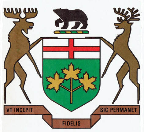
Stylization is one way of recognizing a heraldic figure at a glance. A maple can be drawn with a limited number of large leaves as can an oak to which a few prominent acorns can be added for immediate recognition (fig. 13).[11] Stylization is not easy. For instance stylizing a moose, a bison, a muskox or a beaver requires considerable skill and numerous trials. The object is to create a dignified and appealing image while avoiding a caricatured look or something so deformed that it is grotesque or unrecognizable (such as the plough in fig. 6b or the beaver in fig. 7). In 1972, Ontario redrew its arms in a more rectilinear style to make them look more modern, to give them a logotype appearance (fig. 14). This new look appeals to some and puts others off. Be that as it may, the revised style conforms to the blazon (heraldic description) and, in that respect, cannot be faulted.
Fig. 13. Stylised plants, from left to right: linden, beech, oak, grapevine, olive, and fir. From Pierre Joubert, Les lys et les lions (Les Presses de l’Île-de-France, 1947).
Fig. 14. Armorial bearings of Ontario as drawn in 1972 and appearing since on official documents.
Distortion occurs when something cannot be justified by the blazon. One obvious infraction would be to add a component not mentioned in the heraldic description or to substitute something different to what is mentioned. This occurs patently in figure 7 where the rose in centre top appears as a wreath of laurel and the trefoil to its left as a maple leaf. In the top right quadrant of the cross, the animal is so disfigured that it looks more like a baboon than a beaver. Heraldry permits displaying the shield alone as in figure 5, but it does not permit removing part of the shield or reversing the image as in figures 6 and 6a. Other types of distortions can take the form of obvious anachronisms. The blazon of the Canada Company only specifies a saw and this could be of several types, but a chainsaw would not coincide with the period and would be out of place. Another unsuitable tool is found in figure 3 where the axe is so flimsy that it would be useless to a settler having to chop or carve wood. Fortunately, faulty interpretations can be corrected in subsequent depictions.
How do armorial bearings become distorted? Today it is easy to obtain an accurate picture of many public coats of arms on the internet, but in the past, the available iconography was often limited to images that could be quite small. The artists did not always have access to the heraldic description from which to check accuracy. The canoe and tomahawk in figure 4 are undoubtedly a misinterpretation of a two-handled crosscut saw and an axe. With souvenirs and other commercial applications, a degree of sloppiness is sometimes evident. This can be seen in the Canada Company arms as represented in figures 3-4 and 6-10.
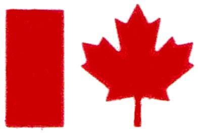
In some cases, graphic artist involved with commercial products attempt to improve upon the original. The flag of Canada is as official as it gets, yet a number of artists have chosen to change its proportions or depict the maple leaf in their own style.[12] A modern tendency is to “logofy” properly granted emblems either by representing them in such a simplified form that the components are difficult to discern or by significantly changing content. Even the flag of Canada was not spared this treatment. By 1972, and possibly a little earlier, the Government of Canada began using as the logo of its departments, the red band on the left side of the flag and the maple leaf, leaving out the red band on the right (fig. 15). It seemed ludicrous to truncate the flag after fighting so hard to finally obtain this national emblem. This view eventually prevailed since the full flag returned in 1987.
Fig. 15. “Logofied” version of Canada’s Flag appearing with the names of Canadian Government Departments from c. 1972 to c. 1987.


